Poll results
Save to favorites
Add this poll to your saved list for easy reference.
Which book cover is more engaging?
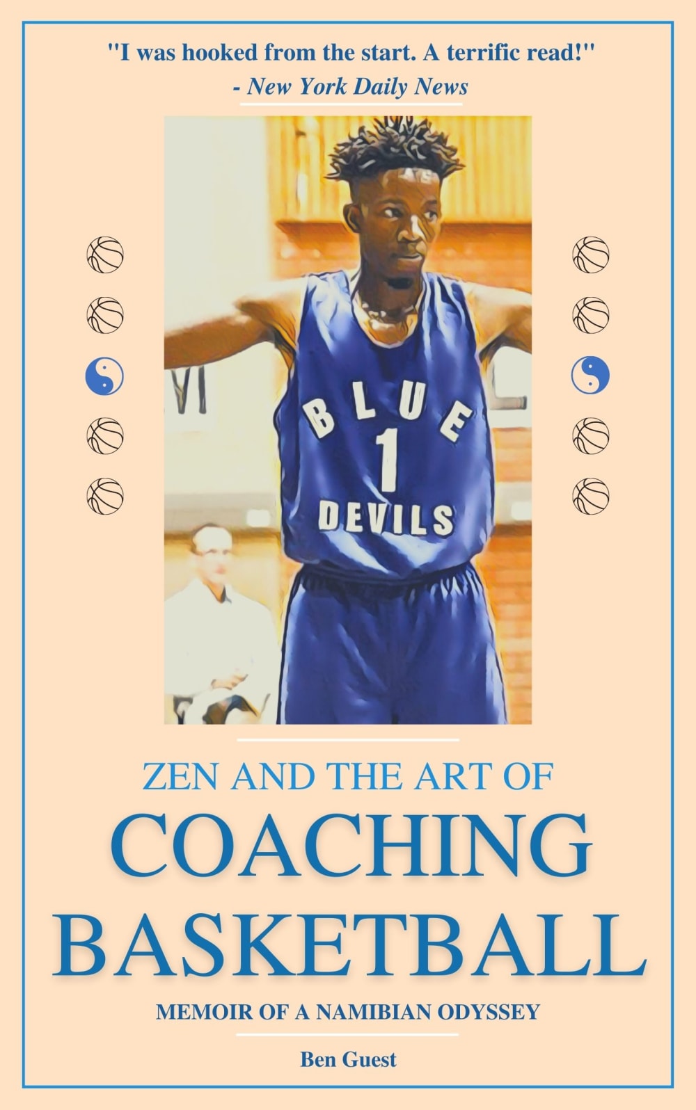
14 Responses to Option A
I choose A, Because this is more attractive and more appealing.
I prefer A, the color is nicer and catches your attention more since it's lighter.
Option A looks better, although I would prefer a slightly darker background. I'm not a fan of a black background (Option B) for a book, and in this case it makes some of the other elements harder to read.
This option featured a cover image that was brighter and sunnier.
A is more engaging to me the because the contrasting color between the font and the background helps it stand out a lot
this book cover is more engaging and i like very much
A feels somewhat more engaging - the contrast between the yellow and blue gets my attention a little more and looks somewhat more appealing. The dark blue background of B also feels a little too formal and less relatable and not as fun or interesting.
The jersey stands out more on A, it looks better as well. B, nothing really has the spotlight like A does.
Choice A is more engaging to me because the light color for the cover looks better to me and it makes the blue color of the jersey and the text stand out more to me. It looks better and makes the colors pop more as opposed to having too much of a darker color.
I option A the most because the lighter background makes it easier to read the title and various parts of the cover.
I think the lighter color cover catches my attention best.
I like option A the best because I think the light tan colored background makes the blue text really stand out (as well as the image) and easy to read.
With the pale background, the color of the font stands out and makes my eyes focus on what I am seeing.
I find the contrast between the light border and the darker image/jersey to be far more eye catching.
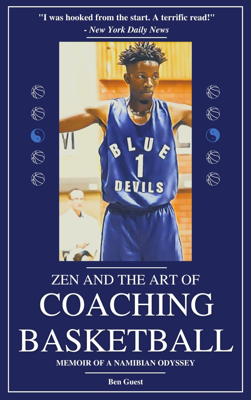
36 Responses to Option B
I like the purple background! It really stands out and matches the player's uniform.
The cover flows better with the blue color.
the book cover in option B is more engaging because the blue makes it look more exciting
The dark color stands out more for B. Also I just like Blue.
I prefer Option B because the blue base makes it look more eye-catching, and the white text really pops.
I prefer Option B because it is much more visually appealing and eye catching in my opinion.
The all blue is a good look. The blue background helps tie in the color of the man's jersey.
I like the blue background much better. It looks more modern and eye catching.
I chose B because the dark blue background with the white lettering is very eye catching and appealing.
Colors make for better synergy.
I definitely think the blue border is more engaging. It is my favorite color so I always want a lot of it no don’t really like the other option
B is the better book cover. The blue border matches the jersey as well as the team name. It is also a color that gives off energy and contrasts well with the white text.
I thought the blue looked nicer.
They are both very similar, but the blue is more expected and more appealing to me. I like how it matches the uniform - the look flows together nicely, unlike option A.
I prefer the color of the cover, A looks like a much older book because of it's background color.
The color of the book cover matches the color of the sportswear of the person in the image. It is a good design to use consistent colors for the book title.
I'd go with the darker background. The darker background really helps the text stand out. The darker background makes everything else pop.
I like the blue more. It matches the guy's jersey and is more pleasing to look at.
I think Option B really showcases the Duke Blue that brings my eye to the book and makes me more interested because the school is so famous and well known for basketball!
I chose option B as my first choice because the blue cover background is more appealing and eye-catching to me than A. I like the white lettering on the blue background as it looks more clear and professional. I also think the background color makes the cover photo stand out more.
The blue background and white font is easier on the eyes and makes it easier to read really quick
B is more engaging as the blue matches the blue of player jersey and just captivates me.
B is empowering, bold and eye catching.
I find the blue color to be pretty striking and visually interesting, certainly more than the odd peach color in Option A, so I'd go with B here.
The overall blue color is more eye catching than the bland looking cover.
I prefer option B. The large blue border highlights the center and makes it more noticeable.
The darker color cover looks more bold and engaging.
That blue that’s famous for the school would help sell it to those that love the team
The peach color looks horrible. You also need a better picture on the cover.
The blue is much more eye-catching
the color matches well with image on the cover
Option B of blue color matching the jersey color creates a sense of commitment to the school.
The blue color is a bit more eye catching and enhances the "Blue Devil" team he plays for.
The dark blue is bolder and really catches my eye more.
Option A looks very bland, flat and boring.
The dark blue is more eye catching. I just think that using the beige tone in A makes the basketball floor a little more muted whereas it helps the image pop in B.
Explore who answered your poll
Analyze your results with demographic reports.
Demographics
Sorry, AI highlights are currently only available for polls created after February 28th.
We're working hard to bring AI to more polls, please check back soon.


