Poll results
Save to favorites
Add this poll to your saved list for easy reference.
Which book cover is more likely to make you purchase this book?
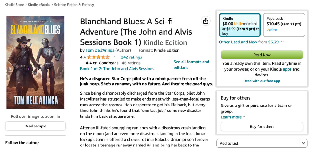
13 Responses to Option A
I think it looks best without throwing a kid out in front, I like the other characters more.
Cover stands out more and the characters look exciting and unique.
Since the introduction to the description only describes the two characters, then I would say A. There is not context who the additional person is in B.
I can see the robot more clearly. The robot is key for grabbing my attention
I am already an adult and I would consider the little girl on the cover indicates this books is only PG13 or even unrated. I would like to see some mature thing. Also I would say that cowboy making friends with robots are already cool enough, and there's no need to put a third person in.
I like the image more in A, since a space cowboy and robot arguing are the focus anyway and adding the kid doesn't really add anything to the image as far as I am concerned.
I like the cover without the child in it better.
The girl makes the cover cluttered, and it calls into question whether the description is talking about the robot or the little girl.
The cover looks more "normal" and not forced with the girl image inserted. Plus it looks more interesting.
The child just looks so out of place on the cover like a bad photoshop
I think having the child on the cover may dissuade some people from buying it because they'll think it's a kids book
The girl makes it confusing and the cover busy
I think that option a seems more mysterious and eye catching. The cover makes me want to learn more
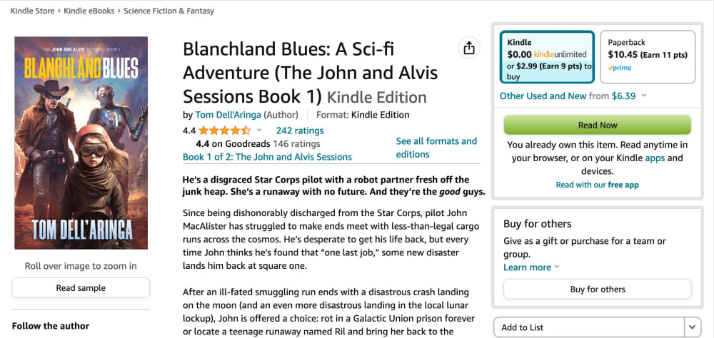
37 Responses to Option B
I like it better with the kid in the foreground. They seem like a cool character.
I assume the runaway is the child in the front? Then only B shows all the characters.
I like having the girl on the cover, because as you read the description and the girl gets mentioned your above to connect the dots and understand who the girl is on the cover.
The addition of the third character makes this cover even more dynamic and adds some mystery and depth to what is going on in this scene.
Good easy description to read
B supports the blurb more, but I'm less interested in it - I don't like the "child sidekick" trope, and the cover makes it look like the focus of the story is on that.
I think the more figures the better.
The wording provides a lot more character and description; the other option is lackluster
I think the girl adds to the interest. My only knock against it is the style. She looks realistic while the other two look more like a painting. A just looks like a guy and a robot talking. B looks like they are leading or being led by the girl to something. B at least gives some hints of conflict and drama while A just looks like a friendly chat.
I would be more likely to purchase and read option B because I think that the addition of the child makes for a more interesting and eye-catching book cover design.
I picked Choice B because I feel like adding the girl does help because she is one of the three main characters mentioned in the description so it would be weird to me if she wasn't on the cover.
I'd rather read about human relationships than human-robot relationships.
I prefer it with the girl-- makes the book a bit more intriguing to me. And, to me, it makes more sense to include all three protagonists that are mentioned in the blurb.
I feel the child in the middle of the cover adds more intrigue to the story line in A
This does a better job of visually showing the main characters and is more involved for me than the other choice.
I likeThe girl being included in the cover. I like the extra detail. It helps to see an extra character. It makes it more eye catching
Adding the girl to the cover is helpful in visualizing what she looks like and supports the blurb better. The cover does feel a bit cluttered with all of 3 of them on there.
This is better because it includes the characters you need to be aware of, giving you a very good idea of what they look like, and helping you envision a journey.
I prefer the book cover in option B that features the girl mentioned in the blurb and summary. I think it adds to the man and robot dynamic to have a young girl and will be a lot more appealing than the cover without her. With things like The Last of Us being so popular right now older man and younger girl counterparts are popular combos and it would be a disservice to not include her on the cover.
B is more likely to make me purchase, as it shows me that the story ha additional depth to it.
When I first looked at A, I hadn't looked at B yet. I wondered where the girl was since she's an integral part of the story.
Option b is cool. It's a great looking cover. It's eye-catching, and a design that really stands out well. I like it. It's a very nice looking cover design. Very cool.
B. It shows more characters. It also gives you a better impression of what the book will be like.
I like the child in the front. It adds extra intruge.
I prefer the cover in Option B because it shows all three main characters.
Since the girl is mentioned in the bold text as a main character, I think it only makes sense to show her on the book cover, so I think this book cover looks and fits best.
The cover in this one looks worse made, but more interesting
Yes I like the cover in choice B because it relates to the summary of finding the girl. Connecting the cover to the summary
Choice B looks more visually appealing and satisfying with the three figures, Choice A looks too barren.
B makes me curious who the additional character is (presuming the other two are the protagonists named in the title).
Presuming the additional character is relevant to the story, I like the picture that includes them. Plus, the goggles are cool looking.
Although it sounds like she may not show up until late in the story, I do think that adding the girl to the cover adds an extra layer of intrigue that makes it more interesting and ultimately more appealing. It helps to play up the odd-couple aspect of a grizzled veteran and a teenage girl forced to survive together, and that's a formula that has worked well on several projects recently.
I like b. Having the girl adds to the cover. Breaks up some dead space and makes you want to know more about her.
I think it makes sense to have the girl on the cover as she is one of the main characters.
Definitely option B. The layering of the characters adds depth and really pulls my eye in. I also feel like it inspires more questions and makes me more curious as to what the book is about.
The story seems familiar, but B is more indicative of the story, while A makes it seem like a buddy story
The girl is mentioned in the blurb and in the summary text, so I expect to see these elements in the picture.It sounds like the girl is central to the book and will be in almost the entire book.The girl is a sympathetic and relatable image. It is difficult to look sympathetic and be a robot or a former cop. I would assume that sympathetic and relatable is what motivates people to look further.I would be even more interested if the three characters were interacting in some way. Imagine the Charlie's Angels picture, these three are close knit and working together.
Explore who answered your poll
Analyze your results with demographic reports.


