Poll results
Save to favorites
Add this poll to your saved list for easy reference.
Which book cover would you choose and why?
Option C won this Ranked poll with a final tally of 60 votes after 3 rounds of votes counting.
In a Ranked poll, respondents rank every option in order of preference. For example, when you test 6 options, each respondent orders their choices from first to sixth place.
PickFu requires a majority to win a Ranked poll. A majority winner differs from a plurality winner. A majority winner earns over 50% of the votes, whereas a plurality winner earns the most votes, regardless of winning percentage.
If an option does not earn a majority of votes, PickFu eliminates the option with the lowest number of votes. The votes from the eliminated option are reassigned based on each respondent’s next choice. This process continues in rounds until a majority winner emerges.
Scores reflect the percentage of total votes an option receives during the vote counting and indicate the relative preference of the respondents. If there is no majority winner, look to the scores to see how the options fared relative to one another.
| Option | Round 1 | Round 2 | Round 3 |
|---|---|---|---|
| C | 42% 42 votes | 44% 44 votes +2 | 60% 60 votes +16 |
| A | 20% 20 votes | 32% 32 votes +12 | 40% 40 votes +8 |
| D | 20% 20 votes | 24% 24 votes +4 | Eliminated 24 votes reassigned |
| B | 18% 18 votes | Eliminated 18 votes reassigned |
Age range
Amazon Prime member
Education level
Gender identity
Literary preference
Options
Personal income range
Racial or ethnic identity
Reading frequency
20 Responses to Option A
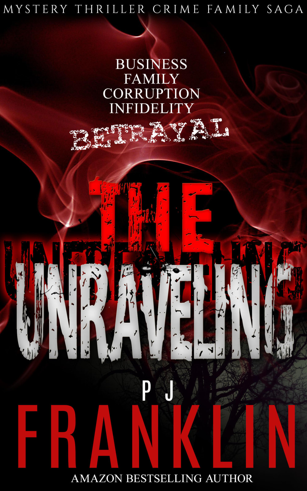
the red makes it seem more scary and mysterious as it reminds people of blood and horror and mystery and bad things.
I would choose the cover in option A because it looks the most mysterious and intriguing. Option C and D look pretty engaging too. Option B is my least favorite.
A and C look the most exciting to me
i like A first because it ominous looking. Looks like a stephen king cover. I like C because pic seems like it gives a description of the type of book. Then the last two are just tied in my opinion
A gives ideas about what the book is about without giving away too much, allowing you to use your imagination. It's my choice.
I really like option A because I am a sucker for the black and red. It looks so interesting and spooky. I am also liking option D & C because the cover is telling me that I must know what this book is going to be about. I like these genres of books the best. I think option B needs some more spookiness to the cover.
I like the red cover the best. Red is associated with blood and goes well with a horror or mystery thriller. I like the font used for the title. It's gritty and eye catching. My next choice would be the similar cover with the blue smoke. It has the same font and the smoke looks cool. I prefer these covers over the covers with people on them. Of the last two options, I like the one with the crowbar over the gun. The crowbar just seems more brutal and interesting. On my first choice, I also like that there are descriptive words above the title so I kind of get an idea of what I would be getting in to.
Image seems most enticing to me in terms of the mysteriousness presented
I really did not like the book covers with the person on the front. They both did not match the title of the book, the unraveling. Nothing about those pictures speak unraveling. So I went with the other two book covers, ranking the red one first, because it caught my attention.
My rankings were based on which book cover I like the best. My choices were based on the boldness and attractiveness of the cover.
Option A because it jumps out the most and the information is easily readable
Having the full title in there, which includes betrayal is important. Like the red flame/smoke for the book cover.
I chose option A first because it embedded so many different options on it's cover. From the red color like blood to the shadowed letters and the betrayal word written so spookily it just is the perfect cover. I really liked option B because the hand is just creepy looking, giving the cover a real thriller look. option B was next. I liked the blue background color but it really didn't jump out at me as much as the other two. Option C I didn't feel the person who is obviously a bad guy was the right design for the title. That would be better for a murderer in the garden or something.
Option A was my first choice because I thought the red color of the text and the background made that book seem exciting. Option D was my second choice because that background image of a person with a gun was fitting of what the book is about. Option C was my third choice because it was similar to option D as it depicted someone with a weapon but the crowbar was less threatening in my opinion. Option B was my last choice because I thought the font colors were somewhat unappealing.
I preferred the color contrast and lettering design on A. B also had a nice color contrast. C had a rather dull look to it.
Choice A really stood out for me and I think it would grab my attention if I was looking for books at a bookstore.
Choice A is just more mysterious to me. Its eye catching and seems interesting.Choice C Honestly I like choice C for some reason the pic reminds me of supernatural the tv show Choice B is ok its a little similar to a but blue is a soothing color not the color of crime familyChoice D has no appeal to me. I know there is a lot going on in the cover but it feels basic to me.
I like the horror feel of this cover with all of the red smoke and the red font. It gives the cover a scary and mysterious feeling. It makes me think that this will be an exciting book to read.
I like A the most because it really grabs my attention. The red is really striking. The hands on B are interesting to me. I think C is too much with the person on the cover.
Red is my favorite color so A is the best to me. B is second because the blue also works well. C looks like a movie poster.
18 Responses to Option B
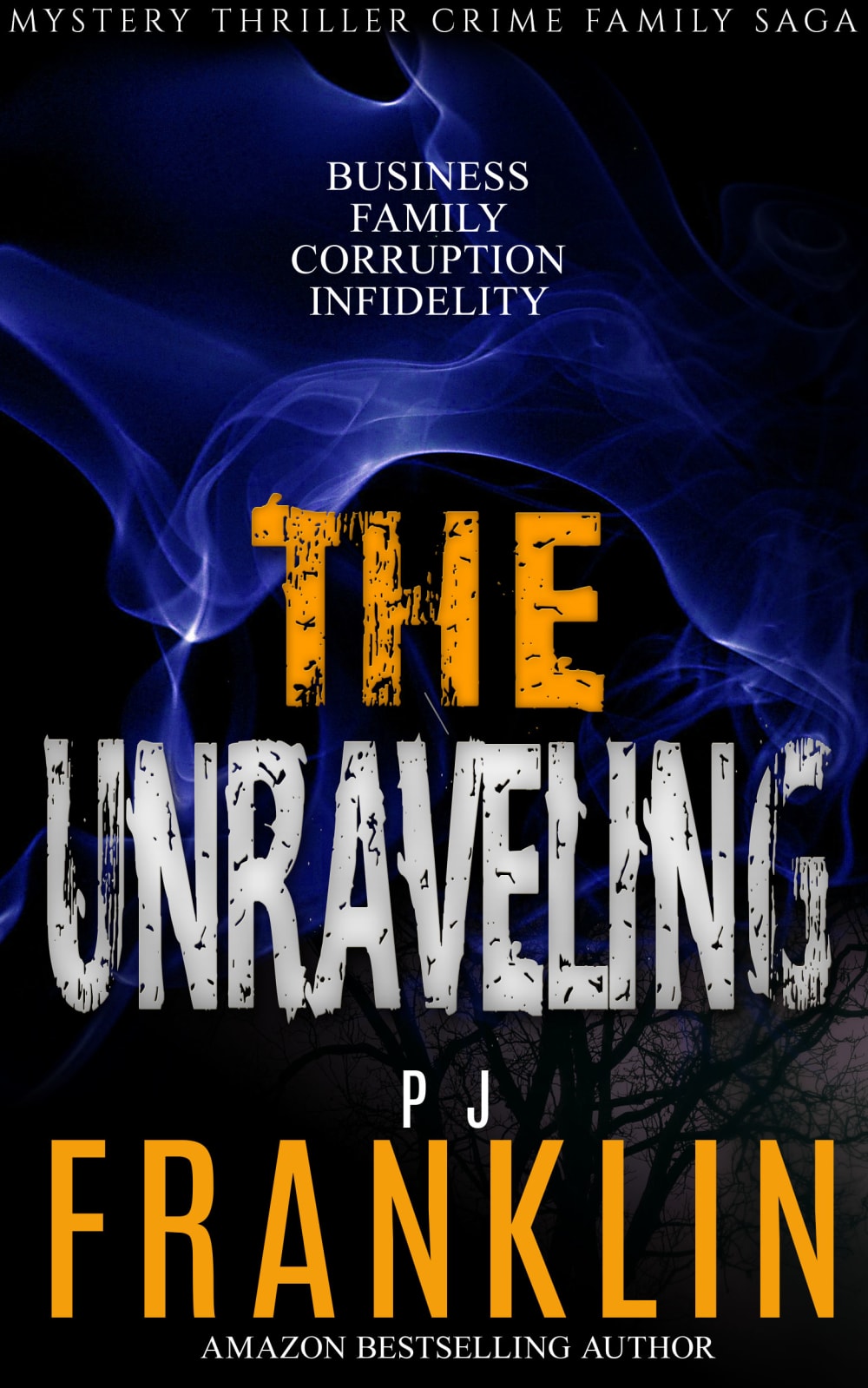
I would pick option "B". The book cover looks appealing and unique.
Option B really appeals to me so much, I find it to be extremely appealing and it really stands out to me so much. I think that its a great cover and it really sticks out to me. Option A I think is great as well I find it to be extremely appealing. Option D I think is great as well, I think its amazing and I find it to have alot of creative points. Option C I would say is a great choice as well to me overall.
I really love the cover in panel B. I think the blue works very well as opposed to the red. I think that there is a mystery theme here and this cover emphasizes it well.
I prefer Option B the best. The cover has a ominous feel but it isn't obvious but rather more sophisticated. Option A is also interesting, just letting the plumes of red to make it seem evil. The remaining options are all just okay but rely on gore and it's very overt and manipulative. I prefer a underlying threat that's not as obvious.
I like the color scheme of B.
I like B the best because I like the mysterious look of the blue smoke. Along with the white and orange font it gets my attention first. I like A somewhat also because the red gets my attention too. The last two are okay but they don't grab my attention
I prefer not too scary covers. therefore my order.
the title page doesn't say murder but C and D imply it. B embodies the title page the best, A second best.
I don't like the violence portrayed in the third and especially my fourth choice.
The smoky blue background is the most attractive
Option B and A look more like covers of a book about a crime family. Option D is more for a kidnapping story. Option C is very generic.
I don't like the image of the man at all and I prefer the blue over the red.
The blue flames are more "bookish" than the guy holding the weapon
This book cover looks dark yet mysterious. The colors work well together.
I think cover B is the most mature looking cover and would fit the target-audience the best. The blue smoke in the background makes you wonder of the nature of the book and gives a sense of mystery. Option A is close but I believe the betrayal in the title is too 'on-the-nose', as in is trying to hard to say what kind of story it is. I also find the red a little less fitting when compared to the blue. D and C are too aggressive in their messaging of what the book is and lack the nuance of B and A. The gun being held in D is a little over-done and could easily make the book more generic than it actually is. The same can be said of cover C but to a lesser extent.
I like the eerie wave of fire in B. Especially the blue makes it look hot and interesting.
I love the background design and the blue color so this one seems to go the best with the title.
easier to read the font and text
42 Responses to Option C
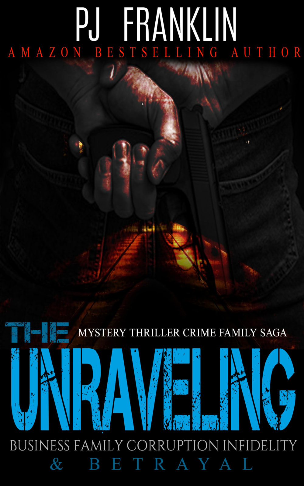
The cover looks mysterious. I think it would be interesting to read the book just by looking at the cover
I would most likely choose option C. I really like the design the best and I feel it bring a lot of attention to it.
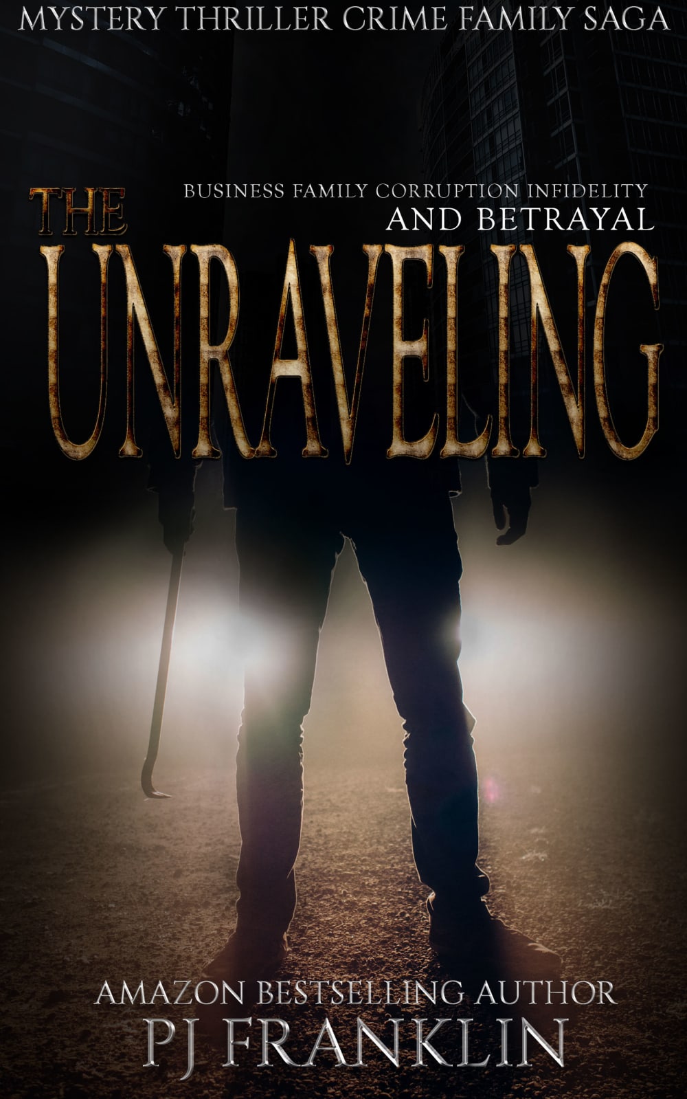
The one with the person is the scariest looking, then the had, then the one with red
I like the covers with the presence of a guy there. It makes it seem more tense. 3 is a little intriguing and 4 seems uncreative and something for kids
I feel the title is ambiguous and stirring. C invites mystery with its color scheme and dark presentation. I feel this is most appropriate for the book title.
photo itself seems to be scary , by the picture itself looks thriller story inside
I like the man holding the weapon as this makes me imagine I will be reading a murder mystery type of book, gives me more insight.
I like option C the best because it is the best combination of being interesting and visually appealing. It causes the most suspense while still being visually appealing. Option D is definitely suspenseful and interesting, but it is not as visually appealing. Option B is my second favorite because it is eye-catching and more visually appealing than option D while still being interesting and suspenseful.
C is more intriguing to me, the character on the front represents some sort of action and suspense right away which is more appealing.
I ranked the designs of the book cover the mystery novel that I liked the most. I found the mysterious sillophute man in option C to be the most engaging. I then liked the color of the book cover of option D followed by the book cover of option A and then finally option B.
The mysterious, shadowy figure draws me in.
I prefer option C first as it best suits the title and then option D as it suits the title somewhat and then option A though it doesn't suits the title, the color is attractive and then finally option B as it doesn't suits the title and color is also dull.
I feel this option is best because usually those in this sort of position with a crowbar tend to be quite unhinged.
i really like the illustrations on c and d.
C is the best one for me because it gives me a sense of all the mystic I want and with the dark cover, it gives me a bit of a hair raising. I would click and buy this one first and would read it quickly.
Makes me want to know who the person is and how they got into this situation. Makes me want to learn more about it.
C looks very creepy, mysterious, dark, and tells a story better than the others. It looks more mature. A is my second choice because the red color is very bold. I dislike the childish bright purple of B
I thought C has the best image and description of the book. It looks creepy and interesting. Then I chose A because it has a nice design as well.
Option C is eye catching, and would make me want to pick it up to see what its about. Theres a bit of mystery in the art, making it naturally more appealing.
C and A have really good color schemes. B and D have too many colors and they clash and make the cover very ugly.
I prefer C and D. I give C the slight edge over D because it invokes the thought of mystery to me. B and A look a little too low budget for my tastes.
It is odd to have two covers with different murder weapons (my assumption). Does the story involve a crowbar or a gun? I like the crowbar better because its more unpredictable when reading the story. I like A because the blue tone kind of looks like an x-ray which is cool.
C I like the design the most it looks like what I would expect a book cover to look like.
The picture on the first cover makes the book look super suspenseful so it is the best option in my opinion. The 2nd option looks pretty interesting as a cover as well. The 3rd and 4th options are irrelevant.
That image of the person with the weapon in C stands in your memory very well so I would pick it over the others.
I'm digging C because it is the most eye-catching and intriguing to me as a lover of books.
A and B are kind of too generic to be eye-catching. Option D looks interesting, but is hard to tell what is happening in the cover at first as the different images blend into each other too much, making it look blobby. Option C is my top choice as the picture matches the words, and is simple and easy to immediately understand, plus makes me feel a sense of dread while looking at it.
Cover C evokes the strongest reaction and seems like it would be the most interesting story so I'd want to at least pick it up and look more into it.
It took me a bit to be able to register what D had with all of the information being placed while C is pretty clear we're dealing with a murderer instead of the generic ribbon water feature like in B and A.
I definitely think having a person on the cover sets the tone for the story and what I should be expecting before reading it. I think it does a good job of creating excitement for the book. Choice D is a decent option as well, but I prefer choice C overall. Choices B and A are a little too basic to me.
Choice C has the more appealing book art, but choice D has a more readable book title font.
I'm immediately drawn in by the guy with the crowbar. I like the bottom half of D but not that hand. I don't get the significance.
The first two book covers look edgier and intriguing. You see the description and then the picture and something starts to form in your mind in terms of what the book could be about. It's more interesting. The other two aren't really much to look at, but the blue font is easier on the eyes than the red.
The book cover for my first choice because I like the car headlights shown and the shadowing and general lighting
I like option C the best. I really like the cover i think it is very mysterious and thrilling
The first book cover that I would choose is option C because it looks more less scary than the other optionsSecond book cover is option B because it has a mystery when the smoke clearsThird book cover is option A because it shows too much red which indicates blood in my eyesightFourth book cover is option D because it is dark and too scary for me to think about reading
The imagery in C seems more frightening and suitable for a thriller novel which is what the book seems like. The red design in A is chilling as well.
Option C really screams this book will be very suspenseful. Option B has a very mysterious look to it, but doesn't scream the contents of the book.
Option C is great because it immediately creates intrigue.
I prefer C the most because it is the most ominous and fits the mood of the title better. D does this as well but less is left to the imagination which holds down my interest a little bit more.
I like the ones with the weapons. let's you know more about the book than no pic at all.
I prefer C because of the man standing with a crowbar. It's a really good picture and grabs my interest. I didn't like the other choices because they look tacky and I have seen them before on a lot of other ebooks. It doesn't stand out at all.
20 Responses to Option D
The contrast in colors draws your attention to the title
I like the book cover in option D the best. The cover catches my attention and makes me interested to read more about this book. I feel a sense of tension and excitement from looking at the image.
i would prefer option D because i like the graphics and layout of the information on the book cover feels thrilling just looking at the cover i would want to read the book just judging by the cover
A and B were too vague and generic; they were basically just strobe lights. The man was creepy in C and D just looked like a scene from a horror film.
The image of the gun in D adds a feeling of danger. The man holding the crowbar in C also invokes a feeling of danger. A and B just look like colorful words that may or may not mean anything.
Option D, looked dramatic and had the most interesting cover. Option C, was good too but I thought the blue colored text just popped out more in option D. Option B, was okay. It didn't have as strong of an impact. Option A, looked hard to read with all the red which is why I ranked it last.
Option "D": First, this graphic of a hand holding a pistol clearly behind this back and in a seemingly casual waiting position immediately heightens the visual tension (the best of the four shown). The color of the distressed font in the title is quite artful and highly legible even at a distance. I'd be happy perusing this book for a synopsis based on this cover.Now, the use of uppercase (read all caps) for the subtitle is ok, I can deal with that. But throwing seemingly every genre available at potential readers is a bit of an overload ie. MYSTERY THRILLER FAMILY CRIME SAGA followed with BUSINESS FAMILY INFIDELITY CORRUPTION is a bit overwhelming in effort to overplease.
That hand is just a very creepy item to have on the cover. It is both unique and unsettling at the same time, which is why this is top for me.
I always prefer when the title of the book is larger than the author's name, which is why I chose D and C first.
Option D is most appealing. The blue stands out well in the wording quite well
To me, D looks the best. I like the lettering and colour a lot and it is the most eye catching.
The first two get your heart hammering and make it clear it's a thriller so I prefer those.
D and C are a little more unique in their cover art. I think A and B are quite generic with the only difference being the red or blue smoke.
D is what I would expect to see on a shelf in a bookstore.
All these book covers look really poorly designed. If I had to choose, option D is the cleanest design where the title and other text is readable and not obnoxious. Option B and A looks like something a made by a very unskilled or uncaring designer.
I chose the ones that stuck out to me the most and I will tell why. Option D stuck out to me because of the hand with the gun. Option B stuck out to me because of the wispy blue smoke. Option C stuck out to me because of the mans shadow. Option A did not stick out to me.
I like either D or C. I think that they look the most serious
I choose Option D because it has "Best seller" on the book cover as a book lover it is very quite appealing to see those kinds of marketing strategy. And overall Option D has a great background and illustration.
Option D caught my attention immediately, the hand imposed over a background, the title being clearly defined. Optoin C is next, i like the way the title is the first thing i see, reading my way down the cover with the image and finally the author. Option A and B are not as favored by me, with the font size the same for the title and author its harder to digest, it takes me a minute to discern the title from the authors last name.
D looks the most intriguing then A then B then C
Explore who answered your poll
Analyze your results with demographic reports.
Demographics
Sorry, AI highlights are currently only available for polls created after February 28th.
We're working hard to bring AI to more polls, please check back soon.


