Poll results
Save to favorites
Add this poll to your saved list for easy reference.
Which book would you pick up in a store?

Option D won this Ranked poll with a final tally of 29 votes after 3 rounds of votes counting.
In a Ranked poll, respondents rank every option in order of preference. For example, when you test 6 options, each respondent orders their choices from first to sixth place.
PickFu requires a majority to win a Ranked poll. A majority winner differs from a plurality winner. A majority winner earns over 50% of the votes, whereas a plurality winner earns the most votes, regardless of winning percentage.
If an option does not earn a majority of votes, PickFu eliminates the option with the lowest number of votes. The votes from the eliminated option are reassigned based on each respondent’s next choice. This process continues in rounds until a majority winner emerges.
Scores reflect the percentage of total votes an option receives during the vote counting and indicate the relative preference of the respondents. If there is no majority winner, look to the scores to see how the options fared relative to one another.
| Option | Round 1 | Round 2 | Round 3 |
|---|---|---|---|
| D | 26% 13 votes | 36% 18 votes +5 | 58% 29 votes +11 |
| B | 30% 15 votes | 34% 17 votes +2 | 42% 21 votes +4 |
| A | 28% 14 votes | 30% 15 votes +1 | Eliminated 15 votes reassigned |
| C | 16% 8 votes | Eliminated 8 votes reassigned |
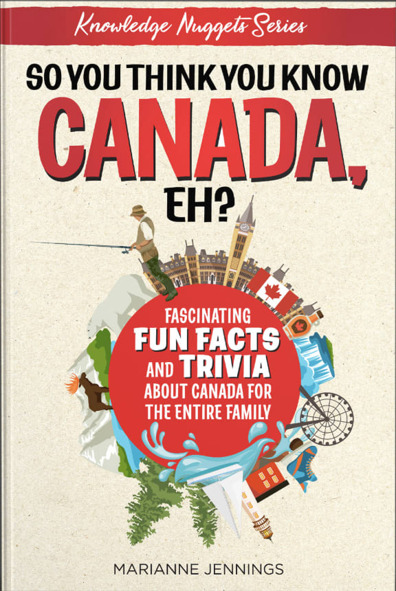
14 Responses to Option A
This one is the most eye catching. I like how each Canadian thing has a bright red border around it & the cover is well laid out.
I like the way option A is all broken up into segments, it makes me feel like there's lots and lots of random facts about Canada
The one i picked looks like it is more interesting and fun to read. It is more attention grabbing than the other ones.
I think the white background looks plain so I picked a colored background. A with the drawings of animals looks really nice and friendly so I picked it #1, D is very easy to read while still attention grabbing so it's my #2.
I chose A D C based on the creativity of the cover and how it each one drew my attention to it.
The artwork is really cool on this and the red borders help it stand out
all of these covers look great, but in this order
A is very catchy and eye appealing and colorful. B has the earth in the middle which is cute also. I like the font on both. C is okay. It plain.
The cover of choice A makes it look like it would be a fun read and is geared towards all ages. Choice C and D as well, but the cover seems like it'd be fit for older kids/adults.
I choose A because A was the brightest and most novelty-like cover. When I think of fun trivias/facts, I think of bright and loud covers just like how the television shows portrays bizzare facts.
A definitely has things would appeal to kids. It would even appeal to me more than the others as an adult. The next one is still attention gettting butmaybe for older kids or people and the last one I just like the cover better than the very last choice i had
All of the book covers are eye-catching and I love facts so even the title grabs my attention. Option #1 is great! You can tell there are going to be all kinds of different types of tidbits. I would pick up that copy in a heartbeat. Option #2 is also really a neat idea and kind of conveys Canada is a whole word of it's own chock full of fact. Option #3 falls really good with the mountains in the background (knowing how much of Canada is covered by beautiful mountains, it is appropriate); and still a lot of different items represented - indicating there will be a LOT of different areas covered. Still, overall, I love the color and bold presentation of Option #1 the best - it would be the VERY first one to grab my attention.
Combination of color stands out the most
I like a first since it looks so old fashioned and the picture is crazy busy but that appeals to me then I like c since it is white and red, then d since it less crazy but similar to the first one A, a is cool though because it is crazy it catches my eye
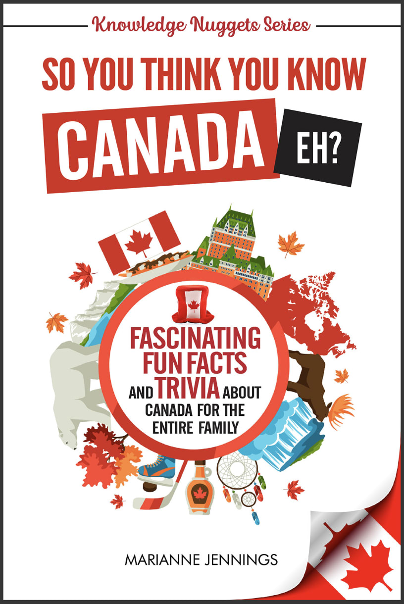
15 Responses to Option B
The front cover is designed to stick out to the reader.
These are the ones that jumped out on me first. I feel like they give me a check me out vibe.
I like the around the world look and the overall Canada themes on all three of these equally.
I picked by the covers that appealed most to me. I like the more serious styles
I really like how you have all the activities around the ball. My favorite is the fishing. I love how the colors all blend well together.
the title stands out more
B the word Canada is large and catches your eye. A is appealing with all the line work and the color red. D also grabs you because of how large Canada is but the mountain in the background has a nice touch.
I prefer B's cover
B seems more like it will be related to the natural world and wildlife instead of just city stuff.
A looks less professional. The others look professional. I like the design of B the best, it's eye catching
I like the first one I selected not as busy
The first option I picked looks the most professional and factual without looking cheesy. The second one is the most eye-catching but maybe not the most factual-looking. Option D looks heavily inspired by The Oatmeal, which makes me want to pick it up, but since it isn't, I hesitated.
It is easy to read and looks interesting I like the design and it is well put together.
I like the basic look the one I did not choose was to loud
It is the best laid out and easily readable
8 Responses to Option C
Light colored background is what I like. Seems uncluttered.
these would be the choices I'd make and would pick up any of these because the covers make the book seem more interesting
I like the one that does not have so much going on
In terms of shape I like the round designs most and then the collage next. I think C best represents Canada and has a more prominent red color.
I like how bold the cover are. I especially like the peekaboo aspect of the Nationality on the first choice.
It's easier to read, I don't like the cartoonish ones much.
It was a close decision between options C and B. I really like both of them. The fonts are eye-catching, and the circle of Canadian things is fun to look at. I did not select option A because it looks too childish and basic.
I prefer the ones that show more diverse attractions.
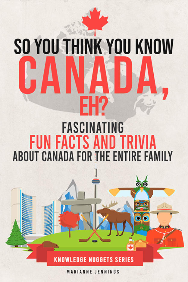
13 Responses to Option D
The colors and artwork in these just look the most "Canadian" to me.
D seems like the clearest and most eye catching if I saw it in a store.Some of the covers seem a little too busy and hard to read.
The design I chose was so much prettier and attractive than the others. Use that one!
I like D the best because I like the red font and the images below. I also like the maple leaf at the top. I like B too, but not quite as much as a because the images are around the circle and that looks a bit odd. I like A mostly because it's different looking and gets your attention even though it's not my first choice.
I liked all these options excluding a because it's just so much to look at and childlike
I prefer the more simple designs.
D is the most striking cover by far
looks more appealing and eye catching for me .
I CHOOSE D/B/C BECAUSE IN ALL 3 I LOOKED THE MORE EYE GRABBING ATTENTION COVERS. OVER ALL I CHOSE D BECAUSE IT WAS THE MORE CLEANER COVER I COULD FIND EASY TO READ NICE PICTURES AND THE HEADER WAS IN NICE SIZE
more colorful is more fun
Option D has a nice color and font to it that is easy to read and decipher. The graphics are sweet as well. I like option B and C pretty evenly. Think they are fun looking. Option A seems a bit like it is a book for children. So I prefer the others more.
I think the first one I chose just looks more clear as to the things that are offered to you in Canada and the things you can do.
I like the layout of D best of the choices.
Explore who answered your poll
Analyze your results with demographic reports.
Demographics
Sorry, AI highlights are currently only available for polls created after February 28th.
We're working hard to bring AI to more polls, please check back soon.


