Poll results
Save to favorites
Add this poll to your saved list for easy reference.
Which cover do you prefer for a French Phrase Book?
There was no majority winner of this Ranked poll after 2 rounds of vote counting. However, Option A and Option C had the most votes (25).
In a Ranked poll, respondents rank every option in order of preference. For example, when you test 6 options, each respondent orders their choices from first to sixth place.
PickFu requires a majority to win a Ranked poll. A majority winner differs from a plurality winner. A majority winner earns over 50% of the votes, whereas a plurality winner earns the most votes, regardless of winning percentage.
If an option does not earn a majority of votes, PickFu eliminates the option with the lowest number of votes. The votes from the eliminated option are reassigned based on each respondent’s next choice. This process continues in rounds until a majority winner emerges.
Scores reflect the percentage of total votes an option receives during the vote counting and indicate the relative preference of the respondents. If there is no majority winner, look to the scores to see how the options fared relative to one another.
| Option | Round 1 | Round 2 |
|---|---|---|
| A | 34% 17 votes | 50% 25 votes +8 |
| C | 40% 20 votes | 50% 25 votes +5 |
| B | 26% 13 votes | Eliminated 13 votes reassigned |
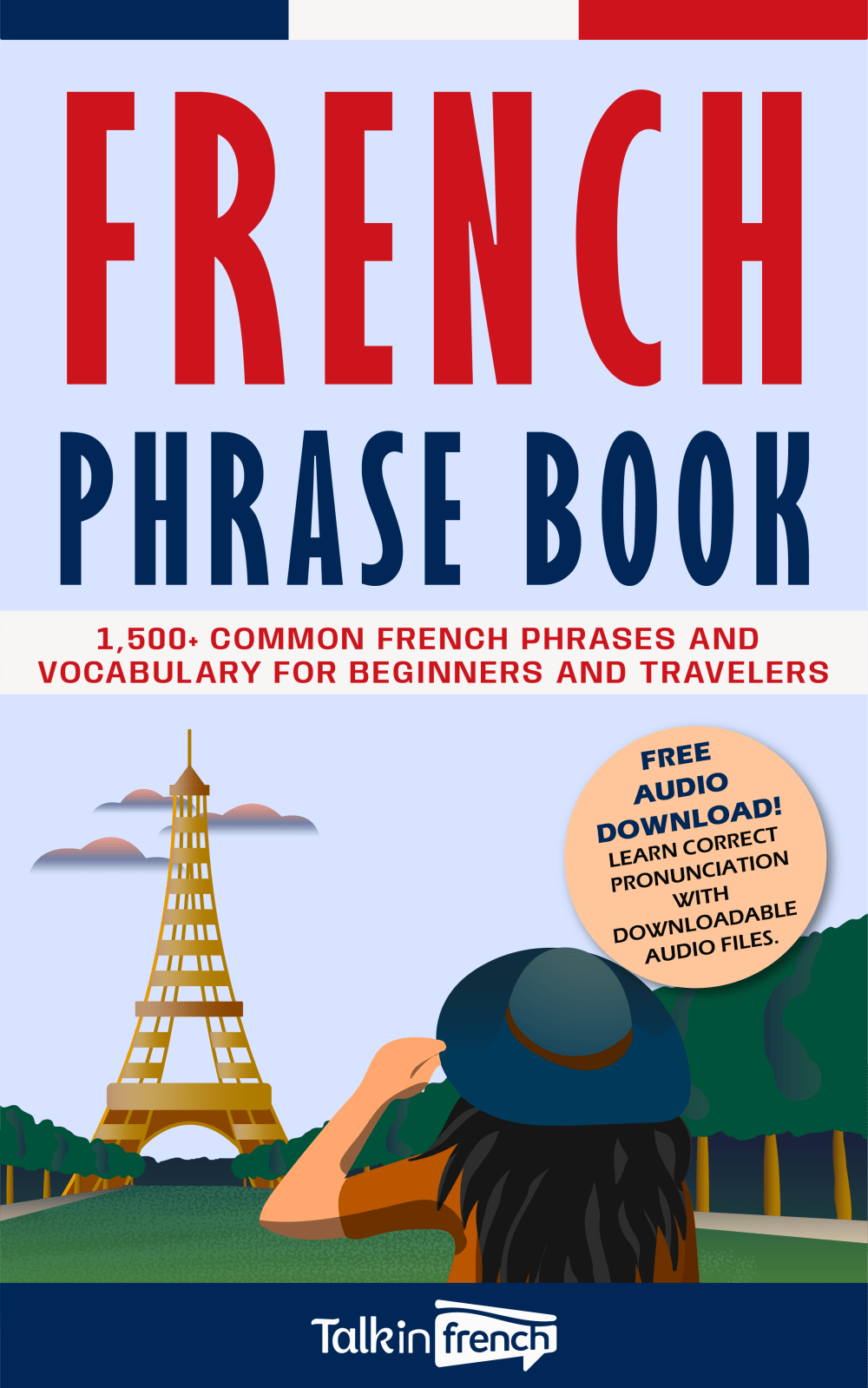
17 Responses to Option A
These covers are the most interesting to look at overall
This design looks the most modern, and I think it would target younger audiences if that is what you are going for. C was my last choice for the opposite reason. I think older customers would really like this, but it didn't catch my eye.
This has the best cover because it is simple and clean.
I prefer A because it indicates that the phrases are appropriate for beginners and travelers, and also includes audio. I ranked C last because it has the least informative cover, without explicit indication of what kind of phrases the book contains and what contexts they can be used in.
This cover looks the best and is the most crisp illustration. I also prefer the font of the text, and think it stands out the most.
The french look of the cover makes it stand out among the rest in choice A
option A. i really like the image of the lady looking at the Eiffel tower theres something about it that pulls me in
I like B; it's clear that it's a book of French phrases, and it includes audio access. B is ok, but I'm not sure what it means by "Easy French". I don't like C; there's too much emphasis on the author
I would buy option c. I like the style of this art. Seeing the traveler on the cover makes me start putting myself as the traveler and thinking of what it'll be like to be there. I think it motivates me to learn more of these phrases.
I chose A because it has an audio upload also included. Both A & B tell you on the cover that it includes over 1500 common words/phrases. Choice C does not give any extra information
I like A the most, the bold red font catches my eye and it is clear what the book is about. B is cute, and clear but doesn't get my attention as much. I don't prefer C, while it's pretty, I don't find the font to be big enough to catch my attention or tell me what it is.
OPtion A because I like thedesign of the book. I like the different colors and the image on the book. I ranked accordingly
I like the incorporation of the french flag and the tower
The more explanation about the book on the cover the better, give me details of what I'm going to learn.
The free audio download is the key point.
The image and graphics are nice and captivating.
While I really liked the visuals on cover of C it did not provide an effective description of the books inclusions. A provided solid details on the inclusions as well as noted extra. B did the second best in providing detail
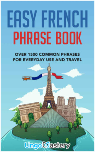
13 Responses to Option B
Because it lets me know that it would be easy to use by the title.
I think B is the best cover for a French Phrase Book since it emphasizes that these phrases will be easy to learn. A is a good second choice because the font used is so large and bold that it grabs your attention. I think C is a good cover, but it seems more fitting for a tour book or something, at a glance.
B. The picture of the Eiffel tower let's me know it's France. C. I like the local view of the community, make me feel like I'll be a part of it. A. To basic and cliché.
B makes it seem easy. A also looks fairly easy. C looks harder
B looks the most fun to read and learn from.
I prefer this one because it seems for someone trying to learn french knowing the common words is best
I like this title because it instills a bit more confidence that i will be able to handle the use of the book
I ranked in the order that I like the cover art, title, and whether the book would grab my attention in the first place.
B looks to be the most user-friendly and inviting.
I prefer B because, as someone who struggles to learn languages, the "Easy" part appeals to me.
Option B is great because it says Easy. I want easy when im learning a new phrases!
This cover seems the most inviting, and the information on it is easier to read.
I ranked the options based on how accessible and useful the phrase book appeared to be based on the cover information.
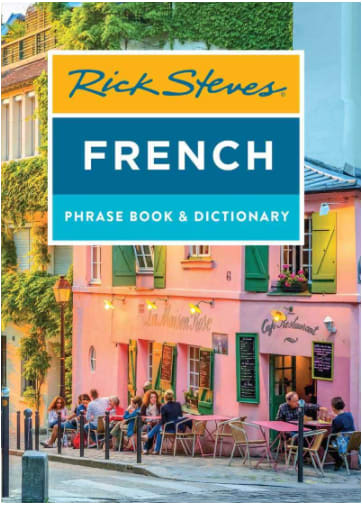
20 Responses to Option C
I love Rick Steves. I have several of his travel books and would highly recommend him. I would always purchase his book over others.
I like this because the background picture looks the most realistic. I like seeing the scenery in France and not just cartoons. I want to experience all the culture
I picked C because I consider Rick Steves a legit expert, followed by A and B which I don't feel strongly about either way.
I like this cover the most, it has a nice image on the cover and it is detailed and colorful.
Option C has the best graphics, and the most realistic. It captures my interest more than the other two.
C looks the most authentic to me the others really look cartoon like.
They're all great but the Eiffel Tower is a bit of a cliché as language books go, so I'd stick with Option C, the cafe setting. Who wouldn't want to be sitting at one of those tables?
I chose C as my first choice because I like the realistic images. I like where the title is and how its blocked and written. I chose A as my second choice because I like the graphics, the title placement, and the description. I chose B as my third choice because I like the colors, the graphics, and the look.
I chose C first because it's by the man who does travel shows for PBS, and I figure he would know the most common things you might need a phrase book for. Then I chose next the one marked easy for obvious reasons! and then the last option.
There are features that I like about all three of them. I picked C first because it apparently contains a dictionary also, which is something that I would like to have, although the cover is the least appealing cover. I chose A second because it comes with and audio download, which I feel would be important when trying to learn parts of a language. B was my favorite cover because I am all for "easy", but the features of the other two were a bit more important.
I chose C because I am a fan of Rick Stevens and have watched many of his shows on PBS. I chose A next cause it offers a free audio file download.
Nice designs for each. I like the Rick Steve's brand here. They are trusted for European travel and that looks like a nice cover. I like option B for the "Easy French" Phrase Book. Seems good for that as well. Overall they are pretty good books and nice to see these out there for French learners.
I prefer the look of the book with the real photo as the background image. It makes me more eager to learn French because it makes me envision myself actually being in France.
I like the image instead of just a drawing for a language book since most people are studying it because they want to go there.
I like the cover here with the French cafe because it's colorful and fun and that's s setting that I think about having a conversation in French
The view of the city block is stunning and immediately takes my attention away from the other two covers.
I love the cafe scene on the cover.it catches my eye.
I like option C because it shows an image of what France really looks like and not just drawings.
Better colors and shows ambiance.
seems to be the most suitable and offering the most realistic and authentic view
Explore who answered your poll
Analyze your results with demographic reports.
Demographics
Sorry, AI highlights are currently only available for polls created after February 28th.
We're working hard to bring AI to more polls, please check back soon.


