Poll results
Save to favorites
Add this poll to your saved list for easy reference.
Which cover do you prefer for a French Phrase Book?
Option D won this Ranked poll with a final tally of 30 votes after 3 rounds of votes counting.
In a Ranked poll, respondents rank every option in order of preference. For example, when you test 6 options, each respondent orders their choices from first to sixth place.
PickFu requires a majority to win a Ranked poll. A majority winner differs from a plurality winner. A majority winner earns over 50% of the votes, whereas a plurality winner earns the most votes, regardless of winning percentage.
If an option does not earn a majority of votes, PickFu eliminates the option with the lowest number of votes. The votes from the eliminated option are reassigned based on each respondent’s next choice. This process continues in rounds until a majority winner emerges.
Scores reflect the percentage of total votes an option receives during the vote counting and indicate the relative preference of the respondents. If there is no majority winner, look to the scores to see how the options fared relative to one another.
| Option | Round 1 | Round 2 | Round 3 |
|---|---|---|---|
| D | 36% 18 votes | 38% 19 votes +1 | 60% 30 votes +11 |
| C | 32% 16 votes | 32% 16 votes | 40% 20 votes +4 |
| A | 28% 14 votes | 30% 15 votes +1 | Eliminated 15 votes reassigned |
| B | 4% 2 votes | Eliminated 2 votes reassigned |
14 Responses to Option A
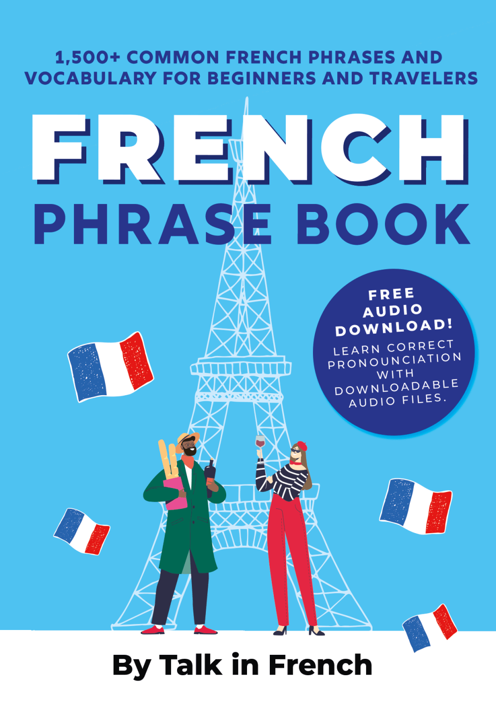
I think option A is the most eye catching and I love the colors and images. I think the font is good and easy to read. All of this makes me the most likely to read.
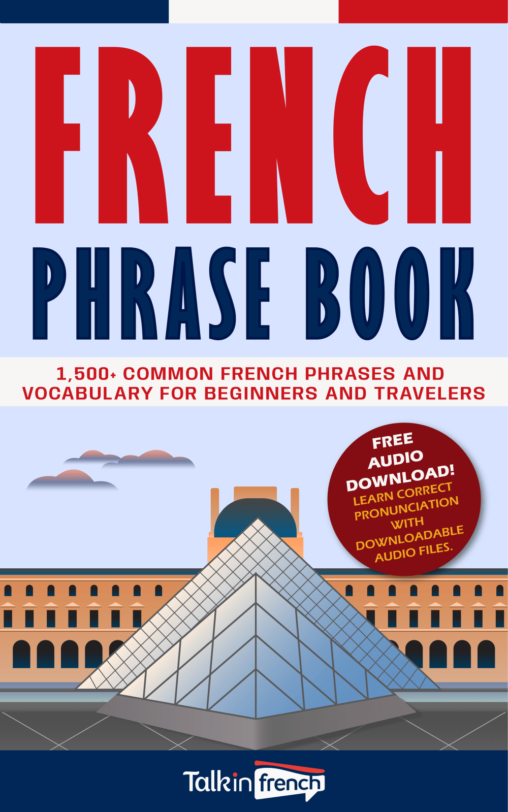
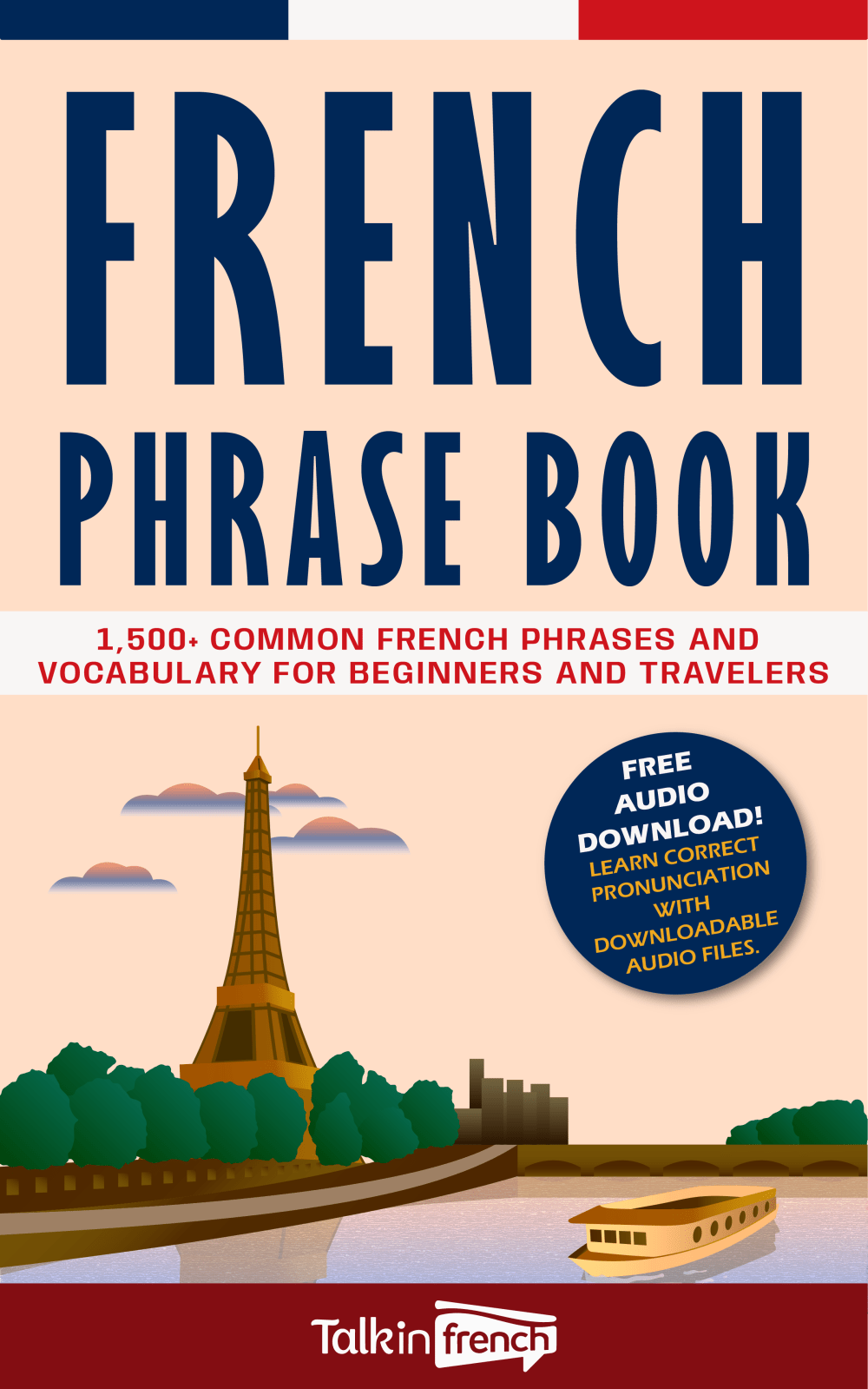
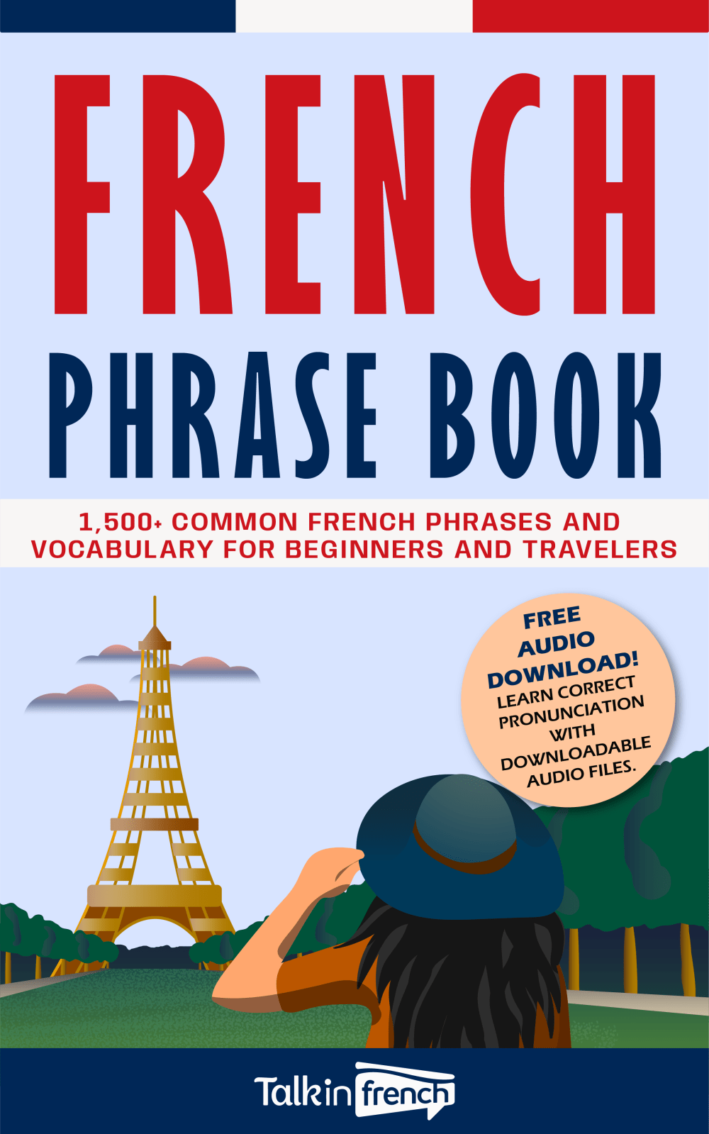
Option "A": I choice this option first because not only does the cover explain what the book covers on the front, the illustration is relevant to the subject; the artist design is nicely done. Option "D": I also like the artistic illustration on the front with the Eiffel tower and the girl on the front. Option "C": Nice cultural illustration and the front cover states all the informative, relevant info that the book covers as the other book covers do as well.Option "B": I like the big lettering on the front, but the design on the front cover is more general than culturally related.
I picked based on the people and background images. I would prefer the louvre + man and woman taking pictures that would be the best cover
Even though there were two glorious backgrounds of the French monument one had better background colors which makes it easier to read and more vibrant. The last two had a horrible background of the French monument and the other had a unknown building in the background.
I chose A as my first choice because I like the colors, the graphics, the flags, and the landmarks. I chose D as my second choice because I like the font style, the color s, the graphics, the landmark. I chose C as my third choice because I like the style, the text, the colors, and the graphics. I chose B as my fourth choice because I like the design, the style, and the graphics.
The people in letter A seem to be talking French so it fits good with the book title, just the Louvre is boring.
I choose A, Because I like the style and the design of the cover it's more amusing and attractive.
I feel choice A is a little bit more interesting looking with the flags waving around and makes me want to open the book.
I chose option A because I like the red, white, and blue colors because it matches the colors of the flag.
Love the pictorial representation of an iconic French building, the French flag and their wine.
The graphics of the two people in Option A is the most eye-catching. D is plain in comparison.
I chose A. The graphics here are the nicest. Also, having the French flags are eye catching. The others are OK, but not as nice as A.
Book A has two people talking to each other, so it appears like you're learning conversational French. Book D shows a tourist, so it appears it's good for people planning a visit. B and C are similar, but I like the small splash of color on the logo at the bottom.
B looks like a ship. You need people, at least 2, since it's a book about speaking.
2 Responses to Option B
B is the best because it has The Louvre on the cover and most people traveling to France would fancy themselves fancy by buying a book with something that is well known but not the Eiffel Tower.
I prefer the covers with the blue backgrounds and noticeable monuments, they are eye catching, with large font and appealing. A is OK but looks a little less appealing and the colors in C are too warm, seem drab and not eye catching like B and D.
16 Responses to Option C
I picked C because I liked the color scheme/graphics the most, followed by D and B. A was kind of bland in comparison.
I prefer the option C French language book cover because I like the picture of the Eiffel Tower with the boat the most. I chose options D and A second and third because I like the more artistic graphical style of the Eiffel Tower in the option D book cover image more than the more line art art style used in the option A book cover. I chose option B last because this book cover does not show an image of the Eiffel Tower.
C and D have the best colors and art style
I like option C. The artwork looks very smooth and polished compared to the other options.
The further out landscape scene works best in option C. This is a nice touch. I like option D as well and the look out from there is good with the lady in view. Option A is decent but not as fun as the first two. While the Louvre is great, think the image here isn't as well-defined as the others with the Eiffel Tower.
I prefer the covers with the Eiffel Tower in a scenic touristy scene. C is particularly artful. In contrast, B doesn’t scream France.
C I feel has the best color and design to it that draws my interest the most.
Option C I just really really like the image of the girl with the binoculars staring at the Eiffel tower and I also like the colors to it it all goes together very well
Overall design and graphic appeal of choice c were my reasons for choosing this ad as my #1 option.
Option c with the creme background is becoming. The eiffel tower is immediately recognizable.
I prefer option C because it is so iconic. It includes the Eiffel Tower and has a really nice color palette.
I picked C because I felt like its the better representation of france.
the first option i chose has the most noticeble cover and looks super user friendly.
I like this the best because the scene is the most beautiful. I like that it seems like it is set during the sunset. The sky looks nice. I also like that it is set to where you can see the river next to the tower
Option C was my preferred choice because I found the cover art to be more attractive. I like how it presented a serene, almost idyllic scene, rather than a more typical, touristy image.
I image of the Eiffel Tower on the river looks cool. I like choice C the most
18 Responses to Option D
I think that option D looks the best for a phrase book, the illustration does a good job indicating it's for tourists and visitors.
These options seem the most aesthetically pleasing in terms of the cover
I just think the landscape ones are the prettiest
I like option D because the image with the woman and the hat is very charming and would pique my interest
I prefer this option. I liked the color choices used on the graphics specifically the red 'French'. I liked the attention that the contrast creates. this ad is a winner.
Option D cover is more unique in terms of the layout, with good themes, color combinations, amazing Eiffel Tower graphic, which are more representative features of French nation and is therefore a perfect tailored cover.
I like D and A because it has landmarks that are part of the culture as well as tourists. I like choice C better than B because I recognize the building in the background of choice C.
I like option D the best because I like that the focal point of the cover is the Eiffel Tower and the person looking at it. When I hear the name France, the first thing I associate with the name and country is the Eiffel Tower. So, this cover is perfect for a book about learning how to speak and read French phrases.
The cover design in Option D looks very appropriate and interesting for this book.
"D" is the best of the four choices. It covers the topic well.
I like option D for my first choice because it shows a tourist looking at the Eiffel Tower. Symbolizing that a the book could help them with navigation around France at the popular tourist attractions. My second choice is option C because it's good, not quite as good as option C because it shows the Eiffel Tower but not a tourist. My third choice is A because it shows the Eiffel Tower and tourist, but the tourists are drawn unrealistically. My last choice is B because people are more familiar with the Eiffel tower.
Option D is perfect, with the over the shoulder shot of the Eiffel Tower allowing the reader to insert him or herself into the image.
I liked the color and design of "D" the best
I chose by options with scenes and images that make me feel most interested and motivated.
It's the best choice to have the Eiffel Tower on the front of the book. Option a has a weird style though. And b doesn't have the Eiffel tower
I like the blue background of D and B better than C, and A seems the worst because it looks very old-fashioned.
Choice D has the best looking cover to me that I would go for.
Option D and A, in that order, are the best choices for me because these covers humanize the book with the graphics of people.
Explore who answered your poll
Analyze your results with demographic reports.
Demographics
Sorry, AI highlights are currently only available for polls created after February 28th.
We're working hard to bring AI to more polls, please check back soon.

