Poll results
Save to favorites
Add this poll to your saved list for easy reference.
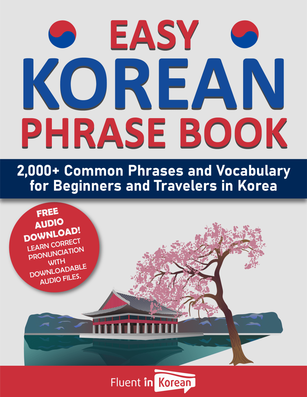
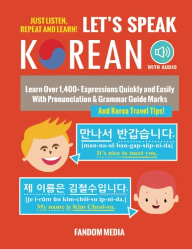
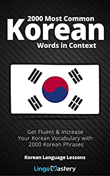
Which cover do you prefer for a Korean Phrase Book?
Option A won this Ranked poll with a final tally of 41 votes after 1 round of vote counting.
In a Ranked poll, respondents rank every option in order of preference. For example, when you test 6 options, each respondent orders their choices from first to sixth place.
PickFu requires a majority to win a Ranked poll. A majority winner differs from a plurality winner. A majority winner earns over 50% of the votes, whereas a plurality winner earns the most votes, regardless of winning percentage.
If an option does not earn a majority of votes, PickFu eliminates the option with the lowest number of votes. The votes from the eliminated option are reassigned based on each respondent’s next choice. This process continues in rounds until a majority winner emerges.
Scores reflect the percentage of total votes an option receives during the vote counting and indicate the relative preference of the respondents. If there is no majority winner, look to the scores to see how the options fared relative to one another.
| Option | Round 1 |
|---|---|
| A | 82% 41 votes |
| C | 10% 5 votes |
| B | 8% 4 votes |
41 Responses to Option A
I think my top pick stands out to me the most, and I like how it has a free audio download included with purchase.
Option A because it is easy to read, it captures my attention and I like the color scheme
B has the least number of phrases and A looks more elegant
A is the best since the tree is a nice touch. The building in the water also looks nice.
I chose option A because I like the illustrations on the book cover.
A, based on the cover, looks like it is the highest quality book.
Choice A seems like the most approachable, the cover design is balanced, and the audio feature is a plus. While Choice B is a bit cluttered in design, the content described is similar to A and is also appealing as favorable to learning. Choice C is the most bland and does not indicate audio or pronunciation help.
Option c is super plane but option is by far the best because it has very sharp images and a great layout
I assume that speaking Korean is difficult. So, I would choose a book that had "easy" in the title!
This cover looks the most inviting. And the reason people want to learn is probably to visit Korea so seeing some of the landscapes on the cover helps.
I prefer the option A language book cover because I like the pleasant illustration of the tree and building on the water the most. I chose option C second because I do not really like the black background color because it makes the text more difficult to read but the flag is an appropriate illustration here. I chose option B last because I do not like the red background color nor the words that are not in English on this book cover much at all.
I like the design of the cover of A the best, and I think it provides the most clear and direct explanation of what the book includes. I ranked B last because I think it's a bit odd that it provides example phrases on the cover, and it's not as visually appealing.
I love the picture of the cherry blossoms in Option A, which is why I ranked it first. Option C is ranked second because of the prominent Korean flag on it. Option B is ranked last because it's too text-heavy.
I liked the design of A the most; C is too bland and B seems too crowded.
I like "A" the most because it incorporates the colors of the Korean flag and it emphasizes that it is easy and geared towards beginners and travelers. I don't like "B" very much because the pictures make it seem too childish. I like "C" the least because it seems very dense and boring, based on the black background and overall text.
I definitely prefer this. I always like to see nice scenery on items because I like to travel. Those trees are very representative of Asian countries so it looks the best
Option A’s cover is appropriate and the most aesthetically pleasing among the three choices, so it’s got my attention.
I prefer A; it looks professional, helpful and complete. C is ok but only references words in context and has an unappealing graphic. B looks childish
Option A as it has really nice imagery ion the cover and gives a friendly feeling tone. It is also really well aligned and well balanced with color. The blossoming cherry tree makes the cover very memorable and eye catching. It also comes with a free audio download.Option C is the traditional cover for a phrase book. Nothing really vibrant about it except the Korean flag. The black background really makes it feel sad and depressing. It is a real feel down look.Option B is way too confusing. There is too much going on with this cover. It looks like it is written entirely in Korean so people may not even pay that much attention to it as they cannot read the majority of the cover.Option A is the feel good, memorable cover design that will get noticed. The cover art is very soothing and desirable.
Option A is a great look. This is awesome here and love the feel with the tree and house. Very nice look for the Korean book. Options B and C are less fun but are able to get it done as well.
a because it says its easy
I like Option A. It's creative and is drawing my into the book.
I prefer the visuals on the cover of option A that illicit my thoughts and ideas of south Korean culture.
I like A and C because they seem less complicated for beginners.
It's clear that you're learning Korean phrases and the picture of the building and tree is quite nice
I like Option A because it states it is specifically a phrase book. Option B looks daunting with the Korean language characters
As an artist, I appreciate the illustration of the landscape in my first choice.
C looks too much like a book for kids so it might not have the vocabulary I am looking for
I pick A and C since both teach the most phrases which is 2000. I pick A as my top choice because it has the keywords or title Easy Korean Phrase Book. That means it is easy to use and learn, so that appeals to me.
I personally love A because I like seeing the fun cover and seeing Korea and what it is known for right then and there. From there, I like B over C because the Korea flag is so standard and it doesn't make the book pop for me
I like A because it looks more inviting.
I like the cover of option A more. It is not cluttered like option B and not bland like option C.
A is the best because the title is clear and the image is beautiful. B is the worst because it is childish.
The scene in choice A looks interesting to me. i like the tree
I like option A because the word "easy" on top makes me feel I could do it. C is ok because it says there are a lot of words in context so it makes me think I would learn a lot. B seems childish and I wouldn't look at it twice.
looks the most authentic and offering the best detail that i would trust as i can take it serious and believe it is authentic
A catches your attention. B less so. C doesn’t quickly tell me what it is so I’d skip it
I choose A, Because I like the idea and creativeness of the cover design which is way more interesting.
"A" is definitely my favorite for one reason: as soon as i looked at it the first word i saw was "easy" near the top of the cover. that's perfect. "C" has a mostly dark and dreary cover./
My first choice is the most attractive and appealing. I really like the look and design of this option the best.
I think A has the most personality, and looks the most unique. It will stand out more than the others.
4 Responses to Option B
The faces on B seem like kids which makes me feel like it's going to be easy to learn / beginner level.
I like how it shows some of the Korean and makes me feel lie its easy to accomplish and builds up my confidence
Made my choices based on which book cover I prefer the most. The cover I prefer most is the one B. Cover in B stands out and looks better than the others
I love the overall design and color in option B. It is the most attention grabbing, interesting, and unique which makes me the most likely to read
5 Responses to Option C
I like the simple design and color scheme of C. I don't like the orange-red color of B and think there's too much happening design-wise. A isn't as good a color.
I like simplicity of Choice C. B and C look really cheesy and make me not want to even open the books.
I liked option C because it was bold, professional and eye-catching. I did not like option B because it was too busy.
I like seeing the Korean flag in the front and center of the image. It catches your attention and fits the book's theme well in my opinion.
The black one is discreet and to the point. I'd prefer it. The easy Korean is ok, but the pink flowered tree makes me think of Japanese cherry blossoms, so confusing to be on a korean book. B, with the kids heads on it, looks like the language books I used in middle school. Might be good for kids, but as an adult I wouldn't want to be seen using it.
Explore who answered your poll
Analyze your results with demographic reports.
Demographics
Sorry, AI highlights are currently only available for polls created after February 28th.
We're working hard to bring AI to more polls, please check back soon.


