Poll results
Save to favorites
Add this poll to your saved list for easy reference.
Which cover do you prefer for a romantic suspense novel?
Option C won this Ranked poll with a final tally of 33 votes after 1 round of vote counting.
In a Ranked poll, respondents rank every option in order of preference. For example, when you test 6 options, each respondent orders their choices from first to sixth place.
PickFu requires a majority to win a Ranked poll. A majority winner differs from a plurality winner. A majority winner earns over 50% of the votes, whereas a plurality winner earns the most votes, regardless of winning percentage.
If an option does not earn a majority of votes, PickFu eliminates the option with the lowest number of votes. The votes from the eliminated option are reassigned based on each respondent’s next choice. This process continues in rounds until a majority winner emerges.
Scores reflect the percentage of total votes an option receives during the vote counting and indicate the relative preference of the respondents. If there is no majority winner, look to the scores to see how the options fared relative to one another.
| Option | Round 1 |
|---|---|
| C | 66% 33 votes |
| A | 24% 12 votes |
| B | 10% 5 votes |
12 Responses to Option A
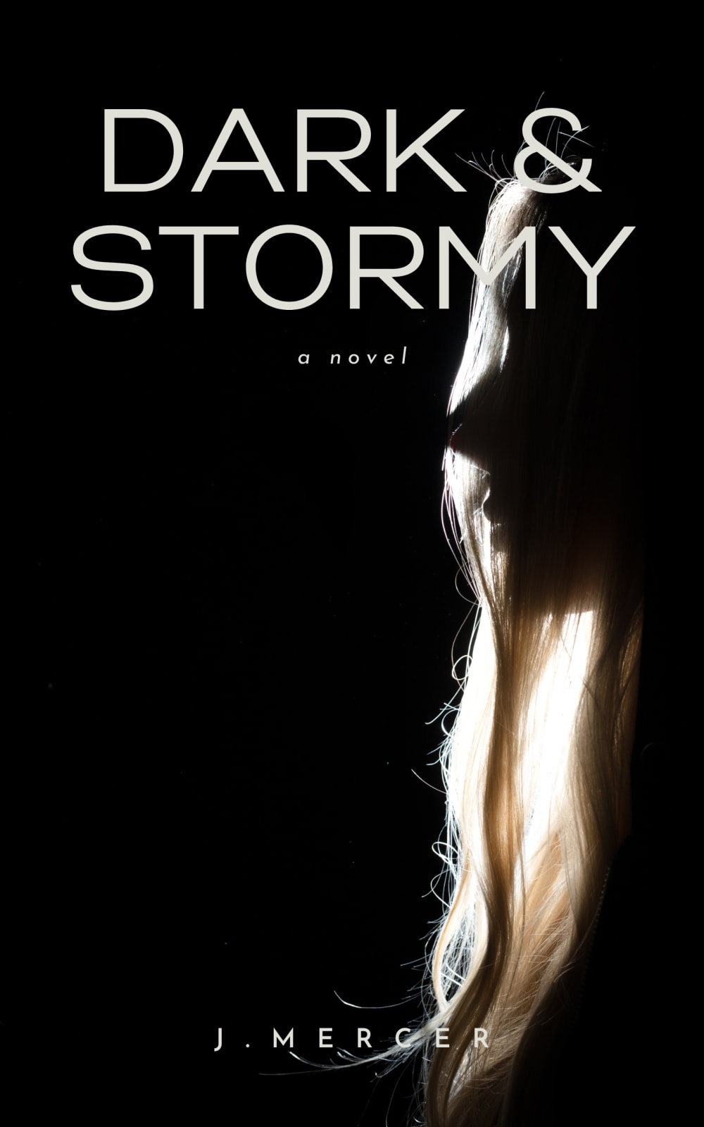
Since it is about romance/suspense, a person or two being in the image of the book cover would be a lot more fitting. Option A was the most relevant one.
I like the cover in option A the best. The dark image of this woman with her hair fits the genre well.
i think having a side shot of a woman staring off makes it mysterious but also subtly notes the genre
I like that there is a seductive lady in option A. It is very sexy and gets me in the mood.
I find the simple designs more appropriate for the book cover. It is still an attractive option when the letters are easy to read at a distance, as shown in the several examples on display.
I only get suspense vibes from B and C, from A I get suspense and romance, which is the point
My favorite cover would be option A, because it looks mysterious showing the profile of the woman in the shadows, I think it goes very well for a plot between suspense and romance.My second option is C, because it looks mysterious, but there is nothing romantic about it.And finally option B does not seem to me that this agreement with the literary genre is simple and does not inspire anything
I prefer option A book cover looks authentic. I find it stands out well.
I am intrigued by the woman on the cover. Why is she in the dark? What is causing trouble in her life?
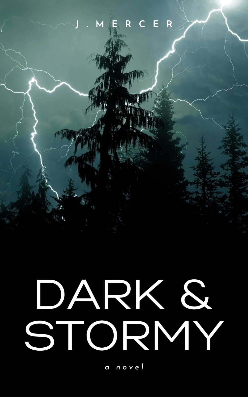
Choice A is the cover that I prefer the most because this image of the woman in the dark fits in well with the fact that the book is a romantic suspense novel to me. It makes it shrouded in mystery. Choice C is second because the cover captures the name of the book really well with it being dark out and the lightning from the storm. The forest aspect did not really fit with the romantic part of the novel though. Choice B is last because it is just a shot of a window on a house and does not really fit to me with either the name of the genre.
A has a more suspenseful and romantic looking style that I think would fit the genre better
I would actually like a combo of both "A" and "C". The woman portends romance and the lighting in the trees portends stormy.
5 Responses to Option B
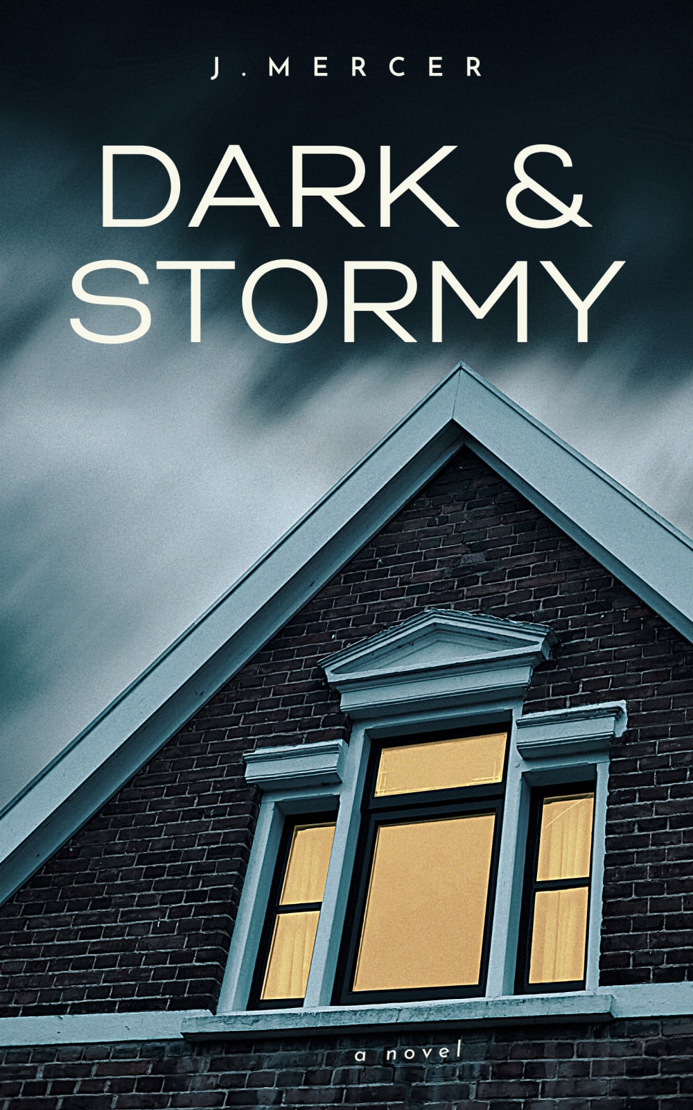
I love the cover photo for B.
I think B was the best option, it gave off the perception of being very suspenseful and entertaining. I liked the others too, I don’t think any option was bad.
i kinda dont like it when a book cover implies the appearance of the characters like A does, i like to create them in my mind
I like B most because it seems like a romance novel cover. I like C because it is showing a storm. I don't like A because it is not really that descriptive to what it is about.
A has too much empty space and the text at the bottom is hard to read because the text is almost the same color as the hair B has the best colors C is mediocre
33 Responses to Option C
A is very generic and doesn't fit the theme. C fits the theme the best and is the best looking image overall
I prefer option C because to me it looks the most mysterious and interesting. Option B and A don't intrigue my interest as much!
The woman's profile is uninformative and doesn't really match the title. C matches the title and tone perfectly; B is ok but the graphics aren't quite as compelling as C.
B is a bit bland but C and A make me want to know more about the book. C i think draws me in the most.
The blonde hair in A was too creepy for me. The lightning strike in C felt the most dynamic.
I prefer choice C for the more detailed cover.
I prefer option C because I think that it is the most interesting, eye-catching, and visually appealing book cover design out of the three options. I also think that it is the most fitting cover design as well.
I prefer option C. I love the lightening on the cover. Besides being pretty, it is also unpredictable.
I picked C and B as my top choices as the covers tell me about what the story is about
If you could find a way to combine #1 and #2 you would have the best book cover.
This cover makes the book seem more suspenseful and mysterious.
The first one really grabbed my attention I wanted to pic it up an read it. The second one make me think of an emotional person who is upset.
option C is quite interesting, I like the stormy design and the thunder and lightening
I chose C because the image did not look like a stock image the way the other two options did.
I think the 1st choice i selected works best in my opinion, the lightning and forest gives a good mystique.
I chose this cover because, as far as a suspenseful romance novel, it exudes mystery, adventure, electricity. I did not choose the other because the cover with the house had too much of an element of creepiness. As far as the cover with the woman, as a woman, reading a romance novel, I don't relate to a photo of another woman (especially one I do not see myself in).
I dig the forest, but the content of the cover depends just as much on the contents of the book as it stands as a marketing toolWith too large of a discrepancy, both the author and the publisher become less reputable.
I think C and B have a great look and fit the name of the book. They look very mysterious and dark which gets my attention
I like C, because it could be a good cover for the setting of the book, but A is also nice because it seems more intimate.
Option C, best matched the title of the book with its cover. Option A, gave off more of a dark creepy vibe to it with the photo over option B.
The title and the book cover are perfect. I think it captures the title well and it just feels like a perfect match to me.
C was my first because it as stormy scene and a hand full of ladies' will be come more romantic due to fear A/B as my less because of the simplicity
I like this one it draws you to it faster with the cover is like a mystery itself. It makes me want to read the book.
I think C and A are both good. I think the silhouette look is better for the genre.
I love lighting and thunder in the presence of ominous skies. C bottles that and matches the theme of the book perfectly.
I chose option C because the nature scene gets my attention more than the house. But, I wish there was a way to combine the house (option B) with the nature scene.
Option C shows the scary storm and darkness. It perfectly sets the mood for the novel. Option A goes more into the direction of romantic with the female on the cover. It must doesn't look as interesting. Option A may or may not show storm clouds. It's not that interesting looking of a book cover.
The position of the title and the background lightening in option C appeals the most.
For a dark and stormy, mysterious and more gloomy cover like option C is more appealing to me, seems more like an actual storm and quite aesthetically pleasing
i prefer the cover in option C for this type of book because it looks the most suspenseful to me
I think C is eye-catching and I like the simplicity. Something about B is intriguing as well.
I prefer C because I found it the most visually eye catching.
I prefer option C because the image actually portrays the title.
Explore who answered your poll
Analyze your results with demographic reports.
Demographics
Sorry, AI highlights are currently only available for polls created after February 28th.
We're working hard to bring AI to more polls, please check back soon.


