Poll results
Save to favorites
Add this poll to your saved list for easy reference.
Which cover do you prefer for a Spanish Grammar for Beginners Book?
Option B won this Ranked poll with a final tally of 31 votes after 2 rounds of votes counting.
In a Ranked poll, respondents rank every option in order of preference. For example, when you test 6 options, each respondent orders their choices from first to sixth place.
PickFu requires a majority to win a Ranked poll. A majority winner differs from a plurality winner. A majority winner earns over 50% of the votes, whereas a plurality winner earns the most votes, regardless of winning percentage.
If an option does not earn a majority of votes, PickFu eliminates the option with the lowest number of votes. The votes from the eliminated option are reassigned based on each respondent’s next choice. This process continues in rounds until a majority winner emerges.
Scores reflect the percentage of total votes an option receives during the vote counting and indicate the relative preference of the respondents. If there is no majority winner, look to the scores to see how the options fared relative to one another.
| Option | Round 1 | Round 2 |
|---|---|---|
| B | 46% 23 votes | 62% 31 votes +8 |
| A | 36% 18 votes | 38% 19 votes +1 |
| C | 18% 9 votes | Eliminated 9 votes reassigned |
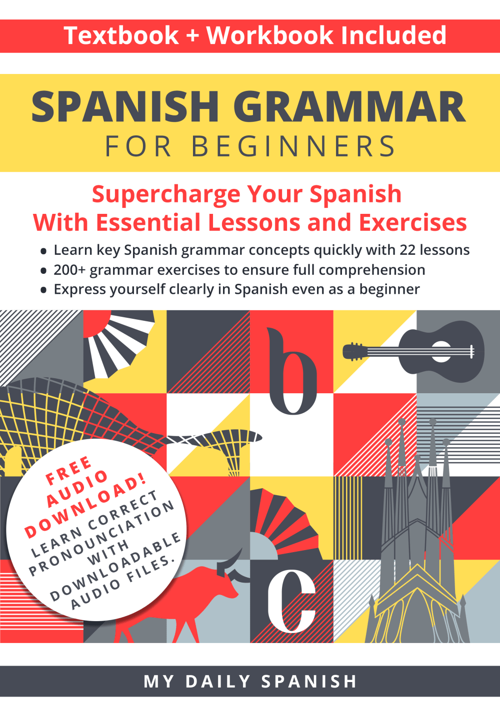
18 Responses to Option A
Seems more calm and approachable, not so in your face with bold colors
The different images on the middle showing what Spanish culture is about is fantastic and interesting.
I love the cover with the bulls and spanish culture that brings a lot of pop to this textbook cover in choice A
I liked the graphics on "A" better. "B" and "C" are the exact same except for the color scheme.
I prefer the option A book cover because I like the multiple illustrations on the bottom of this book cover the most especially the bull and city skyscrapers. I chose option B second because I like the red and yellow color scheme the more than the mostly red color scheme used in the option C book cover.
The ornate cover grabs your eye like what is this book about.
I really like the white background, and between C and B, I really like the solid color cover better.
I strongly prefer the contrast of colors on this option as it looks much more appealing to me. It also feels more approachable.
A I feel has a cover design to it that makes it more appealing and allows me to trust it.
I think Option A looks the most eye-catching and interesting of the selections, so that is what I would go with. Between the more plain B and C, I would go with B since it is a cute touch to mirror the Spanish flag with the colors of the cover.
c has the nicest look to it. Much less busy than a and b
I prefer cover A. I think it's the most dynamic and has a more personal and approachable look and feel.
i like the design and colors on choice A the best. i feel like it catches the eye and really looks nicer than just having it all one color. choice B is my second choice cause i like that it has red and yellow on it instead of just red cause in my opinion the red hurts my eyes a little bit.
I like the white background in option A. The pictures make the cover interesting.
The yellow bar highlights first it’s Spanish grammar then it’s for beginners. B and c highlight beginners first then grammar
I made my choices this way based on which cover stands out to me and makes me want to pick the book up and learn more.
Its cover discribe more then b and then c
I love option A. It looks a bit more different, and...well, smarter...hmmm, maybe more modern, updated, fresh. The other two options looks like they came out of the 90's. Option A looks like it might offer a new approach to learning the language, so this is really the only choice here for me. If I have to rank the others I went with option C because it seems a little different with the full red cover. I can remember the yellow covers in option B from years ago and it just seems very dated.
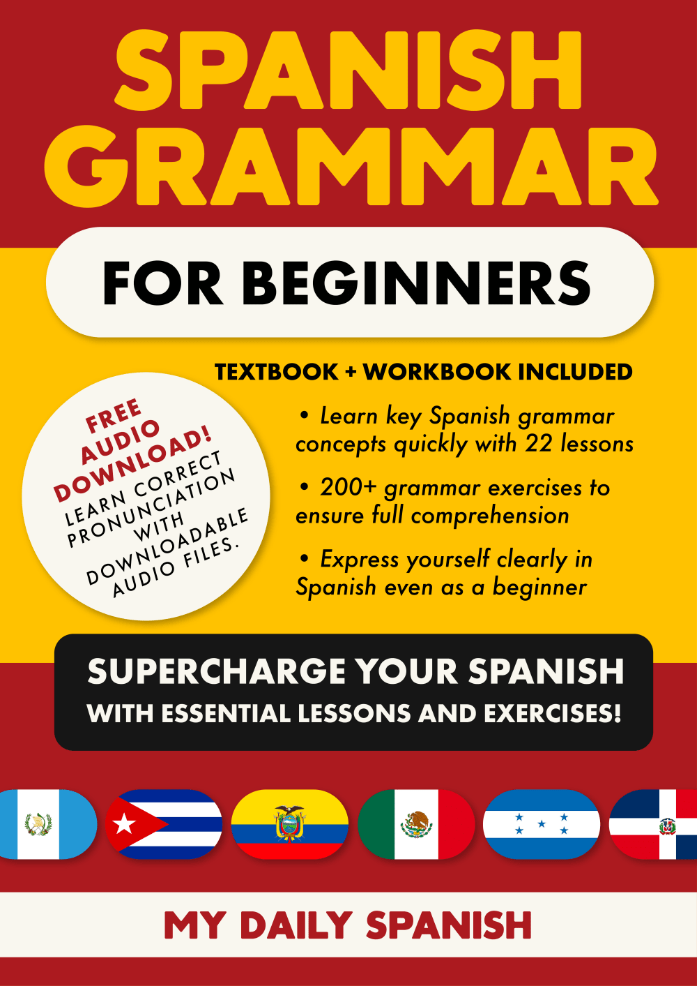
23 Responses to Option B
I think option B looks very much like the language books I am familiar with and I like the red and yellow.
A looks like a boring text book. I like red and yellow colors on B the most. C is a little too much red
Having all the benefits in larger text is helpful. It also looks nice with red and yellow on the cover, makes me think of the Spanish flag.
Option b ewth the red. Yellow, red cover is more eyecatching. I csn read the cover more easily
I quite like all of these and although I like the coloring of the 2nd one I think the 1st 1 sticks out and more as a language learning book
I liked design B the best because it seemed the most authentic. The composers of the product put a lot of thought into the color scheme. Design A seemed to be the plainest and the least legible of the 3 choices.
I don't really like Option A, because the colors look faded and washed out, which makes the book look used. I don't like Option C, because I found the all red background to be distracting. I noticed the background first, before any of the texts. Finally, I like Option B, the best, because the red, yellow, red, colors, divide the texts into three sections, which make the words, really easy to read.
I would rank them in this order. Choice B would be my top choice because I like the two-toned cover and makes it easy to read the information.
Option B with the multi colored cover really stands out and immediately caught my attention. The three sections of this cover perfectly highlight the main word components of each section.Option C follows a close second, but the single color cover does not highlight the information the same as in Option B.Option A is washed out and faded. The colors are not vibrant and the viewer is lost in the multitude of images on the cover. The critical information is not as visible as options B and C. The white background of Option A does not serve the information well as it is more difficult to read quickly. Option B is vibrant, easy to read and perfectly highlights the information in each section. The consumer will have no trouble reading what the workbook and audio lessons will provide.
B is best because the title text is large and visible. The yellow in the middle is a nice touch that highlights the textbook's features and provides balance and variation in the design.
I picked option B because the cover says that a workbook is included, and I like the yellow background better than the red of C.
I like the book here with the mix of red and yellow colors because it helps break up the cover design more and I also feel like the displays of the flags at the bottom of the book cover are meaningful
Option B is the easiest to read. I like how it is broken up inspections with contrasting colors. It is very eye catching and attractive.
I like B the most as it seems to highlight the different points the best and makes it easiest to understand and read. C is close and very similar. A looks like a mess.
I like the color background on b best. Makes text stand out better. Easier to read.
I prefer the two-tone color scheme for the cover of the book, I feel like it grabs my attention more and highlights some text making it easier to read.
Option B is my first choice. Clean layout with yellow background. Eye-catching but not too much. Option A is much too busy.
B. Can see text clearly, yellow background helps it stand out. C. Red is eye catching, can see text, but not as clear. A. Too faded, can hardly see text.
The color scheme for top choice that emulates the flag of Spain is genius and is great creativity
I prefer option A' it has a nice cover that is easy to attract readers attention. Option C' also looks great with that cover, I like how it show some countries flag on it. A' is my last choice, the cover is nice but some designs at the back doesn't correspond to anything about language.
option B I like the colors that are chosen and the way the title is at the top. I like the colors because the other one that is red is very distracting but I like how it's displayed in this option because it's not overly all over red it's red and gold on the cover the words are easier to see as well
Such a book benefits greatly from helpful, readable copy on the cover and Option B does this best here!
I chose B because the letters are big like "My Daily Spanish" and it has the flags of Spanish speaking countries. I chose A last since it does not have the flags.
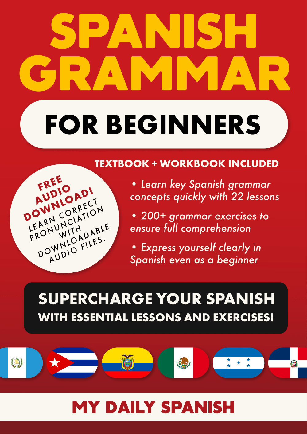
9 Responses to Option C
i think less is more when it comes to these book covers. choice c looks to be very simple and forward. where as choice a is much too busy.
I like the darker color that dominates the background of the book cover in Option C the best. It makes things easier to read as far as the text on it. Option A is last because it's a bit plain and text heavy.
Cover A has too much going on and the text gets hidden in the pictures. C has a better color scheme compared with B. The solid red background is easier on the eyes. The yellow in cover B makes the viewers eyes wonder a bit more. It is harder to focus.
Fir me the all red cover is the best one. It keeps my attention focused on the book.
the background of choice C and B make the words easier to read. Choice A is a little less eye catching.
most clear and easy to see
The red cover grabs my attention and eye way more than the other two I feel like it's way easier to read with a red background.
I found the bold and vivid red background with option C the best. I was very attractive and compelling. I also liked the larger font with for the SPANISH GRAMMAR text, as it was very eye-catching.
I chose these in the exact order I believed the product could help me the most, #1 being the easiest to pick up and start learning today :)
Explore who answered your poll
Analyze your results with demographic reports.
Demographics
Sorry, AI highlights are currently only available for polls created after February 28th.
We're working hard to bring AI to more polls, please check back soon.

