Poll results
Save to favorites
Add this poll to your saved list for easy reference.
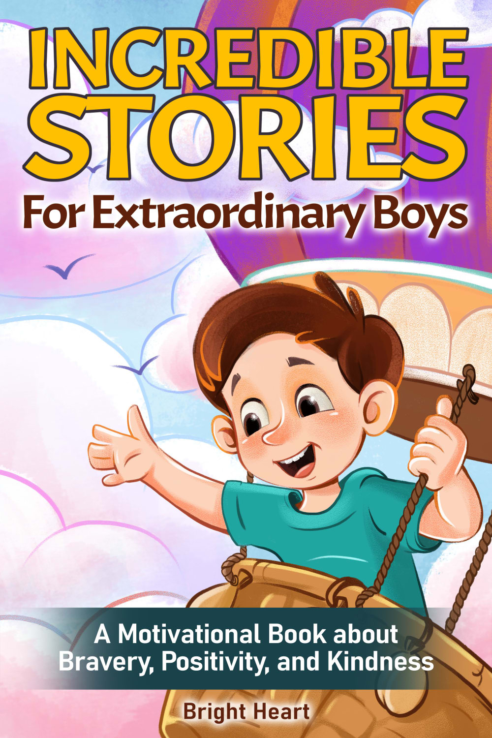
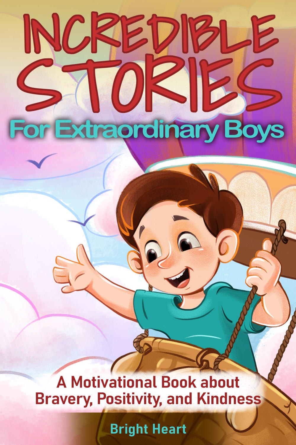
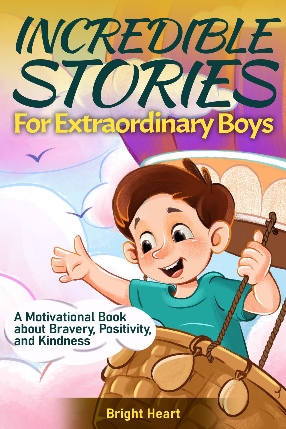
Which cover would you prefer for a book with inspirational stories for boys 7-10 years old?
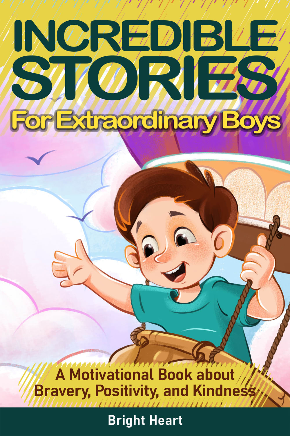
Option E won this Ranked poll with a final tally of 28 votes after 1 round of vote counting.
In a Ranked poll, respondents rank every option in order of preference. For example, when you test 6 options, each respondent orders their choices from first to sixth place.
PickFu requires a majority to win a Ranked poll. A majority winner differs from a plurality winner. A majority winner earns over 50% of the votes, whereas a plurality winner earns the most votes, regardless of winning percentage.
If an option does not earn a majority of votes, PickFu eliminates the option with the lowest number of votes. The votes from the eliminated option are reassigned based on each respondent’s next choice. This process continues in rounds until a majority winner emerges.
Scores reflect the percentage of total votes an option receives during the vote counting and indicate the relative preference of the respondents. If there is no majority winner, look to the scores to see how the options fared relative to one another.
| Option | Round 1 |
|---|---|
| E | 56% 28 votes |
| A | 22% 11 votes |
| B | 10% 5 votes |
| C | 8% 4 votes |
| D | 4% 2 votes |
11 Responses to Option A
Option A seems the best to me, the bright yellow font pops out in a way that is bold and appealing.
Love the bright colors on the book make it more attractive for a baby
option A and E are my top two choices. I like the purple balloon in the background of the first one and how it's easy to read the banner at the bottom about the motivational book. And then I like the one with the nighttime on it and the star that says "inspiring stories for amazing boys". because I think the stars are inspirational and peak curiosity
As a parent of a 9 year old boy, I have ranked all the options based on what I think he would like most. Some fonts used in a title are better than others.
I like option A the best because I like the way the colors are used, which makes the name of the book and especailly the book summary/synopsis at the bottom very easy to read.
I like the coloring and layout of the cover. I light how the message about kindness is highlighted as well.
The bright colors, bold font, and easy to read highlighted subtext all make for a great looking cover.
Oh these are all fun to look at! I like option A the most because I like the white font with the teal blue background. I think it looks the best and stands out the best.
I'll go with choice A' because the book cover has a fascinating design and seems appealing.
I like the outline around the title text in A. THat makes it easy to read because it stands out from the background
I like the color scheme on this one the best. I like how it looks like he is flying through the sky. The light blue matches well with all of the other colors on it
5 Responses to Option B
I like the styling of the cartoon boy in a, b, c and d; however, I was hoping for a choice with less pink in the background. I chose B because the turquiose of the shirt is picked up by the same colour in the title.
I like b. The colors all go well together.
I like option B the best, I feel the wording sticks out the best off the cover because of the font color. I also like the title better than the other option. Options A/D are next because because they are easy to read the cover as well. Option C the font is not as easy to read. Then Option E was last, I feel there is information missing on the cover compared to the other options.
I'm not as big into the yellow text on number three and I think if you want to be able to read these during the day and make them feel more like a daytime story than you probably don't want the picture of the stars and such like a number five. Although I do like all of these covers I particularly like a font for the top part in number one as well I think it's good it sticks out and it looks a bit more handwritten
I prefer the coloration and graphics of option B the best. Otherwise, all covers are comparable.
4 Responses to Option C
these were hard to rank because i prefer the word "amazing" to "extraordinary." however the only book with "amazing" does NOT have the important message about it being a motivational book. therefore, i had to put "E" last because i think the most important thing of all is that it is a very worthwhile motivational book and it needs to be written on the cover. as far as the other four, i give "C" a tiny edge over "B" because of the colors. "D" and "A" are also good but "C" and "B" are my favorites.
I'd going with the more haphazard-looking font for INCREDIBLE STORIES, as well colors that are a bit darker, so Option C over Option B.
Looking at colors, design, design font and overall graphic appeal, my first choice is C.
I thought they all looked good, but C had my favorite combination of colors for the title and subtitle text.
2 Responses to Option D
I prefer this option. I liked the color used for the text area at the bottom and the 'Bright Heart' looks much better as well.
Options D and B are my preferred choices because these designs would be most engaging for boys in this age group.
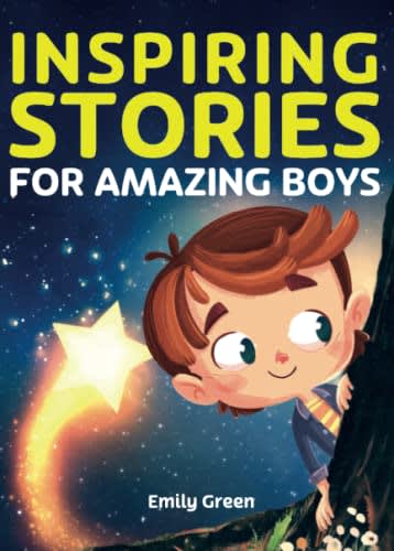
28 Responses to Option E
I think the only book cover art I really like is option E. It's missing the tagline though. The rest of the books I tried to rank according to the legibility of the title and tagline over the artwork. But again, I much prefer the art on option E.
I like the darker background for a boy.
I like option E more than every other option. It looks great and very elegant, it has a really great artwork and looks really attractive.
Option E has the book cover that looks fun and adventurous. I would be curious about the content of the book from the book cover. The colors make me take notice of the cover and the colors also allow the text to stand out more, making it easier to read than the other options. The cover of the book in option E is the only one that gets my attention
E I feel has the best design to it that is the best looking and would draw the most interest to it.
I think the darker color looks more mature which might be appreciated. I then chose by options with the most bold text colors.
I like the cover better
I feel choice E makes the readers feel like they're going on an adventure.
Option c with the darker background on the cover is the one i prefer even though the stories are light hearted.
I chose E as my choice because i like the graphics, the text color, and theme.
'Amazing' looks better than 'extraordinary'. I also prefer 'Inspiring'.
I personally would only consider Option E for such a targeted group, it would be the only one that they would dare to pick up. Thank you.
E is my first choice it is inspiring called and that will give the kids maybe ideas they can develop from that point. IT also if a more inviting cover the boy looks more curious on that cover.
I prefer the art style of E better, and the the others the font in A looks the best.
The design of Option E feels less childish and cartoonish and the shooting star feels like an appropriate metaphor
I chose B because I like that the cover is set at night which makes me feel it could be a bedtime story.
E was an easy pick because the cover has more masculine colors than the others (which emphasize pastel colors, pinks, etc. and are more fitting for girls).
I liked E, I thought the dark color scheme was nice, the others were too bright and almost too girly
I picked option E because of the black background with a shooting star. All the other options have a pink and purple color themed background.
I chose option E over all of the options because it seems the most "kid friendly" and stands out the most with the contrast of the night time sky and the star. It strikes a little bit of 90's nostalgia and overall is the best aesthetically looking book cover - the others are too modern.
I don't think the subtext needs to be on the front cover, therefore I picked the only one that didn't have it
I think "inspiring" speaks to the stories being inspirational more than "incredible" does.
Option E is without a doubt the best choice. I like that option E is in the evening when the boy looks like he is looking for an adventure.
I really like E because it looks like the boy is on an adventure where he is searching for and finding amazing things. I also like how the shooting star relates to the title by being very unique and amazing.
E seems to be the most unique and different, while all of B, A C and D seem very similar and almost feel religious.
I prefer option E the most because the design and overall look is appealing. I think the color scheme looks nice and makes me want to learn more about the book.
I prefer E's illustration the most. The title is also easier to say in my head. The rest are ordered on how easy it is to read the text on the cover. A has good contrast and doesn't have the fade effects which are distracting. B and D's effects and also the bottom on text is hard to read. C has too many effects and looks messy.
I like Option E, I don't think kids will really understand the value of motivation at this point. Maybe the parents will see the subtitle and want to buy it for their kids.
Explore who answered your poll
Analyze your results with demographic reports.

