Poll results
Save to favorites
Add this poll to your saved list for easy reference.
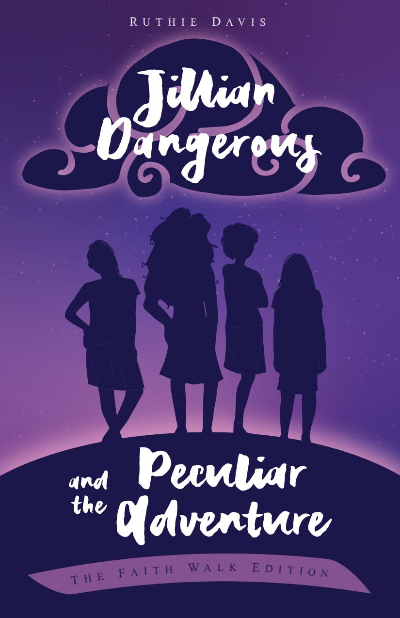
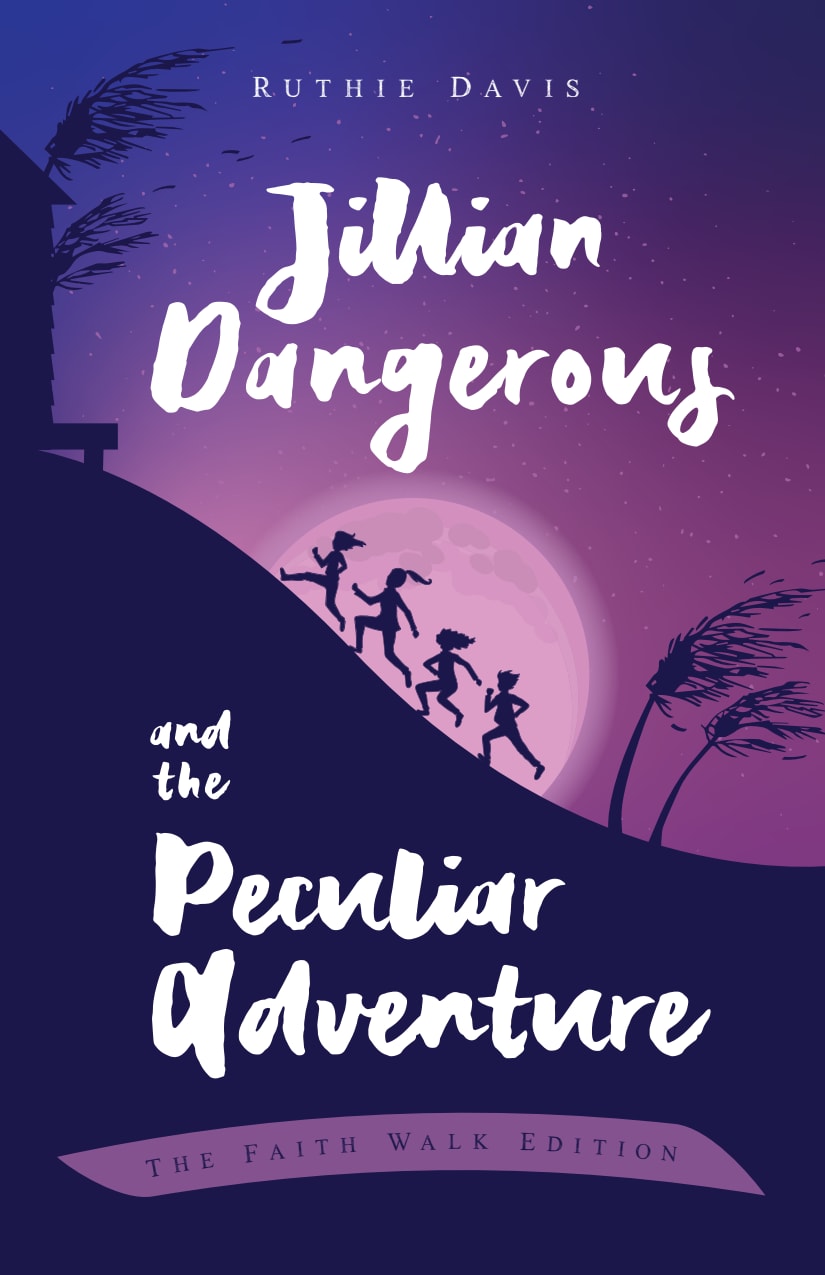
Which fantasy book cover do you like best for 9-13 yr girls? Summary: Jillian 'Dangerous' and three friends accidentally time travel more than 50 years to 1965 Vietnam. They discover even more adventure and friendship as they try to find a way back home.
Age range
Education level
Gender identity
Number of kids
Options
Personal income range
Racial or ethnic identity
Religious affiliation
7 Responses to Option A
I think Option A would be best for tween girls because the girls in the cover look that age. Option B girls look like 7 years old.
I like the sass in the characters on choice a. I also like the clouds above with the title. It looks like the characters are running over the world on an adventure. Choice a grabs my attention first.
I really like the cover for option A. It seems current and appropriate for the age range. I have an 11 and 12 year old daughter and I know both of them would be more likely to choose option A. The silhouettes of the 4 girls seem more mature than those of the girls running up the hill in option B.
I like how A focuses on the girls. It makes you want to know more about since you can only see their silhouette. B is ok but it doesn't intrigue me as much.
I think that the image showing the shadows of the girls would be more appealing to a pre-teen/teen because that audience wants to be "grown up" and might think the other cover is too childish.
This one looks more exciting and i like that the girls are in the forefront on the cover
I like the image of Option A because the girls have a strong and confident stance. It gives me a feeling of girl power which I think all young girls should have.
43 Responses to Option B
I chose B because you can see the adventure in the cover. you see good friends having fun together, and it makes you think about what they could be running toward, or from. I think most girls like adventure and stories they relate to.
I think showing the girls in action and running leads me to believe the book will have some exciting parts to it in relation to the rather boring cover on the other option.
I choose option B it looks like a fun cover
Choice B really expresses a better sense of adventure on the cover. I don't know about 9 year olds learning about Vietnam in the 60s but definitely okay for tweens and teens to learn about it.
I found "B" to be more timeless and personal. The silhouette of the characters is more adventurous.
I prefer this one because it shows the kids in action and would get my child excited.
It looks more like the characters are on an exciting adventure and actively engaged in it. Seems more exciting.
I like the wider view of the area and the actions of hte characters.
I VOTE FOR B BECAUSE ON THE COVER IT SHOWS THE GIRLS WALKING UP THE HILL, HINCE THE FAITH WALK EDITION
I think my daughter would like the one of the kids running up the hill much better
It looks more adventurous.
I think the cover for is more appealing for that age range. The girls running up the hill look like joyful kids. The girls on cover A seem like teen divas.
I like this cover more because the children really look like they are on an adventure and being active.
B has more action in the image.
The picture looks more appealing
I like B because it looks like they are on an adventure oppose to just standing there posing. I think the photo used in B makes the book look much more exciting than option A does.
I selected the cover shown in choice B because it show action of the kids running up the hill. That shows more of an adventure. The other cover could be a book about fashion based on their stance.
I like option B better, the wording is easier to read and stands out better than the other option.
I chose option B because there is more to it and it is less cliche looking but it was a very close competition.
I think option B is more attractive, with more content then option A.
I'd say the background on this color looks slightly like the land might look in Vietnam with the palm trees and little hut. So it makes slightly more sense to me as a book cover.
B shows the characters doing something and going somewhere. This makes me feel that there will be some action rather than just static going ons of the characters' lives
Be looks more fun. The running figures tell a story of fun or fear. Coukd be many diff things
Option b is more intriguing. Makes you wonder how good the story will be
B has the feel of an adventure while A looks like a fashion show or something non related.
I like this image more because the kids running up the hill makes it feel more adventurous and lively.
I would vote for option B for this book cover. I chose option B because just looking at the color you can tell automatically that an adventure takes place in this story. One could infer that looking at the cover in option A you can see a strong bond of girls, I personally do not think that alone would spark your interest as much as the photo in option B.
Cover A looks more like teens than preteens. I'd buy B for my daughter.
First of all, I don't really care for the font on either one - it is a bit hard to read. For the theme and age group intended, I think that the picture on B is more captivating as it shows whimsy and adventure. The picture on A looks like it would be more appropriate for a teenager geared love/life story.
cooler looking grphic
This seems like it would be a much mor fun book, like an adventure.
I like choice B the best because the cover is more appealing to look at since it looks like it is in action and has movement. Choice A looks stagnant and more serious than the playful tone of choice B and the kids running up the hill.
I like the image of the girls running, it gives me a sense of movement and action that's going to take place in the book.
good and nice one
I like the fact that it shows the girls running and doing activities that are adventurous which girls need to see more.
B has greater aim to children
i chose option b because the girls are running up a hill and that makes me think of them going on an adventure as the book is supposed to be about.
good and nice one
It looks like more of an adventure
I like cover B the best because it shows the girls running up a hill like they are running on an adventure, which sums up what the book is about.
B is more attractive in my opinion. The title of the book is easier to read without the cloud distracting my eyes from the text. I like the kids running up the hill. It fits the title more than option A. Adventures don't happen standing still. Adventures happen when we run after those adventures.
I voted for option B because I feel like the book cover fits better with the theme of the book! This cover was very well designed. Option B looks more adventurous and fun, and it captures my attention more. I love the artwork and the group running up the hill. I love the moon in the background. This is something I would love to buy for my ten-year-old daughter to read with her!
Looks more visually appealing. Makes me pay attention so I can see every detail of the ad. I think it tells more of a story of it being an adventure
Explore who answered your poll
Analyze your results with demographic reports.
Demographics
Sorry, AI highlights are currently only available for polls created after February 28th.
We're working hard to bring AI to more polls, please check back soon.


