Poll results
Save to favorites
Add this poll to your saved list for easy reference.
Green or Blue? What logo would you choose for cosmetics and beauty products?
Option A won this Ranked poll with a final tally of 26 votes after 3 rounds of votes counting.
In a Ranked poll, respondents rank every option in order of preference. For example, when you test 6 options, each respondent orders their choices from first to sixth place.
PickFu requires a majority to win a Ranked poll. A majority winner differs from a plurality winner. A majority winner earns over 50% of the votes, whereas a plurality winner earns the most votes, regardless of winning percentage.
If an option does not earn a majority of votes, PickFu eliminates the option with the lowest number of votes. The votes from the eliminated option are reassigned based on each respondent’s next choice. This process continues in rounds until a majority winner emerges.
Scores reflect the percentage of total votes an option receives during the vote counting and indicate the relative preference of the respondents. If there is no majority winner, look to the scores to see how the options fared relative to one another.
| Option | Round 1 | Round 2 | Round 3 |
|---|---|---|---|
| A | 32% 16 votes | 38% 19 votes +3 | 52% 26 votes +7 |
| C | 40% 20 votes | 40% 20 votes | 48% 24 votes +4 |
| B | 20% 10 votes | 22% 11 votes +1 | Eliminated 11 votes reassigned |
| D | 8% 4 votes | Eliminated 4 votes reassigned |
16 Responses to Option A
i think the green label is nice and it goes well with the green movement
I always prefer green personally
seeing the product is useful but i think blue is ineffective in conjuring up the image of a meadow
i guess green since it says meadow on it
I prefer the light green especially, but I really like that leaf on the logo as well
I prefer the solid color the most, then like blue
I would vote green for the logo for a cosmetic and beauty product because green reminds me of more earthy things, it seems more natural. I also like the logo with the leaf the best because that adds to the natural look.
i like the green one better. looks more herbal
A I like the green label better. C then the blue label is good. B don't really care for it because it doesn't show the bottle like the others
I think the ones I have chosen make it seem like the brand is more authentic and also botanical.
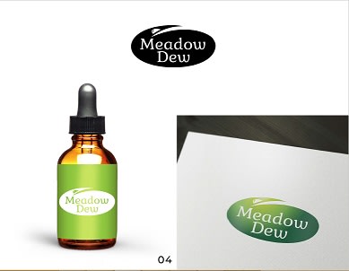
Option A is the best choice. Seeing it actually on the bottle helped greatly. Option D and B are nearly interchangeable. Option C kind of resembles clip art; it doesn't really look professional at all.
Option A is the best because it has great color contrast and a picture with a product near the brand.
In option A, the inverse in the bottom right letter looks great in green. I think that is the best looking and still easy to read logo here. I would go with that as the top choice. Options B and D are nice but the font might be harder to read for some.
I prefer the green labels.
A looks to be the most well designed logo. It has a nice bold look but also looks classy and sleek with some character.
It feels more natural and positive in stance
10 Responses to Option B
The colors stick out a lot more
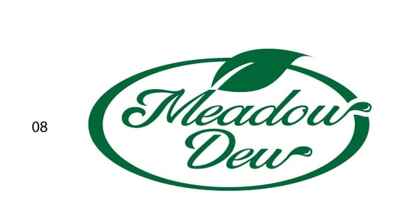
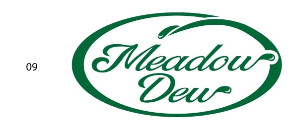
Choice B has the leaf over the logo and the drops near the end of the W's so it seems like it fits more in line with Meadow Dew. Option C and D have a similar look, but Option A is by far the absolute worst and very typical looking.
I like the logo
I definitely think green is best for this label. It reminds me of cool grass in the morning with dew. I like the options with the leaf the best as well. It's more eye catching.
That green color sucks. The blue is bset on the bottles. the dark green is real good tho
B looks healthyC looks innovative and niceD shows what is being sold
Option B and D are green and thus makes me think organic and green and a line of products promoting or made in an eco way is attention getting for me and the millennial generation who were raised to think green. Option A is very generic yet smartly done to keep the logo simple and thus professional looking.
The green logo shaped like a leaf is the most attractive, followed closely by the design with a solid green background.
I like the leaf big and green color
I like green. It matches the theme of a dewy medow more, and I like the logo with the leaf in it, but the dew drop isnt bad.
20 Responses to Option C
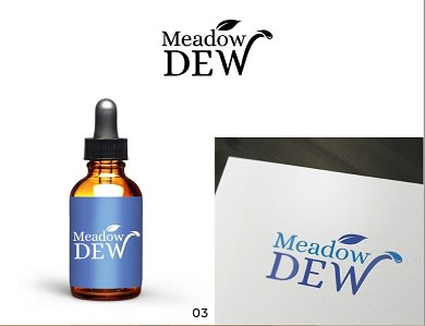
The blue makes it look less like a medicine logo.
easier to see product packaging
I like the one with the blue colors the best.
I would choose the blue... unless it is a CBD product. the green makes it look like CBD.
All these aren't great, they look like dollar store dish soaps. C is the most neutral.
I like C the best because I like the blue and the logo with the leaf at the end of dew. I like A somewhat too because the green bottle is attractive and makes me think, like C, that it;s a high quality product. B is okay, but it would be easier to judge if it were on a bottle.
I like the color blue, the ones that showed the bottle are better, and there is a leaf in the logo.
I preferred option C as most favorable because I liked the font and the placement on the product looked similar to other cosmetic line displays. I chose A for my next option because I liked the use of the color against the green background. I chose D last because the moment I saw the logo it looked more like a soda brand logo than a cosmetic logo.
Option C is the best as the blue works for this. The green chosen for the other logos are dull. Option B is next because the leaf is a nice touch. Option D is last because the green lettering with white background works better than vice versa.
I think it helps that I can actually see the product.
I like that it shows the dropper bottle in C. I like the color of it. I like how the meadow blue sign looks.
C shows that it comes in a bottle. and the logo is the best as it is easy to read and attractive
I like seeing the bottle it comes in
I chose C. I like to see the product as well as the label.
Blue is much much better than any of the greens
My eyes have trouble with the label shown in option A, which is why I did not select it. Option C has an appealing shade of blue that makes it easy to read the white text on the bottle. Options B and D are very similar to one another, but I find the leaf to be more appealing than what I'm sure was intended to be a dew drop, but to me just looks weird.
This packaging looks superior to the others.
I like the blue color better as it is a soothing color. Also I like option D for the design better than the option B.
I like the blue better. And I like the logo with the leaf on the top.
the first has the nicest graphics and font
4 Responses to Option D
i like this one the best
the lighter green is more alureing
Green makes sense for a dew drop type of product
D is definitely my favorite. The green pops like a grassy color (what you would see in a meadow).
Explore who answered your poll
Analyze your results with demographic reports.
Demographics
Sorry, AI highlights are currently only available for polls created after February 28th.
We're working hard to bring AI to more polls, please check back soon.

