Poll results
Save to favorites
Add this poll to your saved list for easy reference.
Which logo design do you like best for a business named Leaf & Tree selling personal care products?
Option B won this Ranked poll with a final tally of 29 votes after 3 rounds of votes counting.
In a Ranked poll, respondents rank every option in order of preference. For example, when you test 6 options, each respondent orders their choices from first to sixth place.
PickFu requires a majority to win a Ranked poll. A majority winner differs from a plurality winner. A majority winner earns over 50% of the votes, whereas a plurality winner earns the most votes, regardless of winning percentage.
If an option does not earn a majority of votes, PickFu eliminates the option with the lowest number of votes. The votes from the eliminated option are reassigned based on each respondent’s next choice. This process continues in rounds until a majority winner emerges.
Scores reflect the percentage of total votes an option receives during the vote counting and indicate the relative preference of the respondents. If there is no majority winner, look to the scores to see how the options fared relative to one another.
| Option | Round 1 | Round 2 | Round 3 |
|---|---|---|---|
| B | 44% 22 votes | 46% 23 votes +1 | 58% 29 votes +6 |
| A | 38% 19 votes | 40% 20 votes +1 | 42% 21 votes +1 |
| D | 14% 7 votes | 14% 7 votes | Eliminated 7 votes reassigned |
| C | 4% 2 votes | Eliminated 2 votes reassigned |
Age range
Amazon Prime member
Cosmetics and body care habits
Education level
Gender identity
Options
Personal income range
Racial or ethnic identity
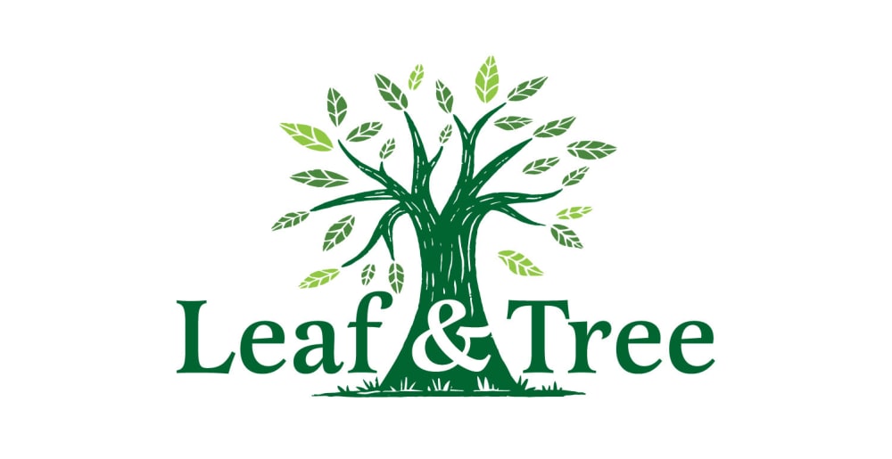
19 Responses to Option A
I think centering the logo and making the tree a part of the logo looks the best and most appealing.
A is simple and cute, has a great feel to it.
Option A looks like the brand would be a more natural and organic product
I went with what I felt flowed the best in its design. A does it the best.
A has the most detail around the tree. B looks good due to the green grass at the bottom. D and C look boring
I like Option A the best because I feel like the tree and leaves look the most realistic out of the four choices. I like that there are actual blades of grass in the logo and that the leaves and tree have details included in them.
I like the balance of Option A. It makes combines the tree logo and name really well. Also, the art style is more unique as well. It looks really good.
In all honesty, only one of the 4 really stood out to be, and that was A. The simplicity and frank honesty of this one was a great eye-catcher. Modern, yet not overly done. Not drab nor hackneyed. This would be my 100% solid decision if I were the person with the company making the logo decision. It completely draws the eye in, making you wonder "What is this company? How can they help me figure out my goals and come up with a solid game plan to achieve them?"
Incorporating the ampersand into the design of the tree works the best for this logo
I like how the type and tree combine in A. I like how the tree is not in the circle in C. A and C have a uniformity to them like they belong together. And I like how the tree has ground in B. D I’m not a fan of.
I like A because the tree divides the two words and has a negative space & sign in the tree. I like B because Of the color of letters used in the font. I like D because it still had the tree and I like the font okay. I dislike C because it doesn’t have the blue circle outlining the tree. I liked that part of the logo.
I picked A as my top choice as I like how the tree is placed in the middle of the logo. I picked B as my next choice as I like how the tree is placed against the hill. I picked D as my third choice as I like the details on the roots of the tree. I picked C as my least favorite as it looks a bit bland to me.
An all green logo fits a personal health brand very well as this is close to nature and natural looking which is the look you are going for.
i like the images of the trees not in a bubble because the options D and B look like an insurance ad
The tree in the middle of A looks really nice in the middle of the logo
Option A is my first choice because I like the design of the tree; it looks light and airy. I also like the way the company logo is displayed across the tree trunk. The company logo size is just right, it is not intrusive. Option B is #2 because the the company logo is too large and overpowering, but I do like the tree design. The grass along the bottom of the tree is a nice touch. Option D is #3 because the logo is too large. The tree would look better with grass along the bottom. Option C is #4 because the company logo is too large. Also, the tree looks too little and bare.
I selected the options based on how much representative each option is.
I do not prefer the circles around the images in B and D. It kind of looks like old clip art from Microsoft Word. Options A and C look much more modern, sleek, and professional. A is by far the best because all elements fit together for a perfect whole instead of having the separate image and words as C offers.
I like option A the most because its easier to recognized as a whole and easier to assimilate to memory. I mean you actually take one look at it and you get the whole picture with the name and picture, while when you look at the other logos B,C,D im either looking at the tree or the name and will easily forget one of them. Logo A forces you to see it as one piece. In my opinion a logo should be easy to remember , catching to the eye , expressive and A does this better than the rest of them.
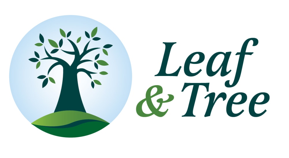
22 Responses to Option B
I think the full color designs with the sky backdrops make the design look more full, and that makes sense for a logo that's about a tree.
I like the logos with the blue circle and especially when it shows grass. Choice A is just ugly
The one I ranked 4th looks like its a tree spitting money which is kind of offensive. My first choice I liked a lot because it had the grass underneath the tree showing me serenity
Option B is more graphic and appealing
I chose B fist because it has a background and a ground image. IT alludes to some level of stability. D was next because of the background image. A was over C because the logo quality was much higher.
I like the light blue background, which makes the logo less white. the one with the leaf shaped bottom looks prettier than D. in A the & is embedded in the trunk, not too easy to read, so it goes last.
B, because it almost a whole picture with the tree in the circle, it has the sky, tree and two tone ground. Then A, because I like the illustration of the tree and the 2 different color of leaves. Also, I like how leaf and & Tree goes through the tree. D, I like the blue surrounding the tree in a circle. Lastly, I like C because its kind of boring with a single tree and the tree seems sorta small.
I ranked B first because I like the design. It's like a nature scene cutout on display. I ranked D second because it is similar to B, but missing the ground portion. I ranked A third because it has a good amount of detail in the design of the leaves and tree. I ranked C fourth because it is a minimalist design.
I prefer to see the trees standing tall on green little mounds, seeing the trees by themselves, and particularly alone against a circle backdrop, is kind of sad in itself.
I prefer the logo to the left and the name of business to the right, it's just more aesthetically pleasing to me. There are three of those which i, naturally, ranked as the first three. The best designs are the ones with a blue background and of those two the mound of grass image, B, get's my first vote as it looks both nicer and more realistic. Choice C without the blue sky background looks a little bare to me. The last logo design i chose because as i said earlier it doesn't have the logo to the left and name of company on the right. In addition to that, i don't like that there are two type of leave colors and that is because it's unrealistic and i just would have preferred one uniform leaf color.
B: I like it best because the image shows a tree with the sky and the grass. It has a lot of detail to this picture. D: This one I like okay because it shows the root and where life starts in life. A: This one shows a lot of detail in the tree it kind of reminds me of the things one goes through in life and the wear and tear that is done to the body of the tree. C: I wouldn't choose this one it is boring. If you put the details of B. D, A, and into one picture I would choose that one Like the grass, and the root showing, along with the detail of the tree I would chose it and that is the best logo a combination of all three of them.
I think this design gives a good image for a personal care product. The image is excellent and portrays a positive attitude. The color is nice with the blue background and the mound of grass. It gives the pictures a very positive attitude.
I like the plain leaves best and the colors in Option B stood out to me. I also like Option D, just not as much as B. C seemed a little flat to me. And the detailed leaves in A seem to make the logo look a little cluttered.
I preferred options B and D's designs. I feel the bright colors and the art style of the tree sell this image well. B's logo had the tree on a hill which I felt was more hopeful. C - Similar to B and D except no circle over the tree which makes the logo appear incomplete. A - The way the company name is impeded into the tree logo makes the image a bit cluttered in comparison. I also don't like the art style of the tree.
I found the design of B to be the most aesthetically appealing. I also like D and A, but I found C to be a bit boring.
The logo of option B is more appealing, the logo of option B is well designed and creative. The color used for the design of this logo makes the logo to be more appealing.
B is really good. I really like it. It's a clean and interesting design. It's very cool.
I chose panel B because of the green grass and the leaves of the tree. It all indicates life.
The more solid tree emerging from a GREEN mound is most inviting to me and seems ideal for a skin care line. The logo is also the most professional looking among the four.
I like the blue background and hill in B. Then I liked pattern on the leaves and bark in B. Then I liked D due to the blue background. I found C to be the plainest.
The tree with the background looks best, but I prefer the one with a slightly larger font. Next up is the tree without the background, as it still looks good, just not as much. I feel as though A doesn't give off personal care vibes and would be better fitted for a company in some other type of business.
With options B and D the colored circle or halo adds a great deal to the logo. I like the colors slightly better in B but the one in D is nice as well. Absent the circle, with A I like the ampersand being incorporated in the tree trunk. I feel like C is kind of bland and fails to incorporate decent effects.
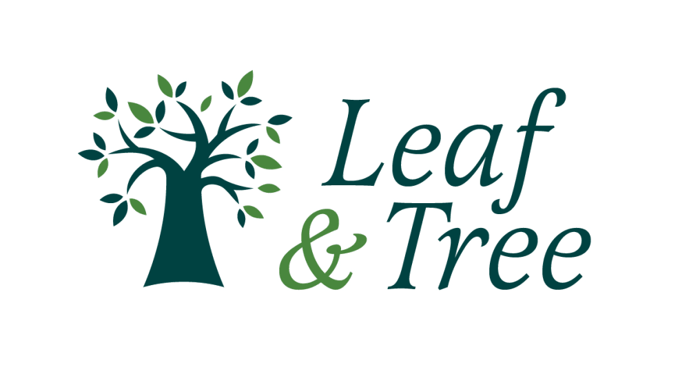
2 Responses to Option C
I actually don't really like any of these. They make me think of a tree service. But C is the best.
I dig the two that don't have the circle.
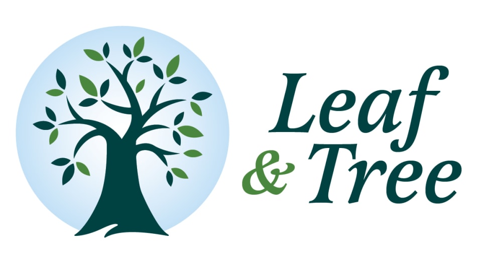
7 Responses to Option D
The blue circular background representing the sky is ideal for this logo and seems appropriate. I'm also a fan of the darker colors in use that mostly seem original as well as creative.
I chose the logo design that I felt was perfect for personal care products, I love this logo and think it’s very impressive and captivating.
A and C are too bare. A looks like a lending product logo. The tree in D looks healthier and happier than the tree in B.
I think choices D and B are the best options by a significant margin. I like the blue sky being depicted over the tree in each design. I slightly prefer option D because I like the bigger tree instead of the smaller tree.
I chose D first because I liked the circle around the tree and how it was just the tree. The leaves and everything fit perfectly it is very eye catching. I chose A second because the design of the tree was very artistic I could appreciate the effort it took to create that design. I chose B third because it was very similar to my first choice D but I did not like the green part on the bottom. I couldn't make out if it was supposed to be a big leaf or grass so was kind of confusing. I chose c fourth because it was the most simple logo and I thought the size of the tree was kind of off and made the logo look weird.
I like the light blue ring around the tree to define it call my attention with a larger area of color. I also prefer the name in a bolder type font off to the side
I like how the blue highlights the logo. I think that it looks good and really showcases the logo. I like the second one and how it shows the grass and really gives it a natural feel. Third one is nice with how the & is in the middle of the tree. The fourth is plain.
Explore who answered your poll
Analyze your results with demographic reports.
Demographics
Sorry, AI highlights are currently only available for polls created after February 28th.
We're working hard to bring AI to more polls, please check back soon.

