Poll results
Save to favorites
Add this poll to your saved list for easy reference.
Which logo do you like the most for a Natural Skin Treatment Brand that uses thyme tincture as a main ingredient?

Option A won this Ranked poll with a final tally of 29 votes after 6 rounds of votes counting.
In a Ranked poll, respondents rank every option in order of preference. For example, when you test 6 options, each respondent orders their choices from first to sixth place.
PickFu requires a majority to win a Ranked poll. A majority winner differs from a plurality winner. A majority winner earns over 50% of the votes, whereas a plurality winner earns the most votes, regardless of winning percentage.
If an option does not earn a majority of votes, PickFu eliminates the option with the lowest number of votes. The votes from the eliminated option are reassigned based on each respondent’s next choice. This process continues in rounds until a majority winner emerges.
Scores reflect the percentage of total votes an option receives during the vote counting and indicate the relative preference of the respondents. If there is no majority winner, look to the scores to see how the options fared relative to one another.
| Option | Round 1 | Round 2 | Round 3 | Round 4 | Round 5 | Round 6 |
|---|---|---|---|---|---|---|
| A | 32% 16 votes | 32% 16 votes | 32% 16 votes | 36% 18 votes +2 | 38% 19 votes +1 | 58% 29 votes +10 |
| C | 14% 7 votes | 14% 7 votes | 20% 10 votes +3 | 24% 12 votes +2 | 32% 16 votes +4 | 42% 21 votes +5 |
| G | 22% 11 votes | 22% 11 votes | 22% 11 votes | 24% 12 votes +1 | 30% 15 votes +3 | Eliminated 15 votes reassigned |
| B | 16% 8 votes | 16% 8 votes | 16% 8 votes | 16% 8 votes | Eliminated 8 votes reassigned | |
| F | 10% 5 votes | 10% 5 votes | 10% 5 votes | Eliminated 5 votes reassigned | ||
| E | 4% 2 votes | 6% 3 votes +1 | Eliminated 3 votes reassigned | |||
| D | 2% 1 votes | Eliminated 1 vote reassigned | ||||
| H |
Age range
Education level
Gender identity
Household income range
Options
Personal income range
Racial or ethnic identity
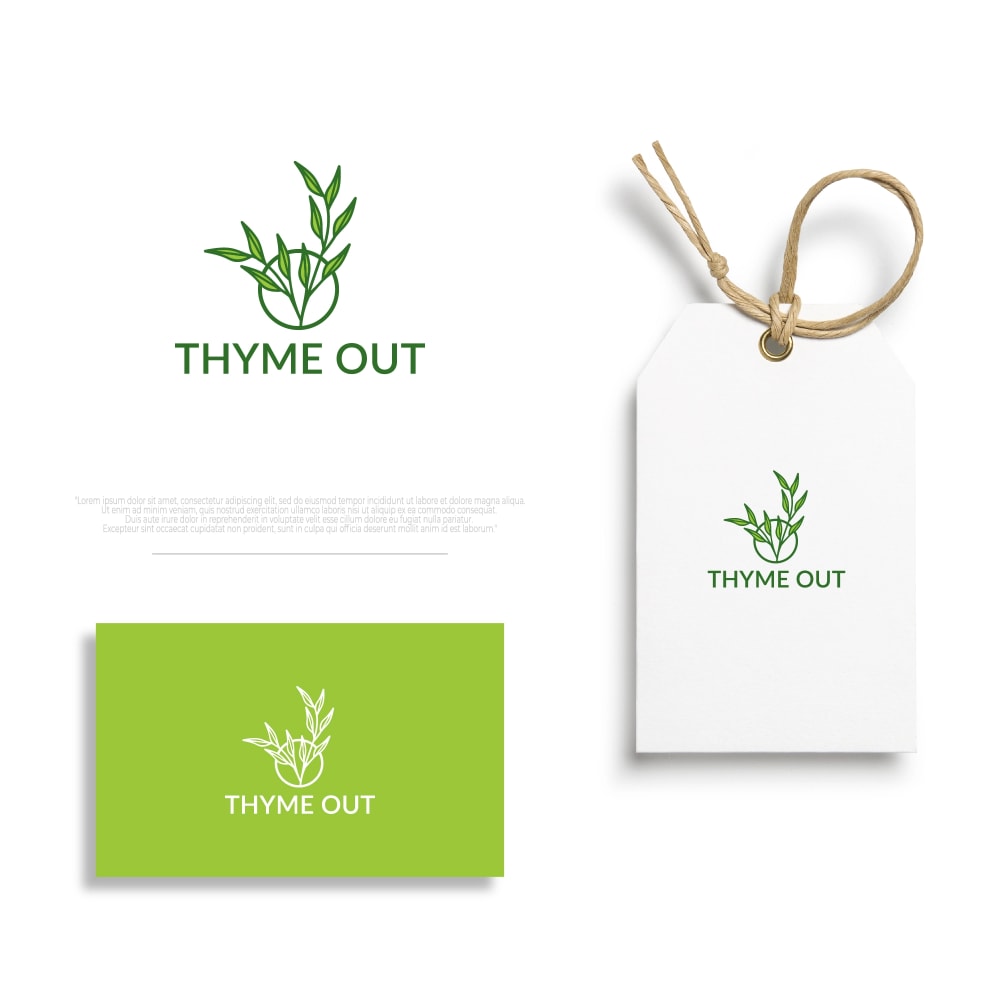
16 Responses to Option A
I liked the options that featured light, bright green hues since these felt a little more refreshing and natural to me. Beyond those I preferred the options that had softer peach tones since those felt more feminine.
I really like the image of the Thyme growing out of the hole. The others showing actual thyme are nice as well.
I liked the more simple color schemes better with higher contrast between the colors.
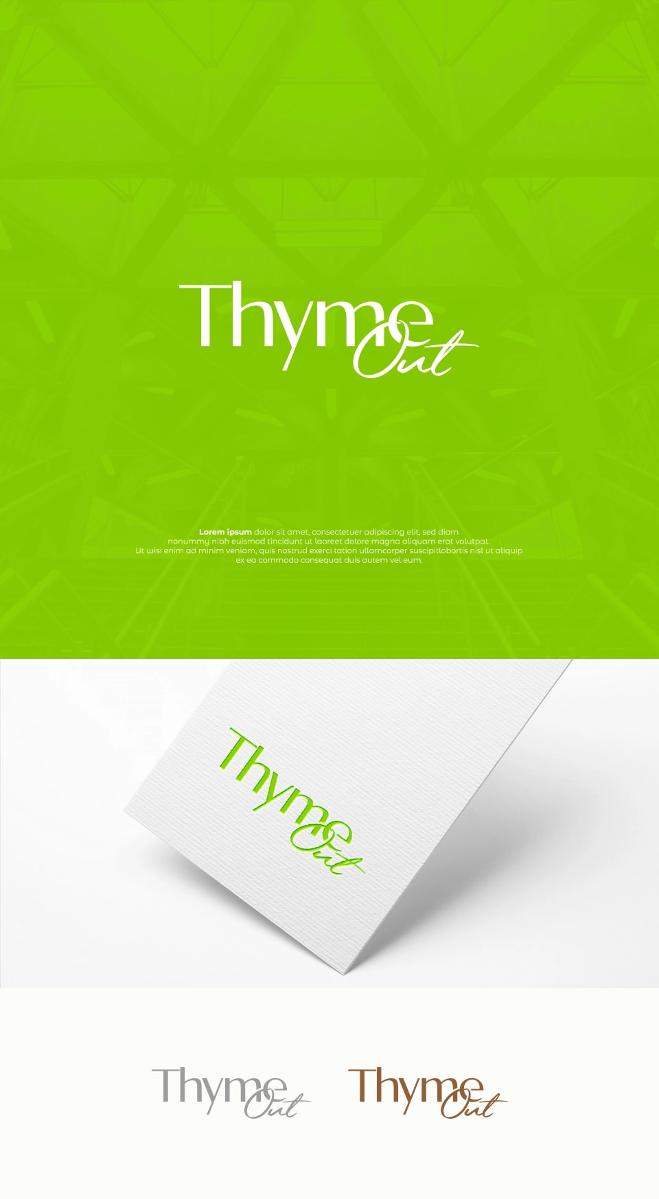
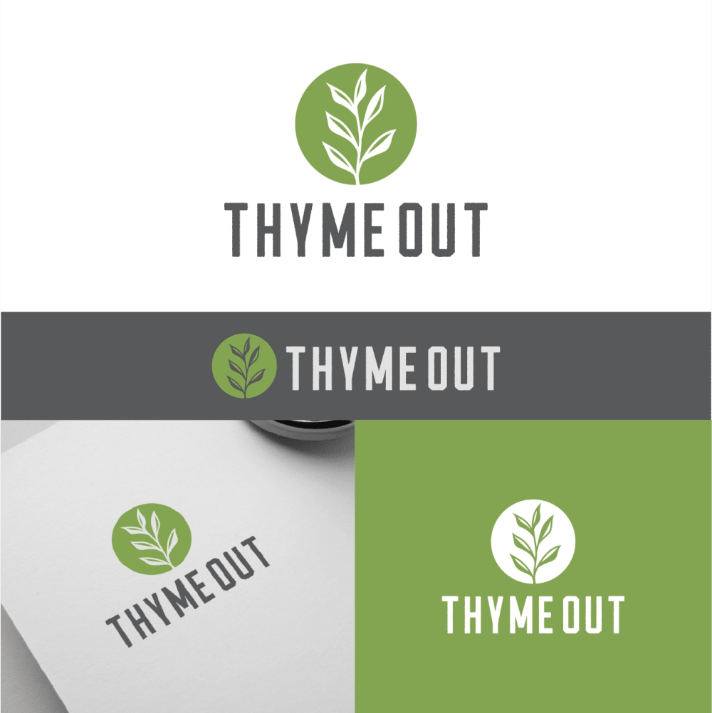
A is simple and the thyme leaf is obvious. It is a good balance between the name and the thyme. G is my second choice as I like the thyme leaf treatment in that. C, E and D are similar but I like the green shade in C the best of those. B doesn't show the thyme as well but I like the cursive font.
I enjoy the color scheme and logo of my first choice. I think the tag is a very nice touch. The color scheme and logos of the green and white ones are slightly more aesthetically pleasing than the others.
seems most authentic and realistic product that will benefit me and my health also the colors and image stands out as appealing to me
I chose option A first because the illustration of the plant is clear and easy to understand. I chose options G and H second and third because these thyme illustrations are smaller than the first but still easy to see and understand. I chose options D, C and E fifth, sixth and seventh because these thyme illustrations look similar and are more difficult to see clearly because of the colors and white space between the leaves. I chose option B seventh because the plant is included in the logo with a solid color but it not as large as the other options. I chose option F last because this logo only shows the text and no plant illustrations like all the other logos.
The logo and postcard is very modern and eye poppping. The green color scheme is an inviting color that would make more customers buy the product.
I prefer option A because I think that it has the most interesting and most visually appealing logo design and color scheme out of the eight options.
I love the vibrant green in option A. I like the leaf image in option F. The options with multiple colors are too complicated and muddy up the branding. Stick with the simpler motifs
I ranked my choices based on which option had the most realistic thyme image and then best on my preference for the design of the logo and colors used.
I choose A because the illustration is extremely eye-catching and attractive with creative designs
I think Option A has the perfect amount of readability, and quite easy to recognize in comparison to the others.
Stands out best and makes the thyme clear as well as eyecatching.
Very clever name and there are many nice options. A though was bold and easy to remember without too much detail
I chose panel A. I like the simple design as it is more about the product than the logo. The logo should complement the product.
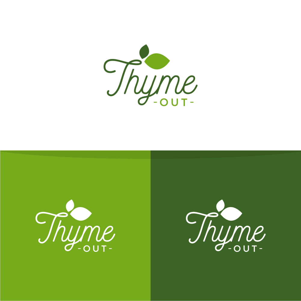
8 Responses to Option B
I most prefer option B. This option is most memorable to me and looks extremely crisp and professional. Just my personal favorite as far as they all go.
THis one emphasizes the greens more than the other options. Greens make me think of new, and l ife, which make me more attracted to this product
i like this order, it looks clean and clear, professional and higher end, good color scheme
I think the design in option B is the easiest to read and looks overall the best because it feels the most modern
I really lie the cursive use in Option B and how the leaf floats over the name!
The subtle cursive used gives the logo some elegance and grace. I like the deep shades of green used. Really makes me think natural.
I really like the shades of green and how they play off each other. It's extremely pretty.
I really like the actual logo of option b. Also, I really prefer the dark green in option E.
7 Responses to Option C
I like the logo design of option C the best. I like the circular logo with the name being split between the top and bottom which looks appealing.
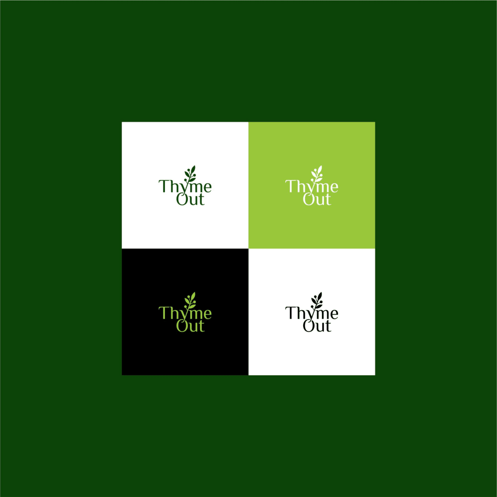
For me C and D are both tops for me as to me their colors are light and I feel like these colors fit skin care very well.
Balancing various colors and designs seems primarily the focus point of these options. The different logo arrangements provide a solid way to market a Natural Skin Treatment. I'm drawn towards iconic and traditional logo designs, and those that offer a reasonable background color. Less likely to be selected are those that appear to be excessively fancy or those with extremely dark shades used for the background.
I would say that the logos that i like the most for this brand are the ones shown in options C, D and E, because they are appealing, simple and look really professional, on the other side the logos shown in options B, H and G arent as appealing but arent bad either, they have a good presentation and are slightly appealing too, last we have the logos shown in options F and A which are the worst logos shown because they are not appealing and doesnt really look good.
C, D, E, all have a nice look and have a nice mix of colors as well. G, B, and A have a nice design as well. H and F have the weakest designs and look more plain.
I liked the first 3, the last 3 reminded me of olive garden
I think option C is definitely the most convincing of the bunch. It looks like it would be natural and an effective skin treatment and I like the elegance of the logo.
1 Responses to Option D
I really like the logo and colors used in D. There is a prestige and classy look to D, E and C. The other ones are good as well but DEC stand out.
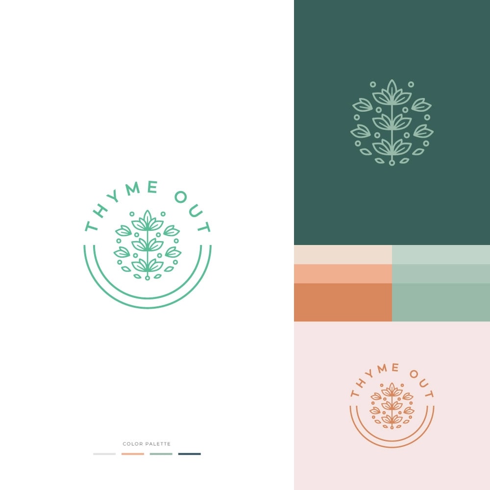
2 Responses to Option E
I really like E, D, C as choices, but primarily E because the colors are softer and calmer for a product that is supposed to be natural. Option A seems fine and simple. B, F, G, H seem too harsh and generic.
I ranked them by the ones that drew my eye first and would click on first.
5 Responses to Option F
I found these logos to be the best in terms of representing the brand
I think I like my 2 3 4 choices better than 1 choice but to me the 1 choice looks the most like a skincare product package or ad should
I pick the one that seems to stand out the most as first.
I love option F the most because ot is the most vibrant and is the most visually and aesthetically pleasing to me.
I like the simplicity of the bright green square in my top choice, which is attractive and energetic. Very cool design for sure!
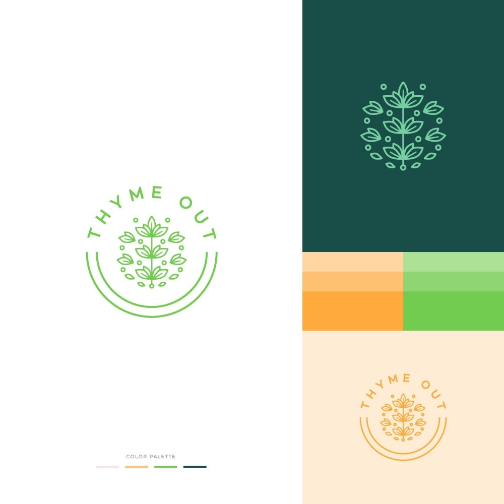
11 Responses to Option G
I like the simplicity of a leaf design somewhat in the shape of thyme with these logos with leaves and circle around it looking natural and clean like in G
The logo in option G is the one I like best, it is both simple and a bit elegant.
I think it looks the cleanest and looks like it would stand out the most at the same time
the 8 options are totally by my personal preference of logo and how much I felt each one represent the product and the name best.
I voted option G as number one because I felt like it was the most clean cut and effective logo design. The color choices are strong and it helps the lettering of "Thyme Out" really pop to make sure the consumers can see it. The image/logo design in option G was also my favorite out of all 8 choices.
These are by far the best, definitely #1 is the best.
I think the symbol looks the most realistic like thyme should as a skin ingredient
G is my top choice because it is the easiest to read while still looking modern and capturing the essence of thyme as a natural herb, especially given the use of green. A is similar but a bit overly simple, though I like that it is nice and clean. B looks nice and is a bit whimsical, however I am less fond of the font used. F is a bit overly simple, but very legible. D, C, and E are largely the same and as such my preference was only by color. Additionally, in all cases for D, C, and E I feel like some of the essence of thyme itself is lost. H is my last choice because I think it looks a bit dated like a logo from the early 2000s and the color combination feels uninspired.
Choices G and F are my two clear favorites. I really like the color scheme in both options and the logos. I think the logo in choice G is the best because it fits the design perfectly and it makes the product look very safe and reliable.
not really a huge fan of 5, 6, 7 or 8 as these are very difficult to read. i love the color choices offered by 3, and 4. however, 1 and 2 are really nice and i think make better logos on a larger range of products, like cards as in #2
G is the clear winner for me here, as the most simplistic design, however, the updated E design comes in with a close, close second. It was actually hard to choose between the two. The color changes made it tough. B and A fall into the "Good but not Great" category. D/C/H are just fairly poor in my taste. I can't get on board with them. I wanted to touch on F specifically mainly because it's a good design overall, but maybe it's the way it's shown here that's not good about it. I'm not entirely sure. I don't think it's a winning combination at this point.
Explore who answered your poll
Analyze your results with demographic reports.
Demographics
Sorry, AI highlights are currently only available for polls created after February 28th.
We're working hard to bring AI to more polls, please check back soon.

