Poll results
Save to favorites
Add this poll to your saved list for easy reference.
Which logo do you like the most for a Natural Skin Treatment Brand that uses thyme tincture as a main ingredient?
Option D won this Ranked poll with a final tally of 32 votes after 4 rounds of votes counting.
In a Ranked poll, respondents rank every option in order of preference. For example, when you test 6 options, each respondent orders their choices from first to sixth place.
PickFu requires a majority to win a Ranked poll. A majority winner differs from a plurality winner. A majority winner earns over 50% of the votes, whereas a plurality winner earns the most votes, regardless of winning percentage.
If an option does not earn a majority of votes, PickFu eliminates the option with the lowest number of votes. The votes from the eliminated option are reassigned based on each respondent’s next choice. This process continues in rounds until a majority winner emerges.
Scores reflect the percentage of total votes an option receives during the vote counting and indicate the relative preference of the respondents. If there is no majority winner, look to the scores to see how the options fared relative to one another.
| Option | Round 1 | Round 2 | Round 3 | Round 4 |
|---|---|---|---|---|
| D | 38% 19 votes | 38% 19 votes | 44% 22 votes +3 | 64% 32 votes +10 |
| B | 22% 11 votes | 26% 13 votes +2 | 28% 14 votes +1 | 36% 18 votes +4 |
| C | 16% 8 votes | 22% 11 votes +3 | 28% 14 votes +3 | Eliminated 14 votes reassigned |
| A | 14% 7 votes | 14% 7 votes | Eliminated 7 votes reassigned | |
| E | 10% 5 votes | Eliminated 5 votes reassigned |
Age range
Education level
Gender identity
Household income range
Options
Personal income range
Racial or ethnic identity
7 Responses to Option A
My top 2 picks are my favorite because they stand out, are bold and are easy to read without he cursive at a glance.
A is my top choice because it looks the most modern and legible. C would be better if the main font and thyme plant weren't blending together. E is nice but a bit too small looking. B is nice but I hate the font. D needs more color, does not look good with a single color palette, and therefore is my last choice.
I like A because it's easy to read, is compact and looks attractive.
I think A makes the best use of the color pallet and using negative art for the thyme image. I also like the easily readable block letters
I think the green circle with the thyme in it is the most attention grabbing feature in any of the logos. I also like how it uses two different color texts with the focus on thyme since that is the main ingredient.
A, C and D are all close in my opinion. I like the green circle around the thyme imagery. It feels like the green in that circle associates it more with a natural product while simply being green isn't. B is okay but seems too consumery in design. E feels looks weird for a skin treatment product logo.
I think that I prefer A the best as it has a very straightforward logo and the font is simple but professional which I definitely like.
11 Responses to Option B
B is the most simple and minimal logo, and would look the best on all kinds of collateral. A is also really minimal and nice. The others feel too busy for a logo.
I just went with my gut feeling and chose the ones that appeal to me the most
I think B ranks the highest for me because it feels the most friendly and approachable and kind of playful with the font selection. I also like the combination of the two shades of green (that lighter shade is one of my favorite colors, BTW). Overall, it comes off as the most fresh and modern and dynamic.
If I saw these logos on a real store, I would prefer them to look like my top pick/s.
B is a really dynamic and fun look with just a hint of the thyme leaf.
I ranked solely based on my preference for the different logos.
It is a toss up for me between B and E. I find both have a natural, soothing aesthetic that speaks to the product type.
offers the best style as it seems to be the most modern and stylish that gives me an impression the brand is healthy
I love the font and simplicity of Choice B
I most prefer option B. This is the most balanced logo in my opinion and the most pleasant to look at without a doubt. This is memorable as well due to the vibrancy and larger lettering.
Option B looks a light easier on the eyes, and is more attractive than the others, which seem basic.
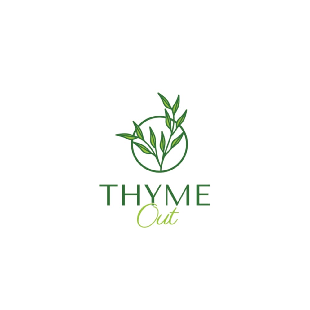
8 Responses to Option C
I liked the logos that were more compact since they seemed more subtle to me. I appreciated that C and D were the most elegant with their sprigs of thyme.
I like the focus on the Thyme in the font. The fancy font at the bottom made me look twice and the picture is nice.
I like the logos that put some emphasis on the look of the thyme leaf like in c and D with this style for a natural look
I think that I like C the most. i think that this option is just so elegant. I really like the font on this one
I like how big the plant is. Also I like the lighter color green. Both make me think of a more healthy and natural product
My favorite is option C because it has symmetry in a compact space. Option D is nice, especially how easy it is to read the texy plus the interrupted circle catches my eye. The others are far behind
I really like the two different shades of green used in option C along with the little picture of thyme above and the writing below, and I like how out is written in cursive, gives it a bit more flair and makes it a bit more visually appealing. It just all comes together very nicely.
Choice C is the one that I like best because I like how the thyme plant in it is standing up straight and how the circle looks surrounding it. I like how the wording is done below it and how the second word is a different green to mix things up. I like how everything is centered. Choice A is second because I like the plant inside of the circle like that and how the wording is centered below it nicely. Choice D is third because I liked the plant coming out of the semi circle a lot but did not like how the wording was not centered. Choice E was fourth because I did not like how the plant was sideways and at the bottom like that. Choice B was last because I do not like how it has no plant and just leaves.
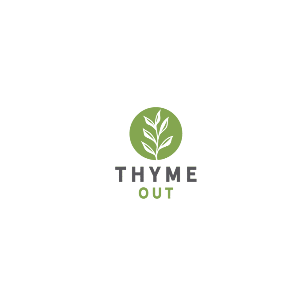
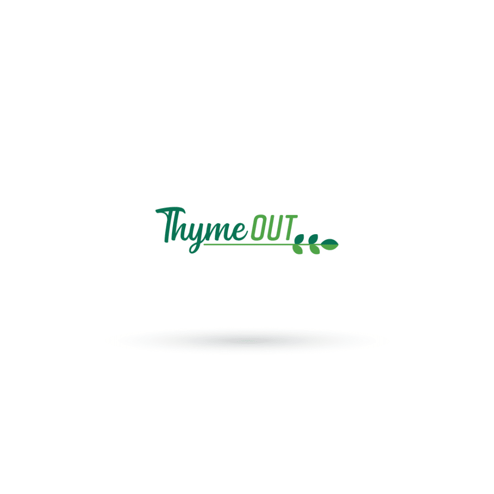
19 Responses to Option D
I like the logos where the appearance of the plant is natural and lifelike, not cartoonish.
i like a picture of thyme as well as easy to read text and lettering. B and E are too hard to read
The sprig above the text really brings out the nature of this product.
I like the image of the thyme growing out of the hole. I think D is the best because I find the dark green easier to read against the white. The icon in A is alright, I don't care for the others.
D and A look the most centered and easy to read. B and E are too hard to read with the cursive or images
I like option D the best because the color stands out the most and grabs my attention.
D is really nice, I love the boldness of the text and how easily it can be read and processed.
Option D is pretty nice. It's clear, artistic and bold. It's a great looking logo.
Definitely D, the logo is more appealing and nicer than the rest
I like the leaf motif, especially in D and C. I dislike the font in B, it seems too trendy and like it will not age well.
The logo design in Option D looks mostly engaging and appealing for this brand, it looks natural and pleasing to see.
I chose option D because it looks like progs of Thyme but also because of the font in the logo.
The logo is going to used for natural skin treatment , so for that the logo must be depicting the naturalness in it . By that the option d and E has clearly depicting the naturalness and the theme was so good . The customers will definitely believe that the service will be nature oriented .
The top two are best, simple, attractive, and legible. The lower ranked ones are less legible or not as good looking.
I prefer option D because I think that it is the most interesting and visually appealing logo design out of the five options.
I like the two designs with the tall multi leafed plants the best. They really stand out from the others.
They're all good options. This option was the first one that caught my eye. They're all similar.
I ranked my choices based on my preference for the thyme leaf in the logo.
I really liked d and c, b reminded me of olive garden
5 Responses to Option E
Font is prettiest in this order. Picture does not matter to me.
I like the color and layout of this one the best. I like how the name just goes straight across and sits on top of the branch. It flows well. I would choose C second because I like the way the thyme looks and is the focus of the picture. I also like the font of the name
Flowing text makes it likeable for skin treatment.
Option E's design is a lot more "cleaner" than the others so I picked that one first
OPTION E LOGO IS VERY CLASSICAL TO COMPARE OTHER LOGOS BECAUSE THAT LETTER AND LOGO IS TRENDING IN THE WORLD AND MAIN THING USER CAN SEE THE LOGO(YEAH OK IT'S COOL LOGO). AND IF YOU CHOOSE ANOTHER LOGO THAT LOGO DESIGNS AND LOGO LETTERS ARE OLD FASION MOSTLY IN THIS LETTERS DESIGNS ARE BEFORE YEARS.WHY I AM CHOOSE(FIRST I AM WATCH LOGO LETTER DESIGN AND THAT LEAF DESIGNS ITS VERY UNIQUE AND TRENDIND DESIGNS SO I CHOSSE THAT)
Explore who answered your poll
Analyze your results with demographic reports.
Demographics
Sorry, AI highlights are currently only available for polls created after February 28th.
We're working hard to bring AI to more polls, please check back soon.

