Poll results
Save to favorites
Add this poll to your saved list for easy reference.
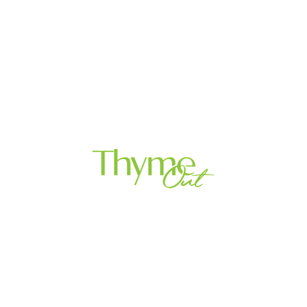
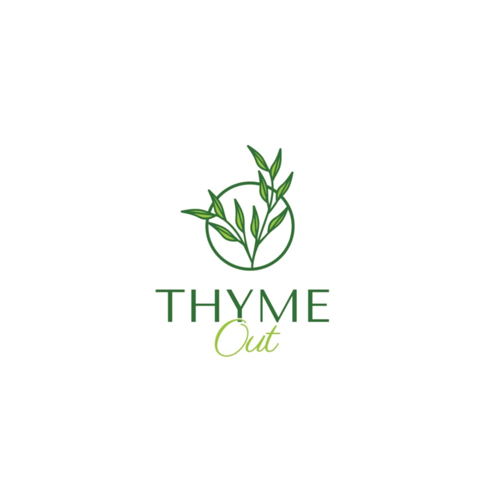
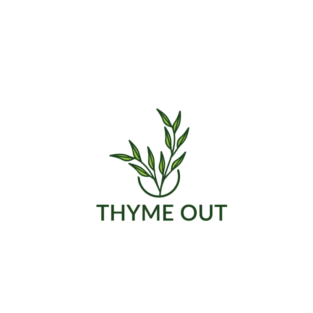
Which logo do you like the most for a Natural Skin Treatment Brand that uses thyme tincture as a main ingredient?
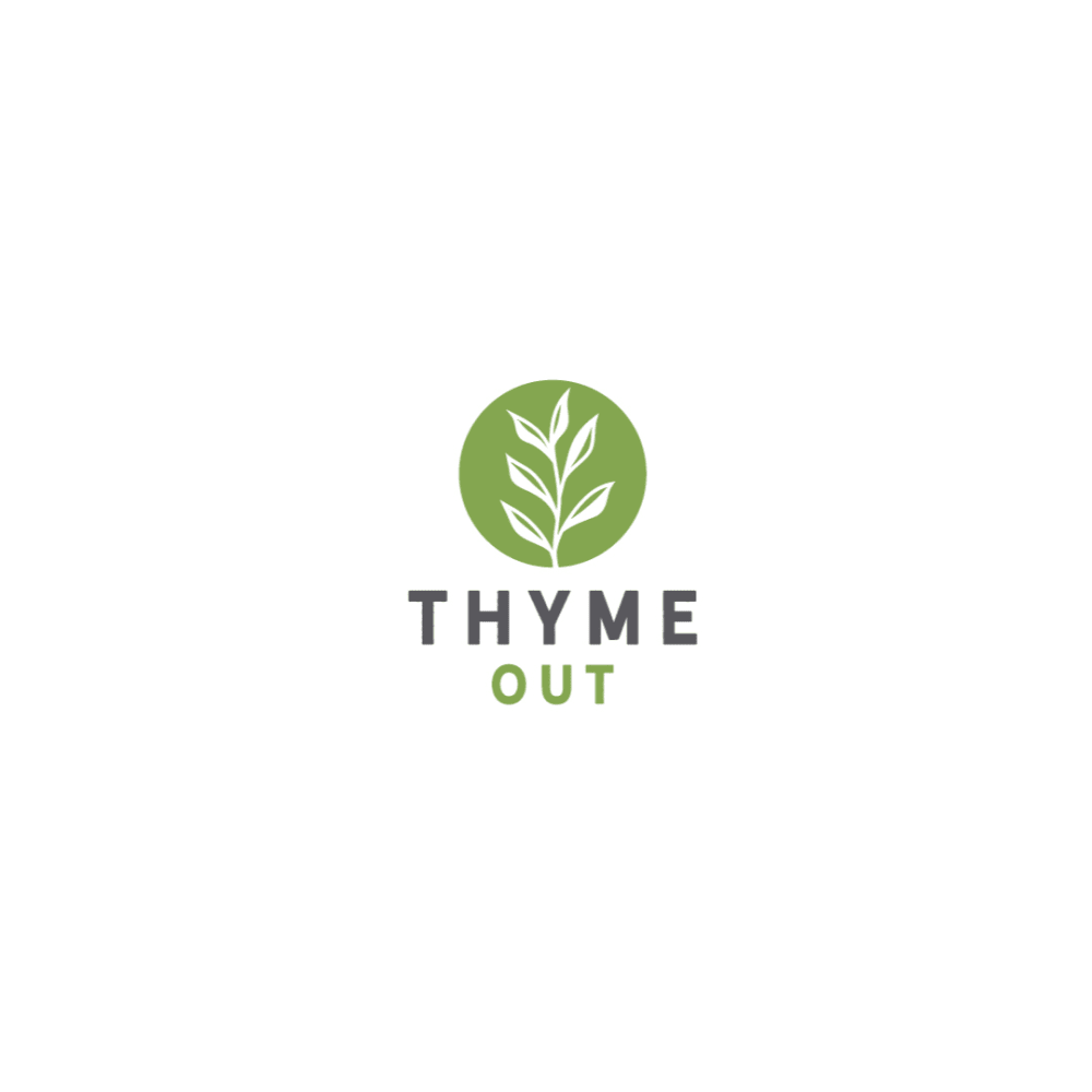
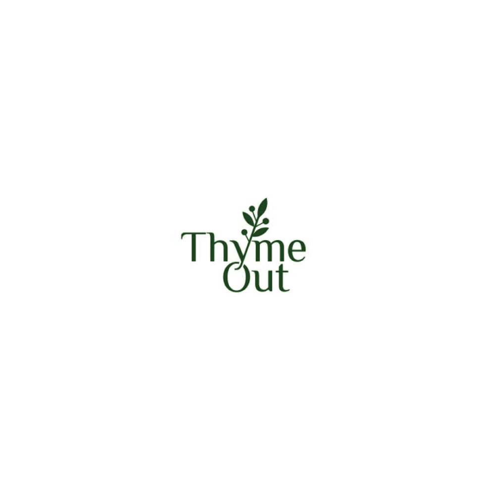
Option G won this Ranked poll with a final tally of 29 votes after 6 rounds of votes counting.
In a Ranked poll, respondents rank every option in order of preference. For example, when you test 6 options, each respondent orders their choices from first to sixth place.
PickFu requires a majority to win a Ranked poll. A majority winner differs from a plurality winner. A majority winner earns over 50% of the votes, whereas a plurality winner earns the most votes, regardless of winning percentage.
If an option does not earn a majority of votes, PickFu eliminates the option with the lowest number of votes. The votes from the eliminated option are reassigned based on each respondent’s next choice. This process continues in rounds until a majority winner emerges.
Scores reflect the percentage of total votes an option receives during the vote counting and indicate the relative preference of the respondents. If there is no majority winner, look to the scores to see how the options fared relative to one another.
| Option | Round 1 | Round 2 | Round 3 | Round 4 | Round 5 | Round 6 |
|---|---|---|---|---|---|---|
| G | 28% 14 votes | 28% 14 votes | 28% 14 votes | 28% 14 votes | 36% 18 votes +4 | 58% 29 votes +11 |
| H | 20% 10 votes | 22% 11 votes +1 | 22% 11 votes | 28% 14 votes +3 | 36% 18 votes +4 | 42% 21 votes +3 |
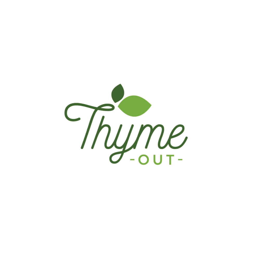
| B | 24% 12 votes | 24% 12 votes | 24% 12 votes | 26% 13 votes +1 | 28% 14 votes +1 | Eliminated 14 votes reassigned |
| D | 10% 5 votes | 10% 5 votes | 16% 8 votes +3 | 18% 9 votes +1 | Eliminated 9 votes reassigned | |
| A | 10% 5 votes | 10% 5 votes | 10% 5 votes | Eliminated 5 votes reassigned | ||
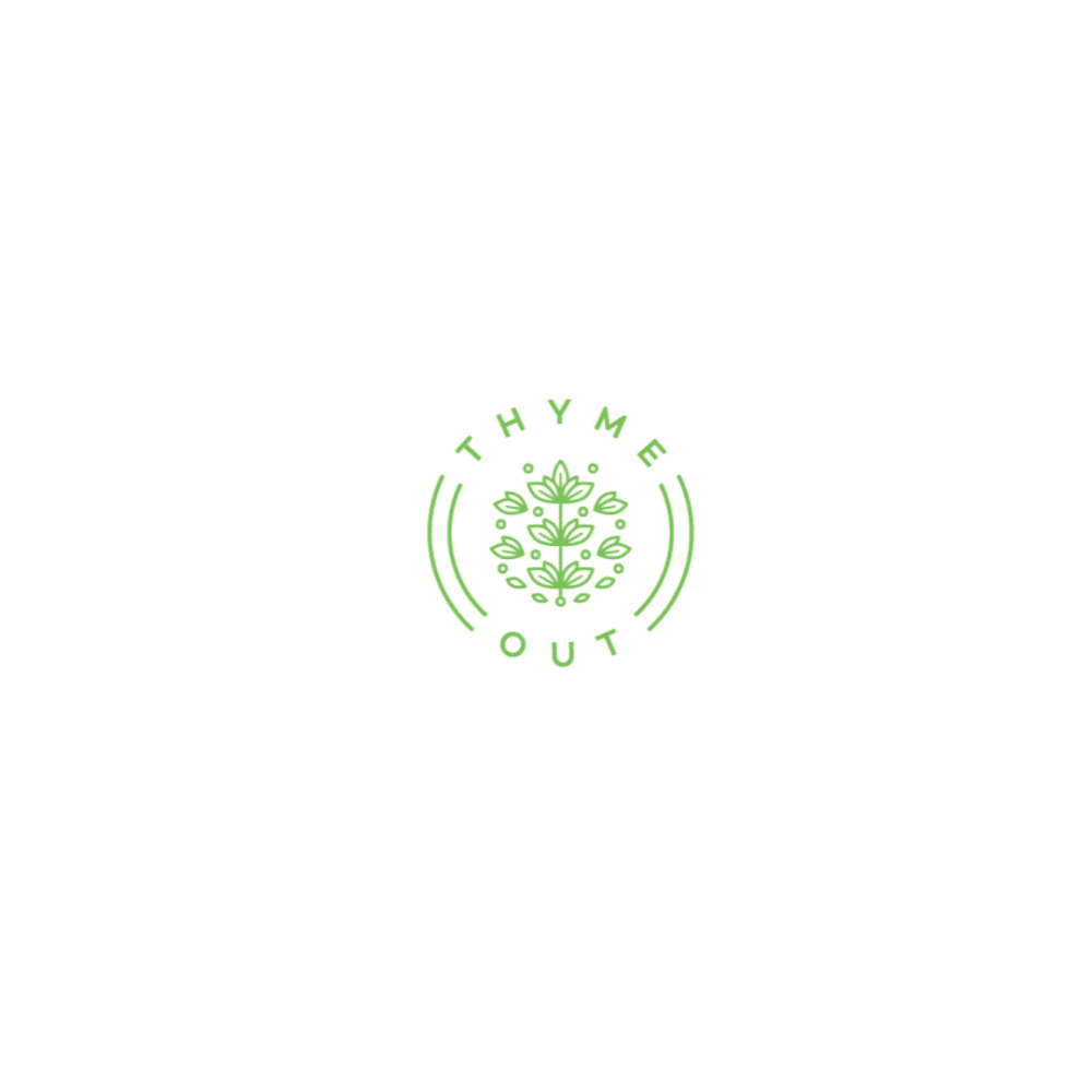
| C | 6% 3 votes | 6% 3 votes | Eliminated 3 votes reassigned | |||
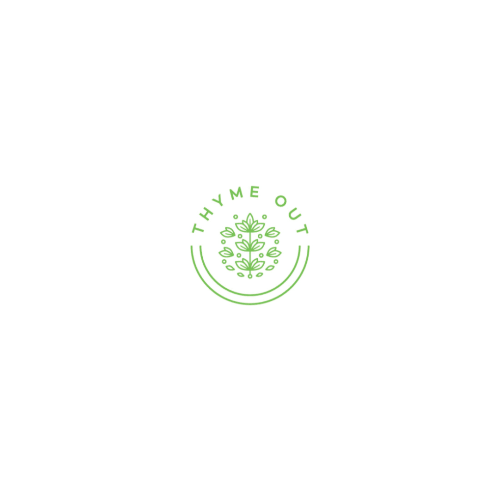
| E | 2% 1 votes | Eliminated 1 vote reassigned | ||||
| F |
Age range
Education level
Gender identity
Household income range
Options
Personal income range
Racial or ethnic identity
5 Responses to Option A
I think A, H and E are all pretty strong, memorable logos that are readable. Some of the others get too fancy with the text or too small.
I ranked options C and D last because they were the smallest and had cursive writing, etc. It made it hard to read or comprehend what the logo is saying. I much more preferred the optoins with the BIGGER and MORE clear lettering. Like Options A H and E
I think they are all good in different ways other than B. B looks like one of those "live, laugh, love" wall signs. A is the best because it really gives the idea of the thyme while being easy to read.
A looks the most vibrant, colorful, modern, and legible. D looks very natural and elegant, but is less legible than D. G looks nice but I am less fond of the color contrast between the "Thyme" lettering and the thyme iconography. B is really nice overall, but I do not like the font, however I do like the leaves integrated into the logo. E is a bit overly simple but highly legible. C is similar to D but I do not like how it is broken up into separate parts of the circle as much. His too plain and as a result looks a bit ugly. F looks amateurish and is too bright.
A is a very simplistic design which is what I look for as a business owner myself. You don't want something overbearing you want your product name simple and neat and a design that catches the eye fast. B does the exact same thing but it's a bit large and the font is a bit different so it might be something a group of people need to bounce around. C/G/H Fall into the Category of "Good, but will need consideration" They're not bad, but not great either. Just good. E/D/F just seem too small. I'm sure these can be worked out and fixed, especially D. But in it's current state, it gets a low score from me.
12 Responses to Option B
I like the readability and font of B
I really like the shade of green and the overall shape of the logo in B and G the most. Those ones make me feel pleasant.
Option B is the most eye catching, easy to read and memorable. I love the font, image of the thyme, and the colors.
My overall favorite logo would be Choice B. I like how the thyme leaves are incorporated into the text, which is a nice touch. It's also easily legible, which several of these are not, at least to me. The shade of green is too light for the white background this is on. I also like how B uses cursive text, that just plain always looks nicer and more professional to me.
After carefully studying and comparing all eight logos for a Natural Skin Treatment Brand that uses thyme tincture as a main ingredient, I selected Option B as my first preference and the one that I would definitely click on to learn more about before purchasing for my own use. I felt that this logo jumped right out at me as having the greatest eye catching appeal based on its size, design and variety in colors. Option G was my second choice followed by Option H, Option F, Option A, Option E, Option D and finally Option C with all eight rankings based on my own personal opinion of the relative attractiveness of each logo image.
I like the plant design and font on B. I like the plant logo on A, G, and H. I think F is too bright and gets lost in the white.
The creative logos are mostly suitable for this brand and the designers established some interesting arrangements for the consumer group. Overall, I'm pleased with these options and opt for simple versions with lowercase letters. The capital letter versions aren't as suitable and seem a bit out of place.
You want to get that thyme leaf or branch in there, and I like Option B's cursive for the company name and the leaf floating above it.
choices b & e i liked the most because they seem more alive
The font on option B is soothing, playful and the imagery is cute, almost calming.Option G, I like the font as well, the way "out" is written underneath appeals to me.Option A, is simple, easy and plain.Option H is almost playful and whimsical.Option E is really nice the way the Thyme image is built into the font.Option F is cute, small, gentle.Option D and C are almost identical and it's not really easy to read with the wording being so small.
I pick the ones that stand out the most as first ones.
I like the curse of writing. It makes it look classy and elegant.
3 Responses to Option C
For me C and D are my top choices as I like the fact that they have a small circular design with a intricate logo on there.
C seems more professional to me.
Option C looks very much like the kind of logo used on something that is therapeutic or a remedy of some sort, I would be happy to try it.
5 Responses to Option D
Option D, looked really nice and was my favorite design of the logo options. Option H and C looked nice too. Option G looked a bit more large but I liked the overall look. Option B and A looked okay. They worked just not my favorite. Option F, looked a bit boring when compared to the other options.
I thought B's size was too large so that was off putting. I liked that D and C featured smaller logos with more vibrant and refreshing colors. These felt more elegant, subtle and classy to me. I disliked the options that felt darker and heavier since they seemed sort of depressing.
I think it would be cooler if the logo incorporated a clock face with the words Thyme Out. I chose D because it's simplistic yet straightforward and appealing. I chose E as second because it's a nice overall design. I chose C because it's like D. As for the rest: I don't like any of them. Some are unprofessional looking. They use fonts that just don't work well. The designs aren't good either.
These logos stood out to me as being the most professional looking to represent the company
D and c Stuck put the most for me, it was simple yet memorable
1 Responses to Option E
The font is attractive and easy to read. The image of the thyme is artistically placed.
14 Responses to Option G
I like the ones with the branches of thyme or botanical logos
Option G is the best because it is balanced, the name is boldly written and the deign is classy and classic. I prefer a lighter and brighter green color, however, like the one featured in option F
I like the use of the leaves since it is a natural product.
I prefer option G. It looks the most like the herb. I like the different tones of green in it and the detail in the leaves.
I really like those circular logos but I don't feel like they stand out as much as my first choice, I feel that's by far the best
I like the simple logos that put an emphasis on the look of the thyme and gives it a natural order of things
not really a fan of 5, 6, 7, or 8. heya re difficult to read and don't really look as nice. my favourite, #1, has a beautiful logo, but the Out is difficult to read as well. 2, 3 and 4 have a nice picture of the actual thyme plant, and also the coloring and style make me think of "Green" as in natural too.
I chose option G because the design of the words are bold but yet still elegant.
My choice is option G as rank 1 because of the Logo design is very well suited for the concept of the product so i choose this.
I picked G, A, B and D as my top choices as the logo looks very bold and it looks like a very fun design to use.
I think the options with actual illustrations of thyme is very creative and nice. I also like the light and dark green contrasts of option G.
These are by far the best, definitely #1 is the best.
I like the melding of the graphics and the font used, think it sets itself off really well
I prefer option G because I think that it is the most interesting and visually appealing logo design out of the eight options.
10 Responses to Option H
in order by personal preference. H is best followed by G B E A F D and C
I feel that H has the best logo because you can clearly see that it is about thyme, and it flows the best. It stands out the most to e, and looks the most pleasing as well.
I prefer H over other options because H has creative and attractive graphic design, with appealing details
I love the design of option H, the leaves are colorful and lovely, the font used is perfect.
I really like the plant growing out of the O look. I think the dark green text looks best against the white.
I like the logos that have the Thyme leaf graphic over just the plain text. I really like the simplicity of #1 as it's not overly ornate.
H, A and G all make me think of the thyme herb with the pictures. F is last, no picture to help describe. And C and D are not bold enough.
I believe Option H and G do the best job at showing a quality product, they also have great readability and they will be easy to spot out.
These are all pretty good. I liked h, e, and g the most since the thyme leaf is very prominent in the design. B is also cute, but the thyme leaf is a little ambiguous. D and c and a seem a little small and the text is not as easy to read, but I do like the circle design and the leaves. F is not very interesting, as it has no design.
I ranked my choices based on which image had the best representation of a thyme sprig and my preference for the font.
Explore who answered your poll
Analyze your results with demographic reports.
Demographics
Sorry, AI highlights are currently only available for polls created after February 28th.
We're working hard to bring AI to more polls, please check back soon.

