Poll results
Save to favorites
Add this poll to your saved list for easy reference.
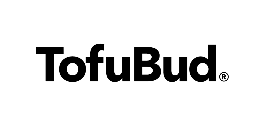
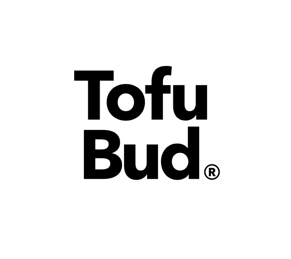
Which logo do you love more?
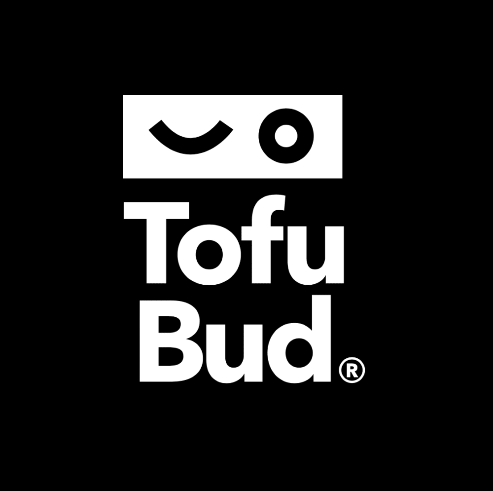
Option C won this Ranked poll with a final tally of 31 votes after 1 round of vote counting.
In a Ranked poll, respondents rank every option in order of preference. For example, when you test 6 options, each respondent orders their choices from first to sixth place.
PickFu requires a majority to win a Ranked poll. A majority winner differs from a plurality winner. A majority winner earns over 50% of the votes, whereas a plurality winner earns the most votes, regardless of winning percentage.
If an option does not earn a majority of votes, PickFu eliminates the option with the lowest number of votes. The votes from the eliminated option are reassigned based on each respondent’s next choice. This process continues in rounds until a majority winner emerges.
Scores reflect the percentage of total votes an option receives during the vote counting and indicate the relative preference of the respondents. If there is no majority winner, look to the scores to see how the options fared relative to one another.
| Option | Round 1 |
|---|---|
| C | 62% 31 votes |
| A | 20% 10 votes |
| B | 18% 9 votes |
10 Responses to Option A
it simple look is very noticeable and appealing
i like the wide logo with the white background. i would go with A
I love the simplicity of the first one and also the sleek and stylish appeal.
I first chose option C because I like the black background. I changed my mind because I do not like the symbols above the word Tofu. But the black background does look a lot better than the white. I also prefer the one word TofuBud because I think it is a fun way to blend two words.
less confusing. simple and bold. Stands out well and easy to read.
The black on white is easier to process on a mostly white computer screen, but that might change on actual packaging. So many questions about what this product is... :)
Simple design and text layout. I like it and nothing there that doesn't need to be there.
I prefer A because I like to see the name of the product or brand together, especially when it appears to be one word. Also most tofu I buy comes in packaging that is similar in shape to the dimensions of A so it is easy to picture it with A as opposed to the other 2. The image above the text on C looks somewhat like Japanese katakana but I feel like it's overly complex.
The first option has the most originality strangely. The second choice just looks like the old Bud Light logo and the last one is trying to be too cute.
#3 has weird nonsensical icons at the top#2 looks simple and clean#1 looks very simple, clean and on one line
9 Responses to Option B
I think the images with the black and white background stand out more, and I like where the logo is split up "tofu" "bud" because its easier to get the reference rather than just reading "tofubud" as one word (one sounds more like a tofu friend compared to tofubud sounding like some kind of seed or tofu plant
I think A looks like an advertisement for a bed for some reason. I think B is my favorite because of the font and the placement of the words.
The letters look larger and are more eye catching. The second option is due to the black/white inversion but I do not know what the symbols mean.
My first choice was because the logo is the clearest. Second choice and third choices were a toss up. I went with the second choice because it's cute, sort of. The third choice is okay.
I prefer option B most of all because I like how the logo is even and balanced against the background with not too much color, but enough to contrast with the background nicely. I liked option C least because the black background and white foreground just looks messy to me and makes it more difficult to read the foreground, and the symbol on top just looks far too gimmicky in my opinion. Option A is okay, but doesn't do very well at being balanced, with the text being all on one line, I just like it broken up into two lines, I can't really explain why I prefer it be on two lines, I just like how it looks better on two lines, verses one line.
Simplicity and Effectiveness. Great Logos don't have to be complicated to make sense. The best logos are created based on simplicity. The ease to remember the brand name and associate with it. GREAT stuffs
Option B looks clean and modern and uncluttered as well as balanced
I liked options B and A fairly evenly, giving the top choice to B because it is a more compact design. I did not understand the design of option C. The wink did not make much sense to me in terms of a tofu product.
B is clear, easy to read, large, and bold. A is slightly less so. C is confusing - is TofuBud winking at me? Is that what tose symbols mean? I'm confused.
31 Responses to Option C
I've always loved white text on black backgrounds! I think this looks the best.
C because It has the nicest background and complement to the main focus of the image.
The dark background is just easier on my eyes. I like having a black background for most things.
Choice C has a little character with the graphics, with the wink I like it. A is nice as one word.
C the black and white is the best in everyway. B the way it's written is cool. A is simple to me.
the first one is the best and feels a little bit more fun and in general it just seems welcoming, the others are bland, but i guess tofu is bland too
At first I didn't care for the winking eye above the name, but I really really like the black background with white font as it really stands out. By the time I had looked at all of them, the winking eye had grown on me and it is kinda cute. The other two logos are fine but just too generic.
I love Choice C more because the black background stands out more
I don't love any of them but C looks the best because of the symbols or logos it has. B is bland and A just doesn't look right and looks cheap.
The logo in option C is more memorable and more noticeable than the other logos in my opinion. If you saw the logo in option C you could easily recall the wink which makes it easier for repeat business and also for referrals. Customers can tell friends to look for the wink, that could even be a catchy ad slogan for commercials or radio ads.
I like choice C, it is by far, to me, the most catchy and attractive logo. The other two look like plain text and nothing catchy.
i think this one pops the most and i like the little tofu guy showing on the logo also
C STANDS OUT MORE THAN THE OTHERS
I like the white lettering on black. Very easy to read, very fun winking eye on the top. Option B shows me how to pronounce the product by breaking the word up. Option A and B are both very plain.
The black background appears stronger and is much more noticeable.
I'm not sure what the logo means in C but I am curious to know more.
I love C the most. I think the black background helps the logo stand out as my eyes went directly to it. I also love the additional shapes at the top that the other two logos do not have, it adds an extra element
The sequence C, B, A is chosen because the black background with white text looks the most pristine.
My main choice has a lot of character, and reading the logo is much easier on the eyes thanks to the white text on black background. It doesn't strain my eyes as much, and I focus more on it. Also, the logo above the brand name gives it character, and makes me feel like the brand is more friendly and approachable, like it has a life of its own.The second choice, A, is good because you spend less time reading and processing it, making it easier to figure out what the brand is. Having the word broken into two lines makes a kind of mental stumble as you stop after reading Tofu, and then have to shift your attention else where.
I liked choice C and how playful and fun it is. Choice B and A look okay, but look very generic and don't look appealing to me.
C looks fun and warm, like it is smiling back at you. The others are quite plain and uninteresting.
The two liner allows the consumer to pronounce the word better. Likewise the logo on top of the words can make people remember it.
I think option "C" is much more bold and gets noticed. I like option "B" because of the the stacking of the words. Option "A" is just ok.
I picked A because it stands out more than B, C
I chose by what stuck out the most.
The black background it a great idea , and I love the symbol above the text. It gives the logo more life and personality.
I thought the characters on top of the name were playful and attention getting. I think it would be a fun brand.
I love the size of both C and B; however, the contrast for option C is much better than the rest of the options.
The black background just stood out more and the separation of word look more attractive.
i think this logo is more inviting and creative
Choice C logo is better than A & B because it's dominate, compact and complete. The black background says strength and the bolded fonts dominates giving the logo a strong and competitive appearance. Choices A & B does nothing for me as a consumer, it's just there lonely fonts on a page.
Explore who answered your poll
Analyze your results with demographic reports.
Demographics
Sorry, AI highlights are currently only available for polls created after February 28th.
We're working hard to bring AI to more polls, please check back soon.

