Poll results
Save to favorites
Add this poll to your saved list for easy reference.
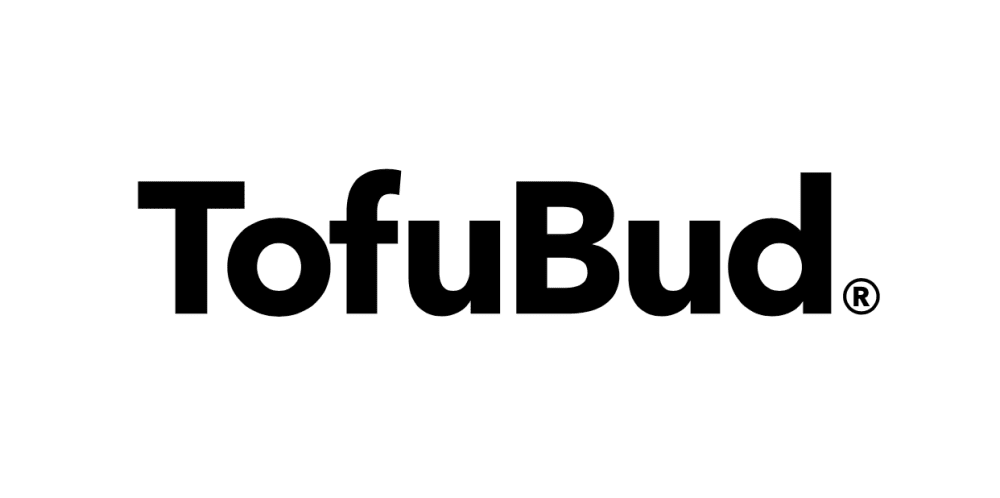
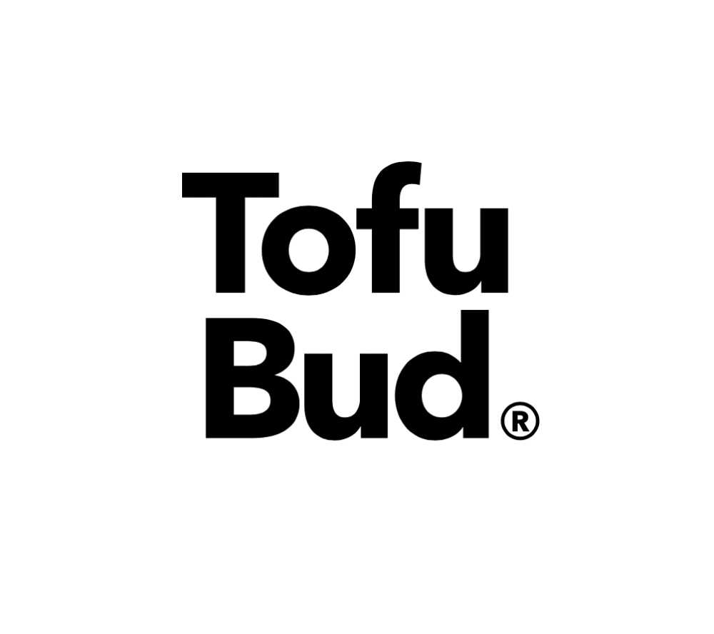
Which logo do you love more?
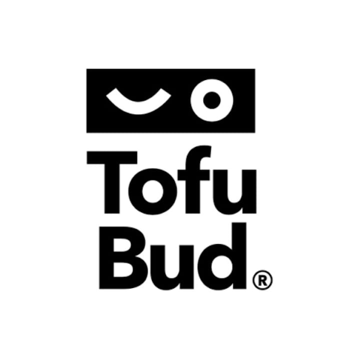
Option A won this Ranked poll with a final tally of 27 votes after 1 round of vote counting.
In a Ranked poll, respondents rank every option in order of preference. For example, when you test 6 options, each respondent orders their choices from first to sixth place.
PickFu requires a majority to win a Ranked poll. A majority winner differs from a plurality winner. A majority winner earns over 50% of the votes, whereas a plurality winner earns the most votes, regardless of winning percentage.
If an option does not earn a majority of votes, PickFu eliminates the option with the lowest number of votes. The votes from the eliminated option are reassigned based on each respondent’s next choice. This process continues in rounds until a majority winner emerges.
Scores reflect the percentage of total votes an option receives during the vote counting and indicate the relative preference of the respondents. If there is no majority winner, look to the scores to see how the options fared relative to one another.
| Option | Round 1 |
|---|---|
| A | 54% 27 votes |
| C | 24% 12 votes |
| B | 22% 11 votes |
27 Responses to Option A
the first one is so cute! i love it
I like the pictures above the text.
Cool logo, better than just the words alone
A is the most creative and stands out more. C is the 2nd one that stands out more, it's simple but bold. B is too basic in my opinion.
I think the logo with the Icon is more identifiable. It would be easier to remember or pick out. I like more compact logos that are boxy over longer horizontal logos better when using them at work. There are more places to use them.
#1 is just the most appealing one because it has the black on it and it draws your eyes into it more than the other two.
I liked the logo in Option A. I picked Option C over Option B because I liked the stacked name opposed to the one word.
I like the little black bar above the logo itself
i like the little smiley face on this one the best
I like the little logo at the top it gives it a little extra to stand out.
The logo sticks out and makes the product more memorable and unique in my opinion. I like it.
I liked choice A and the playful look of the logo. The other logos looked plain and basic and didn't do anything to get my interest. I like how choice A looks like robot face.
A looks more fun and interesting than the others, and gets my attention the most. I like the interesting graphic that goes with it. C, with the words separated and centered in the image, looks more attractive to me than B, which looks a little odd to me with the two words combined together.
I really like the bold logo and the vertical lettering. The last one I chose is very basic. I love the message and interested in the brand.
Option A was very unique, I loved the logo. I chose C as my second choice because it had some height, and a lot of modern logos don't have that. Overall, I love the minimalist design of the logo.
I really love Choice option A's logo. Also, choice option B reminds me of Budlight; which is fine and a nice play.
I still think the icons over the name is super cute. I think it is very attention getting and makes the brand seem really fun.
The way the letters where placed is how is decided here and if it caught my eye. I really think the vertical type lettering looks the best.
I like a because it’s different than the others. C is basic but it has a pretty interesting layout while b is just bland and a typical logo layout
I like the way the logo looks in this order. The first one is bold, I like it.
I like the logo best. It has more interaction feel. The next is the one word because it’s alike a new word and makes my brain work. The third option is just two words next to each other and requires no interaction
I choose A over B and C , because is was appealing to the eyes .
The logo above the brand name really gives the branding a lot of character. It feels somehow more relatable, like it has human like qualities. It makes the brand logo feel more friendly and that I can relate and want to do something with it. Option B makes it easier to process and comprehend the brand's name as it's a single line. Breaking it into two lines makes a mental pause that feels kind of like a stumble.
I think A is the best because the logo above the name is unique and gets your attention right away. I like B and C somewhat, but without the logo they don't really get my attention.
I like A bc it is more personal with the shapes. C is easiest to read from top to bottom and B is least easiest to read
I like the face, it is appealing and draws attention and makes it look substantial. I like the second becuae it is blocky and has substance. The third doesn't look like it would look great on a package, it doesnt stand out enough.
good and nice one
11 Responses to Option B
Option B is nice and clean. It's also very easy to read and modern so I would pick that way over the other two options. I don't mind the stacking of Option C if there isn't enough space for full width logo.
There are all nice really. The one I choose I liked just a little more. Thank you.
the simplistic font makes it really stand out compared to the rest
I prefer the logo as one word, it is simple but effective.It also looks good stacked on itself, but I feel the one word approach is the most memorable and effective. I don't really care for the illustration coupled with the logo.
B is more apt to be read as one contiguous word, "Tofubud." Separating these vertically is apt to be read as "tofu, bud." I don't like being called bud and I don't like the way the word sounds in general. A gets the second choice for the design at the top. C is very plain.
The simple choice is the best when it comes to logos. Option B is most straightforward and memorable.
Choice B with TofuBud is straight and to the point. The words are together and do not word wrap. Also without the logo it is not confusing as Choice A is.
Option B is the cleanest but I don't "love" any of them.
I feel that the font looks great with it being all on one space.
I will start by saying i do not like logo A at all I find the image above the name weird, is it someone winking or is it just shapes. It oddly reminds me of a logo from the 90s, so this would make it out of date as well. I like the simple logo of choice B but it need something more unless the package has color on it I do not like choice C either i think it makes its seem weird with bud on the bottom.
that weird spaghettio symbol doesn't make a lot of sense to me
12 Responses to Option C
I most enjoyed the boldness of C and the trademark too.
i like it very much
The weird graphic in A is just unclear. The square look of C is more memorable than the standard look of B.
the first is unique enough to stand out
My first choice is the clearest. You can understand that it's a combination of the words tofu and bud. My second pick also has the clear separation. I don't understand the graphic at all which is why I didn't pick it at first. My third choice is the words combined on one line which I think is confusing and many people would misinterpret it.
Option C because it is clean and simple, however it depends on what this product is to make a better decision.
simple and uncomplicated is my preference
I like the stacked look of the logo. I like the look of my second choice but I think my first choice would be easier and efficient.
The squared off logo in C reminds me of a block of tofu. Might play with lettering widths a bit more though, so the straight line on the u and the d line up on the right side. You could hide the trademark symbol inside the d.
it's bold and compartmentalized, not to long
simple, elegant and clean. I like the one with the a logo but have no idea what it is.
I like the square shape of the logo because it reminds me of those family name stamps in Asian countries that are used as a signature on important documents. I think A does not make sense to me because I don't understand the shapes meanings.
Explore who answered your poll
Analyze your results with demographic reports.
Demographics
Sorry, AI highlights are currently only available for polls created after February 28th.
We're working hard to bring AI to more polls, please check back soon.

