Poll results
Save to favorites
Add this poll to your saved list for easy reference.
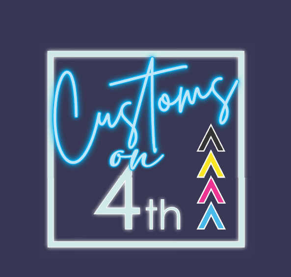
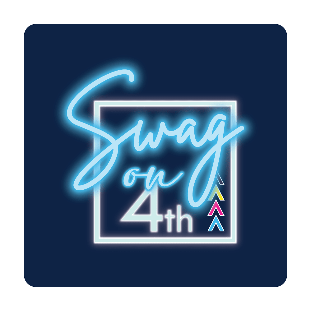
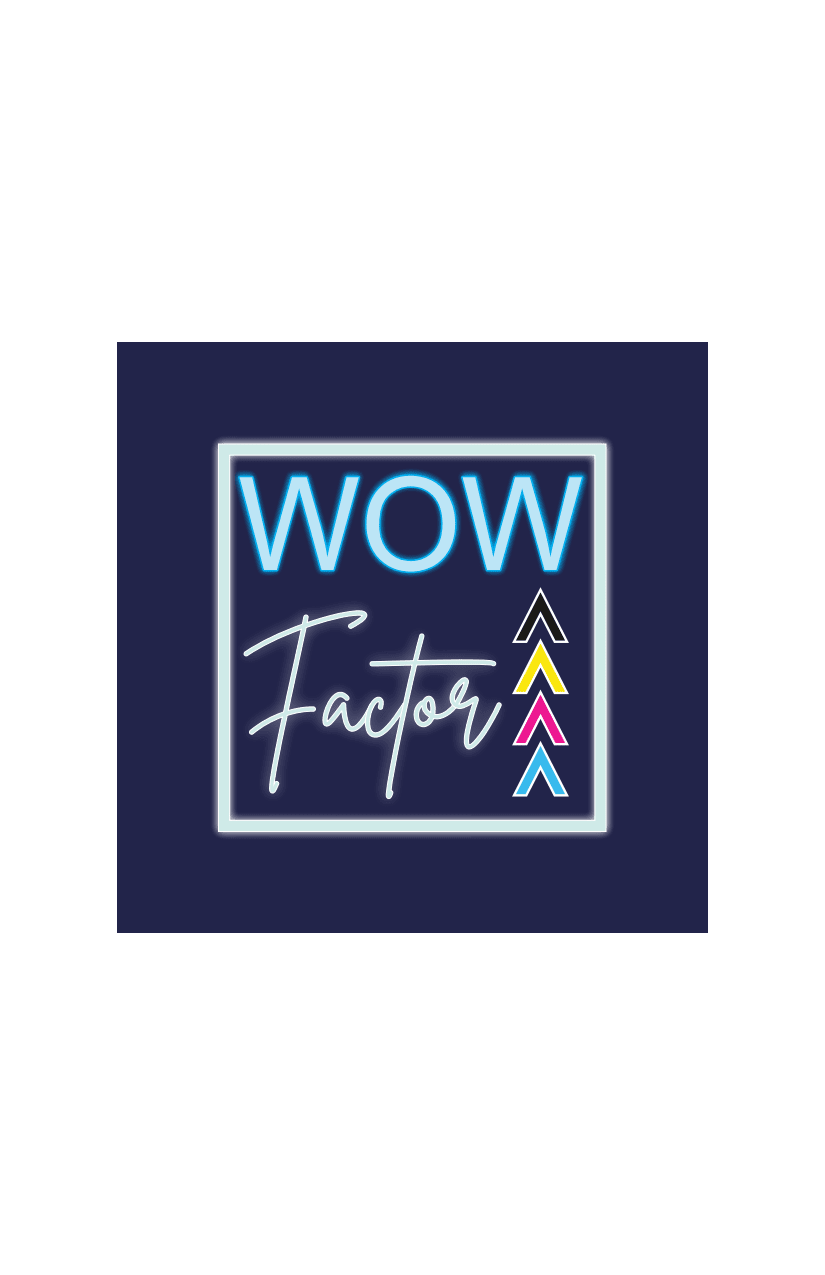
Which logo do you prefer for a business that sells Customized Promotional Products for Brands? The company will be printing and creating items like custom tee shirts, drink ware, electronics, hats, home goods, stress balls, pens, etc - to businesses.
Option B won this Ranked poll with a final tally of 109 votes after 2 rounds of votes counting.
In a Ranked poll, respondents rank every option in order of preference. For example, when you test 6 options, each respondent orders their choices from first to sixth place.
PickFu requires a majority to win a Ranked poll. A majority winner differs from a plurality winner. A majority winner earns over 50% of the votes, whereas a plurality winner earns the most votes, regardless of winning percentage.
If an option does not earn a majority of votes, PickFu eliminates the option with the lowest number of votes. The votes from the eliminated option are reassigned based on each respondent’s next choice. This process continues in rounds until a majority winner emerges.
Scores reflect the percentage of total votes an option receives during the vote counting and indicate the relative preference of the respondents. If there is no majority winner, look to the scores to see how the options fared relative to one another.
| Option | Round 1 | Round 2 |
|---|---|---|
| B | 39.5% 79 votes | 54.5% 109 votes +30 |
| A | 32% 64 votes | 45.5% 91 votes +27 |
| C | 28.5% 57 votes | Eliminated 57 votes reassigned |
Age range
Education level
Gender identity
Options
Personal income range
Racial or ethnic identity
Small business owners
64 Responses to Option A
This is the most appealing.
I picked A and B ass my top choices as I feel like the design feels very clean and attractive!
I really dislike the font in A and B, but hate "Wow" as part of a store name, so it's really a toss up.
I think that A would be the most fitting and descriptive to the brand itself. I also think B would be fitting but these days not everyone likes the word "swag"
I prefer the design in Option A mostly.
I prefer the words on A because it makes it more known that it deals in customized products. I like the simplicity of C. I think the "Swag on" on B has too much glow but overall has the best shape with the text and box.
Choice A is top since the word Custom is easy to imply custom made products. C is middle as Wow Factor is an eye catching name, although the business type is vague compared to A which already says Custom. B is hard to read, I can tell it says Swag but it took a few extra seconds for the font size.
That logo is colorful and customizing all of those items would be wonderful.
Option A is definitely the better of these, as if it's custom printings/etc. you do, that spells it out. Wow factor is kind of vague, and "Swag" is dated already and not as specific.
Looks a little 90’s ish. But I liked the custom piece.
A is more artistic and descriptive! It catches youe attention and is easy to remember
Overall I like "A" the best, but I like the blur on the writing of "B" better. I like the name "Wow Factor" but I like the other style of writing.
I like the colors on the side make the printing obvious but I don't really like any of the names.
I think A is stylish while still conveying the business idea. I enjoy the title of Wow Factor. Swag seems a bit too casual for my liking.
Gives a good idea of what the company is about
I think the name on option A is classier. It sounds like a place to go for good stuff.
I love A. Not only do I love this logo the most, but I love the way it says "custom" so I know I can get something tailor made.
I think the word "Customs" should be in the name because it fits the service.
I like option A because I like the way it looks and it says customs, so I think it fits the best. I like the way option B looks too. Option C doesn't look as good as the others.
Love the font and color choices on choice A a lot more compared to the other ones. Choice C is slightly smaller than A which made it less appealing and choice B just looks a little too plain.
I choose option A because it is straight forward to what you are trying to market.
I really like the color scheme and how bright this one is. I think this company would produce quality products.
Option A does the best job in explaining what the services of the company actually are, so I would select option A.
I like the words on A and B and the color
I like the "customs on 4th" name along with the design, but it looks slightly washed out. I like the wow factor one because it doesn't look washed out.
Deciding what design I liked better and prefered for a logo was easy. I choose A, then B and lastly C. I thought A was very fitting. Whereas the other two options not so much. I didn't like B for it. And I definitely didn't like C for it.
I like choice A the most because it's the most descriptive of what the business will offer. I'm not a huge fan of the overall design of any of the 3 options, but that's my favorite. 'Wow Factor' is hard to determine what's being advertised. Choice B is my least favorite just because it's kind of using a buzzword that is a little bit corny when used in this aspect.
Option A has the perfect balance of flash and really sticks out there. Option C is not as flashy, but it's really easy to read and understand. Option B is just a little overwhelming and hard to read.
A sounds the best to me and it I like the word customs in it as it helps explain better. B is my next choice and C just doesn't sound right to me.
I chose option A because I think "Customs on 4th" is the most versatile, classic-sounding name.
I like A best because they are custom made. I prefer the name of C next but I love the font used in B. I'm not a fan of the word swag.
I would rank B last because swag is an outdated word. Option A sounds more high quality.
anything with the word "swag" in it automatically turns me off. Option A is classy and simple and I feel like it wont be geared at frat boys
A because the format looks highly informative and harmonious with what it tries to represent
I definitely think A is the strongest. It sounds the best compared to the other two options which sound too low-effort in my opinion.
A is best custom in the name implies a personal touch that you get whatever you want.
"Customs on 4th" is my favorite phrase but its initially, briefly hard to read and I wish it had much more of a glow. "Swag on 4th" is also catchy but not as catchy as the first one. "Wow factor" is just cheesy.
Option A emphasizes the customization. Option B has a similar design with the neon font, but the word Swag is not as good. Option C doesn't describe the products and lacks the interesting neon font
It's not really SWAG and the WOW FACTOR is ok, but Option A is the only one to use the term CUSTOM, so I'd stick with this!
A seems the best of the three although the name is nothing special. However, the arrow logo is nice. Swag on 4th is just o.k. too and Wow Factor is common and overused.
The cursive font really adds a lot of style, and Option A is the only one I can both take serious, and expect to give me trendy and interesting look stuff. Option B makes it sound immature, and Option C makes it sound dated.
A's formatting and title is clearer and formatting is prettier. B- The name flows better and has ice formatting. C-I am not as interested in the name. The font for Wow is not as nice.
I think this is the best choice for a company that produces custom materials because the name "custom" is right in the company name. The word "swag" doesn't necessarily mean that the product will be customized.
I like option A because it's more professional. Swag is too trendy to me.
I like option A the most it was catchy and had a nice design to go with it.
I like option A because it very accurately describes what the business is for.
Customs on 4th sound like the best name. Swag standing out of the square doesn't look near as uniformed. Whereas customs give me the idea that you have the whole package in a nice convenient box. The wow factor option leaves... well... the wow... to be factored in it somewhere. Looks pretty boring when compared to the other two. When I think neon lights I think cursive lettering. If it were individual light bulbs with like 20 of them per letter than that would make the wow stand out better than the neon coloring.
I selected the logos that I found to be the most visually appealing, eye catching and professional looking.
Do not like any of these they're ugly
A says exactly what a customer could expect to buy as well as a general location. It's perfect.
I like option A the best. I really like the colors of the logo. it is very eye catching. I like the term customs also
"Customs" really gives me a feel for what the company does-- the other names don't ring a great bell with me.
I love the "Customs on 4th". It looks trendy and up to date, can cover a lot of different marketing territory as well. I don't like the "Swag" option because I feel like the word isn't used right anymore. It's a little dated, my 71 year old dad uses it as do baseball sportscasters.
This name matches what their company will be doing the best and it is easy to remember.
I personally feel that putting "swag" in your logo is off putting. The customs one shows your area and what you do. The second is decent but it feels a little bland without the neon effect.
I picked A because the name is provocative.
I prefer option A because the word customs is on it which helps promote what the company does.
To me, A is the best brand name for a business that sells Customized Promotional Products for Brands. I think having "Customs" in the name is important to get the message of this brand across. I find C to be a decent name as well, though it doesn't automatically tell me what the business does. I do not like B, because I think "Swag" is a bit cliche.
"Customs" tells me what to expect, though I'm not sure what the 4th is about. If it's on 4th street or there's some purpose for it, that's fine.
The 'on 4th' names are definitely the stronger logos of the two types shown here, I find numbers to be more memorable than words. Out of those two, I prefer A the most. It explains what the company does, and is more professional, which I think is important since you'll be dealing directly with commercial entities. Personally, I wouldn't go into a high-stakes deal with anyone saying 'swag' seriously, or any slang terns.
I really like option A the best. Both the name of the company and the logo. It's a great fit.
The picture in this option is very much appealing to me. So that I selected the option.
I think Customs on 4th sounds good and has a nice ring to it. It sounds like something I would want to check out.
The word "Swag" is something I wouldn't want to use being an adult. That's why Option B is last. Option A is a good blend between having a simple yet effective name.
79 Responses to Option B
B I feel is the only one that I feel is able to draw my interest with its style design.
The font/color used for "Swag" is very eye catching and appealing. I like this design the most and this name the most. "Swag" makes sense for the type of company as well.
It is hard to read the cursive font is hard to read so I choose the easiest to read option because 'wow' is easy to read.
All of these logos give me the impression that the company will have low quality products based on the bad logos. Perhaps they should hire a designer instead of DIY in Canva?
I like the brightness of option B and I like the word swag, it is easy to remember.
I ranked my choices from favorite to least favorite design. I also like the term swag best as it makes it seem cool.
I prefer Option B because it sounds the coolest, the hippest and the most retro. I relate to it the most.
I chose option B because I like the lit up SWAG. It really caught my attention and was easy to read and presented nicely. Option C was not as flashy to me and more simple but it was better than option A which I could hardly read the main heading.
I don't like any of these logos. They have too many contrasting elements that also make them unattractive in a conflicting way. I can't tell if the business is Swag on 4th or Customs on 4th. I have no idea what those up arrows are supposed to represent.
Swag is a word that I would use for this stuff, so I like B. I think “on the 4th” sounds cool too. I feel like there is a story behind it
I like the logo in option B because it looks the most exciting and interesting. Option A looks quite delightful too. Option C is my least favorite overall.
overall i like option B i think that it has a more straightforward and easy to understand design
I like the "swag" part, it's reminiscence of buying new stuff to memorialize a place you like.
I like B's deminsions the best but prefer the wording of A
Swag on 4th and Wow Factor grab my eye immediately. They feel a bit more hip.
option B seems to be the most modern and I like the use of the word "swag"
I like swag because it reminds me of swag bags which contain some of the types of items that will be printed here.
I like the curly handwriting as it seems classier, and it going outside the borders of the box makes it seem more dynamic
I love the bright blue bold font.
Option B was very attractive and very worm than Option A and Option C
I like the "on fourth" tag, and "swag" is a great word. B is the best.
I really like the style of choice B and the retro feel it has.
The options with bold bright blue font really stood out to me. The blue font was the weakest in C and it was brightest and thickest in B.
the first one is the easiest thing to read because the arrows blend behind rather than 3 which its the focal point. 2 is not bad, but they are a bit bright also.
Option B is the most unique in this kind of business.
I like option B the best because I think most people would associate the name with something promotional related due to having Swag in the name.
I really like the one I voted #1 and the two others are pretty mid to me.
Option B is the best as the rounded corners give it a nice aesthetic, and also the background blue is a nicer color. Option C is bad as it kind of generic, and option A has a bad background color/
Option B is the best because the image is very well designed with attractive colors and font.
I like all these but I prefer Option B the best. Swag is a good term to use currently and is very socially acceptable.
I went with option b because the logo seemed very simple yet very easy on the eyes
I like the word "swag" in regards to what this company is trying to do.
this looks the most high class and sophisticated of the options
Swag has the best ring to it.
I like option B the best because I think that it has the most interesting, eye-catching, and visually appealing logo design out of the three options.
B "Swag on 4th" is so catchy and clever! I love that phrase! I would 100% buy a t shirt or coffee mug of that!
Swag seems the most unique and I like the use of of the cursive writing
I chose in this order by how catchy the names were. I really like swag it sounds hip
I think option B is most relevant to the products that will be offered and I also think it is the catchiest name.
Option B gives me the impression that they would be good at customization when I look at their logo. This logo stands out the most and is designed well enough that I think they would provide the best service.
B i like the wording and the logo font and design quite a bit, A is good too but i don't like the font as much, C is ok but seems a bit basic
I like this option because the design and text is bold and easy to identify amongst the other options.
Since you want to be seen and come off as creative, I really like B and A because of the light glow around your words. B is the best P feel because it just pops for me and I love how easy it is to read also
I really like the neon looking text and the glow it has with B, it stands out really well and is clean and crisp looking with a high quality looking polish. It would also be a neat logo for the company sign if they had a building to display it on.
The first combination of thoughts that I chose looks the best for such a service and product
My generation loves swag and will remember something that mentions swag. There is no comparison
Swag sounds better, like getting free stuff
I selected "Option B" as my first choice because I feel that of the three logo's this one is the most unique. The glowing font and the dark blue backgroud look good together. Also the term "swag" seems very appropriate.I selected "Option C" as my second choice because I like the color scheme and the symmetry of the design.I selected "Option A" as my last choice because the colors seem dull in comparison to the other two logos, and I dislike the the off center alignment.
Option B looks the most like the neon
The design on B is creative and appealing which conveys the key idea behind the service for customers. The swirling characters creates some mesmerizing feelings.
I think if I were choosing a logo or design company, I'd focus on their design first. I think B looks the nicest and cleanest of the designs. The colors are the nicest and "pop." C is the most similar to B. A, however, looks a little more plain and boring.
The logo I prefer for a business that sells Customized Promotional Products for Brands is Option B. I think the name on this logo is catchy. I would change the glow on the word "Swag" to the level of glow on "Customs on" in Option A. The glow is a bit too much in Option B but other than that I like this design. Option A would be my second option in terms of the words and Option C my least favorite. Option C isn't as catchy in terms of design and wording as in Option B and Option A.
The Wow Factor has this weird font for factor that makes it really hard to read. I ranked it last because of that factor. First, I ranked the Swag design, because I really like the term swag, and I think it's eye catching. For that reason, I ranked it first! It was also very legible compared to option C, for example.
The first choice, containing the word "swag" is the only choice which gives me any clue as to what this business is about as the word is recognizable.
a easy to read and glitzy, A too hard to read customs, c is ugly no wow factor even though it says wow
Having the word Swag in the logo helps to understand what the company produces
I think option B is attractive and the logo design is unique. option A conveys the message that the products are customized. Option C seems like a normal logo.
I think that option b makes the best use of space without overcrowding the design.
I would choose B, Swag on 4th, it sounds catchy and the product is personalized swag, so it fits, my next choice would be C, The wow factor, because I hope the products wow my clients, and A is okay, it just doesn't give much detail, seems almost generic for a company doing personalized products,
B is my top choice because the usage of "swag" is most consistent with the branding and the colors and font are the best. A also shares nearly the same colors and font but I really do not like the usage of "customs." C is my least favorite and looks and sounds juvenile, not to mention the font looks low-effort.
I think B looks the best out of the options. The name is not very good though. A has a better name but it's kinda generic all around. With C name is good but design is meh.
I ranked based on design and name
Option B is the most appealing overall, The logo draws in attention with its color scheme, and transitions well. Its easy to read, and looks more modern, compared to the other choices.
The cursive font of options B and A are very attractive to me. They give off nice chill vibes.
The swag on 4th name is very hip and authentic which I find work the best for the business in question. Furthermore, the overall design of the logo is the coolest out of the picks.
Option B: The work "Swag" makes more sense and sounds very attractive.Option C: The title looks very attractive and does not have the number "4" which did not sound very meaningful.Option A: Customs reminded me of airport custom duty on products.
The vibrant coloring of option B is cool and stands out very well. Option A is good also, the color vibrancy really sells the logo.
I picked B for the Swag logo and feel that will let customers know that there are a variety of items that will be available from the company. I picked A for the Customs logo and thought that this would be a good logo to show that the company would have a variety of items. I picked C because of the Wow logo and thought it was a good logo and would also be a memorable one for the company.
I like using the word swag in the design. Swag is hip and makes the brand look cooler.
The swag wording with the text outside the box makes it stand out the most. Looks good. The "wow" factor just looks too... lame and memelike.
The word swag looks and sounds good.
I prefer the name of options B and A and think that they are more unique and interesting compared to option C. AS for the logos I think that option B has the nicest and coolest design making me think the products them make will be as high in quality.
The text/font in choice B lights up and stands out drawing you into the image.
I think you need something that really stands out, and the 'glow' effect on Option B really does this, and while not as notable Option A is fine in this regard. Ironically enough, Option C doesn't have much of a 'wow factor' as far as I'm concerned, so I wouldn't go with that choice.
Option B is best because "Swag on the 4th" is a unique, fun name. I also like the readability of option C. Option A is the worst because it is hard to read the writing.
Its the least corny one, short and sweet. It looks pretty good and i just like the way it flows together.
I picked Option B as my #1 choice because I think "Swag on Fourth" is the catchiest name and does make you think of a customized product company without directly saying it. I think the neon lights are a good touch. I picked Option A as my #2 choice. I don't like the name as much, but it's also a good name and gets to the point of what they sell. I like that it also has a neon lights look even if it's more subdued. I picked Option C as my #3 choice. I think "wow factor" is a little too vague. And the design isn't flashy enough.
I like how the name looks like it was made with neon lights in option B and A. I also like how the art isn't confined to the box in option B. These aspects make me think their products will look just as cool.
This is the order in which they grabbed my attention.
57 Responses to Option C
These logos are the strongest in terms of what they present
I have no idea what the word on the top of A even says. C and B are at least readable. Though "Factor" in C is a little hard to read. I don't like how Swag goes out of the box in B.
I like C the most. I think that with this font, this is the only one that I can easily read
C is the clearest and easiest to read. The glowing of A and B are a bit distracting. All logos are a bit amateurish.
I like the wow factor - it also was the easiest to read - for choice A - I could barely read with the font - it was terrible
It's easiest to read and see from a distance.
I like the name the most. It speaks to a business because that’s what they are all looking for.
The designs that are elegant with unique, charming colors are appropriate for the described business. I feel these logos sell the brand rather effectively and as long as their design isn't too intricate, they're suitable for marketing.
I like the name for C and B better than A.
wow factor draws my attention more than the other two names and logos.
I had a hard time deciding between C and A for my number one choice. I chose C first because I like the design better, but I liked the text in A better. I thought that text best describes what the products/services that they provide. I wasn't a fan of the graphics and colors on A and B. B is last because I like the graphics the least and the text was the least descriptive of the products.
I can't explain how much I hate the word 'swag' so I knew B was going to be voted last. I felt like C was the safest choice that caused me to cringe the least amount.
I like the plain text style of the first word on option C. A and B feel like they are trying a bit hard and it just distracts you eyes.
The wow factor lettering brings out the position, theme, brand name sense of what the company wants to look for in businesses that want to use them and the sole purpose of using them for their own marketing and branding projects.
Wow factor is a cuter than. The other options are more catchy
I like Wow Factor (C) its a very impressive name. B(Swag on 4th) is very modern and hip. I dont really like customs on 4th it seems pretty generic.
I have had my doubts.I prefer the WOW. Give an idea that the company is great
I like the logo in Option C the best because the text "Wow Factor" convinces me that the company is able to amaze me with their custom designs.
I really like C. It sticks with me. B is fine. A isn't easy to read.
I don't really get the "on 4th" reference.
Wow factor sounds best to me so I chose Option C, followed by Swag on 4th. I don't really like the other two options much because they don't roll off the tongue like Wow Factor does, however I do like the word Swag because that's the products being sold.
I think C is the best option because it communicates well what the business does while also having a unique and original sounding name. A is a decent option as well in this regard. B doesn't really convey to me the customized nature of the service.
C is my favorite style and design!
I prefer the option C logo because the wow factor is a much more appealing and interesting brand name than all the other options. I chose option B second because swag on fourth also sounds very appealing for a customized promotional product brand. I chose option A last because this brand name repeats the customized product brand on fourth, which is remembered easily.
I like "wow factor" better than the on fourth titles, but between the two on fourth options, B is much easier to read in terms of design/layout -- A is slightly more "squashed" together and harder to understand at first.
Option C conveys what I think the vendor would like to say
I prefer the wow factor. Business promotion is likely the main customer for this and they are looking for the wow factor for their business. Great name!
That (Wow Factor) is far better name, that's entirely the reason. This describes the product and the production If name is not the point here I like this order; B,A, C.
Wow is the only one that looks good. The other words are too "hpstery"
I like the one I voted first by far the best.
I think the "wow factor" one is the easiest to read. The Swag one looks nice and flashy, though. The Customs on is a little hard to read.
Option C is best.
I voted for C because I think "Wow Factor" is the catchiest name. I placed B last because I dislike the word "swag." I placed A in the middle because it is a bit less catchy than C.
C I think looks and sounds good and it all meshes perfectly. I like it a lot . A is also good but I think C is a lot better B is already kind of dated
Logo C looks the best for a business that sells Customized Promotional Products for Brands.
I personally didn't like the heavy glow in either Option A or Option B. The text in Option C was the easiest to read, and the glow in Option C is the least blurry of the three options. I like the phrase in Option C the most of the three options. I like the phrase in Option B the least of the three options. While I liked Option A, the white glow and the distorted cut in the image in both the "4" and the outer white box really detract from the quality of the logo.
I prefer C. Firstly, B and A are a bit of a chore to read. Plus, I like the Wow Factor angle -- it ties perfectly into the business theme.
I find this one less flashy which I prefer. It does showcase it's design without going overboard.
C - I liked the WOW word. A - Customs was as OK word. Swag I didn't like.
Option C is easiest to read. That's really the top reason why I like it best. And who doesn't like the word WOW? Option B, Swag on 4th would have been my first choice, but I didn't like that the word ON was in the same format as the word SWAG. It would have been easier to read if only the word SWAG was in the format it's in. I feel the same about Option A. It's just too hard to read and decipher!
I prefer otion C because you can see the name and graphics more clearly than the other two logos. If the other two logos did not have the lighted name across the graphic it would work, the light shines to brightly over the worded part of the logo.
It is bold and has impact
I prefer the wow facter. I think it is a sharp looking logo. The other two were just okay for me. I was confused by the 4th.
The words are clear, legible and don't go over the top of other elements of the logo. This makes it clear with it still being a cool logo.
Option C is much easier to read, and get the message from - than the other two, which have difficult fonts in comparison.
I find the large blue cursive elements hard to read so prefer C.
Option "C": At some level this logo/name comes off as a brag that the reader wants to verify, making it an intersting and a mutil level meaning to the phrase.
I chose the one that i felt was not only easiest to read but overall the logo looked cleaniner
I like Wow Factor and I don’t really get the 4th part of A and B. I prefer the custom wording on A compared to Swag in B.
I would pick option C first because of the use of the words "WOW factor" since the business works with images people are going to want that wow factor to promote their products. My second choice would be option A because of the use of the font and the word customs. My last choice would be option B because the term Swag has died out in the past few years.
I liked C the best because it was the easiest to read and felt the most professional. A was my next choice because I liked the writing inside the box instead of partially outside the box in B.
The relevance of 4th is N t known. Option C seems very apt and is easy to connect with the brands attempt to say that they bring the Wow factor to the customer.The word Swag is sure to get the attention, after the phrase "Wow factor", so it is second in my list. 4th Customs , in Option A is last. It does not explain the relevance of "4th".Hence the ranking of C/B/A.
Wow Factor best gets to the heart of it. Swag got last place for me because it's a corny bit of slang.
C is the best because it is unassociated while b is not as associated as C
I like Wow Factor because that is what I'm looking for when I purchase branded swag.
I liked the WOW the best because the sign isn't blurry or over the top. I like the idea of "SWAG" second. The third one I found difficult to read.
I love this logo for the colors. The colors are appealing and make the business look fun. The logo is not as impressive but the fonts work well. The arrows are appropriate if the shop is up. The fonts seem fun but they are not well designed. The choice B is also nice and the colors, fonts and design work well but could be better placed.
Explore who answered your poll
Analyze your results with demographic reports.
Demographics
Sorry, AI highlights are currently only available for polls created after February 28th.
We're working hard to bring AI to more polls, please check back soon.

