Poll results
Save to favorites
Add this poll to your saved list for easy reference.
Which logo do you prefer for a product that [does this function]?

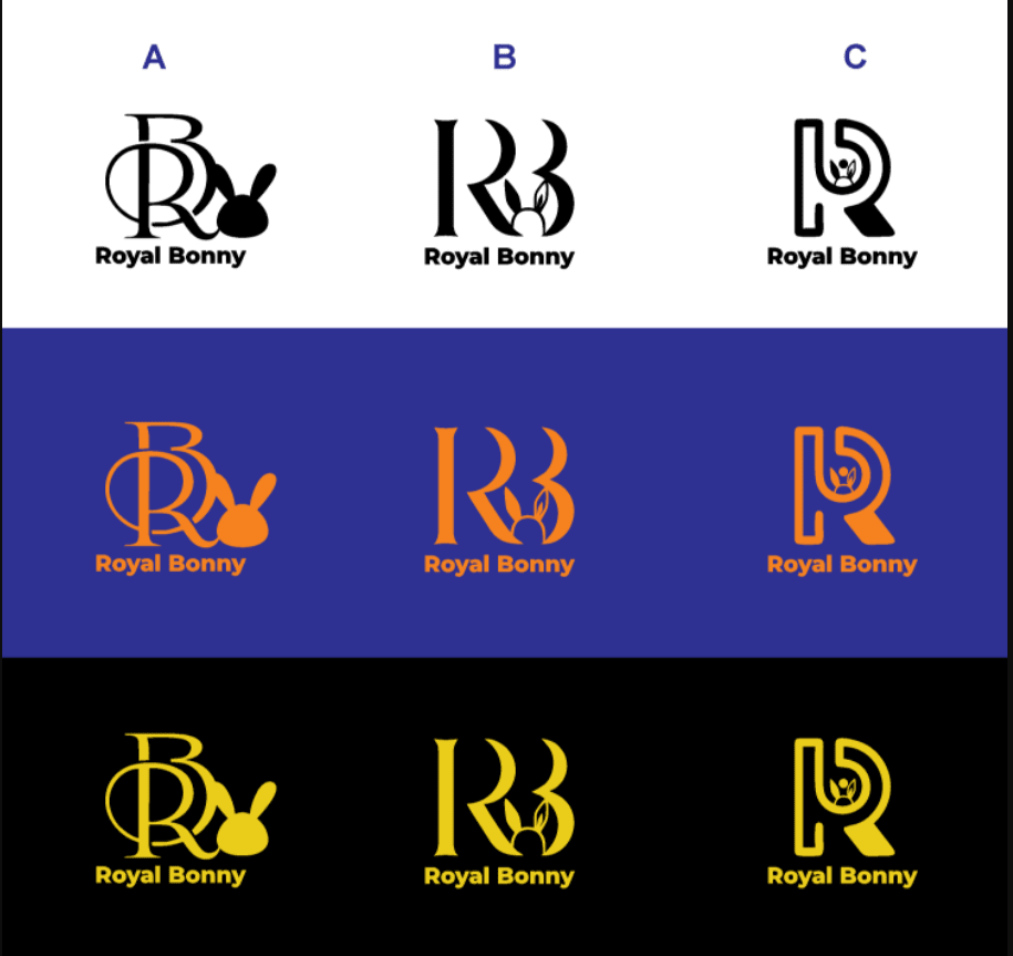
55 Responses to Option A
The logo choice of B in the middle is good for this instance here, maybe in the blue and orange this works for it.
I liked A since it looked really loopy and whimsical in terms of the font. The white and black option was easiest to see.
I love option A more because this style of logo is more fitting for what the name of this company is and it is more aesthetically pleasing.
These are the same and "[does this function]" makes me curious. Regardless, I find the logo options slightly derivative.
Choice A is more visually appealing.
I prefer A over B. I didn't notice much difference. But I was thinking it was the first image I looked at.
Option A is the best because the image is well designed and colorful.
I like option A the best because I like the solid colored bunny and ears, which is a good play on the Bonny name.
I think A is really unique!
OPTIONA I really like the label especially the black one and the first one in that category
Choice A is my favorite option. I like the logo design of the R/B and the design of the bunny with the color black, so I like this option the most.
The lettering seems more petite
I think the lighter background suits the logo more.
They are literally identical in every aspect. They are both sophisticated and smart looking with a elegant color palette that makes a statement.
It depends on the type of product. I really like the A logo, but the C is really cute. I don't like the B one in the images because it's too empty at the top.
I prefer the icons in column B here - they seem the most professionally done. The icons in column A look too much like the Playboy Bunny graphic, and the icons in column C don't really show the bunny at all.
I prefer the option A logo because I like the larger black bunny ears and the more regal font style of the letters that integrated as one unit in this option A logo the most.
I like the black middle option the best. I don't care for the options that have full bunny ears. The outline looks better to me.
It's subtle but I like these colors best.
I like A because it’s very elegant and eye catching, plus it distinctly has the R and B whereas the other two don’t.
Honestly, A and B look identical to me (I looked VERY hard for any differences) and I chose A because it comes first alphabetically. But of the various images/logos seen ON these sets, I am most drawn to the first image in the middle row (the gold against purple, with the fully colored bunny head).
I like the "A" logos with the bunny silhouette best. As for the color schemes, I think the orange and blue ones are more unique.
I don't see any difference between these two options.
I like option A in the black because it looks high end.
I like how the R and B are combined together in column A, it looks very professional and well done!
I would prefer Option A because I think the design looks better in this image.
If there is a difference between the two photos, I did not see it. If you are asking, which column do I like better, I think I like column B. Not sure why, but that is where my eye is drawn. If there is also a color I need to chose, I like the orange on blue.
I am unaware of the difference between set A and set B
I like C because it’s more modern.
I think this option is clear and easy to read. I feel that A is the nicest looking one out of the possible options given in this image.
I like option A in the black and yellow, the colors work awesome together.
They pretty much look the same to me, but I do like A. The colors are crisp and powerful and make quite the statement.
I like the black and gold the best. It seems regal to me. Or having to do with royalty.
I think A is just the best cause it has the bunny head
I have to be honest. They are so similar I can barely tell the difference. Neither one of them stands out
The description for the type of product was left blank but just at a glance this logo set appears to be more prestigious and higher quality and established.
i prefer the logo in option A because the logos look more professional to me
While I don't see any difference between the two options, nor is there an example/description of what the product may be, what I personally think of the logo options are good, I like the swirly RB Option on the far left, but I think I would like it combined with the "Bonny" (Bunny) on the middle option. Thanks!
It Looks Some Impressive
Option A column A of the solid filled bunny makes it look more complete and the company stops at nothing to deliver the best.
I like the look for option B in the middle with the fancy logo. That is a nice feel for a "royal" look. I think that looks best of the images shown here.
I liked choice A and option A inside of it. Option A has a more clean look which is easy to focus on compared to some which has a lot of variation of color inside the logo.
I think A looks best. It’s readable and cute which I like.
I like the A row. It's fancy and cute looking.
Both logo sets look exactly the same to me. I don't think there's a difference between them.
I really like the black and yellow options. I think that it makes the name pop and catches my attention.
I prefer the blue and orange color scheme, which looks striking and classy. Very cool for sure!
Option "A": Column "B" contains the most readable and memorable of all the logos shown; it would be visuible across multiple media types. I wish I knew what the company made/did.
Both options are the exact same image, I don't have a preference between the two
I like A because the bunny graphic is larger.
I like the options where "R" and "B" are side by side.
I prefer the logo design of option A. It looks more sleek.
I liked the r that had thr bunny inside.
I do not see a difference between option A and B. For the logos I like logo A the best. I like the cursive letters and the simple bunny image, simple and elegant.
I like the font of option A. The question doesn’t say the function of the logo
45 Responses to Option B
These are so very similar but I like option A in panel B. I think it stands out well and looks great.
I would pick choice B. I prefer the gold and black logos. I think they look more sophisticated and trendy with those colors.
They look essentially the same.
I would go with option B because to me it looks more bold and memorable to me. Option A does not feel quite as charming to me.
Honestly, the pictures look the exact same. Neither would sway me either way.
B really looks to be eye catching , plus it looks just like A, that seem to have the same image!
I chose option B because I thought the color shades in that option were slightly more vibrant and eye-catching.
these look identical to me. what is the difference? I like both
I'm not sure what the product does, and the options look identical to each other.
I do not see much of a difference, nor is it clear what the company does. So either is fine.
I voted for B because I felt that this reflected higher quality and would allow me to reflect my personality and how I would want to give an impression to others.
They are the same design therefore there is not preference
I like the logo labeled C in this image most of all. It's easy to look at and looks like an actual logo.
Which logo do you prefer for a product that [does this function]?It was very hard for me to distinguish any differences between these two images and I wish I knew what the function of this product was. Having said that, I like option B here and I like the column A with the bunny head next to the fancy letters.
Couldn't spot much differences between the two, to be honest.
the thinner font feels more classic and higher quality. A feels the printer is not working properly
I think option B on the white background looks the most classy and the fanciest too
I would choose choice B because it seems to be more clear and it is precise as compared to choice A which is not that much precise.
It looks more polished and refined. It has my interest.
This was a coin toss as both looked the same to me.
I like B. It looks classy while looking modern as well.
The difference between both logos are extremely slim, I would prefer option B since there really isn't a difference between the two, it would not matter much to a consumer.
Option A logo works the best. The R and B fonts works well with the name, Royal Bonny. The bunny also works well and I like that the tail of the bunny forms part of the R.
I have no idea what thebproduct is I'm afraid. This logo option s3enw a bit less confusing though
The designs in column A look the best as the bunny is clearly defined and a stand out
I prefer option B it just seems like that’s where my eye went to first
These designs are appealing and similar to each other. It is somewhat difficult to select a logo that suits the product more effectively.
Having the Bunny ears stand out more makes it look like a real logo. It's right to the point
B is the design that stood out the most to me, this was more eye catching and interesting
There is a very slim difference in both, they look really nice lettering I went with option B
Looks sleek without being overbearing.
I like b out of the choices.
I like the design of the B version of the RB and I think that it stands out more and is easier to catch one's attention.
This one appears to be sharper. It is easier to see the image more clearly.
I find the design in the B column with purple background really looks pleasant and appealing as the logo stands out and catches my eye.
I prefer B. It seems more functional. Seeing both the initials of the Company and the bunny ears within the B seems most appropriate.
Both options looked largely the same. As far as choice, I think the logos in row B were the best. They had a good design while also being clear and eye-catching.
I am not certain what this function is, i do like option B
I prefer this logo show in Option B because it would print better and the design is more compelling and engaging overall.
The one I like is the middle column that appears in both A and B. I feel like the simplicity and clarity of the design really makes it stand out.
The question said "does that function" but did not describe the specific function. I chose Option b / Column B because to me it looked a good combination of the most professional, easy to read, cute and modern. Option C seemed a little strange and hard to understand. Option A was too much for me.
It could be either one...they are the same..
I like the black and gold color and I like the option B and row B. I think the ones in row A are too fancy and C is hard to make out what is in the image.
I picked Option B just to pick one. The images look exactly the same to me and I can't tell what the product could be. I do like the looks of the first black and yellow one because that fits with the Royal image.
This product is very color and beautiful to logo in design in royal bonny in very good brand and the good product interesting the attrative product in logo
Explore who answered your poll
Analyze your results with demographic reports.
Demographics
Sorry, AI highlights are currently only available for polls created after February 28th.
We're working hard to bring AI to more polls, please check back soon.

