Poll results
Save to favorites
Add this poll to your saved list for easy reference.
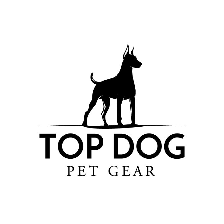
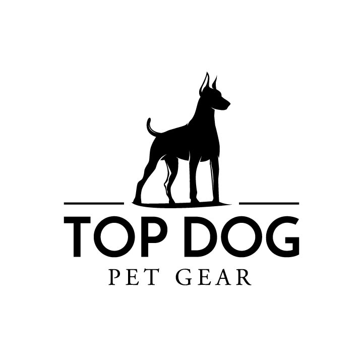
Which logo do you prefer for a product that makes premium travel bags and many other accessories for dogs.
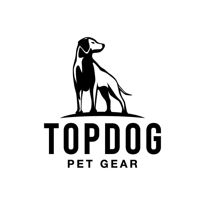
Option A won this Ranked poll with a final tally of 32 votes after 1 round of vote counting.
In a Ranked poll, respondents rank every option in order of preference. For example, when you test 6 options, each respondent orders their choices from first to sixth place.
PickFu requires a majority to win a Ranked poll. A majority winner differs from a plurality winner. A majority winner earns over 50% of the votes, whereas a plurality winner earns the most votes, regardless of winning percentage.
If an option does not earn a majority of votes, PickFu eliminates the option with the lowest number of votes. The votes from the eliminated option are reassigned based on each respondent’s next choice. This process continues in rounds until a majority winner emerges.
Scores reflect the percentage of total votes an option receives during the vote counting and indicate the relative preference of the respondents. If there is no majority winner, look to the scores to see how the options fared relative to one another.
| Option | Round 1 |
|---|---|
| A | 64% 32 votes |
| B | 18% 9 votes |
| C | 18% 9 votes |
Age range
Dog owner
Education level
Gender identity
Homeownership
Options
Personal income range
Racial or ethnic identity
Relationship status
Travel frequency
32 Responses to Option A
I like option A the best because I think the graphic is more attractive for the products it is representing.
I like the dog in option A because he looks a little more relaxed than the dogs in option B and C.
My answer was fully and completely option A. The dog, it’s stance and the fill options all ranked highest.
The dog in A stands out more. B and C are very similar.
The down earned dog feels less aggressive (there can be connotations with the doberman type dogs, which are in the other two logos). Following that, I like #2 because the logo has a continuous line the dog is standing on, with #3 only being 3rd because of the line breaks.
Option A is the best because b and c use the doberman. The pinched ears and tail is now regarded as inhumane and cruel. Might not resonate well with animal owners.
It's like the kind of dog and option is a lot more common, I've never seen the dog like in option b and option c in real life
I prefer the logo shown in A the most of these, it's a cute dog in the logo and I do not think of a doberman as being a pleasant animal for a logo.
I liked choice A since it is highly detailed and the dog looks confident. Choice C looks too simple and not as eye catching which isn't appealing to look at.
I like the bolder lettering with the shadowing of the dog it makes it a attention grabber
Option a has the cutest dog in its logo. I like the font as well.
Option A was my top choice because I felt the dog in the image was common and safe. It felt like a breed that most could relate to and would catch the eyes of someone looking for premium travel bags. Option B is definitely a Top Dog type breed, but I didn't find it to be relatable to most dog owners. I picked Option C last because of the reason I didn't like B, but I also didn't like the way the "ground" under the dog was broken up.
I like how a adds more detail to the dog. Has a more finished look.
I like option A the best because I like the type of dog shown and I like the bold lettering better than the images and lettering shown in the other two options.
I like A because the dog looks a little more generic. A lot of people could see their dog in this logo and it would influence them to buy the product.
I like the font of a better. B and c are pretty much the same
I liked A the best because the logo is most eye catching. It has nice font and clean organic lines. The visual details in the dog are just detailed enough and simplistic. I liked C second because though there isn't much difference between C and B, the underline which grounds the dog in option C is better. It uses symmetrical lines that frame the dog best and make the brand logo look more deliberate and classy.
My first pick was more due to the logo and font both - the logo was the first pick. The other two were close picks - but my first is hands down #1
The dog is standing on top of something in the logo A, in B and C the dog is on a flat surface, not "on top". Option B and C: there is an impression that the dog is looking back, not forward, especially when I look at the tail of both dogs.
option a has a more outdoors/natural feel. the other two depict a dog with it's ears cropped which some see as animal cruelty and/or unnecessary.
I prefer option A simply because the dog looks more like a friendly dog, rather than a mean or a guard dog.
I love the picture of the dog with the floppy ears the best. Choice C and B the ears are pointy and aggressive looking. I like choice A a lot better than the other two choices.
Option A is a really cool logo. It really stands out. Great logo art. Option A is easily my favorite of the bunch.
A seems most like a real dog
This logo A is bold enough and trust worthy.
Option A. This option has the logo in thick bold black lines which is easily seen and visible. Your eyes are drawn to the logo and the dog standing astride of the logo
In choice A, there's actually some detail to the dog and it isn't so generic looking like B and C.
I really love the dog silhouette in Option A, as it's more detailed in a sense and stands out more. Options B and C are so similar to one another, that both have the same appeal to me.
I chose A first because the dog is standing on an elevated arch to symbolize the top, which goes along with the products name. Options C and B were also suitable but too similar.
In the company logo of the premium travel logos. I choose the option A in the first position because it had a good appearance through the first impression. Other than the two options are had a same logo so I choose this two option in the last position in the good vision.
I like the style of dog in A and the lettering. Easy to read and cute.
I think the rounded ground that the dog is standing on actually looks like a hill, with the dog on top, which is a powerful image and fits really well with the brand name.
9 Responses to Option B
I think it's a toss up between B and A. I think C is a bit too close to B with the doberman.
The logo and font in b look the best quality
B is the best — the dog looks cute and proud, and the font is the most expensive and professional looking of the three.
Option B seems the toughest and like it signals the sturdiest best quality gear. Option C really isn't too different but it isn't quite as clean and crisp in design. I think Option A is too soft and cute in design, so it doesn't seem like I would take it as seriously in quality.
I like option B the best. I like the Doberman the best
The logo that I prefer for a product that makes both premium travel bags and other accessories for dogs is B, then C and lastly A. I really liked B. I think B stands out. I like the design. I think it's the best out of the 3.
I like the clean tough look on B best but C is almost the same. I particularly like how STRONG the dog looks in B and C. While the dog in A seems nice, he doesn't quite seem like an Alpha. If you want to seem like you're in charge (Top) the go with either b or c.
The Pinscher (sp?) look is a lot more regal. And when I think traveling pets I think money/ regal.
I think B and C are more powerful images. I see no real difference between the 2. A is a little too cute
9 Responses to Option C
The doberman is very cute on the logo, and the logo on Option C is very well rendered
C and B both convey a sense of strength and confidence, and i would associate that logo with goods that are made to last. The small difference in shading on c is more appealing than b.
i prefer option c because it has the strongest look for a solid brand. It gives it a more of an aggressive look with strong bold lines that option B does not have.
Choice c is most appealing. Having the dog be a stronger image stands out versus not standing so tall and strong
I choose option C and because I like the design of the logo of the best.
When I think of a top dog, the dog in the logo comes to mind.
The black silhouette of the dog in C and B Is very cool. It also matches the description. The dog looks tough and regal. He completely fits the tagline of the product
It is simple yet striking and bold at the same time. It is easy to be able to spot from a distance.
Option C is more visually stunning, mainly due to the bold lettering, and the image of the dog. It draws in natural attention, and looks like a confident brand.
Explore who answered your poll
Analyze your results with demographic reports.
Demographics
Sorry, AI highlights are currently only available for polls created after February 28th.
We're working hard to bring AI to more polls, please check back soon.

