Poll results
Save to favorites
Add this poll to your saved list for easy reference.
Which logo do you prefer for a product that will be focused on cleaners/lubricants in small plastic bottles.
Option B won this Ranked poll with a final tally of 53 votes after 3 rounds of votes counting.
In a Ranked poll, respondents rank every option in order of preference. For example, when you test 6 options, each respondent orders their choices from first to sixth place.
PickFu requires a majority to win a Ranked poll. A majority winner differs from a plurality winner. A majority winner earns over 50% of the votes, whereas a plurality winner earns the most votes, regardless of winning percentage.
If an option does not earn a majority of votes, PickFu eliminates the option with the lowest number of votes. The votes from the eliminated option are reassigned based on each respondent’s next choice. This process continues in rounds until a majority winner emerges.
Scores reflect the percentage of total votes an option receives during the vote counting and indicate the relative preference of the respondents. If there is no majority winner, look to the scores to see how the options fared relative to one another.
| Option | Round 1 | Round 2 | Round 3 |
|---|---|---|---|
| B | 34% 34 votes | 44% 44 votes +10 | 53% 53 votes +9 |
| A | 26% 26 votes | 31% 31 votes +5 | 47% 47 votes +16 |
| C | 22% 22 votes | 25% 25 votes +3 | Eliminated 25 votes reassigned |
| D | 18% 18 votes | Eliminated 18 votes reassigned |
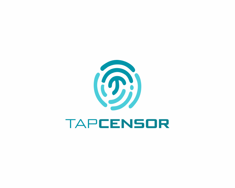
26 Responses to Option A
I really like how complete A seems as a design, it all fits well together color and font-wise, looks tight and balanced.
I like that A appears to be the very middle of a fingerprint. It makes the most sense given the nature of the product.
It's simple but creative like a fingerprint.
I picked option A because the design resembles a drop of lubrication.
I thought a and d looked very modern and clean. I didn't care for the colors on B and c was a bit too dark for me.
I think Option A and how it's shaped like a fingerprint is clever. Option D looks like a faucet tap, which fits the name. Option B is generic and Option C looks more like a headphone brand.
I feel A has the best combination of color and an interesting logo, which the others do not possess.
I really like A. It has a unique style to it and I think it's very pretty to look at. C and B are okay but they lack that same wow power. D is a bit bland and it doesn't really appeal to me.
I think the only logo that really fits the product you have in mind is option A. The other three look like logos for electronics or fitness products, but I can see option A fitting a lubricant bottle.
I ranked them by going first with minimalistic and easier to see and understand logos, like the first one, and I ranked some of them as last because even though they look creative enough, they still are harder to understand.
I chose A as my first choice because I like the colors, the way that the logo image looks, and the font style.I chose B as my second choice because I like the design, the colors, and the font style.I chose D as my third choice because I like the colors, the design, the look, and the font style.I chose C as my fourth choice because I like the two tone look, the colors, the font style, and the design.
Choice A definitely appears like a logo for cleaning supplies, as does choice B which reminds me of how the cleaner would be dispensed. Choice D looks more like an app logo and choice C looks like it is an internet security product or wireless defense product logo.
I prefer option A because I think that it is the most interesting and visually appealing logo design out of the four options.
The logo from choice A looks really well designed and futuristic which is fun to look at
A has a more unique style to it that makes me think a little bit more about cleaners, I think this fits the brand best of these options.
I like the blue shades used as it reminds me of water
option A resembles a bottle with fluid to me . I choose this one
option A reminds me of a fingerprint scanner so it makes sense with "censor". option B has a nice logo with the T and the C and it looks like a waterdrop which i like a lot
I think A fits perfectly because it looks like a finger print. You usually tap something it’s with your fingers so the logo fits. I think a case can be made for D as well because it’s like a finger reader or tap as well but not as good as A.
i think i would need more info to really decide that
I'm not exactly sure what this product is. But A looks like the best logo.
A because it looks very earthy and organic and has a strong and reliant detail
I like the colors on A and how the design is kinda like a spiral it kinda makes me feel like it goes along with lubricant/ cleaners. The next one was close, too as I like its simplicity and how it just goes with a big T and C. B is also alright, but something about it is kinda ugly. Then C just doesn't seem to make sense to me maybe because of the red Im not really sure.
I made my choice this way because I feel that the logo should have some type of water or personal health feel to it. I feel that C and D were too non personal and seemed like something from a big business.
I like the first one because a fingerprint being the logo of a cleaner is ironic. Next, the second label is very clean, which fits a cleaner. Next, I chose this one as third because I hated the last one. The last logo is way to busy and way too dark.
I prefer the option A logo because I like the interesting artwork illustration and the nice light teal and dark teal colors and easy to read font the most. I chose option D second because the teal color is nice and the combination of the first letters of the two words that make up the brand name looks interesting and would be easy to remember. I chose option C third because the blue and red colors are adequate and the illustration of the water flowing is interesting. I chose option B last because the water droplet shape of the logo makes the first letters of the brand name words difficult to recognize here.
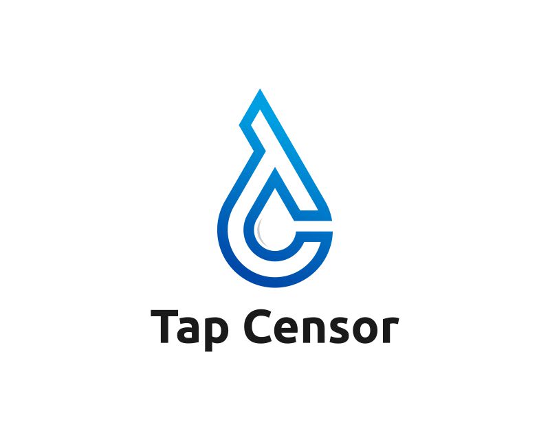
34 Responses to Option B
I like Option B because the graphic looks like a droplet of fluid.
It's pretty clever having the drop of water within the combination of letters. I clearly see the "TC" and water drop too. Makes me think of cleaning and cleanliness.
Option B is my preference because this logo design is clean and streamlined looking and conveys the image of a product that is a cleaner or lubricant.
These logos are ideally designed and I like the colors in use, such as blue, black, and red. Overall, the logical display of the branding is ideal for marketing.
B and D do make me think of water or water coming out of a sink tap. A and C doesn't do that.
Options D, A and C look too tech heavy to be related to the product, making the logo confusing in context. Option B is clear compared to the others due to it looking like a water drop.
I think C looks cool. It looks like a drop of something, which seems to fit what the business will be selling. It seems appropriate
Option B fits the product line better and looks good.
Option B is the strongest image because the droplet formation and the deep blue really give me the sense of a strong cleaner that is also environmentally friendly. Option A also has a nice look to it that would catch my eye. Options C and D looks more to me like tech company logos so they are ranked last for that reason.
I think Option B is the cleanest, clearest, most memorable and distinct logo. I like how it looks like a drop and isn't too complicated or convoluted. Option A is too convoluted for my tastes, but I think it's not too difficult to process because it looks like a fingerprint. Option C seems more abstract, or like it's a pair of headphones, which confuses me as I don't understand what connection that would have to the product. Option D just looks very abstract and futuristic, but also extremely generic, like it could be a log for absolutely anything. I also don't find it that aesthetically pleasing.
I like the design of the logo in choice B
I prefer simple to complex logos, so the simple look of choice B is the most appealing tap censor brand seen here
Option B and I love the logo and design it's very unique and looks great
I like how option B seems a drop and has the brand name initials. Option A also has the initials and resemble the fingerprint and the tap concept, but since the product has more to do with the drop than with the fingerprint, option B is better. Options B and A are better than options D and C, and I like option D better than option C because it has a more modern and clean design.
B was my absolute favorite as the logo looks like a T and a C with the T curving down to the C portion of the logo to create a liquid drop which I feel fits a brand dealing with cleaners/lubricants.
B us simple and easy to remember, the logo looks like a drop of liquid so ties in, A is also simple and easy to read/remember but looks like a fingerprint. D is simple and catchy, C looks like it's for a pair of head phones
I thought my top 2 choices looked the most professional and utilitarian in a way.
I like B the most as it combines the shape of a water drop with the T and C for Tap Censor. C is nice as it is creative ad implements colors. D and A are not strong logos. A seems for technological.
I like this one because it looks like a drop of liquid which goes well with the product.
Option B looks the most high tech and interesting.
B for me had the closest association to a cleaner. C looks like a tech product
I like how B's logo resembles a waterdrop which kinda brings to mind lubrication.
I like the logo in option B the best as it looks novel and fitting for this type of product.
OPtion B looks like a brush that would clean a bottle so to me it is most relevant/evocative of the product and its purpose.
I chose the ones that looked the most like a lubricant.
My first choice is Option B because I like the color and the simplicity of the logo! I think that the shape of the logo looks great, too! My second choice is Option B because the shape of the logo reminds me of the opening of the bottle. The colors are nice, too! I'm not a big fan of Options C and D. Option C looks like a headphones to me. Option D is something I cannot relate to with the product.
This logo looks the best in my opinion, clean and to the point.
Option B is perfect because the icon is simple and very positive looking. Option A kind of gives me vertigo when I look at it.
I would say that the best logo for the purpose they are talking about is the one shown in option B, because this logo really fits the kind of product they are offering, on the other side the logo shown in option D is good but it doesnt have much reference to the product, on the other side i would say that the logos shown in options C and A are not fitting at all for a brand that offers lubricants or oils, this logos are more fitting for a company that offers products related to touch screens.
I think B fits the branding the best and makes me the most intrigued. The logo design is a drop of water, essentially.
Hands down, B seems superior to the others. It's simple, it'll be easy to recognize, and it seems related to the products. A is okay but I'm not really sure what it's meant to represent and it's a little complicated, D is simple and clean, but boring and doesn't relate to the products at all. I just didn't like C for this a all, it might be a decent logo for headphones but not cleaners.
I chose B because I like this look best. It looks good to me.
Options B and A have the best deisgns and I prefer them to be more compact, out of the two, option B has the most appealing design.
I like the simplicity and the design of choice B the most. I think the logo looks the most prestigious and the most trustworthy. I like choice D as well , but I prefer choice B overall.
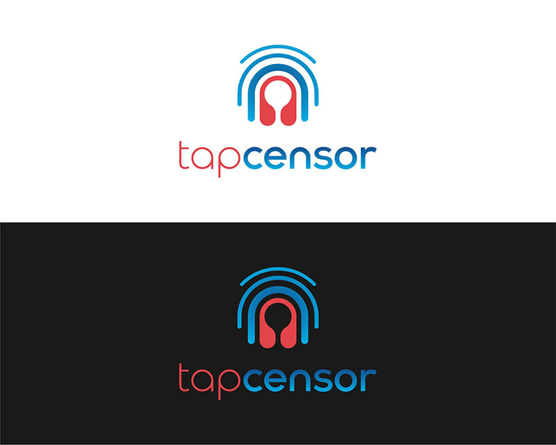
22 Responses to Option C
C is definitely my favorite, and stands out sharply from the rest of the pack with the vibrant colors.
I LOVE THE DESIGN OF OPTION C AND I ALSO LIKE THE COLORS IN THIS DESIGN
Option C and A look as though they are in the action and working.
I love how modern and colorful C looks it pops and stands pout.
i really like choice C cause i like the color in the background the best cause i feel like it makes the main label stand out more. i also like the choices that are more bold and really stand out more unlike choice A that just seems a little too dull and doesnt really stand out to me as much as the others.
I like this one the best because of the colors. I especially like it with the black background. It really makes the colors pop. I also like the design and the curves at the top. I would choose A second because I like the variety of colors better than the remaining options
I really like the back on blue in the bottom of option C.
I think c is in line with the name and the products they supply.
I prefer the multi-color version of option c over all the others. It stands out and the black looks nice. When I think of small plastic bottles, I think of a round water bottle. Option a reminds me of the bottom of a water bottle. Option B is also a good image as it resembles a drop of liquid which is what is being sold. Option D does nothing for me to remember the logo being connected with the product.
I like C the best because the more detailed/well thought-out logo shows to me that the product is premium, or better than most on the market.
I like optin C the best because the graphic design and the way the name is designed are the most catchiest to me out of the options show.
I like the logo in option C because it feels the most innovative and creative. Option D and A look quite compelling as well. Option B looks the least intriguing to me.
I like C the best. It is visually appealing.
I like both the logos in C and A but the color usage in option C makes it more admirable.
I choose option C because I like the darker background and the cooler design
Choice C is the logo that I prefer the most because I like the colors that it has and how colorful it is as that made me notice it right away. I like the middle silhouette that it has to it and how the lines radiate out of it. Choice A is second because I like the fingerprint kind of look and vibe that it has to it and how it is multicolored like that. Choice B is third because the design does have any interesting flair and and style to it but I felt it needed more color to it. Choice D is last because I did not really like it and did not feel like it fit.
stands out to me as being the best option that provides me with the best detail and appeal
D and B are pretty generic. I like the color scheme in C best. I like the font in A. Interesting icon in A that might give an indication of what it is. Intuitively C was more appealing to me so I voted it first.
I like the red and blue color scheme. I also like the wave imagery in the logo, like the red in the center is emanating out.
i have to say option C is the most unique looking, it also features a dark version which i love very much
The black background looks cool and is more appealing to th eye.
This option reminds me most of an audio-related brand which I like. I think the colors are also great together for drawing attention from your prospects.
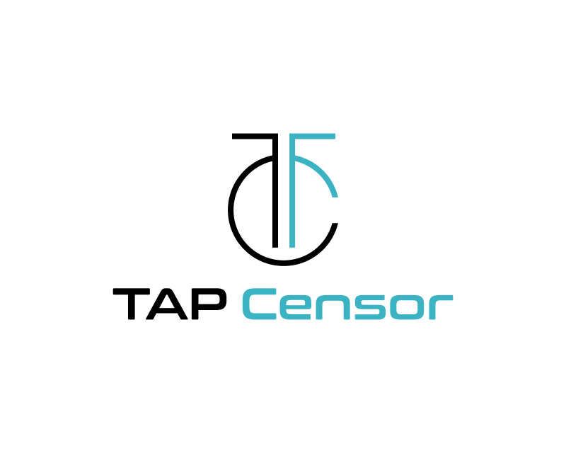
18 Responses to Option D
i prefer the logo in option D because it looks the most relevant and professional to me
Something about the symmetry and cleanliness of it makes me think of bigger and greater things than me, almost religious
I like that there are 2 colors in D and it is sharp and geometric. B is okay too with the blue gradient. A is too busy and looks like a thumbprint. C looks more like headphones and I don't care for it.
D is the clearest in my opinion. It has the nicest look to it overall.
I like the more simple logos. D and B stand out will and are recognizable. I like the color and text/icon mix as well.
Option D looks the most modern and creative
I like the simplicity and cleanliness of options D, A and B (in that order, A could be a little smaller). I do not like at all option C, too busy.
This logo is the cleanest while also being eye catching and appealing.
The logo in Option D looks very professional and appealing for this service and i like the overall design and color scheme.
My first choice for the logo on cleaners/lubricants in small plastic bottles is option D because it is plain and simple and easy to relate.Second is option B because it is nice and has appearance of a hookThird is option C because seems to relate more to speakers due to the shapeFourth is option A because it seems more like an antenna code
The logo in D is unique and I like the typeface. A is also a unique logo but I slightly prefer D. I chose C over B because I like that C has two color options, otherwise I don't really have a preference between the two.
I ranked the designs of the tap censor icon that I liked the most. I really like how option D looked the most followed by the design of the logo of option B followed by option A and then finally option C.
I like the symmetry in logo D and think it looks professional
I like the simplicity of choice D the best. The colors are nice and the image stands out without taking over the branding
D seems to evoke bottles most clearly. A seems like it's for another product entirely, a security thing.
D is sophisticated not over power logo is ascetically pleasant for the eyes , But B I think more match to the product you want to sell A and C they are just ugly in my opinion
i like this logo really good creation and unique
None of these really seem relevant to the product. I chose by logos that seem the most simple and easy to remember as I find that helpful.
Explore who answered your poll
Analyze your results with demographic reports.
Demographics
Sorry, AI highlights are currently only available for polls created after February 28th.
We're working hard to bring AI to more polls, please check back soon.

