Poll results
Save to favorites
Add this poll to your saved list for easy reference.
Which logo for a laid-back luxury resort do you like better?
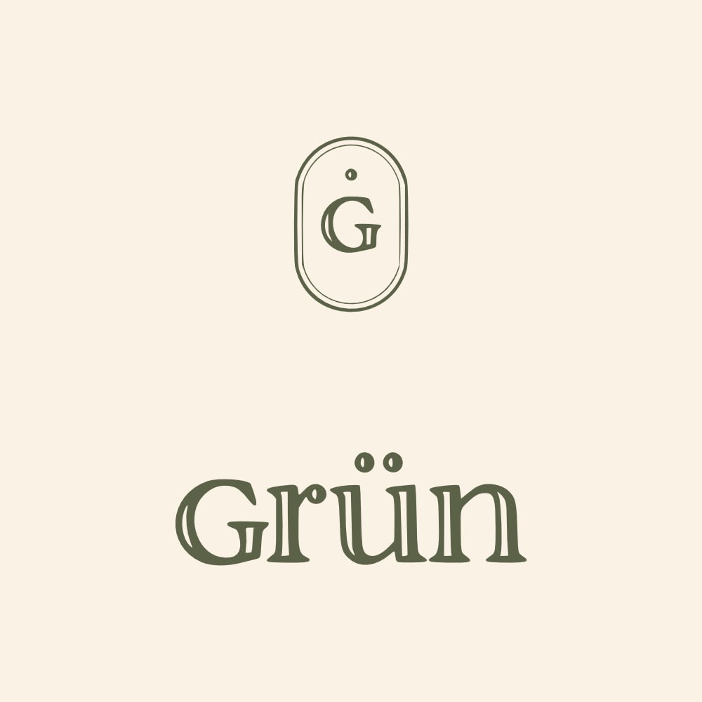
25 Responses to Option A
A is simple and elegant. I think it is exceptionally better. Neat, clean and classic
I prefer A for a laid back luxury resort. The logo is understated yet elegant and sophisticated. It exudes calm and serenity. It isn't trying to hard....likely because it doesn't have to because it has achieved success and delivered on the promises so is well known by it's customer base. Option B seems very ordinary and like many other logos I have seen. It doesn't stand out our feel exclusive to me at all.
I think A looks more luxury.B looks like it has way too much going on. It's way too busy for a luxury feel.
I like A better because it seems a bit classier and upscale to me, compared to the more modern look of B.
Option A looks more elegant and like something that would represent luxury. Option B seems more like it would be for a tech firm.
I prefer the old-style super-classy Option A. To me, it better communicates "laid-back luxury" and has the added benefit of cost-effective reproduction on a wide variety of media.
The logo style in option a looks more luxurious but still laid back
In Choice a there is a lot less stuff which makes me feel a lot more relaxed rather than try and have to search for information and then feel anxious which is not the point of a relaxing Resort
This logo is cleaner looking. The choice of a single color ink and the typeface conveys elegance and class...a formal invitation look. The other looks like something on a website and it has too much going on.
This font seems a bit more relaxing and also luxurious at the same time.
I like a. Clean and simple. B looks like it wouldn’t be as laid back.
I love the simplicity of A. It gives me a much more "modern luxury" vibe. B is a bit too cluttered, too many colors, and just looks like words in a foreign language to me which doesn't tell me anything whereas the colors, font, and logo of A just look more upscale overall.
The logo in option A looks more luxurious. The logo is simple but sophisticated. I would like to stay at grun!!
There is nothing about Option B that screams luxury. The colors and font are fun, but it sort of looks like it should represent a trendy cafe or clothing item. I think that Option A is high-class because of the muted tones and fancier font. I also like the G logo at the top of Option A because it reminds me of a luggage tag which makes me think of travel. I think this connotation is perfect for a resort brand.
I absolutely love the font depicted on option A but really don't like on option B.
Option A looks like a high end all inclusive resort style logo. Simple but elegant.
To me, this looks more appealing and commands respect. It looks more like a logo for a company that sells luxury.
I would choose choice A first because it has a good design and I really love the color choice of the product because it really looks cool and not as shouting as choice B which has several color which do not make the logo to look that nice to me, I love choice A also because the logo is just smile and easy to read through.
Choice A definitely gives me the laid back feel over Choice B. I like the simplicity, the casual style and colors but somewhat sophisticated feel of the logo. B feels a bit more complex and new-age over laid back. I think Choice B is just too complicated with too many things going on.
I think A looks much nicer as the logo for a luxury resort. It is very understated which makes it look classier than B, I could definitely see that being a real logo and I would think high end when I saw it.
I chose A for the simplicity. B just doesn't fit. I can't explain it but I don't look at it and think resort.
OPTION A LOOKS A LITTLE MORE HIGH CLASS. EVEN THOUGH IT IS LAID BACK I WOULD STILL PREFER A NICER PLACE
This one looks like it could possibly be a luxury the other looks cheep.
Option A is much more sophisticated and clean.
I like A best because it is simplistic and more elegant than B. It looks like a more upscale resort.
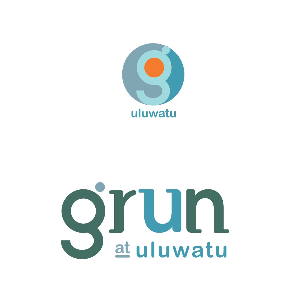
25 Responses to Option B
This logo definitely feels more laid back, so it's an easy pick for me.
I prefer B because the colorful and fun logo is still simple enough to imply luxury and also shows a more laid-back and friendly kind of place
Option B because the more color made the logo more attractive and it stood out more
I think the colors and the font of the logo give off a more relaxed feeling.
"B" blows away "A". It is more colorful, tells you where it is and looks more fun. "B" looks like some old school design that took little thought and no creativity
I like B better because it seems both more modern and cooler, due to the use of the colorful, lower-case fonts. The design just seems more relaxed than A, which seems stiff and formal by comparison, with it’s antique woodcut style and text appearance.
A is a bit outdated. B also gives info on where it is at.
Option A feels too much like a "serious" type of luxury resort due to the plain colors and the formal graphics/text. Option B appears to be much more laidback, as it has a modern design, such as with its "g" and also a playful color scheme. It's far more in line with what the brand is going for.
Option B is more eye-catching and intriguing.
It is more colorful and more appealing.
I like A better as a logo but it looks straight luxury and not laid back. B is nice and has an element of fun and relaxation
This catches your eyes with the colors. It not too vibrant but more classy in the color scheme. It feels like a high quality logo for a luxury brand
I chose option B because I like the use of differen colors in the logo. I also like the use of the orange circle in the G at the top. It reminds me of the sun which makes me think of a resort.
This logo looks more modern and like it would appeal to younger generations.
A is too plain so I chose B
B looks more interesting and modern. A looks a bit pretentious as looks like a 1970s style logo.
I think B has a much more fun and approachable look through the different colors and text sizes. I also think the logo is far more modern and intriguing.
It is more eye catching and seems more laid back.
A just doesn't look like a resort. It looks like a beer or something. B looks more exotic, more luxurious, more like something you'd want to know more about. Oh, it's more feminine! That's why I like it, and also probably who you want to market towards.
I find the colors more relaxing and the style "softer" and more inviting
I like option B the best. I like the colorful logo and it is very witty. It fits a laid back atmosphere
I think the white background and color looks much more nice and professional than the off white. And I think it fits the laid back theme better.
The other one does not look like a resort at all. Like B and can understand the name etc. Also would be very interested in a laid back resorts.
I think the logo for option B looks more fun and whimsical. That seems to better match the description of it being laid back. I think Option A does look more luxurious, but it seems more stuck up.
I like B because it is more colorful and modern looking. I think A is a bad fit for the relaxing, vibrant nature you would associate with a resort.
Explore who answered your poll
Analyze your results with demographic reports.
Demographics
Sorry, AI highlights are currently only available for polls created after February 28th.
We're working hard to bring AI to more polls, please check back soon.

