Poll results
Save to favorites
Add this poll to your saved list for easy reference.
Which logo is more appealing?
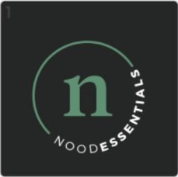
Option B won this Ranked poll with a final tally of 31 votes after 1 round of vote counting.
In a Ranked poll, respondents rank every option in order of preference. For example, when you test 6 options, each respondent orders their choices from first to sixth place.
PickFu requires a majority to win a Ranked poll. A majority winner differs from a plurality winner. A majority winner earns over 50% of the votes, whereas a plurality winner earns the most votes, regardless of winning percentage.
If an option does not earn a majority of votes, PickFu eliminates the option with the lowest number of votes. The votes from the eliminated option are reassigned based on each respondent’s next choice. This process continues in rounds until a majority winner emerges.
Scores reflect the percentage of total votes an option receives during the vote counting and indicate the relative preference of the respondents. If there is no majority winner, look to the scores to see how the options fared relative to one another.
| Option | Round 1 |
|---|---|
| B | 62% 31 votes |
| C | 28% 14 votes |
| A | 10% 5 votes |
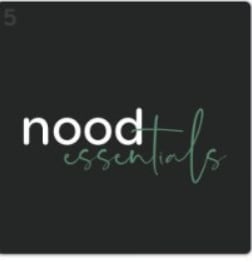
5 Responses to Option A
Only one I like is A because it's easy to read
The plain text is easier to read on the track here. I love the look of it though.
I like how casual option A is yet I like how professional option B is. As a result I think it is based on what this brand is trying to go for whether you want a more casual or professional logo. Even option C is not bad
The white and green script on blank is really appealing and very trendy. It makes the brand seem hip. I liked Choice B second because I also really like the circle with the brand name, again with the white and green on black. It looks more sophisticated than the first one. The last one I liked as well, but the green background isn't as appealing for all people.
A has a good design and clear message. B has a simple but clear design. C has an unclear design and I was not sure what is said until I read it a second time.
31 Responses to Option B
Not a huge fan of any of these, but the first choice is easy to read. Last choice is very difficult to read.
B and A seem more traditional, which I prefer.
Option B has a logo which is more appealing than Option A in which it has a emphasizing circle design and also the background color.Option A has a better background color than option C.
Option B seems to be the most straightforward clean look for a logo. Basic always looks better. Good choice of colors that catch the eye without being WAY too much. Option C i picked 2nd because if you are going to use a cursive font, i feel like less is better. Making Option A a little too much.
I chose option B because it is the cleanest and most appealing design. It's simple, elegant and easy to understand. I chose option A second because it was the second easiest to read. I am not a fan of the all lowercase letters, but I do like how simple and clean its design is; just not a fan of the cursive font. And Option C was the words. With that cursive font and without the other options, I would have no idea that the name was Nood. I would think maybe wood, hood, nood, mood. Just a very poor design.
I like choice B because the font of this logo is easier to read than the other options.
I found B the most appealing because it's the most professional of the three logos. A came next because the font used in essentials is pretty cool. Not a fan of option C because at first glance I mistook the n in nood looks like a cursive w. At first glance someone would think it's wood essentials not nood essentials.
I much prefer the black backgrounds. B - The simple "n" logo looks sleek and catches my eye. A - I enjoyed this one as well but felt the "essentials" font could be more legible. C - I did not care for the green background.
I like choice b because it is the easier to read.
I really liked the clean image on the B. I think that the font was really nice on C with the color. I feel like the black background did not work well with the font on A.
This logo looks clean and simple. Black, green and white blends well together. Making the word 'essentials' bold, made it easy to read and understand. The letter 'n' centered in the middle is eye catching and innovative. The cursive on the other two options made it difficult to comprehend.
Option B logo design was really appealing.The logo looks like a branded.
i like the circular aspect of choice B but i feel like i could make a better choice if i knew what the logo was for. knowing the purpose may change my answer so for now i've got to go with the one that's more visually appealing with no information
I felt that B had the cleanest and most modern look of the bunch so I preferred it over both A and C. C was clearly the worst because it is easy to misread as either wood or potentially mood.
The circular logo looks the best and most credible. The one with the green background is a little unclear on what it ways.
Option B is the cleanest and easiest to recognize at a glance. Option A is good too, but it doesn't look as professional or clean. Option C is a little hard to read (could be hood) and has a less appealing background.
I like the circle and it looks neater without the font that looks like handwriting.
B - most creative design and attractive fonts; A & C - Unattractive presentation and fonts
B and A are black and look sleek. A looks too generic. I chose C last as I don't like the green color so prominent
I chose B first because its classy and appealing to the eye i like this one the bestI chose C second because the green looks nice and mellow i like this oneI chose A last because its too simple and plain its kinda generic
B IS MORE CLASSIC AND MUCH MORE DIGNIFIED. ALTHOUGH A LITTLE STANDARD VERY ATTRACTIVE AND READABLE. SOMETIMES SIMPLE IS JUST BETTER.
I like the creative design of B. I've never seen something that is as cleanly refined in a circular design as this one. The other ones are also great.
My least favorite was definitely option C. The font makes it look like it says "Wood essentials." I was torn between B and A. I liked B more because it looks more modern and "clean" and I think the addition of making the words into a circle is a nice touch. Option A is simple and appealing but a bit too much on the simple side.
I don't like any of these logos. I hated B the least, so I chose that one first. I can't stand fake words, and "nood" really bothers me. But B does look the best out of these 3 choices. I chose A 2nd because C is awful. I would never click on anything that had any of these logos.
B has a clean logo aesthetic; the scribble logo of C is difficult to read correctly.
I really like the look of Option B, with the curved/circular writing and the symmetry of the logo in general. Option C is alright, but not too big of a fan of writing of "nood". Option A feels very flat and unappealing
I made by choices based upon the fact that I, personally, prefer more "standard" fonts.
Options B and A are very modern. On Option A it’s hard to read “essentials.” Option C looks less modern.
The logo for Option B is the most appealing because it looks sleek, classy, and up to date. Option A is also not bad, since it still looks up to date, but is not as sleek or classy as Option B. Option C is my least favorite, since it looks a little messy.
From a distance or at a quick glance, the cursive is harder to read. (And I'm from a generation where cursive was still taught in schools.)
B gives me the feeling of this being a LOGO not just text. It's a great shape. C looks more high end than A.
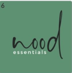
14 Responses to Option C
I really like the dark tones being used and I think they work best in that way particularly
I like how C and B look a lot more organic and natural because the text appears to be quickly handwritten. C features this handwritten text most prominently. I dislike B because it uses plain computer typeface that’s boring
I liked C the best because the font for "nood" seemed very natural looking and reminded me of noodles, I the ranked B over A because the design of option B seemed more professional to me.
Would like to pick option C is the best logo which is attractive with amazing color combination, great one and fantastic logo
I like panel C. I think the logo looks excellent against the nice green color.
I think that C is best because "nood" is the specific unique brand name and "essentials" is less unique, so "nood" should be fancier. however I do feel like the "n" is a bit hard to read. I like the overall format of C and A better than B.
i think the logo with the green background rather thsn the black backgtounds is much more legible snd aesthetically more appealing
(C) The green background makes the logo and name really stand out. (B) is similar to (C) but does not stand out as much. Overall I really like the whole look on (C)
The green background makes the name pop out. B is easier to read at a glance. A is my last choice
The nood being stylized seems to fit best.
The squiggly style of the word "nood" on my first choice really fits the moods, since I'm not quite sure what the word itself means, and with that font I can't quite tell what the word says!
I really dig that font
C- easier to read, B- not as eye appealing as C but could read it clearly. A- hard to read
I like the artisticness and green of the first and the word 'nood' in the second
Explore who answered your poll
Analyze your results with demographic reports.
Demographics
Sorry, AI highlights are currently only available for polls created after February 28th.
We're working hard to bring AI to more polls, please check back soon.

