Poll results
Save to favorites
Add this poll to your saved list for easy reference.
Which logo is more appealing? What does the logo convey?
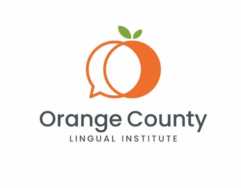
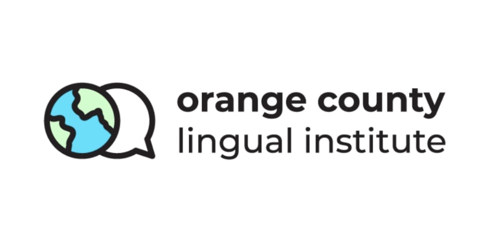
Option A won this Ranked poll with a final tally of 25 votes after 7 rounds of votes counting.
In a Ranked poll, respondents rank every option in order of preference. For example, when you test 6 options, each respondent orders their choices from first to sixth place.
PickFu requires a majority to win a Ranked poll. A majority winner differs from a plurality winner. A majority winner earns over 50% of the votes, whereas a plurality winner earns the most votes, regardless of winning percentage.
If an option does not earn a majority of votes, PickFu eliminates the option with the lowest number of votes. The votes from the eliminated option are reassigned based on each respondent’s next choice. This process continues in rounds until a majority winner emerges.
Scores reflect the percentage of total votes an option receives during the vote counting and indicate the relative preference of the respondents. If there is no majority winner, look to the scores to see how the options fared relative to one another.
| Option | Round 1 | Round 2 | Round 3 | Round 4 | Round 5 | Round 6 | Round 7 |
|---|---|---|---|---|---|---|---|
| A | 24% 12 votes | 24% 12 votes | 24% 12 votes | 24% 12 votes | 32% 16 votes +4 | 34% 17 votes +1 | 53.19% 25 votes +8 |
| G | 16% 8 votes | 16% 8 votes | 18% 9 votes +1 | 20% 10 votes +1 | 24% 12 votes +2 | 34% 17 votes +5 | 46.81% 22 votes +5 |
| D | 22% 11 votes | 24% 12 votes +1 | 24% 12 votes | 24% 12 votes | 28% 14 votes +2 | 32% 16 votes +2 | Eliminated 16 votes reassigned |
| C | 12% 6 votes | 12% 6 votes | 12% 6 votes | 16% 8 votes +2 | 16% 8 votes | Eliminated 8 votes reassigned | |
| F | 14% 7 votes | 14% 7 votes | 16% 8 votes +1 | 16% 8 votes | Eliminated 8 votes reassigned | ||
| B | 6% 3 votes | 6% 3 votes | 6% 3 votes | Eliminated 3 votes reassigned | |||
| E | 4% 2 votes | 4% 2 votes | Eliminated 2 votes reassigned | ||||
| H | 2% 1 votes | Eliminated 1 vote reassigned |
12 Responses to Option A
I like the logo that incorporate the color orange since that is the county name. I really like the ones that include the speech bubble that enforces the linguistic theme.
I like the ones that include a chat image the most. It ties in the language aspect the best. The globes are also a nice image as languages connect the world.
I like the choice A because I think it stands out more and i like the color
I like A the most because the word bubble with the orange fits the company name perfectly. My second favorite was F because of the same reason. I just like A's color scheme better. E was my third pick because of the same reason with the word bubble but I preferred the orange more than the globe.
Simple, clear logos that are not too busy or distracting. They also seem to inform you what can be accomplished by attending a lingual institute, primarily being able to communicate with others around the country and the world.
Choice A is the most fitting and caught my attention the most with the colors and the bigger logo design. The mix of colors in choice D give it a nice touch. The remaining choices have a hit of orange to it which fit the name.
My preference was those having the actual orange orange in them. I thought the color stood out as well as the connect from the ad to the picture. Choice a stands above the all as being the boldest. It has the largest lettering is easy to catch with the eye the two oranges convey two coming together. I thought maybe 2 languages coming together. Institute to me is a place of learning. I thought orange county was the location of the place of learning. Lingual made me think a bi language school of some sort.
I like the logos with the oranges in them. I think it makes them unique and stand out from the crowd.
I think combining the orange with the speech bubble is a creative way to get the idea across
I love the combo of the orange, the color orange, and a speech bubble, while still keeping it simple. I get multiple messages without feeling overwhelmed.
I love option A! It shows me by the logo that it is a 'chat bubble' with orange lettering and an actual orange. Clever. This is BY FAR the best one. It is eye catching, easy to understand what the company does. I love it. Option G is great also but not as bold and clever as Option A. The color orange is good and the use of the globe is a great connection between different languages and what they do. I can get an idea of what the company does by the logo. Option B is good but not vivid in color like the other two. The black and white contrast is nice, but it doesn't necessarily tell me what the company does. At least not as clearly as my first two choices. I also am not a fan of the logo being in front of the name of the company. Option E is good; I like the use of the chat bubble (I really like the chat bubble in the logo) and the use of the globe. The only problem is that the color isn't as vivid and I like lots of colors usually. Option C is fine, but when I saw it all I could think of was the 2008 Obama logo (which I loved, but still, it shows some political affiliation that may or may not make people think of an association with one political party).
I think the logo stands for different language teaching institute in Orange County. I liked Option A as the Logo had orange color as well showing the integration
3 Responses to Option B
I chose the logos that said what orange county lingual institute does without having to say it, so i chose the ones that had globes and very bright colors because its what pops and catches my eye to read the whole logo
It conveys bright language skills that unite the world
I like the simple clean lines of my first choice.
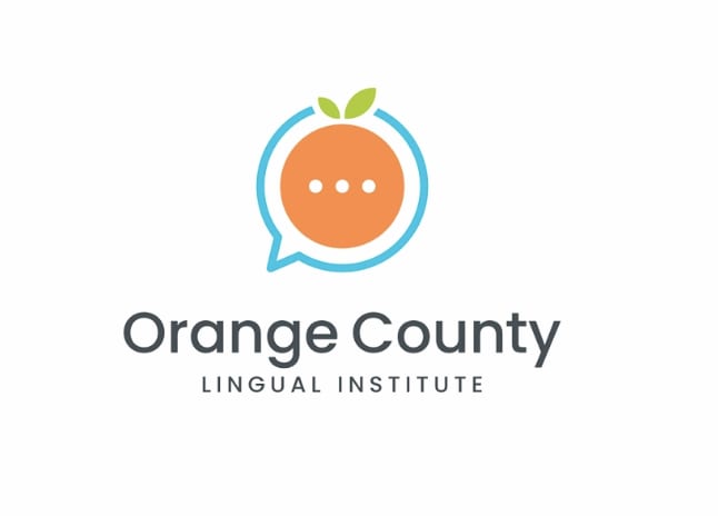
6 Responses to Option C
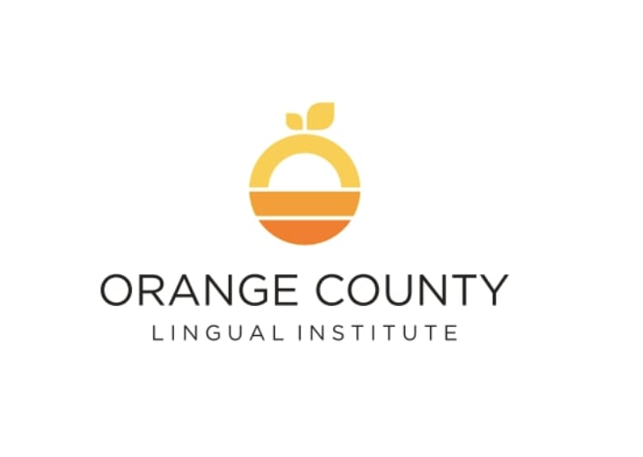
I think the logos containing orange were the best since the name of the business contained 'Orange County." The black and white option was boring. In addition, I preferef the simpler fonts as the more complex ones are too distracting.
I like clean sharp images. Clean lines. Not busy. It makes a statement.
All of the choices, except two, use an orange, and the ones I chose appealed to me as cleaner, more modern versions. Of the remaining choices, option H looks awkward, and option E and G are too generic.
I like the logos that actually use the color orange also, and I like the font and design of C best
Option C-I loved the colors here the most; Option F- I loved the orange colors; Option G- this is my favorite, it is both an orange and globe; Option A - I like the dual oranges, but no my favorite; Option E- I like the globe.
Option C is the most eye catching without being too gaudy and the transition of colors helps create a neat and eye-catching logo. Option G is also very good because it especially conveys that the company specializes in worldwide linguistics and is eye-catching at the same time. Option D is similar in that it shows that the company deals with worldwide linguistics, but it is not as aesthetically pleasing as the other two options. Option B is alright, but lacks any color to help draw attention to it. Option E is the best of the remaining options but is not very helpful in understanding what the company provides in terms of services.
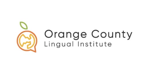
11 Responses to Option D
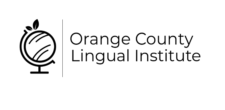
I like the logos that look like oranges because it's a clever play on words. The logo conveys a sense of global unity.
I like the play on the orange and it being the world. I also like the minmalistic look of the logos.
Since this is for an institute that teaches language, and foreign ones I'm assuming, it is awesome to make the orange for orange county look like a globe, for option D. Option E and Option H, love love that they include the earth in the orange to make people think of the languages of the world. As for C and F, they are jut better looking oranges. I do like that F makes me think of texting and language, but I just like the aesthetics of option C.
I like how the color orange is incorporated in the logo in all my choices. I particularly like how the globe or earth is made to look like an orange. The logo conveys providing education in language learning.
I liked the more colorful designs. They caught my eye over the other logos without orange in the logo
My first choice is the stylized globe logo with an orange in place of the globe. It looks the best, in my opinion, and it conveys education/learning. It makes me think, "this place would be a good place to learn a language" (the language part is of course implied by the name of the company).
I choose all the ones with the really obvious globe imagery I think for something in the linguistics field it's a really cleaver idea to blend the orange from orange county and the globe imagery in the logo. I think option C and E are too vague or too obvious with the globe imagery which is why I didn't end up picking them.
Just an aesthetic preference. Image D looked the sharpest to me.
I really liked option D and how it drew in color to the whole logo. I really believe this is also showing an orange for orange county but placing the orange in a globe perspective shows the lingual part as being part of the world. I enjoy the different varieties of oranges and the colors that make it pop and draws your attention to them. These are all well done, simple and clean.
I like these logos in this order. I am not sure exactly what the company is about but like the orange for the logo
I organized the options in terms of what represents the services and goals of the company while being creative and original.
2 Responses to Option E
chose based on preference of logo
I think the logo tells me they are an organization that provides language courses. I like E the most because it makes me think of global.Option G is good for this because it is orange, I just think I prefer the world color.Option D is adorable as an orange but I don't think of what they do when looking at it.Option A does make me think of speech but not as great as the world logo.Option B is ok, a bit dull
7 Responses to Option F
All my choices incorporated a picture that fit directly with Orange County Lingual Institute's name
i like when the icon looks more like an orange it catches my eye better then when its black and white
Option F is by far the most appealing logo to me. First of all the colors look nice and so does the text. I like that the logo is an orange (for Orange County) and that there is a "..." insinuating talking/texting. I also love the chat bubble, it fits the companies premise so well. This is by far the best logo of the bunch. It fully encompasses the company in my opinion.
I liked the ones that used the orange color and shape the best.
I chose option F because the symbol in the middle looks like an orange and I like the font of the name in this option better than the others.
So overall none of them are perfect and could be tweaked more, but options F and B are the best of the bunch. They are both easy to read, use a clear font, and have logos that are easy to decipher. Both are attention grabbing, but option F is more appealing aesthetically.
#1 - Love. Love the colors. Love the ellipses. Clean, clean lines. Love the dialog bubble, indicating "speaking."#2 - I love the dialog bubble overlapping the orange. I like the green leaves, and I don't miss the turquoise blue, which I like on #1.#3 - I like the motion lines around the globe, and the placement of the text. The way the orange color melds into magenta is attractive.#4 - I like the design of #4 but those stacked lines kind of remind me of rising water levels, which makes no sense with orange and not blue. It's pretty---but somehow it's reminding me of something other than language instruction.#5 - An orange on a globe---nice! Perhaps if the lines were bolder, this design would make more of a statement, catch the eye?
8 Responses to Option G
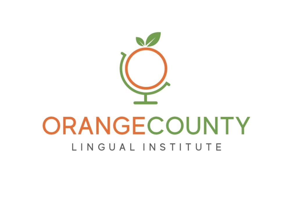
Orange county logos should have oranges in them. The best choices had the best oranges,
Most importantly is the colors but a close second is the globe view - lingual institute implies that foreign languages are taught - therefore a global view is appreciated.
i started with the most modern and best looking logo and worked my self back to the most dated looking
I like option G the most as it shows the orange for Orange County and also the globe for linguistics. Think that is the perfect combination. I feel that is a global aim there and that it is also a good indicator that it is a local brand with Orange County thinking globally. Option A and D are nice as well. Option A with the chat icon looks great and capture the orange in Orange County. Option D is nice with the globe and orange incorporated as well. I would stick with either of those as the top options.
G looks the most professional to me. I also like the logos that are mostly orange and black. I like option F because it reminds me of an app.
I chose the ones that had the earth on them and if they had color, I liked them the best. I believe that this is a school for language learning and that if they had the earth on them, they described learning languages from around the world.
Choice G was an easy #1 the font looks professional, not cartoonish, and the globe with orange color scheme was a nice touch without getting too corny (aka giant orange). That was a very clear standout, to me. Also liked B (#2) quite a bit. The font is nice, professional, I like the globe graphic. It references an orange while still looking respectable. D is still clean and modern looking, professional and easy to understand. E & A weren't really that great but not as terrible as the not chosen options. The graphics didn't look as clean and professional, and they started to look too busy or cheesy.
SInce this appears to be a school of some sort, I picked the options that inspired the most confidence and looked the most competent. Some of the options looked unprofessional.
1 Responses to Option H
My top choice was H because it conveyed three ideas at once - the orange (for the location of the school), the world (for global connections), and the speech bubble (for communication). I thought this best encompassed the business, and was cleverly designed to include all three. My next choice was D, because it combined two of these ideas (the orange and the world) and uses striking colors and clean lines. My next choices were F and A, because each combines two of the ideas (the orange and the speech bubble) in a way that makes it clear that the school focuses on language skills, but are also bright and interesting logos. My final choice was C, which is aesthetically pleasing (almost like a sunset) but doesn't tell much about what the business's goals or specialties are.
Explore who answered your poll
Analyze your results with demographic reports.
Demographics
Sorry, AI highlights are currently only available for polls created after February 28th.
We're working hard to bring AI to more polls, please check back soon.

