Poll results
Save to favorites
Add this poll to your saved list for easy reference.
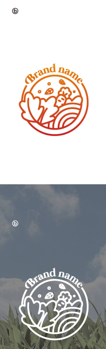
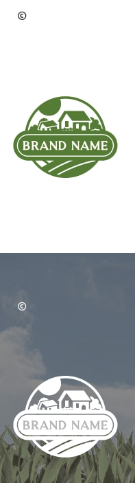
Which logo is your favorite for a health supplement brand product made from plant-based ingredients?
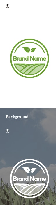
Option A won this Ranked poll with a final tally of 28 votes after 2 rounds of votes counting.
In a Ranked poll, respondents rank every option in order of preference. For example, when you test 6 options, each respondent orders their choices from first to sixth place.
PickFu requires a majority to win a Ranked poll. A majority winner differs from a plurality winner. A majority winner earns over 50% of the votes, whereas a plurality winner earns the most votes, regardless of winning percentage.
If an option does not earn a majority of votes, PickFu eliminates the option with the lowest number of votes. The votes from the eliminated option are reassigned based on each respondent’s next choice. This process continues in rounds until a majority winner emerges.
Scores reflect the percentage of total votes an option receives during the vote counting and indicate the relative preference of the respondents. If there is no majority winner, look to the scores to see how the options fared relative to one another.
| Option | Round 1 | Round 2 |
|---|---|---|
| A | 38% 19 votes | 56% 28 votes +9 |
| C | 32% 16 votes | 44% 22 votes +6 |
| B | 30% 15 votes | Eliminated 15 votes reassigned |
19 Responses to Option A
Simplicity is key, but you also want an image that invokes some kind of natural kind of element, done in the simplest possible manner.
I liked A (and to a lesser extent B) because they show leaves/produce to emphasize the "plant based" aspect of the brand. The barn/field in C doesn't convey this as well.
option A- simple is better. option B is wayyyyyy to cluttered and busy.
A is the cleanest design and demonstrates the plant theme. B also demonstrates the plant theme. C just looks like a farm theme, which does not necessarily indicate plant-based.
The simple and green logo gives natural food vibes more than the other two. The other green one sort of does, but the red one doesn't at all.
I think my favorite logo is Option A because I think the logo looks nice and cute and gets the message across that the product is plant-based.
Red just isn't a good color, I like the shade of green on A the best by far
I think A is the easiest to read while also being memorable... its simple but the artwork is more unique, since there's less to focus on it stays in your mind a bit more.
I think A is the most contemporary and fitting design. C is fitting but sort of old-fashioned. B I don't think works at all. It's hard to tell what it is.
Choice A is simple and to the point. I like C somewhat too but do not like B much.
I chose Choice A as my favorite design! I believe plant-based products and other vegan-like items should have some kind of green color/design to them. Green just fits well and the minimalistic design of choice A looks really appealing compared to the other choices. Stick with a green design and minimalistic texture.
I ranked my choices based on my color preference and then based on my preference for the depiction of the farm.
I like to chose option A. because the logo itself shows the information.
I liked A and C better than B because I think the green color of the logo is more consistent with the idea of a product made from plant-based ingredients. I liked A a bit more than C because the logo more directly evokes imagery of plants.
I definitely like option A because it has less going on compared to B and C.
it's simple but effective
Option A is the best because the logo is well designed and simple
Option A looks to me like the best thing for a plant based product. It shows some type of organic and natural element. Option C is the next best option for this and option B does not feel fitting for a plant based product to me.
I choose option a I have felt when I looked at the pictures that that would be the best one for a plant-based product logo
15 Responses to Option B
I usually prefer green the most but that rainbow type logo strikes me as quite memorable
I prefer the option B brand logo because I like the large plant and carrot illustrations on this logo, which goes well with a health supplement brand. I chose option A second because this logo includes a couple of green leaf illustrations, which look nice. I chose option C last because the home or farm land does not necessarily evoke feelings of a health supplement brand like the plant illustrations shown in the other logo options.
I feel like Option B looks the most like a real brand for a distinct product, whereas C and A (especially A) look more like the logos for some sort of certifying agency (A could be some sort of 'certified organic' stamp more than a brand of its own).
This one is my favorite because it is not green. "Healthy" things always seem to be packaged in green.
B and A focuses more on plants than C. B looks better, in my opinion.
I chose B first, because I think that logo looks the most original while still clearly containing plants as a motif. I chose A next, because it has more of the "natural" look that I think the product is going for.
The leaves make me think it's plant based, and the color scheme of option B is very cool.
i'll take red over green almost any time.
I made my choices this way because I felt that the logo should have a design that lets you know that it is plant based such as flowers or leaf's.
It's not entirely clear right away Option C is supposed to represent a farm, where Option A and B do a better job. Option B is really unique, though, and immediately makes me picture and think of a basket of fresh produce.
this gradient stands out and is pleasant
I love the gradient in the logo in B. A has a nicer design than C to me because it is more minimalist.
The logo designs that seemed natural and had a rustic appearance were mostly suitable. I like the references to farmland on these versions.
I like the overall look of this option best including the font and the carrot and leaves logo style and the coloring.
I don't like the farmhouse. gives the connotation that rural is better, when that is not always the case. tons of farms use GMOs
16 Responses to Option C
Option C is the most visually appealing. Option A is the second-most visually appealing. Option B is the least most visually appealing.
I would say that C overall looks the most appealing. There's no debate that green is the most natural pick for anything related to plants and health, so using one of those would be very relevant to your brand's image. I just happen to think the farm imagery of C is superior to the somewhat less overt counterpart in A, though it isn't bad either.
I think this option is the best because the nice houses and rolling hill are very relaxing.
C seems the most wholesome. A seems too much like a generic pharmaceutical.
I prefer option C because the green makes you think of natural plants and the image of the farmhouse in the logo makes you think it is farm fresh.
They all look nice, but the one I like best is the one that has a farmhouse with a green logo.
I like option C the best because I like the view of the farm and the green color used, which combined reminds me of growing plant based ingredients.
green color best shows nature interactions here, as we would like to see them!
I really love the farm in the logo for Option C. It is cozy and comforting. A is okay too as it looks modern. B I don't care for at all it is far too busy.
I love love love the farm design on C. It’s very appealing for the product. A is cute also, but B is hard to read.
Option C makes me think of home, which is in the country surrounded by nature, and it looks more like plants. Option A was my last choice because it reminds me of logos I associate with genetically modified crops.
I like option C because the green makes its feel more plant based and it is a bolder green.
This one looks more natural and homemade. It is very wholesome.
They all look really good but Option C sort of stood out to me more than the other two options did. Something about logo really pops out at you. It looks so professionally done and it really does pop out more than the other two logos.
C is very artistic and fits the product. It looks natural and earthy
C has that folksy, down-home feeling that one loves for comfort and simplicity, so that would be my choice.
Explore who answered your poll
Analyze your results with demographic reports.
Demographics
Sorry, AI highlights are currently only available for polls created after February 28th.
We're working hard to bring AI to more polls, please check back soon.

