Poll results
Save to favorites
Add this poll to your saved list for easy reference.
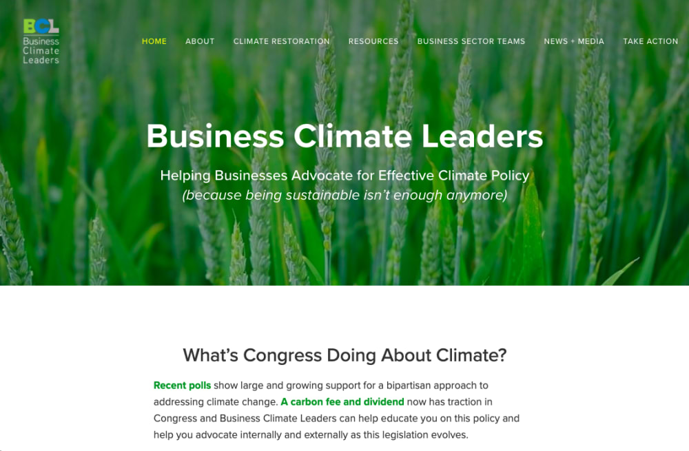
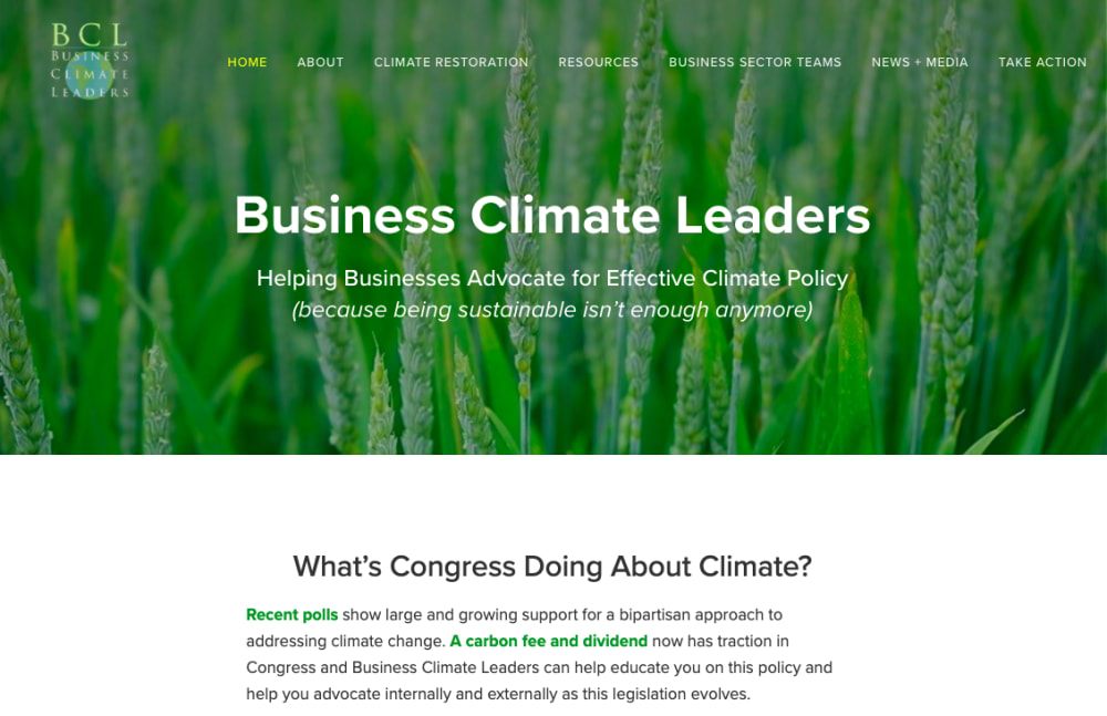
Which of logo do you prefer and why? (The logo is in the upper left corner of the image.)
Age range
Education level
Gender identity
Options
Personal income range
Political affiliation
Racial or ethnic identity
36 Responses to Option A
I find it to be more abstract
I like that the letters are colored in this one.
The Earth art is interesting but it obscures the name of the organization which is more important in a logo
It's cleaner and stands out better
I think option A is better as the logo stands out better with the coloring as well as the font in comparison to the background and the slogan/main message. If you wanted the slogan to not stand out and it isn't important than I would go with B but for me Option A is superior for those reasons.
this logo looks more colorful which is better
This logo looks nice and clean and has a nice blend. The earth in the other logo just looks tacky.
I prefer the logo visible in this option because it seems more inviting. The other option appears too serious and formal. The option I chose appears more friendly and I would be more likely to engage with the organization mentioned.
The globe behind B muddies everything up and I can't tell what I'm supposed to be looking at. A is much cleaner, the colors work, I can read the text easy, and it's nice to look at. B is just to much and sloppy looking
I much prefer the logo in option A because the text under "BCL" is much easier to read compared to option B which has a globe. I also like the font and colors of "BCL" better in option A.
The font and overall design of this one us more eye catching
I feel this logo stands out better than choice B. Choice B seems to be blending in the green background.
This is more visible compared to another on and more colorful.
I like the logo on the top left better.
This logo looks more modern and bold looking. It's a more eye catching design to me.
The logo with the letters hiding behind each other, seems good and modern. It feels like a more memorable logo as well. I like it as it is easy to read and easy to understand.
I like A because the font and color variations of BCL really makes it stand out. Also, the name written below is much easier to read than B which has the circle in the background. A is by far my favorite.
Option B is lacking color and a definitive shape.
BCL is a lot clearer. Also, I think that the letters stand out a lot more. It's hard to read B but it is really easy to read A. That makes it a much more attractive logo. I really like the color scheme, too.
I personally A better because the font was easier to read and the 'circle/earth' behind the words made it a little hard to read. I wasn't too impressed though with the color of the C being blue - I think I would have went with a different color.
I chose A because you can read the print stand out more than option B.
The color choices on the A logo really stand out. It is also easy to read the full name under the logo. In the other option, because the Earth is behind the letter, it makes it hard to read and kind of fuzzy looking. A is crisp and clean and is by far a better option.
Choice A has a better logo in the upper left hand corner.
I prefer this option because the letters in the corner stand out more and you can easily see them and read what the words say. It adds to the page as well. Other option the wording in the corner blends in and is not easily seen.
When it comes to climate change organizations, I really want to see the colors green and blue. They would somehow enhance the credibility. I know it sounds silly.
Generally I like the logo for B better, but A grabs you more. I think this is due to the choice of background.
The letters and logo look strong and stick out better in my opinion.
i think they look exactly the same but i chose option A because somehow i think the font looks bolder
I think this is easier to read and just looks cleaner and more professional.
The logo BCL is in color
A is easier to read. I can see the logo on the background much better in A than in B. It kind of fades in B. It looks much more clear in A.
I prefer logo A, it looks more modern and is easier to read without the text overlaying on the image of the globe, as seen in option B.
I think choice A is much more simpler and easy to understand. It is also more neatly organized.
Option A- looks very attractive design, fabulous color combination, much visible
I choose choice A because the color scheme of the logo suits the background more than the logo in choice B. Choice B looks rather archaic and has the font of what a museum logo would have.
I prefer the business logo design of my choice because it is easier to see
14 Responses to Option B
B is a good sharp look and has a classic feel to it, although it's not really different from A.
More high quality with the corner name and coloring
The logo in the top left looks more professional and inviting to click on.
I chose B because the logo look more professional and good fit for the post.
text is more convincing
i like more this logo in the corner
The logo featuring a globe, shows that they intend to tackle climate change not just from a small point of view but from a world wide view. The issue not just to one country but to the entire world.
This logo looks far more professional and attractive.
A monochrome color on a colored background appears better and is easier to read for the consumer.
In the context of the website, I like B because it is cleaner and more crisp. Against the green, elegant background, A looks childish, while B gives off the feeling of being formal and competent.
The font is clear to read, which is good because I don't like to struggle when I look at websites.
Choice B has a much more professional image. It looks academic, and conveys a sense of confidence in the organization and it's goals. Choice A has a juvenile, whimsical appearance. Choice A would be fine for a number of different organizations, but not one attempting to tackle a serious topic such as climate change.
It stood out more to me.
The logo in B looks like a globe so I think of a global climate
Explore who answered your poll
Analyze your results with demographic reports.
Demographics
Sorry, AI highlights are currently only available for polls created after February 28th.
We're working hard to bring AI to more polls, please check back soon.

