Poll results
Save to favorites
Add this poll to your saved list for easy reference.
Which of these logos do you prefer and why?
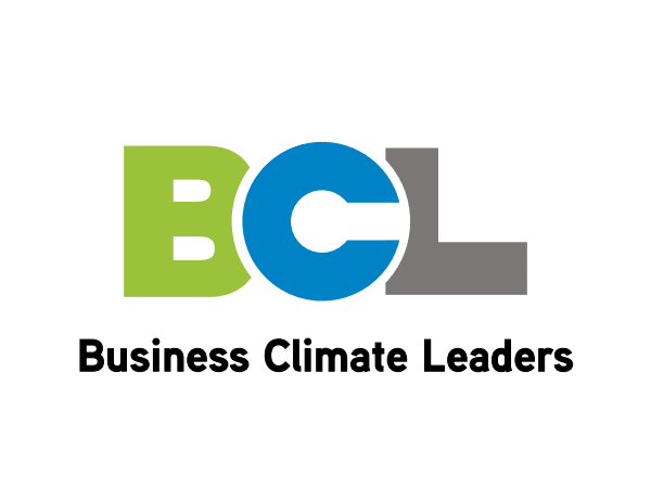
29 Responses to Option A
The other logo is just really outdated
much more condensed view and provides a more professional look and appeal to the logo, not as cluttered and just easy to diagnose
This one is far more memorable due to the large block lettering.
This logo is more interesting, better looking, and less generic looking.
"A" is much cleaner and looks a lot better. "B" is pretty cluttered and very busy. "A" is a streamlined logo.
The larger and brighter letters just catch my attention a lot more. It also looks more professional - the other one with the globe is cheesy clip art and looks like it is from the 1980s.
This one is more eye-catching. I usually don't like the current trend toward really plain and simplified logos, but the colors on this one makes it work. The middle letter looks bubbled, which makes it more unique. The words are easier to read in A than on B.
The logo is exciting.
I chose A because I abhor globalism and B looks to promote globalism. There still is the imprint of a globe like sphere in A but hopefully it is not promoting a one world government.
I like the logo with the C sort of pushing on the B and L. And it is more simple and clean.
Short and clean logo. I like it.
I prefer that these earth and the font used.
I like Option A because I think it looks current. It's also very easy to recognize.
it stands out a lot more
Bigger clearer letters. easy to read and to the point.
This option is more fun to look at. I enjoy the font and the colors used.
Option A looks more fun. Option B does not excite me the way Option A does. Option A is also simpler and bolder than Option B.
There's more solidarity in the tight font, and the text takes up less space.
it is bold and engaging
Bold, bright and looks impressive. Large print shows confidence, ability, and motivation.
The big, thick letters are warm, fun, and inviting. Looks like a nice logo!
I prefer A because it's much easier for me to process. The boldface font makes it much clearer and easier to comprehend.
The letters and colors stick out better in this logo.
More eye catching attention grabbing.
It looks like there was more thought put into the design.
I prefer A because logos that are simple and bright can be remembered more than the more complicated ones. This logo is bold and catches attention of the viewer.
Option A- very cleat design, good looking, very attractive, color combination of letters are excellent, good to go
I chose Option A as my choice because I know exactly what the business is and don't have to guess. I like that the design is bold and stands out well. I think color scheme looks really well done.
I don't really like the picture of the world in Option B, it's just too generic for my tastes. Therefore, I prefer Option A here - the smooth rounded space given for the C in the logo is quite pleasing to my eye, and the logo in general is pretty striking.
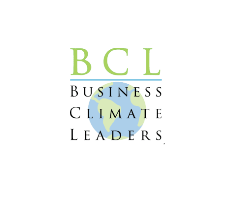
21 Responses to Option B
The bigger letters denote a level of Boldness.
like this look the best
Choice B looks a lot more professional and more eye catching. It is complex, yet simple in design
I personally prefer the globe in the background as climate change affects all of us on the planet earth.
B is a very nice design and really gives a good idea of what BCL might be by showing the Earth as a watermark.
Both look good, but B looks a little fancier and classy.
I like B better. It like the picture of the earth in the background. It really jumps out at you.
I like the globe in the background of logo. I just like how this is set up better and I like the font used.
The other one hurt my eyes when I looked at it
Definitely B, I love the font on the letters and the small earth logo in the back makes it much more attractive.
B appears to be more in line with the type of business. This logo would be good for a long time.
I like the world and the font used
well if its a global company b certainly says that better!
I like this logo better because of the globe. it makes it seem like this company makes a big impact and the globe is a positive symbol.
I think that option B is the more appealing option over all. I like the look and the layout and I think that it is more attractive
the world is eye catching
I like the spacing, font, colors and design of B a lot!
It looks more minimal and professional
I chose B. I like the inclusion of the Earth and climate. I think I would have preferred A if the letter C was more incorporated to look like the Earth. I also dislike how the B is partially covered in A's design.
Between the two, "B" looks more professional to me. "A" seemed like less effort was involved and it feels rushed.
I like it because of the globe, and the nice looking Earth, together with 'climate' in the title it has positive connotations involving balance, and forward planning, and good judgment.
Explore who answered your poll
Analyze your results with demographic reports.
Demographics
Sorry, AI highlights are currently only available for polls created after February 28th.
We're working hard to bring AI to more polls, please check back soon.

