Poll results
Save to favorites
Add this poll to your saved list for easy reference.
Which Pet Supply Logo Looks The Most Appealing?
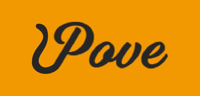
Option C won this Ranked poll with a final tally of 33 votes after 4 rounds of votes counting.
In a Ranked poll, respondents rank every option in order of preference. For example, when you test 6 options, each respondent orders their choices from first to sixth place.
PickFu requires a majority to win a Ranked poll. A majority winner differs from a plurality winner. A majority winner earns over 50% of the votes, whereas a plurality winner earns the most votes, regardless of winning percentage.
If an option does not earn a majority of votes, PickFu eliminates the option with the lowest number of votes. The votes from the eliminated option are reassigned based on each respondent’s next choice. This process continues in rounds until a majority winner emerges.
Scores reflect the percentage of total votes an option receives during the vote counting and indicate the relative preference of the respondents. If there is no majority winner, look to the scores to see how the options fared relative to one another.
| Option | Round 1 | Round 2 | Round 3 | Round 4 |
|---|---|---|---|---|
| C | 26% 13 votes | 26% 13 votes | 36% 18 votes +5 | 100% 33 votes +15 |
| A | 24% 12 votes | 26% 13 votes +1 | 32% 16 votes +3 | Eliminated 16 votes reassigned |
| E | 28% 14 votes | 32% 16 votes +2 | 32% 16 votes | Eliminated 16 votes reassigned |
| B | 14% 7 votes | 16% 8 votes +1 | Eliminated 8 votes reassigned | |
| D | 8% 4 votes | Eliminated 4 votes reassigned |
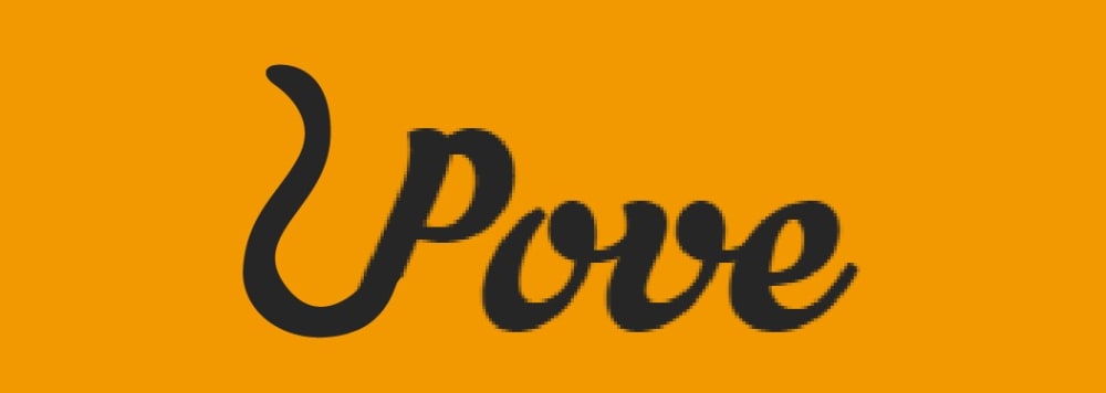
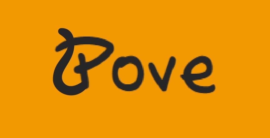
12 Responses to Option A
This is readable, but has an offbeat look to it that I like. #2 is also readable, a bit more generic, but still a nice script. The third is like #2, but a little bolder, which I don't think looks as good.
Bright colors caught my attention
these are the most interesting just how they are bolder and more curvy like a dogs tail
It took a minute to realize what the logo contained, but I like the cat/animal tail. I like that the logo is bold, big, and centered, additionally I like the orange color, it gives it a tiger feel.
I chose A B C based on the little tail coming off the P to represent animal products. I also chose these based on the font and how easy they are to read.
B is readable, not too big and has just enough personality. E is fun and has a look like an animal was trying to write which could be good for a pet related logo. A looks sort of cat like.the tops of the letters have a slight ear feel to them.
I think A looks the best because it's the biggest, clearest writing, and so forth down the line.
The other fonts are hard to read.
the thicker font is more inviting and looks fancier. it has some mystery to it.
I like the design of how that it is layed out.
I like these three the best because they're easy to read at a glance and the tail image is easy to perceive. I also like the thickness of Option A, it feels more bold and hardy. Option E is pretty cute, but at first glance it's hard to know what that first letter is supposed to be.
I think option C is the cleanest and clearest. It just looks nice and inviting. I picked Option D second because I like how the P has what looks like a dog's tail. I thought that was cute. Out of the last 3 choices I picked option E because it was written in a very block-type manner and this one also has what looks like a dog's tail coming from the P.
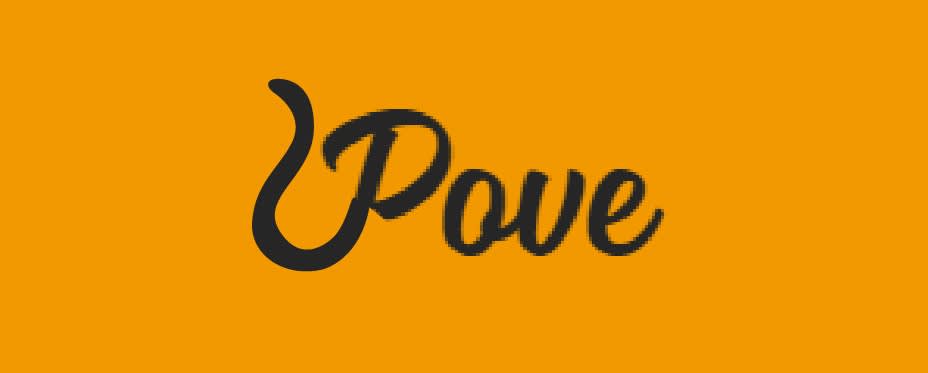
7 Responses to Option B
The others look like poor handwriting.
B is just the right size. D is not to big or small. C kinda big.
I think B is very good looking. It has distinctive writing
My choices are based off what I feel the logo should represent. I feel that the logo should look professional but have a feel of small time and fun to it. I feel that these choices best represent that by not looking to amateur, but at the same time keeping the customer interested and drawing them in.
Easier to read
I think both were smooth and looked good for the viewer.
These appeared to be the cleanest presentation of the text. However, I don't find the letter P to be appealing in any of these options and would immediately prefer anything with a simple, normal P.
13 Responses to Option C
I chose the ones that were the most clear and easiest to read. I avoided the ones that looked strange or not symmetrical.
I picked the best looking tail on the P
C has the best readability while also still looking unique. D is very whimsical, but could be misread upon initial viewing. Same for A, and the P looks kind of sloppy and not balanced with the rest of the text.
C and B are neater and pretty as cursive lettering. E I chose because I had to.
I choose C first because it like the bolder font. I like all the ones I picked because it looks like a dog tail coming off the P.
i like option C the best because its bigger and fills most of the space i think this makes it look better overall. option E has a unique font that i think would fit a pet supply logo
They appeared the best
Because it was readable.
I like the tail this way and the font is a little more bold which is nice.
I chose these choices because the logo stands out the most. I liked # C the best because the logo is bigger and bolder and catches my attention more so than the other logos.
My first choice caught my eye and the logo lets me know its a pet product. My second choice I like also because it has that pet feel reminds me of a dog. and my third choice stood out and gave me the cat image a pet cat
Option C looks the most appealing as a pet logo followed by A.
I prefer the larger font presentation for a logo.
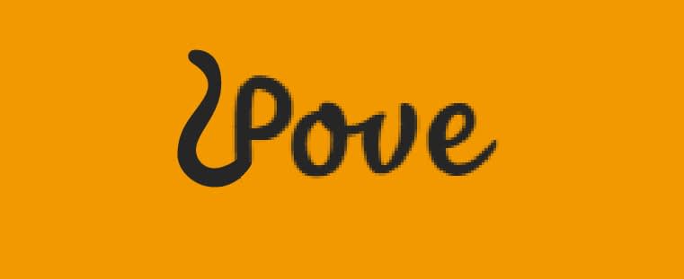
4 Responses to Option D
I like the font choice on Option D as it's the easiest to read & understand what the company is.
D Just looks more puppyish I guess. So do E and A - like they were made with a puppy paw.
I liked the more understated designs. I felt it allowed the focus to be in the front of the logo.
The most easily readable ones seem like the best options
14 Responses to Option E
I like choice E it's so cute how it looks like a dog. The others with the tails are cute, but not as cute as the face.
It looks more whimsical and fun and not related to love or relationships
E looks friendly and perfect for pet supplies.
For the first choice, the letter P is stylized to resemble a dogs head. Very cute! Choices 2 and 3 were selected more for the professionalism of the font. Both Ps have a tail to rememble cat or dog, which in some ways may be more broadly appealing than the first choice just resembling a dog.
I found them all more visually appealing.
I picked E for number one because it reminded me the most of a tail, which immediately identifies it as a pet supply logo. Option B was quite close to E. I didn't quite like the tail as much since it didn't over lap the P. Somehow it seems less playful. Option D was my third choice because the tail still was obvious. I didn't like it as much as the previous two because the font seemed quite similar to Dove bath and body wash which was distracting to me.
look like more atractive
Chosen in order of which fonts I like.
I cant even tell what the word is. Pove? I like the dog shape on "D" the rest are all lame
I like the one with the clearest font. It is plain and not like cursive. easy to read. I like the one with the loop made over into the letter than a separate loop. I think it is more script like for the letter and then the rest is very easy to read/
I liked the printed versus cursive the best, and then the thinner lines are easier to read.
I like my first pick the best, you can see what the name is with putting a little symbol curly q on the first letter and making it cute. All the others the curly q makes it look funny as it is too big for the rest of the lettering and you don't know what it is for and it makes the word harder to figure out what it is
I chose option E out of the 5 because it was the easiest to read and because the shape of the "P" looks similar to a cat or animal back. Despite it's simplicity, I could tell that the P looks like it's catering to an animal. I liked option B as my 2nd choice because it was legible and it is slightly less pix elated than option D.
I prefer the bolder fonts.
Explore who answered your poll
Analyze your results with demographic reports.
Demographics
Sorry, AI highlights are currently only available for polls created after February 28th.
We're working hard to bring AI to more polls, please check back soon.

