Poll results
Save to favorites
Add this poll to your saved list for easy reference.
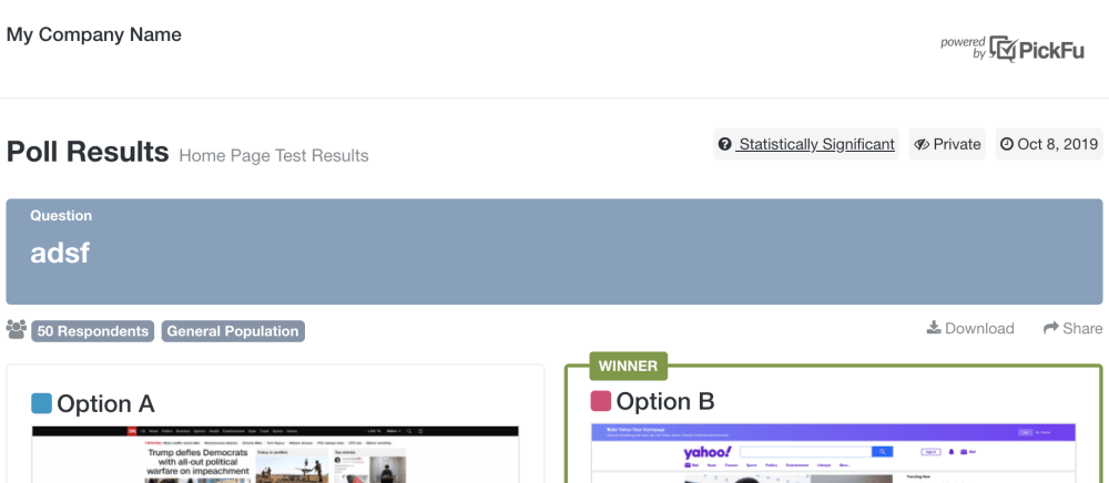
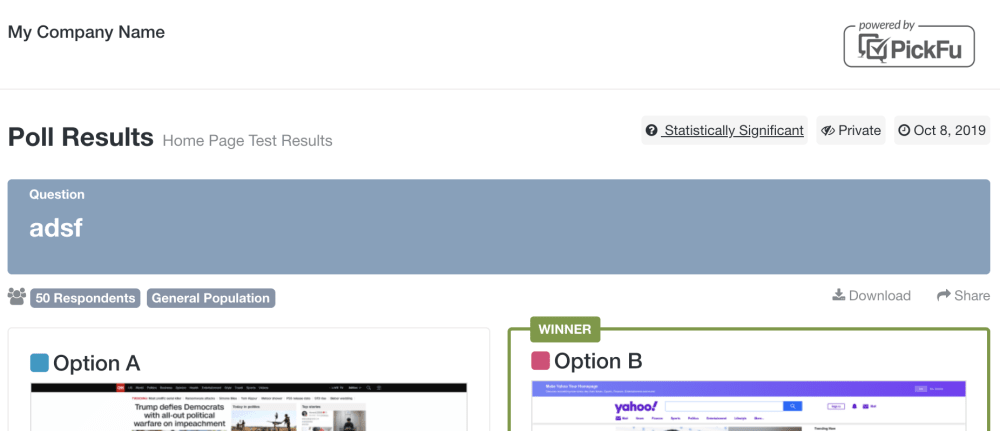
Which "Powered by PickFu" logo is most appealing in this layout?
Age range
Education level
Gender identity
Household income range
Options
Personal income range
Racial or ethnic identity
11 Responses to Option A
Option A looks much better
Option A looks more attractive compare to option B.
Slightly larger titles is easier to see and choose. This is the one you should go with.
I like A the best.
I think the one in A is more understated and subtle. You don't need it looking like it was stamped onto the page by a press.
i don't really see much of a difference between the two images
This logo really stand out
the lines / box around pickfu in B make it seem like it's clickable. Since I don't think this is clickable, i picked the other which then makes more sense.
I prefered the pickfu logo being smaller
I prefer an unobtrusive logo. The fewer visual distractions while taking a survey, the better it is for me.
The border seems unnecessary and doesn't look as good
39 Responses to Option B
I like the circle around the logo, makes it easier to spot
I like the border around the entire logo because it stands out and is much easier to read.
B is easier to read.
I think that it looks great with the box around it because it kind of showcases the powered by a bit more than it just being on the side
i like more this design
I like how it is wrapped up and more apparent
B is much more clear. I instantly picked up on it. A is a little too small and has to much going on it got glanced over for me.
The frame around the logo helps it jump out on the screen.
The logo stands out more and draws your attention to the circle around it.
this one is bigger and more eyecatching, the other one is a little too inconspicuous
I think B looks the best and it stands out the most
I like B, just because with the box around it, it stands out a bit. Otherwise it kind of blends in and I don't notice it.
I think the box around the logo makes it stand out more.
B stands out more because of the border.
The logo in option B is the most appealing to me because it appears to be larger in bolder print and has a box around it drawing your eye to the logo. The logo in option A is barely noticeable if you aren't looking closely for it.
It looks more clean and organized.
I prefer this one because the logo is larger and it is easier to read so it stands out.
The larger one is more appealing for those of us with emerging presbyopia!
I like the darker and larger logo of B. I think it will be more visible to someone looking at the page.
It's prominent just to the right amount that needs to be
I chose B because it looks bigger making it easier to read, but also I like the box around it to draw attention to who made the survey.
Choice B is more appealing to me, and it also stands out more which is a good thing for the company. Choice B draws your eye to the logo much more than choice A does.
I couldn't tell the difference between the two so it doesn't matter to me
strong and inviting to look at
The box outline in Graphic B helps the logo stand out more and not get lost in the rest of the screen. I don't see any other differences between the two.
I like the circle around the logo. It is easier to spot. The other kinda blends into everything else. So, I have to be really looking for that specifically to notice it.
I like the use of screening to border the logo. It is more appealing in this layout to me
I liked that the logo in Option B is easy to read, but not obnoxious.
I really like the layout of this one.
stands out more. easier to see bolder.
I like the box around the logo better than the standard no box feel. Makes it stand out a bit more.
This is more interesting to look at.
I think the box around the logo is better
The larger logo in option B is easier to read so I am more likely to notice it and less likely to ignore it.
I like how big it is and it is easy to see so you know who runs it.
i think the bubble is much nicer to look at and makes it stand out more. the other one just like like every other boring logo. nothing special about it, nothing eye catching. the other one in the bubble at least looks like something that would catch your eye.
Option B was a little larger and more clearly a logo, versus option B which has some small print. The box around the logo may be misleading though. People may think it is a button to click on.
Option B stood out because of the top right corner. It draws more attention to the eye more so than option A.
I like this this one more because it stands out with the box around it and the check boxes are bigger.
Explore who answered your poll
Analyze your results with demographic reports.
Demographics
Sorry, AI highlights are currently only available for polls created after February 28th.
We're working hard to bring AI to more polls, please check back soon.

