Poll results
Save to favorites
Add this poll to your saved list for easy reference.
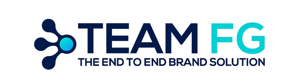
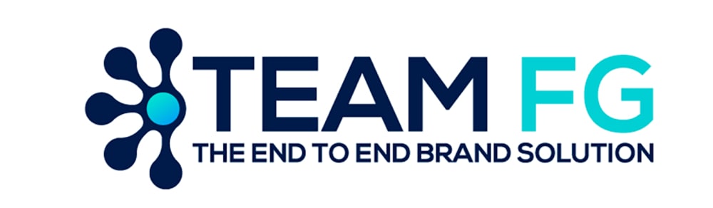
Which version of this logo looks best for a company that "connects the dots" for building a brand?
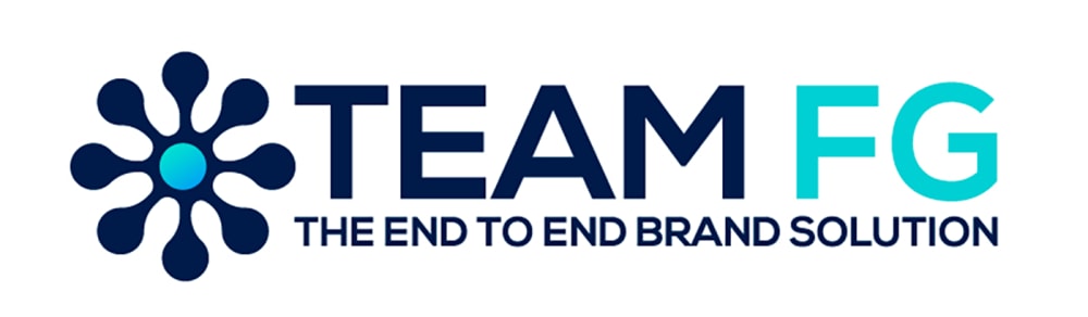
Option C won this Ranked poll with a final tally of 35 votes after 1 round of vote counting.
In a Ranked poll, respondents rank every option in order of preference. For example, when you test 6 options, each respondent orders their choices from first to sixth place.
PickFu requires a majority to win a Ranked poll. A majority winner differs from a plurality winner. A majority winner earns over 50% of the votes, whereas a plurality winner earns the most votes, regardless of winning percentage.
If an option does not earn a majority of votes, PickFu eliminates the option with the lowest number of votes. The votes from the eliminated option are reassigned based on each respondent’s next choice. This process continues in rounds until a majority winner emerges.
Scores reflect the percentage of total votes an option receives during the vote counting and indicate the relative preference of the respondents. If there is no majority winner, look to the scores to see how the options fared relative to one another.
| Option | Round 1 |
|---|---|
| C | 70% 35 votes |
| B | 24% 12 votes |
| A | 6% 3 votes |
3 Responses to Option A
I like that it doesn't overpower what the words are saying
All logos looked very similar. I picked based upon looks and color. And what looked more professional.
according to my opinion i choose this order
12 Responses to Option B
I like this logo because of the way it stands out.
I prefer the logos from best to worst in that particular order
When I look at the logo in B, I see TeamFG supporting the center of the group of dots to make it stand strong.
i LIKE OPTION b THE best. This logo stands out
Choice C Seems like too much with the design. Choice B seems perfect as it complements the Team FG
I think the logo that appears half finished reminds me more of building, completion.
the more condense look is easier to read
The partially connected dots make the most sense.
The full circle is too much, just half is sufficient or even 3
I like half the flower better
I think that these have the best balance
They all look so really nice
35 Responses to Option C
made my choices based on what looks best
the logo next to team is more unidirectional and shows more of a full team approach versus only a portion of the team
The more dots connecting, the better if that is the message you want to convey.
I like these designs best in this order.
I like logo C better, it looks complete.
A full circle would help the reader with the connect the dots logo.
I chose the logo that had the most dots connected in that order. If the company is connecting the dots for building a brand the first logo makes more sense to me because the dots are connected to "build" a flower. The logo in a way gives you an indication of what they do or makes the most sense when you find out what the company really does, in my opinion.
I like the all around image. Then the second closest to all around. The more of an image the better.
Looking at it, the incomplete versions in B and A seem off. I like the whole dot matrix in option C the most. Makes the most sense as well.
C really shows the dots and how the entire picture is connected. A is like the beginning of something. B is like something broke halfway through. I don't like it.
I LIKE HOW c HAS THE LOGO AS A FULL CIRCLE, IT MAKES THE MOST SENSE
I chose C because I like the completed "flower." To me, it shows you connecting all the dots. The other two look unfinished to me.
I think this image represents end to end brand solution the best. The more full the image looks I think it is more appealing to connecting the dots for a brand.
I LIKE THAT C HAS THE LIGHT BLUE DOT IN THE MIDDLE AND HAS THE BLUE COMING OUT.
I like the full design of the logo without it being cut in half
The more dots that are connected in the logo, the more resourceful and useful the company appears. It subtlety lets people know how well connected they are.
C shows the whole sybols abd seem sm ore complete; B is ok but loolks weird not having the whole deseign; #3 looks like a shot put to the symbol and makes me think its for a badmitton game
The first choice looks complete like it is all inclusive based on the design (flower). The second choice appears partially inclusive based on this same design and the last choice seems less inclusive based on this same design as it barely connects the dots like the ad says they do.
I like the logos that are full dots or less dots the most.
The full flower is best for connections the dots
I made my choices according to how well the hand-like figure in the images portrays the idea of "connecting the dots."
I have to go with C first because it signals an inclusive atmosphere. It indicates to me that everything will be connected. The other two are OK, but they seem...incomplete at best.
The symbol on the left hand side seems more appropriate and complete which would maybe make me think this company is complete and accurate.
I PREFER C, WITH THE DESIGN COMPLETED
Option C's graphic part of the logo looks better because of the full symmetry and the fact there are eight dots connected to the hub, representing to me that this company could incorporate a multitude of things into a brand. Option B was next because it looks not as weird as Option A in the layout and amount of the dots connected to the hub of the graphic.
I chose logo B" because it's the boldest of the three. The logo "B" and "C" show a lesser degree of illustration and "A". I always say that more is better in commercial advertising.
The more connections there are, the better and more fitting. Choice C has the full spectrum of connections.
They are all very similar. The logo is C looks the best. In B and A, the logo looks like it is missing something
I feel C is the most complete graphic and fits with the idea.
I prefer option C the most because the logo looks completed. Options A and B look incomplete and unprofessional.
Option C is the best, because if this company is about connecting the dots the logo shows all the dots connected. Best option in my opinion.
I chose option C as my favorite option because it makes the most sense that all of the dots are connected. The logo is the most captivating. I chose B and A second and third, by their respect number of dots in the logo.
Even though I think C looks somewhat like a flower, which had me thinking I should not select it, I think that having things connected from one side all the way to the other is important. It makes it appear to connect everything instead of just a few. Likewise A second because it includes more connections.
I like the symmetry of Option C, B is also pleasant on the eyes - both seem professional and a good logo for "connecting dots". Option a feels unfinished.
The bigger logo makes it seem more connected
Explore who answered your poll
Analyze your results with demographic reports.
Demographics
Sorry, AI highlights are currently only available for polls created after February 28th.
We're working hard to bring AI to more polls, please check back soon.

