Poll results
Save to favorites
Add this poll to your saved list for easy reference.
Which wordmark logo / branding is more appealing for a higher-end soft furnishing/textile brand? And why?


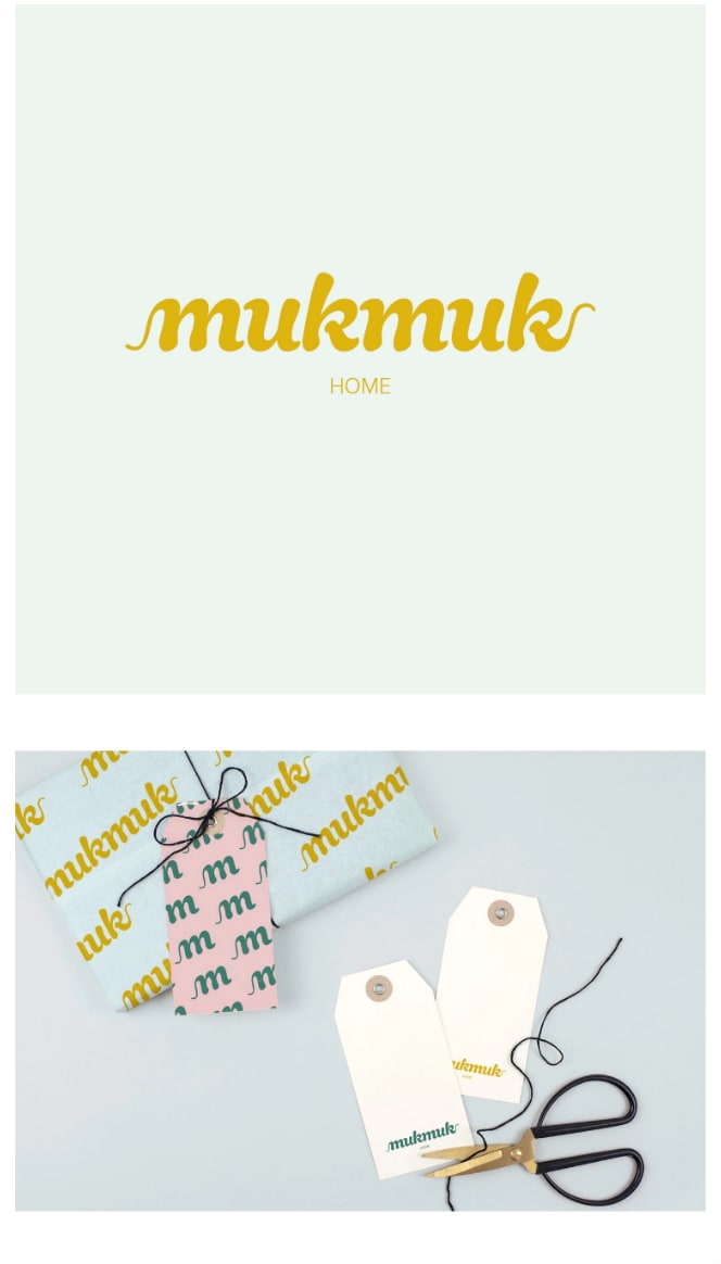
12 Responses to Option A
B reminds me of an Irish Pub, for some reason. I feel like A is more appropriate to the product.
I like them both, but the font face in choice B has a nice symmetrical flow to it. I like the bracketing at the start and end. Choice A flows very nicely but I like the hooks at the start and finish of choice B. It looks more elegant.
This seems to fit the theme of the brand better with the phrasing
You can see the tags a little easier
The cursive font on this one suggests a higher-class, fancier air about the brand.
A is more simple and it looks like it is luxurious but chic. Designs like these make me think high end.
I prefer this design, it is fresh, looks expensive and is memorable.
It is soft and yet bold. It states what it means and you can see through the chaos. It looks as if it would catch the attention of the consumer and be able for it to stand out and be able to connect with the need of what they are after.
I like the simplicity of the white background.
The font is softer and the curving strokes feel gentler which is what makes sense to me as something applicable to soft higher end textile.
The softer color palette seems more inviting and encourages people to inquire about the brand. The darker options seem to be exclusively for the "Fall" season which seem to limit the brand, in my opinion.
I chose A because it just seems softer than B. Home goods should have a soft touch. Lighter colors and such. I prefer the lighter backgrounds incorporated in A and the varied font colors to the dark green and mustard mix used in B.
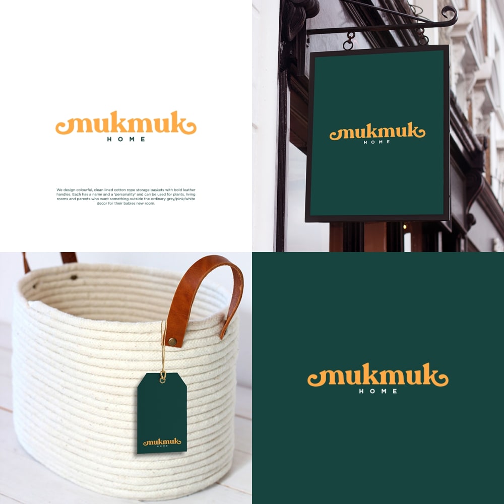
38 Responses to Option B
The darker background color definitely sticks out in my opinion. I like it.
The gold on the dark green looks so classy. I would definitely pick that.
I like the darker background, looks more business like, more professional
The soft, green background brings a sense of elegance in my mind.
Choice B looks more akin to a higher-end brand. The image is photographed and presented in an up-scale way.
Option B looks more high-end and consistent with a luxury brand.
This logo is much more attention getting.
I chose B because I feel like it's more bold. The yellow sticks out from the green in a way that is more noticeable and memorable than yellow on white. However I will say that I might expect the white one on something more higher-end, although I'm not entirely sure why.
The dark green adds a degree of class to the logo.
The gold on that particular green is very sharp. It looks high end where as the other one looks cheap.
I thought this was easier to read
I think B is a much more dignified and elegant style. A looks like it should be for chocolates or a teenage clothing store.
Option B seems somewhat less generic than A. I find B more eye-catching and memorable than A. I think that B is more distinctive than A. B seems more readable from a distance than A and it is easier to identify at different sizes. B catches my attention for longer than A. Overall, I prefer B to A in most aspects.
I think the option B logo has more of a symmetry which seems more consistent with a higher end brand.
I prefer Option B due to its more elegant and sophisticated font logo. It is more mature and serious. I feel that it would blend well with what the company is representing as far as a "high end textile brand".
i really like the dark green with the yellow on top, it pops really well and i find it pretty engaging
I selected option B because the gold lettering on the green background caught my attention way more than in option A. The green and gold seems to be more of a higher end product in my eyes. Additionally the picture of an actual textile product is shown in B and this gives more meaning to the logo and ad as opposed to the wrapping and tags and scissors in option A. I also think the hanging sign in B makes the brand look sophisticated, and it seems like it would be a nice place to shop for higher quality textile products.
I prefer this one because it is more warm and inviting, it makes me feel like they care about the consumer.
Choice B since I really like the green and yellow combination. It does not look as bland as choice A.
i like this one cause u get to see the products too
I like the two tone of colors used.
This one looks really soft and pleasant to look at.
I picked b because of the color blend. The evergreen and gold has ab earthy feel.
I like the curls at both ends of the logo. nice!
I like the combo color scheme of green and yellow in B.
The hunter green color is the best for a soft textile and higher end! Choice A is the best for a better option!
I love the bolder colors
B is the better choice, in my opinion because it shows the shop, the brand and an example of the product. These are all key selling points to me.
B is more professional.
VERY COLORFUL SHORT AND SWEET LAYOUT NICE PICTURE
The ends at the two sides of my choice are in my opinion much more appealing. The flourishes on the other one look like they almost lack confidence, whereas these thicker ones have more presence.
I think the text being straight and not angled makes it look more elegant and classy.
A is boring not enough going on. Very dull imagery.
this option appears more professional
NICE LOOKING GROUP OF ITEMS TOGETHER
The color scheme appears more high-end and contains complementary colors.
I like b its more balanced as an image and gives a better idea of what the brand is about. Its cool to see a product there makes me watnt to click on it and learn more. A is vague and doesn't show any useful information about the brand. A is confusing I don't know if its for packaging or labeling or something?
I feel this is more appealing. The colors stand out and it is very eye catching.
Explore who answered your poll
Analyze your results with demographic reports.
Demographics
Sorry, AI highlights are currently only available for polls created after February 28th.
We're working hard to bring AI to more polls, please check back soon.

