Poll results
Save to favorites
Add this poll to your saved list for easy reference.
Which message appeals most to you?
Option B won this Ranked poll with a final tally of 26 votes after 4 rounds of votes counting.
In a Ranked poll, respondents rank every option in order of preference. For example, when you test 6 options, each respondent orders their choices from first to sixth place.
PickFu requires a majority to win a Ranked poll. A majority winner differs from a plurality winner. A majority winner earns over 50% of the votes, whereas a plurality winner earns the most votes, regardless of winning percentage.
If an option does not earn a majority of votes, PickFu eliminates the option with the lowest number of votes. The votes from the eliminated option are reassigned based on each respondent’s next choice. This process continues in rounds until a majority winner emerges.
Scores reflect the percentage of total votes an option receives during the vote counting and indicate the relative preference of the respondents. If there is no majority winner, look to the scores to see how the options fared relative to one another.
| Option | Round 1 | Round 2 | Round 3 | Round 4 |
|---|---|---|---|---|
| B | 26% 13 votes | 26% 13 votes | 32% 16 votes +3 | 52% 26 votes +10 |
| D | 20% 10 votes | 26% 13 votes +3 | 38% 19 votes +6 | 48% 24 votes +5 |
| A | 24% 12 votes | 28% 14 votes +2 | 30% 15 votes +1 | Eliminated 15 votes reassigned |
| C | 20% 10 votes | 20% 10 votes | Eliminated 10 votes reassigned | |
| E | 10% 5 votes | Eliminated 5 votes reassigned |
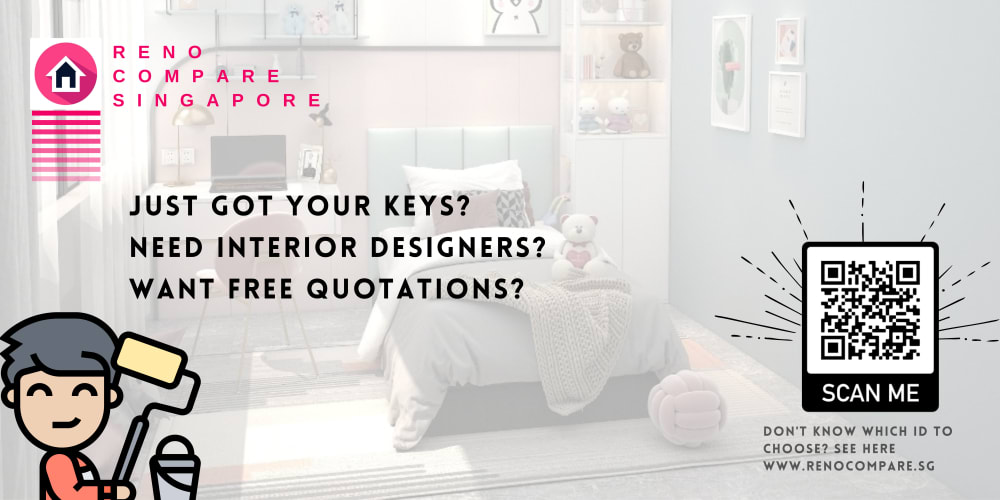
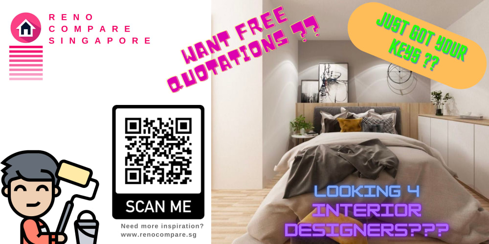
12 Responses to Option A
choice A has more of a modern text style and can still be easily picked up and read.
I like the design A it is easy to read and understand the background does not draw away from the relevant information, I like B for the same reason, but I like the character on it better, I did not like D, or E very much there is to much going on, option C is grammatically offensive.
A & B both work the best for me, they set the mood perfectly and give me a solid picture.
It gets to the point faster. I know what they are offering. The text is easier to read and it draws your eyes to it.
I like all the these they are pretty straight forward.
Options A and D have the better design and layout. Options B,E and C look really cheap and generic.
I think the painter boy is cute, and also the three clear point. In A they come together the best and are easy to read.
C and E look really unprofessional to me, with the brighter font and bubble style letters. A looks the most professional
I personally like the designs with the little cartoon character. I thought it made the advertisement more fun. I think that one of these has font that is too small. I think all of them are good in their own ways, but the ones that the cartoons are the most fun.
The design in A looks simple and mature and the words are easy to read.
I like A as it is clear and easy to read and has a little doodle of a man holding a roller brush which indicates home painting is available. I think C & E are hard to easily read and probably shouldn't be used in my opinion.
I picked A because is has the simplest design. Its the least distracting of them all.
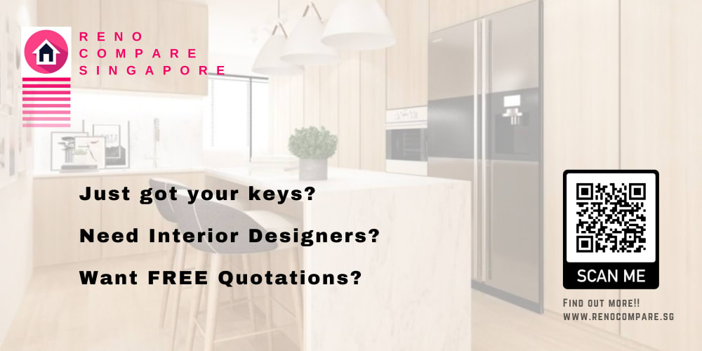
13 Responses to Option B
I try to find the three lines that are most readable - B is the best! big and clear! A is also big and clear but the cartoon is not really my style. then it's C. E is just too spread out, one here one there, in all angles. But it's still better than D - how can anyone read those small prints?
Option B looks the most professional and trustworthy which makes me more likely to find out more
I voted Option B as my #1 choice. I thought the ad looked the most professional. I like the kind of opaque background with the text. the text has a good font. It looks clean and tasteful and organized. I voted Option E as my #2 choice. It's a bit of a different approach, it's got the cartoon person with the roller and the messy bed. I think it conveys the message very clearly and the cartoon and the colors really get your attention. I picked Option D as my #3 choice because it looked similar to Option E. It's not bad, one of the differences is the guy with the roller is a little smaller and on the other side. I picked Option A as my #4 choice. I like it too, but I don't think the opaque background with the character with the roller works as well. I picked Option C as my final choice. The kitchen looks nice and isn't a bad photo but I think it could have a better choice of font. The font color itself is okay.
I prefer this option. It looks more professional. I am guessing the market for your service is business professionals with above average income so your ads should look professional.
The messages that seem simple and mostly appealing are the ideal options here. I like the arrangement of colors and textual details that allow me to determine which are easier to garner from the background.
Options b and a look the most clean and attractive.
I like Options B & C the most. The layouts are clear, direct and straightforward with attractive decor and a pleasing style. Option D , while stylish, has no ready message at first. Option E has a cheap and messy look and Option A is too vague and faded looking to make any impression.
B inspires confidence, as it looks like something that an accomplished designer would create.
Option B has the best combination of Font, Color, complimentary colors, and easy to read words. Option A is close, however the background is distracting, and can make the words hard to read. Option C is even worse, using a light font color against a light background. Option D, although it separates the wording, using a tiny, hard to read font, and the layout makes the viewer think that the words are trying to convey something specific in the picture. Option E is very Tacky, using bad color combinations and hard to read fonts, and Just like with option D, the separation of words and picture is trying to convey something that isn't there.
I ranked B first as it seemed the clearest and most concise. I chose C as #2 because it too provided clear information, but the white color of the font made it more difficult to read. I ranked options A, D and E all last because I felt the inclusion of the animated "worker" gave a sense of youth/inexperience as to me the animation looks like a child.
The more simple the better because I do not feel that the design needs to do too much. That is why B is my top choice.
Option B is the best because the advertisement and description is simple and customers can decide if the bed is a good fit for their needs
Um not sure that you your icon a person of any decent. Look what happened with aunt Jermaima. The last one though looks very dated. The others are nice and I like the more colorful ones such as 2 and 3
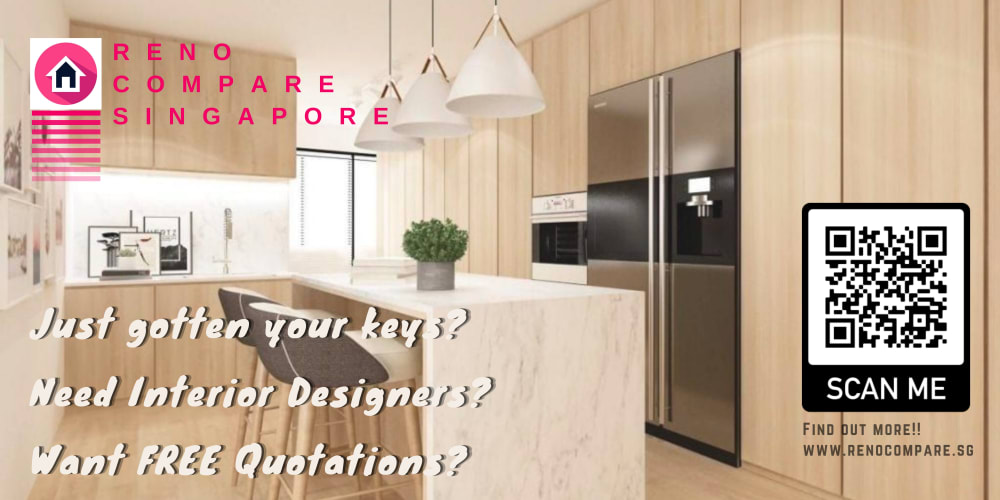
10 Responses to Option C
I like option C the best, it has easy to read print and a nice shot of a kitchen. Option B looks nice, it's simple looking. I don't really like the questions all over option E. And I don't like the faded look of options B and A.
I chooseiption C because it looks very attractive than other images.
I liked the warmth and coziness of the brighter and bolder color schemes of C and E. I thought the remaining options got increasingly dull and their colors got too faded which made them wholly cold and distant.
C is the most appealing to me because the image is very attractive and good looking. The text is also fairly easy to read.
"C" has a nice backgound picture. This is what sold me on my choice.
I voted for C as the most appealing message. I link the modern look of the interior design photo is attractive, most people want when looking for interior design. The photo is very natural looking and also neutral to appeal to a wide palette taste. I like the way the verbiage is presented against the photo.
I ranked them in order of easiest to read and understand but I do not like any of them. Pink is too gendered for a logo so you'll lose about 2/3 of customers and no I know uses a designer
I chose by options that look most professional and the least spammy.
I like the less cluttered and sleeker look the best, so I chose accordingly with option C as my favorite.
All the options except option C look crude and low-tech. Option C looks like it was made by a professional graphic designer. The position of the QR code in option C is exactly right, at the center of visual attention.
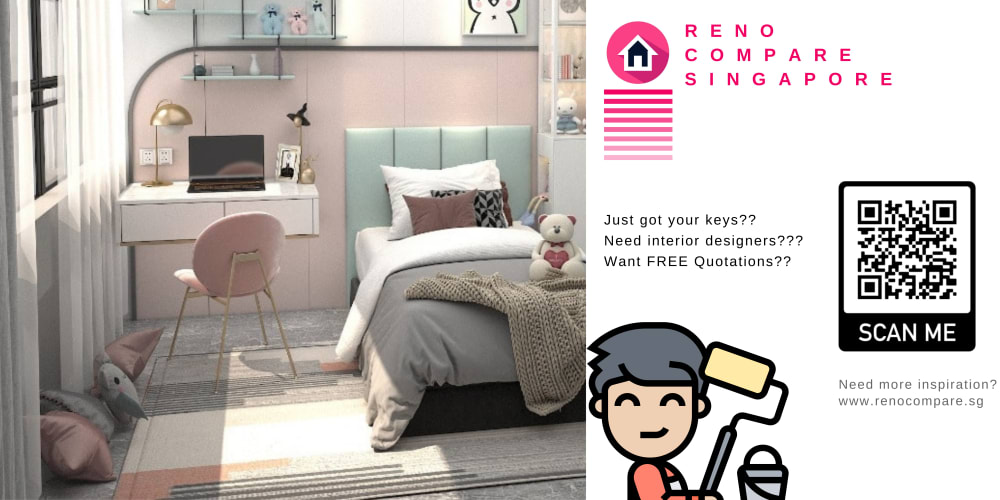
10 Responses to Option D
this looks the most organized and simplistic and gives me the most hope that it could work on my interior
Option D was very appealing and very worm than Option B and Option E ,and Option C and OptionA
Not all of these are very legible, worst amongst those being C and E. I put them last because it's annoying to read them, which would disincline me from the service entirely. The other 3 aren't as bad on that front. D would be my favorite overall since it's easy to read, looks nice with the brand mascot, and demonstrates what you can do via the room also shown in the image. It ticks the most boxes, so it's the most appealing one to me.
I like the little smiling man but I also like to see the room, and with less words
D is simple and attractive. It is straightforward and to the point. It is easy to understand
D and A are the easiest to read - B, C, and E are all very difficult due to how the text is colored/stylized. I would also add that all the designs seem a tad unproffessional and that you may want to reconsider the grammar/phrasing as it, too, does not seem the most professional or natural.
I think that D does the best job of conveying the message compared to the others.
I chose d, c and b because they were clear to see and understand and the images were clean. I chose e and a last because they were all over the place and not appealing.
Option D looks cleaner to the eye, and makes me more likely to click it. Makes me think the designer has done this room, which looks nice. The message is simple, especially if I've just "gotten my keys".
Various factors.The Image of the photo is clearer, visually it is better.The position on the right of the titles has better visual contrast.
5 Responses to Option E
The little cartoon characters shown in E and D are appealing for the cute design and spacing used here
E, D and C pictures are clear and appealing
Option E is a fun design and looks like it would still be professional but also the most budget friendly, and option A is a close second for the same reasons, Options C and B look nice but also a little out of my price range, and D looks like a service only a true executive professional would use.
I chose option E first because I like the fancy fonts with different colors because they are larger and much easier to read than the other fonts in the other options. I chose option A second because the font used on the text on the left side of the image ls relatively large and easy to read. I chose options B and D third and fourth because these images use fonts that are smaller and smaller, respectively, than the black font used in the option A image, which makes the text much more difficult to read. I chose option C last because the white text font makes this text extremely difficult to read compared to all the other images.
I like the little character and the code to scan along with the colorful background in E. The brightly colored words really set off the ad.
Explore who answered your poll
Analyze your results with demographic reports.
Demographics
Sorry, AI highlights are currently only available for polls created after February 28th.
We're working hard to bring AI to more polls, please check back soon.

