Poll results
Save to favorites
Add this poll to your saved list for easy reference.
Which store front would most likely influence you to buy baby products from?
Option C won this Ranked poll with a final tally of 28 votes after 3 rounds of votes counting.
In a Ranked poll, respondents rank every option in order of preference. For example, when you test 6 options, each respondent orders their choices from first to sixth place.
PickFu requires a majority to win a Ranked poll. A majority winner differs from a plurality winner. A majority winner earns over 50% of the votes, whereas a plurality winner earns the most votes, regardless of winning percentage.
If an option does not earn a majority of votes, PickFu eliminates the option with the lowest number of votes. The votes from the eliminated option are reassigned based on each respondent’s next choice. This process continues in rounds until a majority winner emerges.
Scores reflect the percentage of total votes an option receives during the vote counting and indicate the relative preference of the respondents. If there is no majority winner, look to the scores to see how the options fared relative to one another.
| Option | Round 1 | Round 2 | Round 3 |
|---|---|---|---|
| C | 30% 15 votes | 40% 20 votes +5 | 56% 28 votes +8 |
| B | 34% 17 votes | 34% 17 votes | 44% 22 votes +5 |
| D | 24% 12 votes | 26% 13 votes +1 | Eliminated 13 votes reassigned |
| A | 12% 6 votes | Eliminated 6 votes reassigned |
Age range
Education level
Gender identity
Number of kids
Options
Parent
Personal income range
Racial or ethnic identity
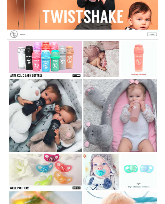
6 Responses to Option A
A gives me an idea of an array of baby products that they carry. It shows a variety without overcomplicating the photos, and easy enough to get an idea at a glance while surfing. A is likely the only one I would take a deeper dive into.
I picked A because Something about the name TwistShake resonates with me.
I liked choice A the best since the image is easy to focus on and the images are high quality and flow smoothly. Choice C looks good also and is a trusted brand which is appealing.
Simple pictures, clear and not too busy background
I prefer the ads that show more and larger images of the products being used in daily life. It gives me a greater sense of what would be available for purchase in the store.
I picked the images that showed the most product options.
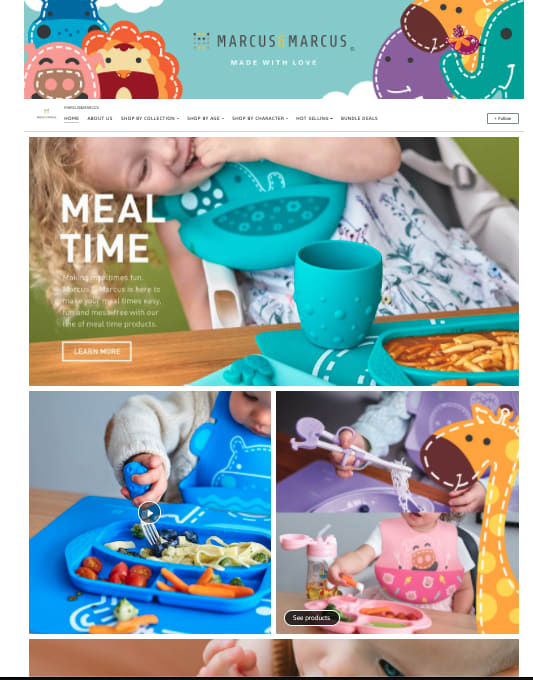
17 Responses to Option B
Option B's layout is decidedly the most sophisticated artistically/aesthetically - great colors, stylized animal figures - and showing just a portion of the infant's faces is a subtle enhancement.
Option b is best because it shows the products up close
They are more vibrant and fun looking, it looks like it would engage your child and provide fun safe products for your child. the last ones make parenting look boring and dull
I like the variety offered in options B and D.
The color palette for option b really drew me in when I looked over the images. I think that the combination of colors and pictures made it really enjoyable to look at.
I found B to be brighter and more interesting to look at. I felt it was more engaging overall.
I liked B most because it felt trustworthy and professional. I felt similarly about C, but didn’t like the main banner quite as much. Then, I didn’t like A as much because it seemed to weird and modern. While, D seemed like it was trying too hard to be cute.
I like the color scheme on this one. I also like that they are displaying how it is being used. It is cute and attractive. Thank you.
I chose based on which was more colorful and then which one had the most product images
Option B seems the most friendly, playful and colorful. It shows the various products in realistic but attractive ways. Option A has adorable cuddly babies all cuddled together and enjoying the advertised items. The remaining two options are fine but didn't catch my eye as the first two did.
I feel that choice B looks much better out of the four because there's a sense of real-ness of the depiction of the situation and makes it more relatable than the others.
I chose option b. This store front has products showing in bright colors and fun designs
I think B does the best job of showing a variety of products in use while the others I find myself looking more at the babies and missing the products.
B really entices me with its relative simplicity. You don't need a store front to be too busy.
Option B is by far the most dynamic and colorful.
I like option B because overall it feels like the website is less cluttered.
Option B draws me to it right away because I am always interested to see what other babies/children eat so I can get some meal ideas. I know that's not the point, but that one caught my attention right away. I like Option C next since it seems to have a wide variety of items to meet all different types of needs. The same goes for Option D. I think Option A is a little lacking in variety.
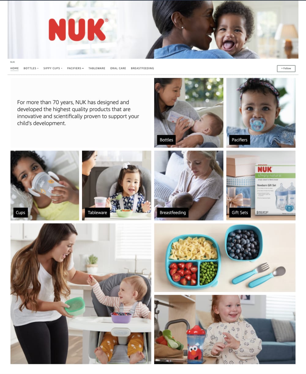
15 Responses to Option C
My first choice has a brand name I feel familiar with. My second choice looks like a full and easy to read layout. My last choice seems most generic.
Option c and b are interchangeably attractive to me option d looks too gimmicky
When it comes to my baby, I go with brands I know and trust. Nuk from C is the most confidence inducing. That said, B looks like a product I could use with my child. D is a well put together advertisement. A doesn't look like they are trying to sell something.
I like option C the best because the pictures show the mom interacting with the baby, which makes me think of my wife and baby. I also like the company name and the little blurb about the history of the company.
C is the most interactive, engaging, and realistic. A and D are both heart warming. B is too limited and does not focus on real life enough.
I like the variety of ages shown in C. This gets me thinking about products for different stages.
C is most attractive.
C has a lot of baby pictures doing different things. I like it most. Then C had some really good pictures.
I am familiar with the brand Nuk and have bought their products in the past, so I picked them as number 1.. I thought the logo in A was really boring and unimaginative. Nothing wrong with B and D. I just preferred B’s colors, it was more attractive
I like C and A because they emphasize the kids in the photos more prominently than the products. B because the products advertised are useul, and D least of all because everything looks oversized and plastic.
The name of the store is cool and all the babies are happy in the image
I voted based on the brand name that looked most appealing. All of the designs are fine, but I like C best.
I like option C as it has so many more images of parenting. I think that adds a lot of credibility.
Prefer C I like the picture of the cute babies using the products
Option C is best as it shows interactions between a mother and child while using the products.
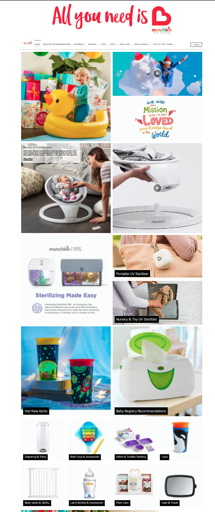
12 Responses to Option D
I would go with option "D". The colors in this image looks bright and vibrant. The overall image looks creative and appealing.
Shows more information and options.
I like option D the most because the photos are spaced out better and are neatly organized. They also have more information about the products.
Seeing twist and shake scares me, it makes me think they are suggesting shaking babies
D is the most detailed and informative. C is professional. A and B are not as intriguing or detailed as the other two.
The store front of option D is well designed and creative the color bused for the design bif option D makes option D to be more attractive.
It would definitely be Option D store front because of its lovely logo, its variety of products shown and its appealing images. Other options follow in the mentioned order.
Option D had the most positive influence on me because of the messaging and overall design which gives me confidence that they provide quality products
D is very heartwarming and touching to me.
I like D. All you need is love is cute. I like the heart at the end as well. I also like the bright colored products being featured.
I like D best. I like that i can see the products very well. B would be next. I like the colors and how easy it is to see the products. I would choose A over C... I can see the products some better in that one.
That looks most like a storefront instead of a collection of pictures
Explore who answered your poll
Analyze your results with demographic reports.
Demographics
Sorry, AI highlights are currently only available for polls created after February 28th.
We're working hard to bring AI to more polls, please check back soon.

