Poll results
Save to favorites
Add this poll to your saved list for easy reference.
Based on the design, which 'Burj Al Arab' Neon Light would you rather buy?
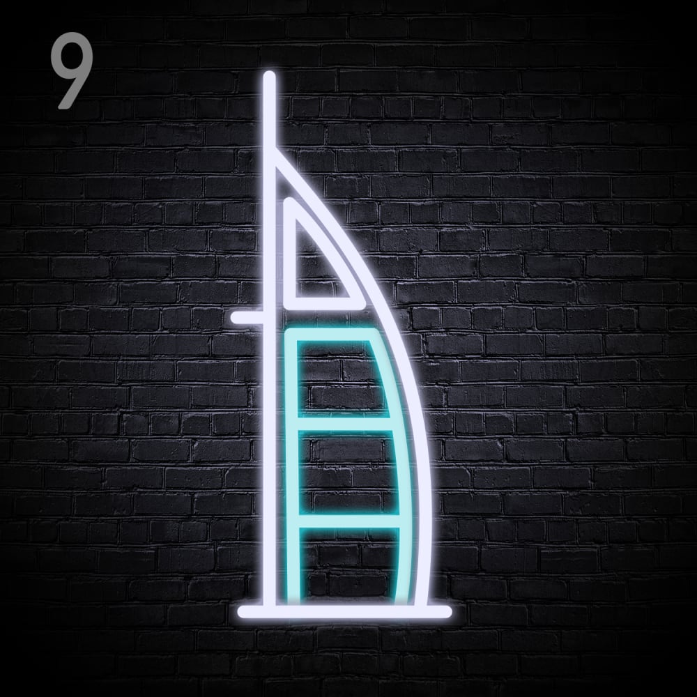
Option C won this Ranked poll with a final tally of 26 votes after 1 round of vote counting.
In a Ranked poll, respondents rank every option in order of preference. For example, when you test 6 options, each respondent orders their choices from first to sixth place.
PickFu requires a majority to win a Ranked poll. A majority winner differs from a plurality winner. A majority winner earns over 50% of the votes, whereas a plurality winner earns the most votes, regardless of winning percentage.
If an option does not earn a majority of votes, PickFu eliminates the option with the lowest number of votes. The votes from the eliminated option are reassigned based on each respondent’s next choice. This process continues in rounds until a majority winner emerges.
Scores reflect the percentage of total votes an option receives during the vote counting and indicate the relative preference of the respondents. If there is no majority winner, look to the scores to see how the options fared relative to one another.
| Option | Round 1 |
|---|---|
| C | 52% 26 votes |
| B | 30% 15 votes |
| A | 18% 9 votes |
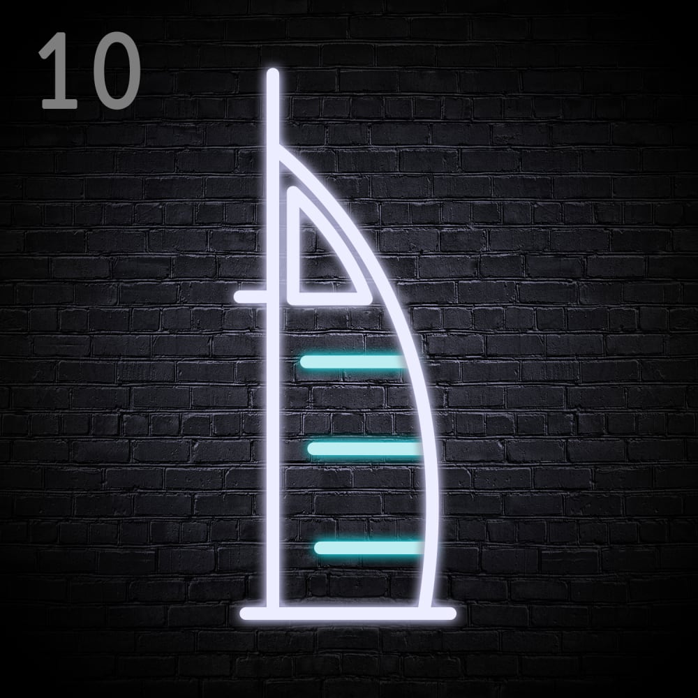
9 Responses to Option A
I prefer it simple, the fewer structures the better, so A is the best to me. then B. C is too complicated with the curved internal lines
I ranked my choices based on my preference for how the lines of building are represented and for the negative space.
i like A and C. B is too wild; chaotic for me. i prefer A over C by a tiny margin; i just like the appearance a bit more.
I love the sleek minimalistic design of my first choice, and I absolutely love the light blue color
OPTION A it has its own very own style to it and I just really find it appealing the way it looks like a kind of step ladder on the inside of it or like steps is so cool looking
it is very useful and very informative
I like the design the best
I like the empty space in option A, it looks like its floating and looks more unique than the others.
Option A is the classiest of these choices.
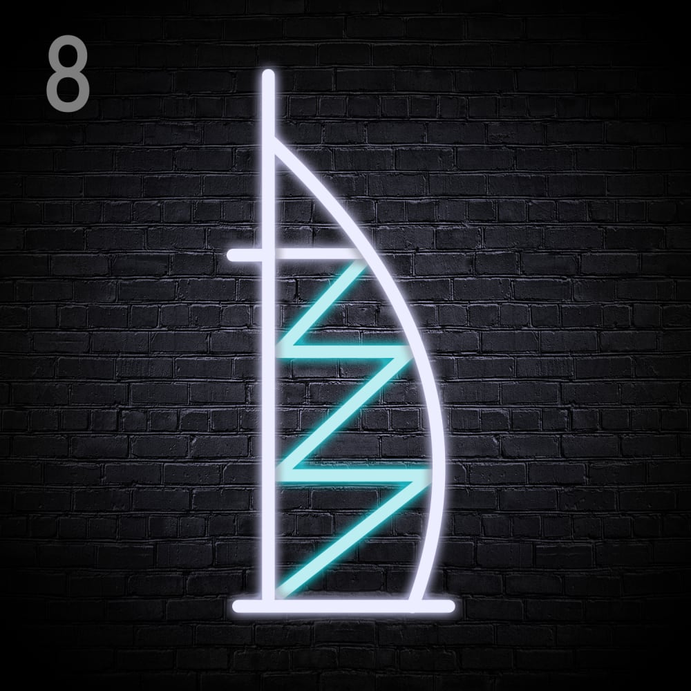
15 Responses to Option B
B- this seems nice and clean with the perfect outline colors to it C- this seems to be unfilled but still seems to be looking good A- this is simple and clean outlook to it which kind of looks ordinary
This is the most interesting lighting design here because of the zig zags as this element makes it more interesting
I like to choose option B. Because this zig-zag neon light is looking good.
8 looks like the most accurate look at this item for most and it reminds me of the city
I like the zig-zag lines of it in Option B, as it's a nice little twist on it. That's why it's my top choice. Option A's straight horizontal lines are too basic for me.
The lightning bolt-style design here really kills it for me, that one looks fantastic. Definitely my favorite compared to the other two, especially since that's the part in blue for that version. Choice B would be the one I buy.
I think that B looked the best in terms of design and overall appearance followed by the rest.
I think the 'zigzag' design in Option B is the most visually interesting, so that's what I would go with. Option A and C aren't as interesting to me, but A wins by default since C reminds me of some sort of weird ladder on a first look.
I like option B because it looks the most delightful and charming to me. Option C and A look less promising to me overall!
I like the zigzags a bit more than plain straight, and A doesn't seem like the lines are long enough.
I chose B first, because I prefer the connected squiggle style line. I chose C next over A, because I prefer the filed in look in C to the minimal style in A.
B has more of a "neon lights" feel than the others.
I would choose choice B first because the lighting design looks more complete and it looks really nice then the next choice will be C which also looks good but the block-like lighting is not that great as compared to choice B which has a zigzag design then the last option will be A which has no full lines on the lighting sections and it does not offer a very design to one who is buying as compared to the other two choices.
My choice is option B as rank 1 because of the light design is very attractive and energetic to show the power of light so i choose this. And the pattern of the light is very unique from other so i choose this.
I love option B the most because the blue line does a zigzag pattern in it making it the most attractive and aesthetically pleasing.
26 Responses to Option C
C i think the ladder look is cool.
I think that C looks fun and I like the design on this product. A is also nice but it looks a bit simple and generic to me. I don't really like how B looks. It looks strange and off-putting to me.
C looks more uniform and elegant. B looks too messy
All the lights in Option C are aligned symmetrically.
I like opiton C the best because the solid lines make the design more aesthetic and symmetrical.
Based on the designs, I would rather buy Option C because it makes me think of the Burj Al Arab more than the other options do.
I like C because I like the squares in the inside. I like A because of the horizontal lines in the inside. B is last because I don't like the zig zag lines in the inside, it just seems like too much lines.
I like the structure of C, as I think it's an interesting and intriguing juxtaposition with the neon lights.
I prefer the option C neon light design because because the inner blue light looks more like the profile picture of the luxury hotel in Dubai. I chose option A second because the lack of the frame around the blue lights makes the neon light design look more like a fish or bug than a luxury hotel. I chose option B last because the angled triangles in this neon light design make the lights look more like a mouse than a luxury hotel.
Option C has a nice overall structural look that is more pleasing to the eyes.
I would elect to have realistic designs over those that are overly simplified. These are comprised of a reasonable amount of detail with enjoyable colors like blue and pink.
I made my choicest his way because C reminded me of a building on the ocean that was very relaxing. I feel that A had a boat feel that made me feel relaxed, and B was just odd and I would not really want this design in my room.
I like option C the best because the product feels filled out and complete. I like option B the next best because the design is cool and I do not like option A because it feels generally empty.
This one looks the most like a tower, and is likely the brightest of the 3.
C is the only one that looks balanced.
Looks bright and much attractive.
I guess I like structure. this is my choice. I like the way this feels.
I like how option C looks very full, I think it looks the best. Option A is pretty good but I don't really like option B's zig-zag design, I like the design style of the other 2 better.
I chose option C because I like this design the most. It is the design that is the most aesthetically pleasant to look at compared to the other options. I also like that option C is more complex with respect to the geometric shapes and that there is a pattern that can be discerned. Option C has good contrast with the triangle and overall it's a design that looks nice and is the design I would rather buy. Option B is my second favorite option because the design is less consistent with respect to quality and presentation. Option C is very consistent and easy to understand. Option B is with the somewhat random directions that the line is moving isn't as pleasant to look at. I still like it more than option A because the design is more complex and it is kind of cool to see the different triangles created by the design, but I like option C more. I think option B is a design that is good but not great and option C is a design that I think is great so I like option B less and Option C more. I like Option A the least because the design seems very minimal and simple. I like the complexity of the presentation for options C and B and option A is a lot less complex. Three short lines just isn't as visually or aesthetically interesting compared to the other two options so it is not a design I would rather buy. I also don't think the lines contrast very well with the triangle. Option B has really interesting contrasts with the shapes and sizes of the contrasts and option C has a greater degree of complexity for the shape of the objects and the presentation overall. So I like option A the least because the design is too minimal, I like option B second best because I don't like triangles as much as I like the squares for option C and I like option C the most because I think the design of option C is the nicest to look at.
C looks the most realistic with the square inside part to me. It just fits with the burj design better imo
I like the straight boxes that the blue lines make. Choice B is a cool zizag, like a lightening bolt. Choice A is too simple.
Option C was my first choice because I felt that design best evokes the look of the Burj Khalifa tower. Option A was my second choice because that design also evoked the look of the Burj Khalifa tower but it wasn't as nice as option C. Option B was my last choice because I don't like the zig-zag pattern in that option.
The design is bold and catchy. The product look is creative and bold.
The light pattern in Option C looks very appealing and attractive to me.
The design in C looks more like the design it's supposed to look like.
C has the best look and fullest design. A is a little minimalist. B does not look like the building with the zig zag.
Explore who answered your poll
Analyze your results with demographic reports.
Demographics
Sorry, AI highlights are currently only available for polls created after February 28th.
We're working hard to bring AI to more polls, please check back soon.

