Poll results
Save to favorites
Add this poll to your saved list for easy reference.
Based on the design, which decorative stacked books would you buy for your home decor?
Option C won this Ranked poll with a final tally of 29 votes after 1 round of vote counting.
In a Ranked poll, respondents rank every option in order of preference. For example, when you test 6 options, each respondent orders their choices from first to sixth place.
PickFu requires a majority to win a Ranked poll. A majority winner differs from a plurality winner. A majority winner earns over 50% of the votes, whereas a plurality winner earns the most votes, regardless of winning percentage.
If an option does not earn a majority of votes, PickFu eliminates the option with the lowest number of votes. The votes from the eliminated option are reassigned based on each respondent’s next choice. This process continues in rounds until a majority winner emerges.
Scores reflect the percentage of total votes an option receives during the vote counting and indicate the relative preference of the respondents. If there is no majority winner, look to the scores to see how the options fared relative to one another.
| Option | Round 1 |
|---|---|
| C | 58% 29 votes |
| A | 26% 13 votes |
| B | 16% 8 votes |
13 Responses to Option A
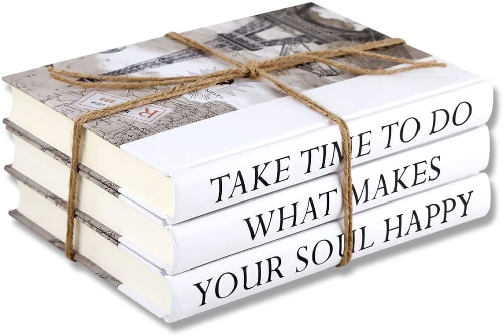
Option A is the most appealing because it looks like a regular stack of books but on second glance is for decorative purposes.
A looks the most like a real set of books
A looks the best to me, this is the stack that would look most natural in my room.
I like the look of the real books in option a. It is not over the top, and it would fit a minimalistic lifestyle.
I like the simplicity of A. B looks awkward. C looks like a Pinterest explosion.
I like the simplicity of the twine and the white books in Option A.
I hate 'home sweet home'. I picked C over B because of the color
I think the books in A look the most realistic and also dont feel corny with the names on the spines. C and B have too much of a "live laugh love" feel to me and thats a detractor
I love, love A. The simplicity of it is appealing, and something I would purchase, today. The titles on the spine are the right font and size, too. C is entirely too much, and busies up a minimalist design.
I like the more interesting titles on the books in A. Very cute.
I like option A the best because I think take time to do what makes your soul happy sounds like the perfect slogan for people to read when they come into my house. Home sweet home is a nice sentiment, but it's one that I've seen so many times. I would chose B over C though because I'd rather have a more plain home sweet home than an over the top flowery one.
Option a is really unique it looks good has a great saying it would fit my Decour perfectly. I also like options c it looks good as well
I like the option A, where it seems possible at least, that these books could be actual books, not fake ones, though upon close examination, you'll have your doubts here anyway. At least option C is quite stylized, though I would hate to have to keep dusting this option, over the years I'd become quite tired of keeping it clean.
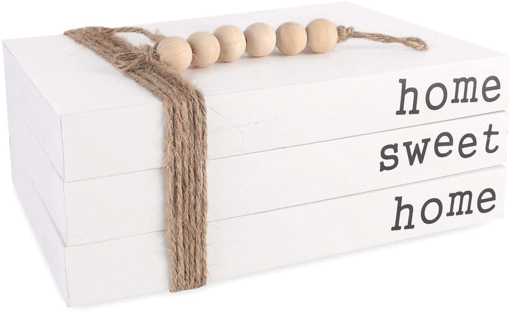
8 Responses to Option B
Definitely B. I like the simple look of this one. A would be next, it is somewhat simple too. The flowers on C take away from it for me.
I like option B the best because the design looks the most simple and would be the best fit for my home.
I prefer the option with the more condensed and simple text, highlighted by basic decorations.
B* is simple and cute A* is okay C*is over decorated
I like the home sweet home message and quite like the colors in option B.
I wouldn't buy any of these because they are tacky and feminine and I think most people will agree. With that said, the least offensive of the bunch is the white stack that says "home sweet home".
B has a simple, yet effective design that makes it more engaging to the consumer.
I like to simplistic design. It looks symmetrical and easy to understand and look at
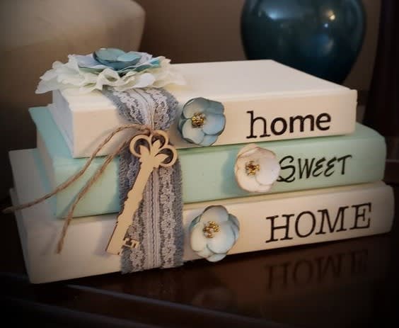
29 Responses to Option C
The ones that say home sweet home are just simple and straight to the point.
The 1st one has a nice beach feel to it tends to go with a nautical theme. The 2nd one looks more like books rather than a sign in the 3rd 1 because of the placement of the titling doesn't look mucb like a stack of books
These seem a bit more well designed and eye catching
Option B does not look like books at all, look more like boxes. Options A and C look just like books. Option C has more of that natural look with the flowers and the key. Symbolic of a key to opening up one's home.
Option C looks pretty and more eye catching
the subtle blue color makes this look much better than plain white
I chose Option C because this looks really stylish and elegant. The other two options are too plain.
I like the decorative mix of colors used here. Having the books be different colors and sizes breaks it up nicely giving more complexity and interest to the product. The use of flowers and decoration makes it feel more reassuring as well.
C is far and away the best, I wouldn't put the other two in the same galaxy.
I like seeing a real world example like in C
Choice c is the most eye catching
I feel like C has a natural home setting. I also like the plain modern look of B.
Choice C was the best because it looked very homely and welcoming. Choice B was nice because it was engineered smartly. Choice A was okay but felt more simple in comparison.
I like the colors in the first, matches my kitchen
I don't like how the twine covers the words in A. I like the font better in C and honestly I'm buying a house in a few weeks and I like the colors that will match my décor in my new house.
I like the use of flowers on the book spines of my top choice, which look fresh and appealing. Looks like a nice product for sure!
Having the background lets me relate to it more. I could see it being in my place easier due to the relatedness of the table.
Option C is most visually pleasing of this grouping. Options B and A both seem very bland in comparison and I would not be inclined to purchase either of them.
This decorative stack has more color, and feels more at home and unique. The level of detail - flowers and lace makes a big difference.
I love how each book contains a different font it makes it unique and different from the others.
I ranked the designs of the home decorative books that I liked the most. I think the book design of option C looks the most appealing followed by the design of option B and then finally the design of option A.
C would match my home decor much more than any of the others. C looks great in its design.
I chose by which option has the most interest.
Like the colors and design of the first one. The white cover looks the best. I can see the title more
I like the combination of key and flowers on the decoration. It's just so aesthetic with them.
Real books are abundant, why would I need decorative stacked books. This seems completely unnecessary. If forced to choose, I would pick C. It looks like real books and is nice and colorful. B doesn’t even look like books. What kind of dummy has fake books in their house?
I think C is super pretty and would look really cute on a decorative shelf
I like C. The color/hues give it more depth and dimension. The others are too basic by comparison.
This is beautiful ,like the flowers and ribbons. The different colors are great and the bigger sizes appealing from big ,med, small.,>> The other two don't like.
Explore who answered your poll
Analyze your results with demographic reports.
Demographics
Sorry, AI highlights are currently only available for polls created after February 28th.
We're working hard to bring AI to more polls, please check back soon.

