Poll results
Save to favorites
Add this poll to your saved list for easy reference.
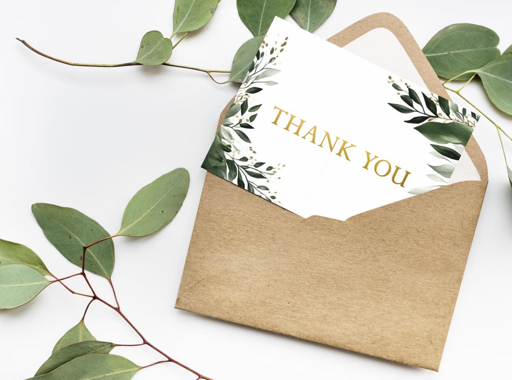
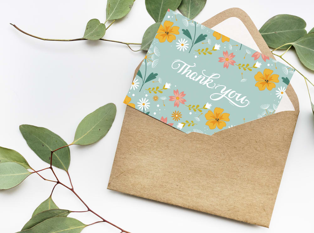
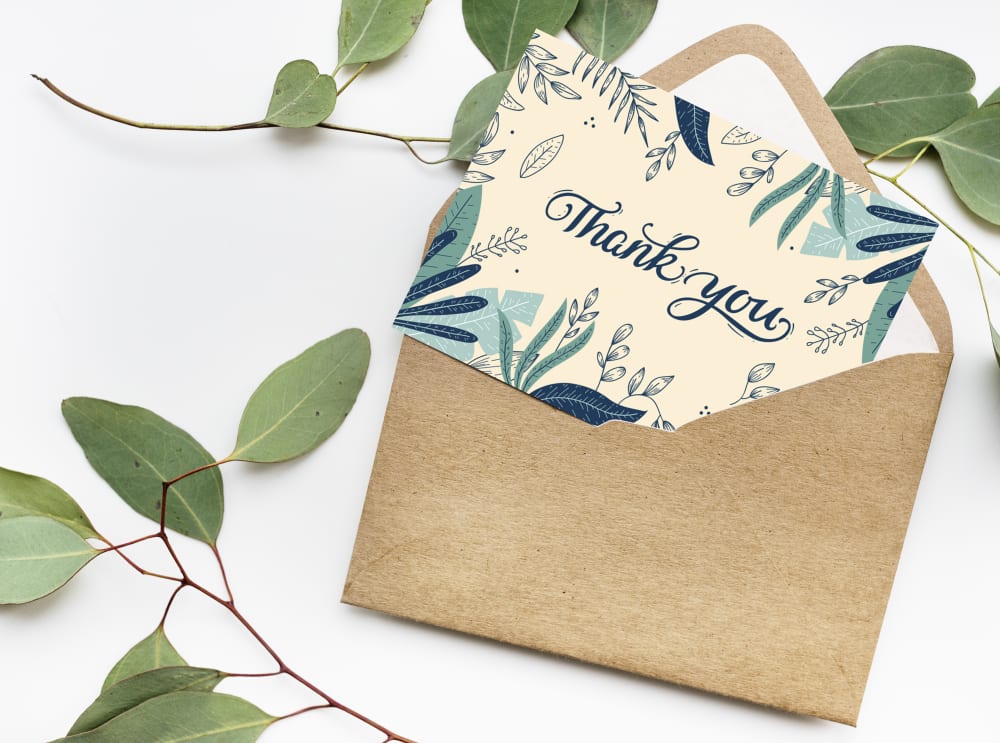
Based on the design, which product would you rather buy?
Option A won this Ranked poll with a final tally of 29 votes after 2 rounds of votes counting.
In a Ranked poll, respondents rank every option in order of preference. For example, when you test 6 options, each respondent orders their choices from first to sixth place.
PickFu requires a majority to win a Ranked poll. A majority winner differs from a plurality winner. A majority winner earns over 50% of the votes, whereas a plurality winner earns the most votes, regardless of winning percentage.
If an option does not earn a majority of votes, PickFu eliminates the option with the lowest number of votes. The votes from the eliminated option are reassigned based on each respondent’s next choice. This process continues in rounds until a majority winner emerges.
Scores reflect the percentage of total votes an option receives during the vote counting and indicate the relative preference of the respondents. If there is no majority winner, look to the scores to see how the options fared relative to one another.
| Option | Round 1 | Round 2 |
|---|---|---|
| A | 50% 25 votes | 58% 29 votes +4 |
| B | 30% 15 votes | 42% 21 votes +6 |
| C | 20% 10 votes | Eliminated 10 votes reassigned |
25 Responses to Option A
This design is very simple, yet very elegant and gender neutral.
Choice A is clearest with that color combination. It is the easiest to read
For me I like this one because it's the most simple design. I feel like I want the thank you to actually shine and it does this with this design.
To me at least colors presented in my first two choices are much more aesthetically pleasing and not as busy as my third option. I don't like when there is too much going on in a design.
I prefer a white notecard to a colored one. I think it is a cleaner classier look.
B is too busy and a bit hard to read. The clean design of A gets the idea of gratitude across the best, and makes the point most compellingly.
I prefer the more basic and simple care for this type of product. It will be enclosed anyway, so it's not like someone would notice it until it's opened.
I like the simplicity of option A, a little green with the leaves and the gold foil text look nice together.
the graphics of the other 2 look cartoony
the graphics here are a bit more subtle and elegant. they are interesting still without being too loud or distracting which is perfect
A is simple and straight to the point. C is also quite good.
I like Option A, the design is much less busy than the others. I prefer it that way.
I like the cards in this order, with A being my favorite because the design is simple yet pretty and it's easy to read.
I like the simple clean and classy design of option A the best.
I like a. Not overdone but still thoughtful.
Option A was the most elegant. Options B and C weren't really my style, but I liked how cheerful B felt.
I liked choice A since the design of the card is simple and is focused on the text which is mroe appealing.
Option A is the cleanest design on the card and can be read without issue. Option C was chosen next as it is still legible but contains more design than I would have cared for. Option B has bad colors and too noisy a design, making it hard to look at.
I chose A for its simplicity. The others seemed too frilly to me.
I like a lot of simplicity and neutral tones. The white background in choice A is my favorite, followed by the more colorful (but still neutral) choice C. I would not buy choice B
I like the color scheme and simplicity of Option A.
Based on design, I would rather buy A because it is the exact match of the rest of my wedding decor.
A has a crisp, cheerful, bright background where the "Thank You" takes center stage.
I really liked the simplicity of the thank you note card with the white center and the green foliage accents (A). It makes a simple but stylish card that would be good for any occasion. Option C was my next pick. It had a fun feel about it that would be good for such things as a baby shower or bridal shower thank you card. All though option B was pretty it just didn't appeal to me that well.
I like the elegant and classy look of choice A that I would lean towards this one. The other two choices just have too much coloring going on.
15 Responses to Option B
The font is attractive. The colors and floral design are appealing.
Option B just has a "special" look in my opinion, so I ranked it first. I like Option A, but no as well as I like the other options. For this reason, I ranked it last.
This is my personal preference. I like a little color and fun with the cards I give. Sometimes, cards are too serious. They need to lighten the soul, some.
I like the informal hand writing.
In my opinion, option B has a colorful design with a "Thank You" quote. So I have chosen option B.
I like option B the best because I like the colorful flowers with the blue background.
I like the bright orange colors used in my top choice, which is exciting and energetic for sure!
THe clean look of the font and the coloring is nice as well it's also easy to read
I liked the bright color on B as this felt bold and energizing.
I would buy this one I like it, I the brown and the color of the card how they blend togethe and makes them different
Option B has a colorful and bright picture + nice font - rank 1.Option C has the same font but worse picture - rank 2.Option A has the worst picture and font - rank 3.
B. Bright, Stands out more, people would remember getting it. Cute design.
I absolutely love flower and foliage designs so all three of these look great to me. But, option B is my top choice because I love how colorful it is with the flowers and I think they really pop against the light blue background.
I love the coloring and design of option B. It’s super fun but still really elegant and attractive. The color is unique. C is my second favorite. It also feels well designed and the coloring is more natural but it’s not as fun. Option A is my least favorite because it just feels bland.
I like the warm color combination and floral pattern in Option B the best for a thank you card design. Next, I would choose Option A because I'm not fond of the design in Option C - the pattern takes up to much of the corner spaces on the card.
10 Responses to Option C
C and A fit best with my personal style.
I like a little detail. The card in 3 does not go overboard in the background color but adds a special font
I prefer option C. I like how the decoration on the card frames the word thank you. I like that the word thank you is dark and bold.
I like the color combination of C; the cream is a nice background and the blues are colorful but not overwhelming.
C I like the colors of the flowers and the words and the design. B I like the design colors. A I like the green floral design on the card.
all are not really my style, but i like option C the best. it has a cool look and is clear to read
I think C looks the most special and has a nice nature vibe to it
Option C and A card are looking gorgeous, attractive, chic, modern, aesthetic and stunning.
I slightly prefer the more colorful designs of Options C and B to the less colorful design of Option A, but that preference is not strong.
I'm a little mixed here. both C and B are really nice. I do like the design on option C, but I'd be open to buying either C or B.
Explore who answered your poll
Analyze your results with demographic reports.

