Poll results
Save to favorites
Add this poll to your saved list for easy reference.
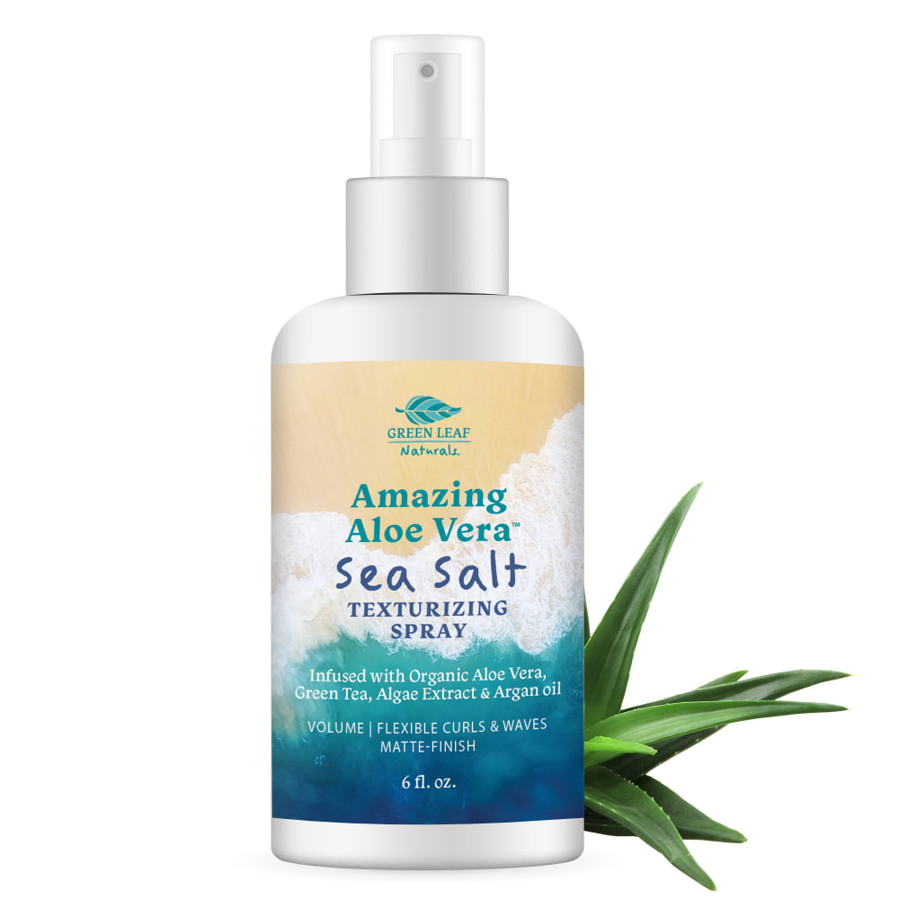
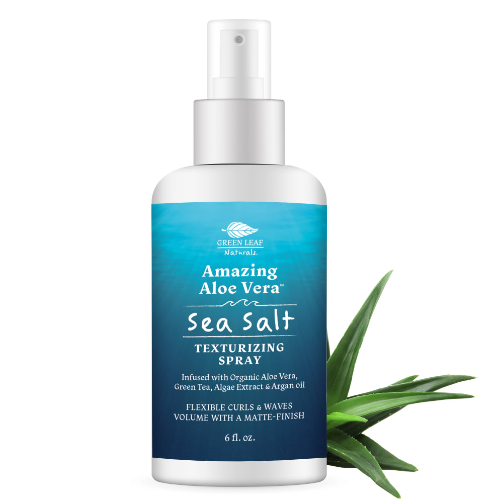
Based on the image which product would you buy as a sea salt hair texturizer?
Age range
Cosmetics and body care habits
Education level
Gender identity
Options
Personal income range
Racial or ethnic identity
22 Responses to Option A
I find choice A easier to read and more appealing overall
The label is just better at representing what the product gives.
I like option a because the design gives it a more beachy vibe
The beach look is much better for a product about sea salt as I associate salt with a beach
Better color scheme
The multiple colors on product seems to stand out more and looks more appealing
Simply because of the background on the bottle. It looks nice and refreshing and I think of the granular salt as it splashes on my skin.
A stands out. The color is classy and makes the product look high quality
The different colors just stick out and make the product catch my eye better.
I find this label to be more eye-catching and visually appealing.
I liked option A is the best which is more awesome and stunning label on the product
This one emphasis aloe vera and the words are done on a nice background that makes them easy to read.
I like the picture on A better. The beach and waves look appealing.
I like the imagery of the beach.
Ok, sea salt. Where do you make sea salt? Where the sea meets the land. That's what I see in A, water, beach, an ideal place to harvest salt. Sure, B looks like the sea, but not anywhere that could evaporate the water, leaving the salt. A is most realistic.
I like the colors of the design of Option A. It evokes more of an "sea" feel than just "water" (as in Option B).
I like the different colors on this bottle. It gives me a sense of the ocean and the beach.
Option A has a more natural and authentic look to it based off the variety of colors.
I went with Choice A because it reminds me of being on the beach with waves coming in. I think that is the feel it is going for. Choice B just reminds me of water.
The larger variety of colors pop and bring to mind a tranquil beach
option A has a bigger font so it is easier to read, the picture also makes me think of the beach and sea i would purchase
I think the ocean backdrop in A makes it look a little more legitimate. The plain blue is a little too ordinary.
28 Responses to Option B
i like the look of choice B better. it seems like I'm looking up from the ocean water.
I like the background of option B being all blue as it reminds me more of the sea.
I like the simple blue image
I chose Choice B because the label coloring is very calming. It reminds me of the sea which is what the product is wanting to emulate. I would buy this product.
B because I like the way it looks light blue and cool like it will cool me down.
Having most of the label be blue invokes more of a calm feeling in me than the other label. It also feels more "consistent", since the text isn't all different colors.
I prefer more simple design choices that aren't too busy. For a sea salt spray, I want to see the sea more than the salt.
i like the blue color with the gradients, it's easier to read
This bottle design was overall more appealing to the eye. It wasn't as busy, it was easier to tell what the design was,a it looked more professional. In addition, it made me focus more on the product rather than the design.
I picked B more as I like the calm blue colors.
Based on question, I think Option B is the better choice.
the blue label seems to match the concept of the product fees more like sea salts with blue
I like the variation of the blue color for the sea salt texturizing spray. This is excellent and looks better for the bottle. The uniform color is also nicer to keep. I would go with that as the better choice here. Excellent sea spray for the aloe vera.
The blue color is bright and pretty and fitting because it looks like the ocean.
I like the variations of blue. They have a richness that catches my eye
The blue background is very comforting and inviting. Very nice design for sure!
I chose B because the monochromatic label appeals to me.
The image of choice B looked the most refreshing and gave the impression of being in the sea. The logo and design were more visually appealing and looked smooth together. A good texture if you will
The ocean blue color on choice B stands out, it is calming, beautiful, and the blue just says sea salt
I like B because I think the all blue bottle is more aesthetically pleasing and enjoyable to look at.
I like how the bottle looks in option B particularly the colors and how well they mesh together with the white background of the bottle and the text
I like the colors better. It is more attractive and professional looking.
I love the label design. I didn’t quite see the beach at first A. Nonetheless, the color scheme is very nice o B.
I feel that given the product and its characteristics, this design is more suitable and pleasing to the eyes because of the nice blue color.
The color design in B is easily associated with sea and nature. It is vivid and makes people feel calm and peaceful.
The design on B seems to be a bit less busy, therefore making it so I can better focus my eyes and attention on the information on the bottle rather than on the design itself.
Although I like the beach scene, B is better because its easier to read and I like the blue color better.
I like B because I think the blue label looks a lot more attractive than A with all the different colors. I think that makes it look a bit cheap.B looks like a higher quality product based on the label to me.
Explore who answered your poll
Analyze your results with demographic reports.
Demographics
Sorry, AI highlights are currently only available for polls created after February 28th.
We're working hard to bring AI to more polls, please check back soon.

