Poll results
Save to favorites
Add this poll to your saved list for easy reference.
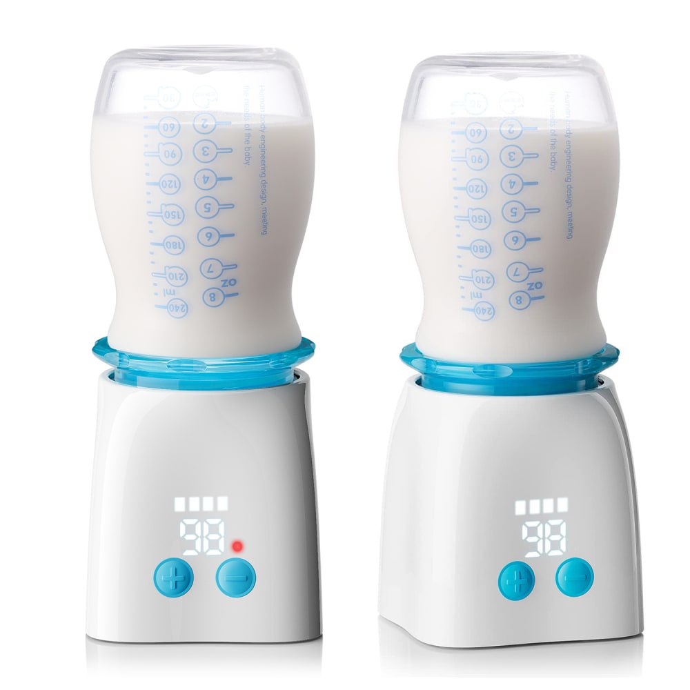
Based on the images, which Portable Baby Bottle Warmer would you rather buy?
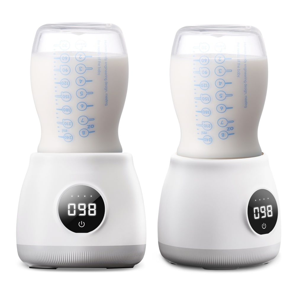
Option C won this Ranked poll with a final tally of 65 votes after 2 rounds of votes counting.
In a Ranked poll, respondents rank every option in order of preference. For example, when you test 6 options, each respondent orders their choices from first to sixth place.
PickFu requires a majority to win a Ranked poll. A majority winner differs from a plurality winner. A majority winner earns over 50% of the votes, whereas a plurality winner earns the most votes, regardless of winning percentage.
If an option does not earn a majority of votes, PickFu eliminates the option with the lowest number of votes. The votes from the eliminated option are reassigned based on each respondent’s next choice. This process continues in rounds until a majority winner emerges.
Scores reflect the percentage of total votes an option receives during the vote counting and indicate the relative preference of the respondents. If there is no majority winner, look to the scores to see how the options fared relative to one another.
| Option | Round 1 | Round 2 |
|---|---|---|
| C | 47% 47 votes | 65% 65 votes +18 |
| A | 29% 29 votes | 35% 35 votes +6 |
| B | 24% 24 votes | Eliminated 24 votes reassigned |
29 Responses to Option A
I chose A first, because I like the brighter blue and think the controls look more intuitive. I chose C over B next, because I think the base looks sturdier.
I would rather buy option A because I like the blue colors rather then the black colors.
If I was in the market for a baby bottle warmer, I would go with choice A purely on the color blue. Choice C is sleeker and not as fat as choice B which is why I put it last.
A i like the increase and decrease buttons.
I ranked A as number one because I just really prefer the way it looks with that beautiful blue color. Looks really fresh and modern. I ranked C over B because the base is much wider and it just looks more stable, along with the ridging to help make it non-slip, presumably.
A, the blue one is what I would look at first. It looks easy to handle and use. And I want to know what that red button means on the front that the others don't seem to have. Possible that milk is ready? B is a nice design and with C, I find the fat body of the product too much for me. I like things that take up little space.
I love the blue color on A, B looks very sleek and compact and C looks well made.
The colors a\re easier to see and the bottle would be easier to hold.
I would buy Option A as i really like the two buttons and temp display design. I also enjoy the blue accent color.
A looks easier to change the temp with the extra buttons. Also it just looks nicer compared to the other 2 images.
I would go with option A. I like the slimmer design. It makes the product fit easily on the counter without taking u too much room. I also like the colors. The blue and white gives the product a softer appeal with makes it more ideal.
I like the blue coloring on A, very cute, I like baby stuff to seem like baby stuff :) I chose C over B because it is wider, I prefer that style over the thinner B.
I picked option A as my first choice because of the sleek style of its design. It looks very attractive and classy, followed by B. Option C is the least favorite because it looks quite big and not so cool in style
Option A color is really cool, blue is my favorite color. Options C and B is exactly the same but that also good
I prefer option A because on this bottle and product overall directions and buttons stand out more, are easier to process and navigate.
i ranked these from the most utility to the least, option A also has the least boring design as well as color
the blue stands out and is less plain and ordinary
I like that option A has actual buttons instead of digital. Option C is bigger than option B, and I feel like it's a stronger warmer.
A and B are smaller looking and would be more compact and light to travel with. C looks heavier and more awkward to carry.
I like the light blue one. I prefer the buttons on it. The black is too harsh.
I like the light colors on option A, it matches baby products more and looks more lighthearted and less cold/stark than the black that are on C and and B. I like the shape of option C, it looks sturdier because of the wider base.
The blue color makes it more appealing.
The simple two button system would be much easier for a sleep deprived parent to use than a touch screen.
I would most want to buy option A because I like the blue accents.
I like A for the blue color and the clear buttons. I like the slim design of B.
I love the blue accents on the first one, and in general I like the slimmer design of the bottles.
I like the color and the display of A quite a bit.
It seems to me that option A is the easiest to use because it has buttons to increase or decrease the temperature, so it is a product that is not very aesthetic but it is intuitive, which is what moms need.My second option would be C because aesthetically it looks good like option B but they don't seem as intuitive
B didn't hold enough volume and I liked that A featured bright blue hues that stood out more.
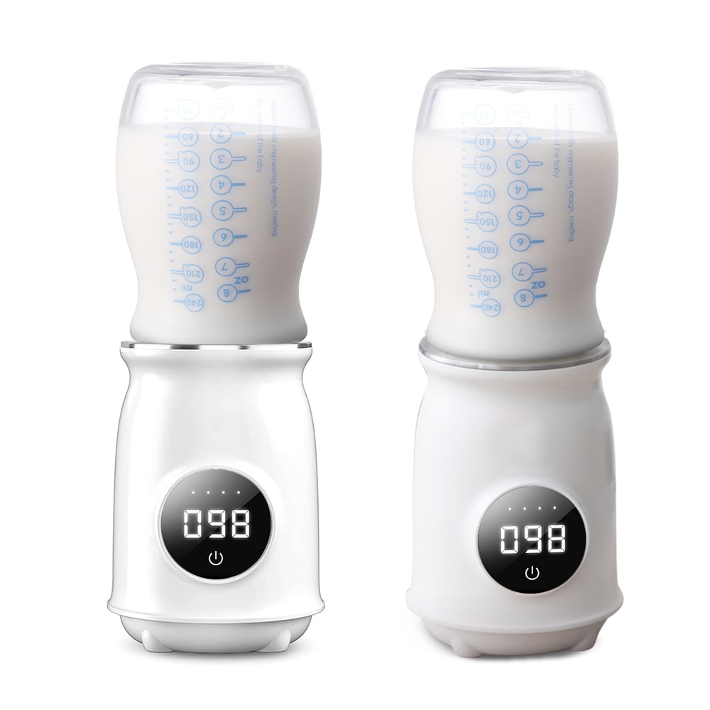
24 Responses to Option B
I chose option "B" as the base of the product is thin. THE shape of the bottom allows easy removal of the bottle, after the bottle has been warmed.
I prefer the shape of B it's more streamline and easier to pack and carry.
I like option B the best because it's the smallest. I also like the way the temperature is displayed. Option C has the same temperature display but is bigger but I picked it second because I don't like the temperature display on Option A. I think if the room was bright, you wouldn't be able to see the white numbers on the white background. I also don't like the blue buttons on Option A. Choices B and C are something I'd be okay with sitting out on a counter but not Option A.
The temperature is easy to read. The base is small and compact.
My choices in order of my color preference.
The temperature was easier to read on b and c but I didn't like how wide c was
I picked option B because I like the black colored displayed and the sleeker look of the product.
The black display is easier to read and I prefer the one that is sleek.
For portable, B looks the most compact. It would take up the least space and be easiest to travel with so I selected it first. Between C and A, I prefer the neutral color scheme of C and placed it higher.
B looks the smallest and the least likely to take up a lot of room in an already jammed pack diaper bag.
I would rather buy option b because it seems to be more compact and the screen is easier to read
I picked B because I like the colors. I also think the timer is more readable. In addition, the size is good for being portable.
I would buy B or C based on how they are designed and the colors because those could be used for either boy or girl babies
I prefer the higher contrast temperature display for ease of reading and also the more streamlined looking narrow design for a smaller footprint or narrower space needed to carry or setup on a countertop.
I prefer option B because it looks like it would take up the least amount of space on the counter. I could easily tuck it into the corner. Option A would be my second choice because the base of it doesn't seem quite as big as option C. I'd rather have things that don't take up as much room on the counter and can easily fit in the corner.
I like the smaller base that B provides. I like C because I can see the temp numbers easily. A is ok but I find it hard to read.
It was looks like to clear and looks great.
I like how small and compact option B is, it also looks the most high quality in my opinion with its size and shape and I like that it is just black and white.
I like the slimmer profile and the more visible read out.
I prefer B best because of the size. If might be easier to fit in
B is the slimmest and the numbers are easiest to read, C's numbers are still easy to read, A is hard to read
I like B because I like the thinner look of the warmers. They look sleek and attractive. I think the others are good too but B stands out for me.
I like the look of B the most because it looks like the smallest, most thin option which would take up less space in packing and storage. I think C and B look bulkier and I do not care for the colors.
I chose B because it looks the smallest. It would be easiest to travel with and keep in a bag.
47 Responses to Option C
I like that C is shorter and squater - it's cute! Not a big fan of the bright blue.
I like the way the white temperature is displayed against the black background. It is easier to read. C seems like the bottles are larger.
option C. I think it's more visually appealing than the other two. I like the black around the icon of the temperature
looks bulky and seems like it can take a whole lot of items, I really do like the design too.
I like options C the most and would rather buy it over the other options. I like option C the best because I like the way it is designed and styled at the bottom it looks very durable and strong enough to stand on its own without tipping over. I like how the digital display has a dark background it makes it easier to read the bright numbers. I like that it shows you a sort of side view in a front view so that you can get a good look at it size comparison. I like option b second best because I like that it has a dark background on its digital area it makes the numbers easier to read and I like the bottom design I just don't like it as much as option C because it seems smaller unless durable I much prefer the water bottom of option C. I don't like option A because I don't like the colors around the design and blue also it looks harder to read the digital clock area.
I LIKE THE COLORS BEST IN OPTION A BUT IT IS DIFFICULT TO SEE THE NUMBERS SO I WOULD CHOOSE OPTION C OR B
I like the black and white, it is easier to see the temperature reading. I also prefer the bigger base.
I like C because it has the widest base and the clearest temperature screen. I also liked the temperature screen in B, but A's base was too narrow and the temperature is harder to make out.
I prefer the smaller warmer with the black digital display just because I think it’ll be easier for me to read at night. We all know that babies are up at all times of the night so having something to illuminate these numbers is important.
I would choose Option C because it looks bigger and its more modern looking.
C is my favorite but A is the worst because it seems difficult to read the numbers on it.
I ranked my choices based on apparent size and ability to read the numbers
I liked all three products, but preferred Option C and A most. I chose my preference based on how the quality and sturdiness appeared. I like that Option C seemed to have a short and wide base so it seemed like it would not topple. It's also the design I preferred most aesthetically. Then Option A seemed the second most sturdy. Finally Option C just seemed a little thin and like it could topple over easy.
I love the wide base on C. It looks very sturdy and least likely to tip over. A is cute because of the pastel 'baby' colour of the trim.
I think B is more attractive than C, but I would choose C because it is less likely to tip over. A looks more like it is for boy babies. I wonder if they all include two warmers.
The base of C looks the sturdiest while still having appealing curves. I like the look of B the best but with baby on the move and unknown surfaces I might be using it on, I would be concerned about it getting knocked over too easily.
I just the ones that looked most stable I feel like if I was warming up bottles in the middle of the night I want some thing that I wasn’t going to accidentally knocked over.
I chose option C because I like that I can see the numbers on the digital display better because they are larger. I also like the more rounded design.
The shape of option C and A look easier to use. Option B is too long and Im afraid it would spill .
I prefer the temperature being in the black circle as it 's much easier to see. And I like the larger base on C.
I would choose option C because of the color and shape that it has. It seems very stable when put on a flat surface
i like the base the most on C its a bit fatter so it would be more stable in case you bump it also the display is very easy to read. B is similar to C in display but its a bit thinner. then C is last its thinner and hardest to read
The black information plate looks more high-tech and modern than the blue one. I feel like the blue option looks like a walkie talkie. I like the larger base in Option C because it looks more stable and it seems it would be less likely to tip over.
This one is smaller. It is cuter overall. The numbers are easier to see against the black background.
Option c looks like it holds the most milk and it looks very innovative compared to the other two
It is much easier to see the temperature with the black background
This looks the easiest to read and when getting a bottle in the middle of the night while half a sleep you need all the help one can get.
The screen on C and B are MUCH easier to read than on A (A is white lights on white background - very difficult for most to see). Option C has a wider base than B, which makes it look like it will be more stable, less likely to tip over - this is important.
I like the cylindrical shape better and it looks almost bubbly, c, that is why I chose that one first. It is big, round and stands out the most.
I like the wider base of Option C. I feel the smaller bases would tip over easier but the wider base makes me feel secure that I am not going to accidentally knock over. I like the color of Option A and it appears to have a better base than Option B which is pretty narrow and looks top heavy.
I like C the best because of the design and the large stable base. B was my least favorite because the smaller narrow bottom may tend to tip over when using.
Choice C has a broad base for support of any size baby bottle perhaps and an easy to read digital temperature gauge. Choice A has a very sturdy base since all sides touch the top of the counter top and also has a red light alarm to show when temperature has been reached. Choice B has a small base and might not be as easy to put larger bottles in the warmer as they might tip over but the digital temperature is easy to read.
They seem exactly the same to me. I picked C first because it had a restart button that looks like Apple OS. Truth! And so does option B but it's a little bit smaller! Option A looks like a knockoff.
I like the shorter and fatter base.
I like choice C because i feel that the curved body of the bottle warmer makes it look more expensivie and less cheap looking
I like the colors on A best, but I like C and B better because they make it easier to see the temperature (having the numbers on a black background helps a lot).
I prefer Option C because it looks very stable and has a noticeable display. Other options follow in the mentioned order.
I like the black and white look, it’s very classy. What concerns me is that they are upside down, are the bottle being used ones that come with the warmer? If so I would assume at that point that there is some sort of lid, but if it’s your own bottle, would it come with different sized lids?
Option C is the most visually appealing and grabs your attention more right off the bat. I think the numbers are easier to read and make it clearer as to what temp you are getting to. I also like the size and layout better and think it makes the product more useful and valuable to the person using it. If this is portable, people want to it to be easier to use and functional and Option C has the best options for those things. Option C would appeal to more people and would make them more likely to check deeper into what it has to offer.
I chose C based on the image. The blue buttons look cheap to me for some reason.
I chose by options that have base shapes that look the most stable.
This one looks like it will be less likely to turn over. It looks sturdier. I also like the black and white color the best. The solid bottom is the most important to me though.
i like the shape of choice C the best cause i feel like the other ones may be a little top heavy. i think that the one in choice C is nice cause i also like the bigger temperature thing on it. i feel like it shows the temp best.
I like the closeup view of the product, and the temp is very easy to read.
I like the shape and design of option C the best. I think the black stands out as well and makes it much more appealing
C looks gorgeous and sleek in design. I really love the shape of it and imagine it would be easy to use. I like A for it's uniqueness and being the only one that is blue and white
I chose C because the digital display looks more easy to see/read and use.
Explore who answered your poll
Analyze your results with demographic reports.
Demographics
Sorry, AI highlights are currently only available for polls created after February 28th.
We're working hard to bring AI to more polls, please check back soon.

