Poll results
Save to favorites
Add this poll to your saved list for easy reference.
Based on the Vitamin C symbol image and label design, which product would you rather click on and why?
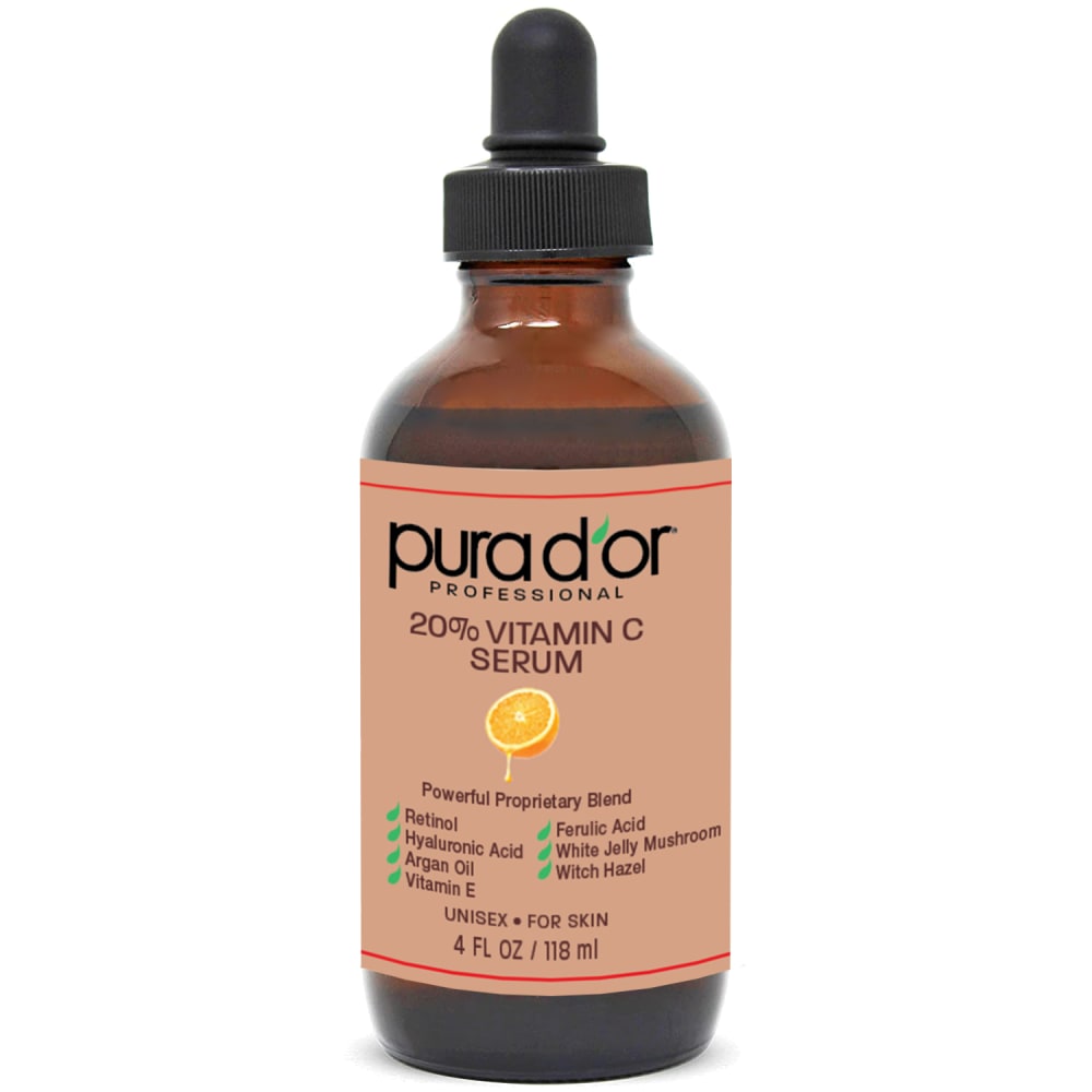
Option A won this Ranked poll with a final tally of 53 votes after 1 round of vote counting.
In a Ranked poll, respondents rank every option in order of preference. For example, when you test 6 options, each respondent orders their choices from first to sixth place.
PickFu requires a majority to win a Ranked poll. A majority winner differs from a plurality winner. A majority winner earns over 50% of the votes, whereas a plurality winner earns the most votes, regardless of winning percentage.
If an option does not earn a majority of votes, PickFu eliminates the option with the lowest number of votes. The votes from the eliminated option are reassigned based on each respondent’s next choice. This process continues in rounds until a majority winner emerges.
Scores reflect the percentage of total votes an option receives during the vote counting and indicate the relative preference of the respondents. If there is no majority winner, look to the scores to see how the options fared relative to one another.
| Option | Round 1 |
|---|---|
| A | 53% 53 votes |
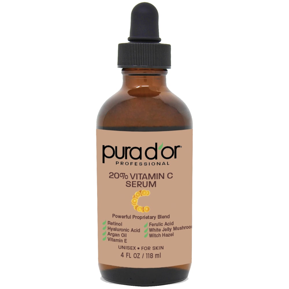
| D | 26% 26 votes |
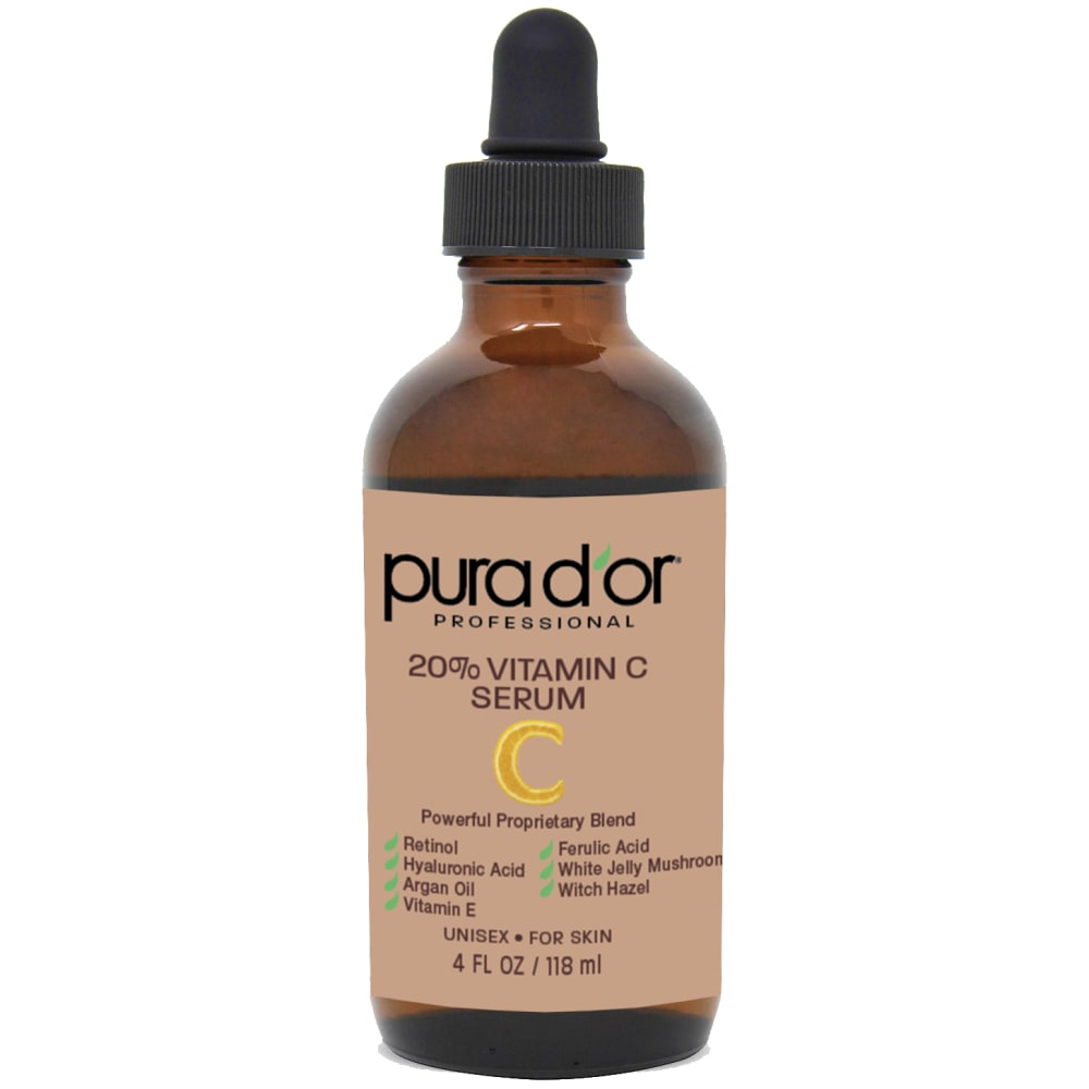
| B | 13% 13 votes |
| C | 8% 8 votes |
53 Responses to Option A
I like the fresh, natural fruit on the front.
I like the ones with the oranges the best, it make them unique and stand out.
I like A the best as I think its the most reasonable symbol. It would be easy for me to tell what this product is for at a first glance and I like that simplicity.
I like the little orange symbol on the bottle
I like A because of the drip and C because it looks like an orange flame, which is cool looking.
I chose option A because I like the picture of the lemon. The other labels were ok but not as good as A
The orange really draws attention. Fruit is good for you.
A I feel is the most fitting and it is easy to see that it is an orange and represents vitamin C.
A has a more pleasant and natural, appealing style because of the orange
The image of the half of the orange in Option A captures the source of the vitamin C so well.
The orange is synonomous with vitamin c
I chose option A because I like the orange illustration on the label.
I like the citrus fruit on the cover of A
I would choose option A because 1> product image has fruit on it which looks more attractive
The word vitamin C and the image of an orange is the most congruous. the other images don't really mean anything.
I prefer the label with the picture of the orange. The label looks high end and professional. Looks like a healthy product.
Option "A": The almost universal association between vitamin C and the orange is undeniable making this the more memorable and recognizable association comparatively.
I think the orange gives the best idea that this is vitamin c, it looks clean and fresh and natural
All of them except option A look odd to me considering the context'
I really like the orange on the bottle and the ones with similar colors and designs. It gives away a lot of information at a moments glance and makes the bottle pop.
option A clearly displays an orange on the label. option c's label is like an icon of an orange. option d is a plain C. option b is a worm? When searching for vitamin C, the label is important in conveying the ingredients and option A does the best job at revealing the contents on the label,
I like option A> The orange is more appealing and eye catching which make the product more likely to purchase.
I like the half orange in A the best. The C shapes in B and D are fine. I'm not entirely sure what the image in C is supposed to be.
I like option A with the orange logo, its much more natural and appealing
I like the cut orange. I think it's the right fit for the product. So yeah, I like option A.
The image of the orange is very clear and helpful.
Option A, overall design looked the best. Option B, looked interesting with the oranges making the letter C. Option D looked okay. Option C, little photo used didn't really make that much sense to me which is why I ranked it last.
I LIKE A SINCE IT HAS A PICTURE OF AN ORANGE WHICH IS IMPORTANT SINCE IT TELLS ME THIS IS VITAMIN C B HAS A WEIRD ORANGE IN A C SHAPE AND THEN D IS OK, AND C NEEDS A PICTURE OF AN ORANGE
I feel the orange best telegraphs the vitamin C aspect.
A is the best because it shows a cut orange on the label, which means lots of vitamin C. B is next because it shows orange slices. D is better than C because it shows an orange C letter.
The little orange icon involved in this product presentation makes me feel confident that it's the correct product for me because it makes me understand that it contains 20% Vitamin C serum and some other vitamins.
I like seeing a picture of an orange on the bottle. I then like the letter C in oranges in B image. D is ok with letter C just in orange and having it say C . The last one is just plain
Option A is my choice because the image of the orange on the label is very compelling for this product.
I really like the orange. It goes well with vitamin C. I also like how you can tell it is an orange, unlike the other options
The label looks "medicine-y", which is entirely consistent with a serious approach to supplements. But the icons in C and B are total meaningless fails. A and D seem good enough so they come in as first and second.
the one i chose has the coolest design has an orange on it makes sense choose this pick i like it the most
I like A because there is an image of an orange and the orange symbol allows me to clearly see that this vitamin C is made by oranges. D is a bit simple but I like the letter C for vitamin C and lets me know that the main ingredient is Vitamin C. C is next because it has a symbol that isn't related to vitamin C but is a pretty decoration for the bottle. B is last because I don't like that the letter C is made out of rings of oranges.
The single orange slice is a good natural representation of what the serum is for and will taste like
I prefer the option A symbol image on the product label because I like the sliced orange image to represent the vitamin the most. I chose options B and D second and third because I like the C symbol with the many sliced oranges more than the one orange peel illustration. I chose option C last because this image symbol does not make much sense for the vitamin nor for an orange.
I would choose A because it is a simple way to tell people it contains vitamin C. Option D and B are also good choices but they are generic. If I saw the image used for option C I would not know it was an image of vitamin C.
I prefer the citrus fruit on the labed, but the citrus shaped in letter c looks very weird
Having the fruit symbol looks more attractive and natural. I would go with the Option A as it makes more sense to see an orange half cut in that shape as compared to the other options. Option C is a clip art version of the orange but it is not very clear. Option B has very small slices of oranges in the picture making a C from a distance it would be very hard to tell what that is.
I loved the orange on A, I thought B was cute, I like the yellow C on D and I did not like the logo on C
I think the designs with orange's included would be a great way to get the point across.
I like the orange as it is more indicative of vitamin C to me. B is more abstract but I like the orange sections. C is nice because it also incorporates orange but it doesn't look as bold. D is very boring and trying too hard to symbolize vitamin C.
I prefer this one because I like seeing a piece of fruit on the bottle and most people know that Vit c comes from eating this kind of fruit
Option A is by far the best one as everyone loves fruit and it is instantly recognizable. A is just so much better, but perhaps using just a single orange slice might be even better.
I prefer a image that looks like an actual orange
The simple half orange picture is the best
I liked how A and C caught my eye, they were all very simliar with the main difference being option D and B had the c logo and I did not like that as it was repetitive of the other options, there was something missing
The small logo on the label in option A makes more sense considering the contents of the product.
I love option A the most because it has a picture of a cut open fruit on it making it look more appealing and inviting.
I like option A the best because the picture of the orange stands out the most and grabs my attention.
13 Responses to Option B
I liked B the most due to the little oranges that made a C. I like A next because of the orange.
I like the "c" they have on choice B, but don't like the font type they used on it on D. I like the image of the orange on B.
I picked B and A as my top choices as the designs tell me that they are very formal and bold to use
B shows it is made of oranges and vitamin C, it attracks customer more.
i arranged these from the most professional design to the least with option B at the top of the ranking because it does a great job with the logo design and presentation
I like the logo of the C a lot. I think it makes the product look more interesting and unique. It makes the product stand out a bit, so I prefer choices B and D. I like the design a bit more in option B.
These label designs are the best looking overall in terms of appearance
I would be most likely to click on and ultimately purchase option B because I think that it has the most interesting, eye-catching, and visually appealing product label design out of the four options.
I think b is highly unique and clever looking. I would go with the most creative option in my opinion which is b.
I ranked them n order of what i felt was easiest to understand the product. the letter c on the bottles are very clear. the picture of an ornage some people mght night relaize that oranges have vitamn c in them
I chose by options that make it most clear that the product is about vitamin C.
I think it is very clever that the C is made out of oranges in option B, it is very eye catching.
I think they are all ok except C, I'm not sure what that is a picture of.
8 Responses to Option C
I prefer the more stylized oranges.
I made my choices according to the order in which I found the small icon under the logo to be cute and eye catching.
C looks the best. The rest looks kind of cheap and cheesy and doesn't fit the rest of the aesthetic.
I like the abstract image on this label. I find it visually appealing and interesting.
I like option C. It stands out more than the others but looks normal. The image doesn’t say vitamin C but it looks much better than the other options.
the symbol in c is most attractive. b and d have plain symbols. the symbol in a is ugly.
I like C because I like the look of he icon the best. It's subtle and attractive. The rest for me are just okay.
the label without the fruit directly on it makes me think it is worth purchasing vs just rubbing a lemon on my face
26 Responses to Option D
It is clearer that this is for Vitamin C best in this order.
I liked option D because when you look at the bottle it is quick to see what it is and there is no guessing.
I like the yellow color, the letter C in yellow is really cool to me.
I prefer a clear image that directly indicates what the product is.
I picked options D and B because they have a letter C in the center, which emphasizes Vitamin C.
I like the plain C best. The others look gimmicky.
I like D with just the normal C it adds more classiness to the bottle. B is ok but looks somewhat weird. C and A I do not like at all.
Prefer Option D. Don't need or want to see orange slices to signify it's vitamin C. The letter "C" is more than enough.
I chose d first because it's clearly labeled C, and the fruit slice is cute. Same goes for A, the fruit is cute. B looked like shrimp to me at first. I don't understand at all what C is supposed to be
I chose D because I like the old fashioned C best. It looks good to me.
i like the orange in option a. i think the letter c designed as an orange is creative for options d and b. option d doesn't exactly look orange like or anything exciting.
I like the presence of the C on the label, but I prefer the straightforward design of D. B is a little extra.
Professional labels are a must and I find these options appropriate with a variety of iconic imagery displayed on the containers.
i prefer that the c be up front and evident so that i can easily see what i'm looking for/at. although the lemon is a nice touch as well.
The 'C' in my top choice makes most sense and best fits the product. I don't think everyone would understand the images used in the other options.
I think the simple C in D is most direct and clear. The others I ordered based just on my impression of clarity and linkage with vitamin C.
I would click on the one on option D first as it is very visible and hence easy to understand it.
I like the 'C' on option D. It's a clever idea and looks great.
Actually the first one, with the "C" symbol is far better than the others because they all have other symbols or icons, which are less relevant. I buy Vitamin C serums continuously and I think the Vitamin C label is much more simple and direct.
I like D the best because it tells me it is Vitamin C very clearly. A is good too because it shows an orange, which represents Vitamin C. B is not bad but not my preference. C is ranked last because it is unclear what that symbol really means.
I chose D first and placed B second because they are the clearest-labelled products.
I like the more simplistic C (Option D) best. It is nothing fancy but it easily shows that the product includes Vitamin C.
The design of D I find the most appealing with the way the C is shown on the label.
The C on this one is the most obvious what it is representing and it is simple and nice to look at visually
D looks the most unique to me and it also really symbolizes vitamin C the most. A would be next because the orange caught my attention, but it isn't exactly clear that it means vitamin C. B would be third because I like the creativity of it even though it looks a little silly. C looks awesome, but I wouldn't recognize what that symbol meant.
I like D the best because it's easy to recognize and feels more professional than the other ones.
Explore who answered your poll
Analyze your results with demographic reports.
Demographics
Sorry, AI highlights are currently only available for polls created after February 28th.
We're working hard to bring AI to more polls, please check back soon.

