Poll results
Save to favorites
Add this poll to your saved list for easy reference.
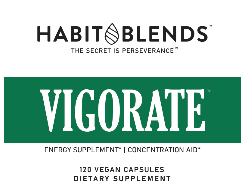
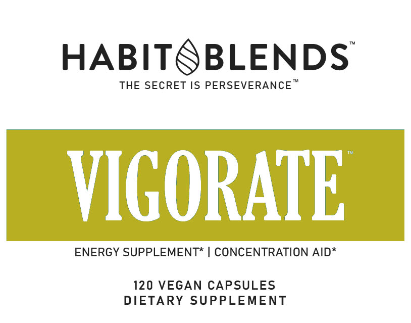
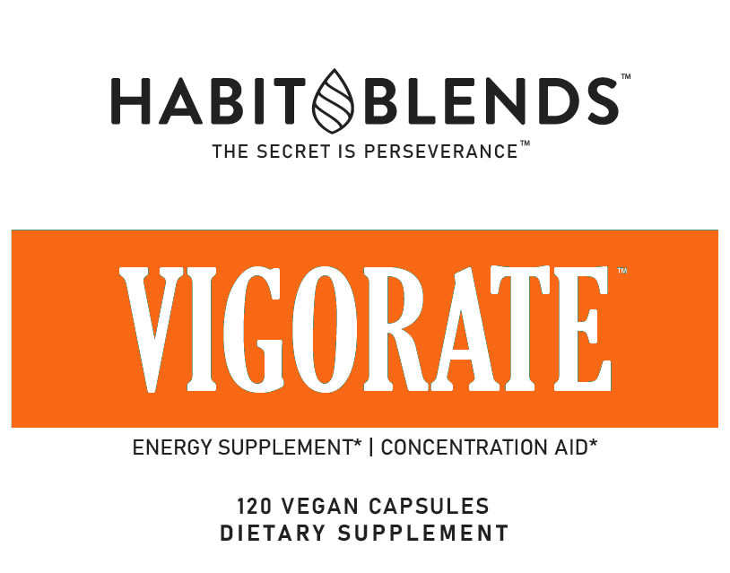
Caffeine Supplement Color? We are a dietary supplements brand looking to launch an energy supplement (caffeine, l-theanine, Dynamine). Which color stands out to you for an energy supplement? Other color suggestions are welcome!
Option C won this Ranked poll with a final tally of 62 votes after 1 round of vote counting.
In a Ranked poll, respondents rank every option in order of preference. For example, when you test 6 options, each respondent orders their choices from first to sixth place.
PickFu requires a majority to win a Ranked poll. A majority winner differs from a plurality winner. A majority winner earns over 50% of the votes, whereas a plurality winner earns the most votes, regardless of winning percentage.
If an option does not earn a majority of votes, PickFu eliminates the option with the lowest number of votes. The votes from the eliminated option are reassigned based on each respondent’s next choice. This process continues in rounds until a majority winner emerges.
Scores reflect the percentage of total votes an option receives during the vote counting and indicate the relative preference of the respondents. If there is no majority winner, look to the scores to see how the options fared relative to one another.
| Option | Round 1 |
|---|---|
| C | 62% 62 votes |
| A | 33% 33 votes |
| B | 5% 5 votes |
Age range
Education level
Gender identity
Nutritional supplement use
Options
Personal income range
Racial or ethnic identity
33 Responses to Option A
Green is more reminiscent of nature. It stands out more because of it’s softer color.
I think the green label really fits well and flows with the rest of the brand. It reminds me of Starbucks with their green logo. Orange is another great color simply for the invigorating and energizing color
I think the green stands out and looks the best. Green makes people think of "go" so it fits the best for an energy supplement. B and C are okay but they don't fit as well or look as good as A.
Dark green is a good color, reminds of of "go". Light green will do for the same reason. Orange is seldom a good color for anything.
I believe that option A with the green background represents more energy.
I really like the green in the label makes it pop then I like the orange then I like the golden yellow that is not my favorite color, I think green is the best
I prefer the green but a brighter color would match the word better. Like a yellow.
Option A the color green reminds me of nature and the environment. It would inspire me to take the supplement for increased energy to be a better person. Option C has a very inspiring color and it draws my eye to the box. Option B has a very uninspiring color and I would overlook it in the store.
The dark green looks nicer. The Orange is more invigorating because it's so bright. B is not a good color and looks sickly.
Not a big fan of these colors. Maybe something slightly neon or metallic would look better.
If you are going for something natural or subtle I think these are appropriate. I find green is a good color for representing anything having to do with health. I like the darker green. I don't really associate orange with caffeine so I chose that last. As a person who relies on caffeine in some form daily I would also respond to the color blue.
The color on option A is the one that I find to be captivating to me.
Green (A) was the brightest and most attractive- kinda "energizing" followed by C and the least attention grabbing was B.
My choices are based on the color I like best for this supplement. My top choice is Option A.
Out of these 3 I like this one. I actually like purple. I don't know if you could make purple but I love purple. You color choices are pretty cool too though. Thank you.
This is professional and vibrant without being overwhelming.
I like A the best because of the bright green.. reminds me of go go go. Not a fan of B at all..it reminds me of mucus.
I choose A first because the green is synonymous with health and energy and being natural so this would mean a good boots of energy. C is next because the orange color has to do with natural vitamins like vitamin A that one gets from orange color foods or any dark color foods so that also is energy and B is last because the color doesn't symbolize food and what it gives to the body which to me is important
I like to choose option A. because the color green is more appealing.than option B & C. We can give blue, pink maroon colors.
A and B are good, serene colors but C is just ugly and garish.
I like the green in Option A because it looks healthy. Option C is very eye-catching with the orange--although orange means decaf when it comes to coffee! Option C is a little bit harder to read with the yellow/white combination. Some people with poor eyesight really have trouble with yellow.
Option A, the green looks more natural. I would suggest also a red as it is brighter and matches the energy color
The green is bright and bold. It stands in my mind for a plant based product which I am always looking for. The second choice from there is the very bright orange. The color really stands out well. However that choice b color is just awful. It's bland boring and really just looks like the blah puke color.
I chose A because Green signifies Vital, Vigorous and seemed best choice. Option B is a very odd color and isn't attractive.
I like the green best, its energetic but also stands out well against the white, option c is next, the orange is vibrant, option b is an odd shade
I like the Green and White label as it stands out and reminds me of a vitamin. I think the Orange is bright and also stands out. The font chosen on all of the labels does look nice.
I strongly prefer the green in A because it connotes something natural to me. The orange stands out but really isn't my style. The yellow is pretty ugly to be honest.
I prefer cooler colors so Option A caught my eye. I think it and the bright Option C are the best. I don't care for the gold. It would need to be brighter to attract my attention.
A stands out the most for me because it is unique and most visually appealing.
I think you should go green, but a much brighter green than what is shown. Orange is also nice, but the color used in "B" is not pleasing to my eyes at all.
I think the green stands out the most.
I do like the dark green better than the other colors. I think a more vibriant color would stand out more. Like a midnight blue color that was bright. Give it more brightness.
I find Option A to be my first choice because the color green makes me think of Vegan.
5 Responses to Option B
B has the most open and fully dynamic display that I feel is the most beneficial to my overall health.
Both B and C feel more invigorating than the green option. Both would stand out more on the shelf simply because they are unusual. I am torn between which is better. I think the orange is a more cheerful color but B is more unique.
The yellow green color would stand out a lot because it’s more unusual. It’s also a pretty color.
I think the shade of green shown in B works the best. Green is a color I associate with health and wellness and I think this particular shade does just that.
I chose by what seems to me to have more energy in the color.
62 Responses to Option C
Orange is the best color because it is my favorite color and it is so active.
Orange is the warmest and most energizing of the three.
Orange color symbolizes energy.
I choose "C" because the bright orange catches my eye and I would take time to read it and probably purchase it.
Orange and yellow are more energized colors and stand out for me more
I like the orange first and the dark green. The first really stands out and makes me think of energy.
When I think of caffiene, I think of choice C which is bright and a color that's in your face.
Orange and yellow just seem more energetic than green.
I feel C is best for this because the bright orange is a more energetic color. The more yellow color in B is nice but doesn't stand out as much and the green in A is too relaxing. I feel a bolder yellow or bright red would also be good for an energy product.
I like the most option C because color orange really looks eye-catching and it "pops out", I think it fits well with energy supplements.
I prefer Option C because it is the boldest and the most eye-catching. Red would be the best and most appropriate.
I chose option C because orange translates the best as energy to me.
Orange seems like a vibrant color and I like it best for a caffeine supplement.
C- orange is vibrant, reminds me of energy. A- the green is okay, but pretty bland. B-is really lackluster looking. I would suggest any bright or neon colors.
Orange is the most eye catching but green looks more natural. The last one is just ugly. Not sure if it's yellow or weird puke green.
I'm actually not the biggest fan of the color orange, but this would most definitely represent the energy that your supplement boosts having here. It's high energy and exciting, a natural choice for this sort of branding.
I chose the orange in C first, because that color is the most vibrant and feels energetic to me, which fits the product. I chose A over B second, because the deep green is a little bolder and hints towards a "natural" color that fits with the vegan pills.
a bright red/orange or yellow catches my eye more and makes the brand stick in my mind more than a plain green
I DO NOT LIKE THE COLOR OF OPTION B AT ALL. IT IS WAY TOO DULL. I REALLY LIKE OPTION C. IT IS BRIGHT AND EYE CATCHING
I like the orange the best. It is bright and a true orange color. The yellow is also a nice "alert" color, but it is too green tinted.
The orange signifies a lot of energy to me. Green and yellow seem like they are slowing down or chilling out.
Orange is bright and energizing, it reminds me of the morning.
The orange looks the most vibrant and caffeinated. The green is second. The puce green is not a good choice.
The orange one caught my eye quicker than the other two.
To me, orange has more of the symbolic image of energy. It's more eye-catching. Green is good too, as it symbolizes plants and healthy plant growth.
Orange seems best for caffeine since it's lively and energetic.
Option C, orange, first and foremost. It's bright and loud and draws you in right away. The darker green in Option A is my second choice. It doesn't stand out near as much as the orange though. I'm not at all a fan of Option B, the color is too pale and bland.
I always think orange is a great color in branding. It is eye catching and in this particular product it shows it is invigorating and energetic.
I like the bolder color to match an energy drink. Green seems like a health supplement, but too calming. The yellow isn't appealing for some reason.
C has the most attractive color, I really like it. B is also a nice color and stands out. A is to bland.
An energy supplement should use bright colors, like that orange.
Out of the choices I think choice c standa out the most because of the brightness of the color. I think for an energy supplement it should be a bright color cause it gives a burst of energy just looking at it. Choice b isn't that bright but it's brighter than choice a. I think a bright blue color would be perfect for this type of product.
I like the option C most because to me meaning of the word vigorate correlates best with the orange color, in the option A I like the brightness of the green color.
I think that a caffeine supplement has to be a bright color like orange to represent energy.
C has the best most energetic color. A is next and can be associated with green vegetables which give the body energy and C is last because I find to be absolutely terrible almost associated with decay. What about red? Red is the strongest color. Perhaps that's why Coca Cola uses it. You can also try a bright sunny yellow or a purple.
The brighter the color, the better the implication of the product
I like the orange the best because it is bright and eye catching. next would be the green. I really don't like the yellow, it is muddy
Option C is a nice shade of orange. It looks healthy and clean and fresh. OPtion B honestly is like a blah color, not very eye catching.
Honestly after the orange not sure the other two colors depict energy, maybe a vibrant blue
Prefer orange or bright colors. Reminds me of the morning light when I'd be reaching for caffeine and needing to get a start on the day.
I like the orange; warm colors communicate energy too me. I think red would also be great. The green looks good; the golden yellow isn’t bad but isn’t as good as the red and green.
Option c has bright orange which is an invigorating color.
I like the bright orange color the best. It gives me an energy vibe.
I think the orange stands out more for energy, maybe a blue would work better as well
I chose C as my first choice because I like the orange and how I think that the color represents energizing. I chose A as my second choice because I like the color and think that it represents Earth/natural. I chose B as my final choice because I like the way that the color represents nature.
C is the most vibrant and grabs your attention. A is a pretty color but not very attention grabbing. B isn’t a very attractive color
Orange is the most invigorating of the options. I have no other better suggestions.
Option C (color orange) is warm yet vibrant, and feels energetic. Option A (green) implies health to me, and Option B is my least favorite because it feels like an unhealthy yellow.
Orange is bright and it will easily catch the sight. It would be more attractive if its in a light blue color.
I think the orange is vibrant and gives energy to the ad.
The color should be bold like red it’s energy
The orange in C is more vibrant and lively, and evokes energy the most out of the three. A's green is a good, living color, but possibly a little sedate. B is ugly and drab. It's like split-pea soup or baby poop, and has no upbeat energy about it.
I think the brightness of the orange really make the name stand out. I would also think purple or red would look nice.
The orange color definitely stands out the best. It is bright, the words pop and looks nice
I picked c because the orange stands out and is bold
The orange stands out the most and was bright! I’d try a mix of colors or a bright teal
I think C is most energetic followed by B. A almost seems calming to me.
B is the brightest which is invigorating. A does not seem very exciting and C does not have energy in the color. I would go for a bright royal blue or if attracting women try magenta.
I think brighter is better for an energy supplement, so the orange is best of these. (The odd green in choice B is pretty bad, I definitely wouldn't use that. Maybe a bright lime green, but not the one shown).
I would also think of energy as bright yellow, but that is the hardest color to pull off, and not everyone can see that color as they age. So maybe a bright cobalt blue or a red for options...
I think that orange is the best color for an energy supplement.
The orange color gives off high energy vibe. Green appears to refer to 'green' foods or superfoods.
Explore who answered your poll
Analyze your results with demographic reports.
Demographics
Sorry, AI highlights are currently only available for polls created after February 28th.
We're working hard to bring AI to more polls, please check back soon.

