Poll results
Save to favorites
Add this poll to your saved list for easy reference.
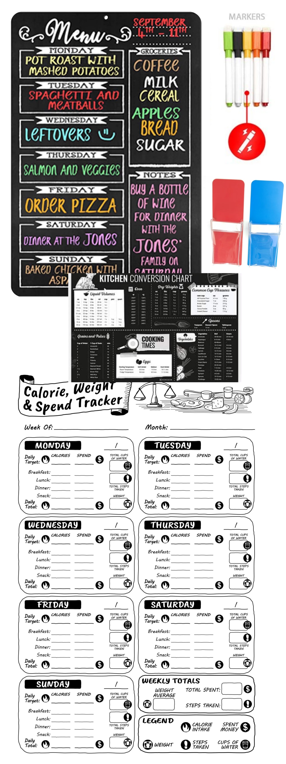
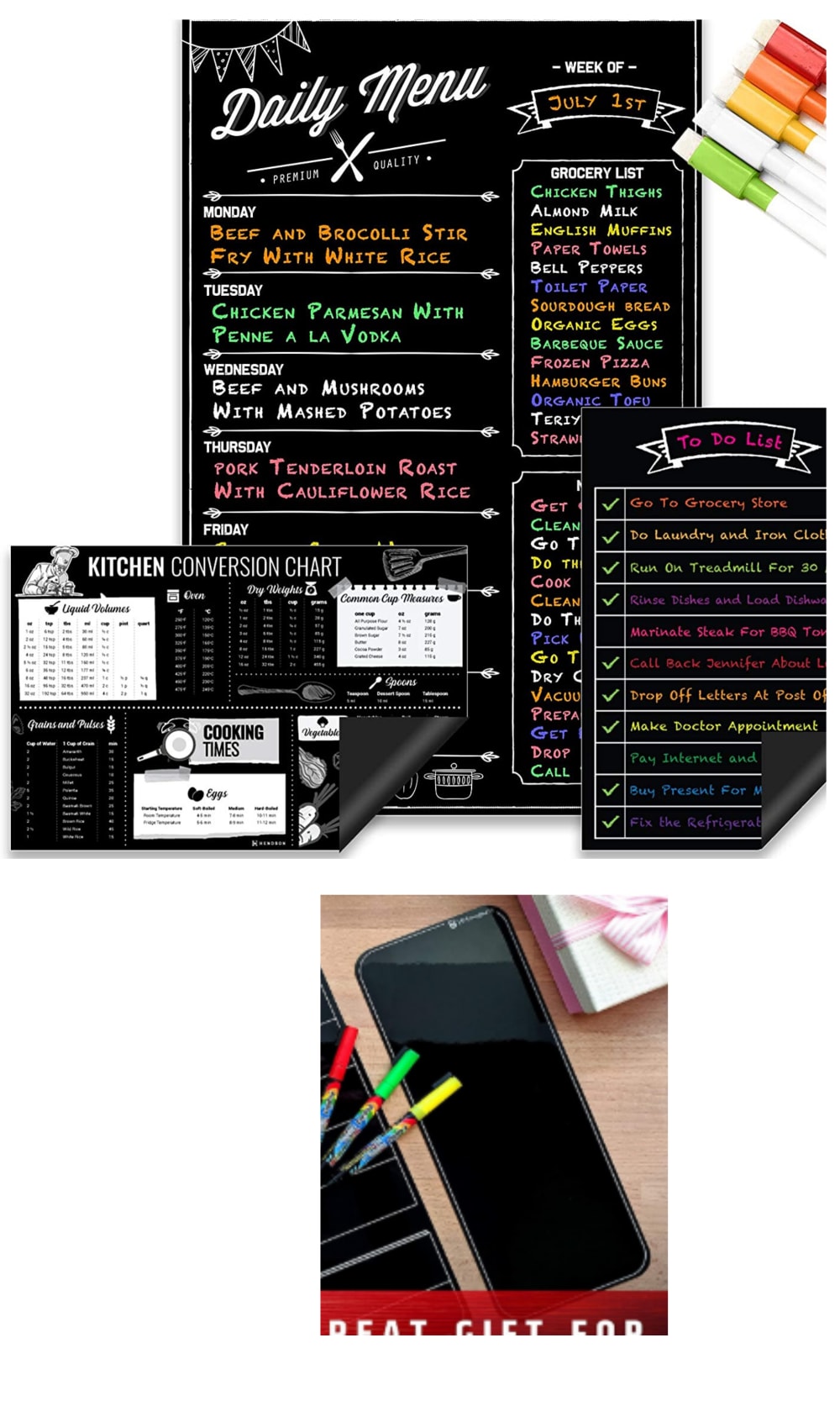
Choose the board combo you prefer (disregard quality of 1st pic, just choose preferred combo). A: MenuBoard+Bonus Calorie,Spend & Weight Tracking Board+5Pens+PenHolder+ConversionChart. B: Menuboard+BonusToDoListBoard+BlankBlackBoard+5Pens+ConversionChart
28 Responses to Option A
This one seems more extensive
the colors are more vibrant and stand out more
fony and colors on the menu are easier to read and follow
I much prefer A because the picture is more comprehensive and it really tells me everything that's included. I like seeing the complete package of what I'm getting when shopping online for something.
Seems like there's more markera
A is easier to read and doesn't make my brain hurt while trying to read what's on the menu. I like the larger writing and the days of the week are easier to see separated than the smaller writing on the other board.
I like this chat board
seems much more fun
I prefer the design of this board. I like the bigger, bolder font sizes.
Love how the days of the week are broke down in large font.
I prefer the physical look of option A with boxed in squares for each day of the week. The font and overall style feels more fun and kitchen like, it would go well with my current design. I also like the bonus food/calorie tracker provided with this option.
For me option A looks extremely trendy and organized and looks a lot better than option B does and is my clear choice between the two.
I like option A because I like the look of the rounded edge of the board and the accessories that come with it. It makes for an easier flow on my eyes when processing the information.
Option A was easier for me to follow and navigate. I prefer the layout of option A and think it is more in line with what would help me be more organized.
Both are very nice but I like A a little better. I like the space for larger text as this would help me plan meals better.
I love how the big chalkboard with the dinner options was the first image at the top, it makes it very eye catching and easy to read.
Choice seems to have more of all the information that I want for the week available to be filled out
Option A feels more complete and that you get a good menu, a good daily target to reach, a tracker to keep it together, and the conversion chart. This feels better and that everything is laid out for you. I feel you would be more motivated with this as well.
More spread out with details and not so jammed together.
Theres a lot more that comes with it; I enjoyed all the picutres of the product
The extra calories weight tracker feels like an extra free bonus that would be super handy
I like A better because it includes the calorie counter which is helpful. It seems like you definitely get more for your money with option A. Seems like the rest of the products is the same between the two.
This look and image is most appealing. I like the font and script of it and it all looks very visually appealing. It is very clear and attractive.
I like that the menu column is bigger but I like the B has the extra to do list, so I would combine that to A and it would be perfect. It's nice they have the conversion charts too.
This one is easier to read.
I like option A the most because I like the inclusion of the calorie, weight and spend tracker.
The details of the menu board in option A is fantastic. I prefer how the board itself is set up in comparison with option B. Option B does not look as detailed and descriptive. Option A has all the features that I am looking for and gives me all the characteristics and qualities that make the menu board very useful and informative.
This board is easier to see, and provides more options
22 Responses to Option B
I prefer B because it has less elements so it looks to be a little bit simpler
B is easier to read
I prefer this combo because it seems simpler and more efficient. I think it has all I would need and it would create less clutter.
I think there is just way too much in A. B gives you the main stuff and everything seems relevant.
I chose B because the fonts and layouts look much more clean, modern, and professional.
This one looks like it would be easier to read and it's split up better in my opinion.
I like B more because I feel like it allows the owner to have more creativity. It lets you write more and make the sign more of your own.
Choice B presents every item in a more clean and organized manner and is my preferred choice.
I like having the general to-do list, which is useful in a wide variety of contexts. I'm not that interested in losing weight at the moment, so I don't care about that feature in the other choice.
I chose “B”, I feel like it is easier to read from the “Black” board. I actually like the big black board in “A” better as the days of the week are larger. However the combo is better in all black in package “B”. The roll up and stick board is nice to put anywhere.
I think the bonus to-do board is the most relevant and useful add-on, and that makes choice B better.
I like option B better because I personally wouldn't end up using the calorie counter trackers. I also like the format of the daily meals better in choice B than A. It is easier to see and read what each meal is for each day. It also seems you can fit more on the grocery list and the to do list than in choice A where the space seems more limited for writing things down.
There is too much going on with the other package which is why I didn't choose it. I'm a minimalist so wouldn't want all the stuff.
I'm confused. Is this for the home? If so, I personally prefer B because I would used a To Do List over a calorie planner.
I just like the way that it’s designed better
I really like the layout of option B. It seems you can be more organized with it. I like the black background.
Choice B seems easier to read as it doesn’t seem to be as busy and cluttered looking
The colors are bolder and more appealing to me.
No need for a penholder.
Choice B seems to fit together better than Choice A and the various pieces have more in common with each other.
I would select option B because I like the blank slate option because I would want the ability to write something myself. That option doesn't come with A.
I chose option B because I like that it comes with an additional to-do list. I also like the style of option B, it looks like it belongs in a cafe.
Explore who answered your poll
Analyze your results with demographic reports.
Demographics
Sorry, AI highlights are currently only available for polls created after February 28th.
We're working hard to bring AI to more polls, please check back soon.

