Poll results
Save to favorites
Add this poll to your saved list for easy reference.
If you are a pickleball fan, which pickleball paddles would you choose?
Option E won this Ranked poll with a final tally of 101 votes after 3 rounds of votes counting.
In a Ranked poll, respondents rank every option in order of preference. For example, when you test 6 options, each respondent orders their choices from first to sixth place.
PickFu requires a majority to win a Ranked poll. A majority winner differs from a plurality winner. A majority winner earns over 50% of the votes, whereas a plurality winner earns the most votes, regardless of winning percentage.
If an option does not earn a majority of votes, PickFu eliminates the option with the lowest number of votes. The votes from the eliminated option are reassigned based on each respondent’s next choice. This process continues in rounds until a majority winner emerges.
Scores reflect the percentage of total votes an option receives during the vote counting and indicate the relative preference of the respondents. If there is no majority winner, look to the scores to see how the options fared relative to one another.
| Option | Round 1 | Round 2 | Round 3 |
|---|---|---|---|
| E | 46.5% 93 votes | 47.5% 95 votes +2 | 50.5% 101 votes +6 |
| C | 18.5% 37 votes | 22% 44 votes +7 | 26% 52 votes +8 |
| D | 17.5% 35 votes | 19.5% 39 votes +4 | 23.5% 47 votes +8 |
| A | 9% 18 votes | 11% 22 votes +4 | Eliminated 22 votes reassigned |
| B | 8.5% 17 votes | Eliminated 17 votes reassigned |
Age range
Gender identity
Online shopping marketplaces
Options
Recently purchased categories
18 Responses to Option A
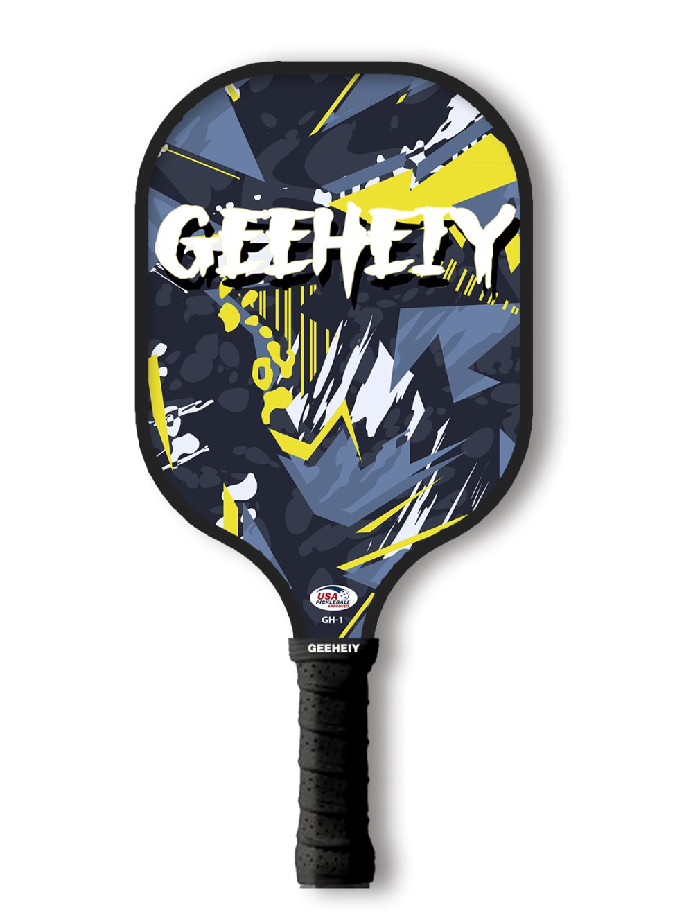
I would choose the paddles in option A first because they look exciting and playful
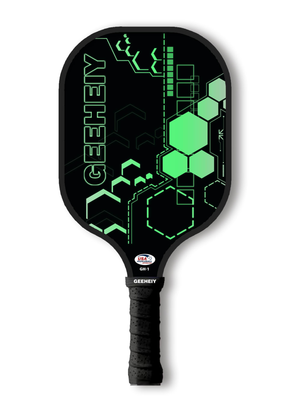
I dislike the green in C a lot so it is last.I like the black and yellow color flames in A. E is just a cool looking pattern. I would like A better if it did not have the name on it. The colors on D are just very busy.
A and E are fun designs
Option A is interesting and not as busy as option D.
A is my favorite, i love the color pop and comic book art style. C is my second choice, a good technical vibe and easy to read. E is third as it doesn't have as much color but is still very readable. B is fourth as it doesn't seem very unique and D is fifth because the graphics and words are very hard to read.
I like the designs that are not as bold.
Fantastic quality according to trustworthy and interesting
I ranked it like this because in choosing a pickleball paddle I consider the design and color. It has a awesome design
The best color combinations in order are the ones I like best. I love cool designs on whatever I purchase so it has to be unique and edgy
I selected my choices base on the design i like most, and the color combinations
I'd want a paddle with a little bit of flair and design, enough to show some individuality, but not too much. D was just a little too much going on for my taste.
Pickle paddleA first choice because its unique Pickle paddle C second choice because of the color Pickle paddleB third choice because its comfortable Pickle paddle D fourth choice because of the brand Pickle paddle E fifth choice because of its handle
I just like the graphics they are quite original in design
I picked A as my first choice because I enjoyed it more and is a good quality product and the handle is good
I would choose option A because I like the contrasting colors on the paddle, but they are also not too loud and bright. I picked option C second because I like the green and it reminds me of Spotify colors and contrasts nicely with the black background. I picked option D third because I thought the sports theme was unique. I picked option B 4th because I liked the design but didn't like the colors. I picked option A last because the design was too simplistic.
Lighter colored paddes are easier to see on the court, especially during fast-paced rallies. Hence i would go for brightly colored.
I like options A and B the best. I like the design on the paddle and the colors used. They look fun, but aren't distracting. Option E is nice. It is a little formal looking and not as much fun. The design doesn't really go well with the sport, but it looks nice. Option D might be okay for a child. It is pretty distracting and isn't that attractive to me as an adult, but a kid might like the graphics on it. I don't like option C. It doesn't really go well with the pickel ball. It looks like something that would go with a technical item, not sports equipment.
I loved these colors. They were great. These concepts are excellent.
17 Responses to Option B
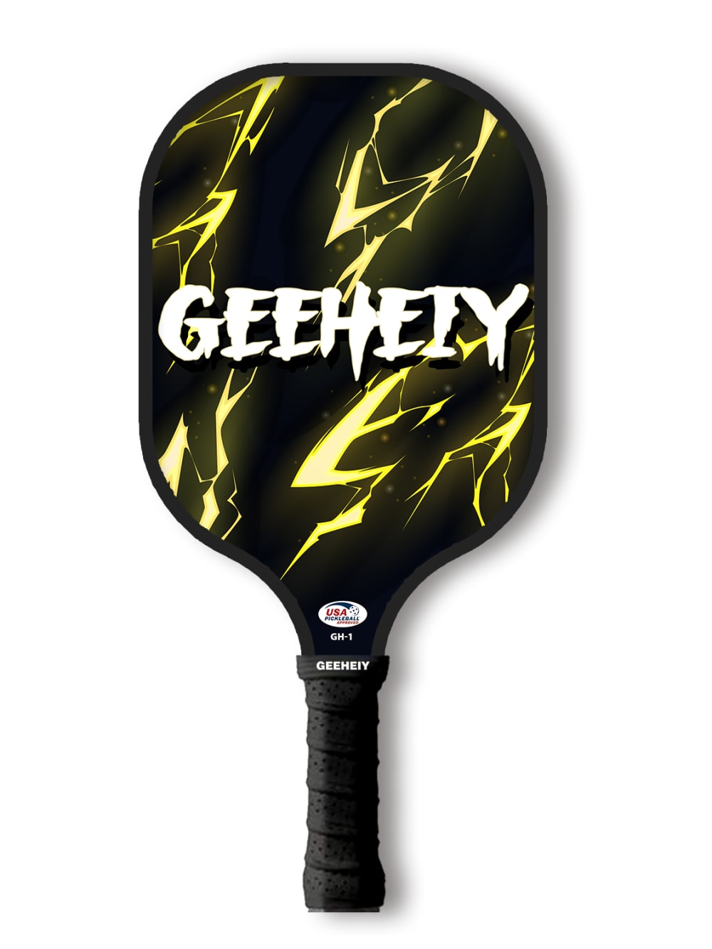
These are all nice, artful designs. I chose option B. I can easily imagine myself using it. I like the black with the camo.
I chose option B first because how cool it looks with the black and yellow. I chose Option D next because all of what is going on inside the design. I chose option A next because of the color. Option C and E look pretty good too. All good options
i would want a paddle that looks strong and bold, but not too busy. i think options b and e are both great options.
I prefer the bright design on option B
I like the lightning style graphic of my top choice. They're all cool though
I like the more stable design that go for consistent than the ones that look more random
Option B is cool, simple, and has an amazing graphic. Option C is great too, just black on green. E is alright, not too distracting. A and D are just ugly and distracting.
I love B and D! These have great colors, great designs and look good all around. I love these! B and D also look 3D and graphic, very nice looking.
B, C, and E all look unique and modern.
I like fun and dynamic designs that aren't too busy. I like the simple marbled aesthetic.
The colorful look of option b is what grabbed my attention and got me interested in that paddle. The design is bright, unique and I know that I would be sure to receive many compliments with a racket like that
They are very interesting and I would purchase any of these
First of all I do play pickleball and am always looking at paddle colors and designs. Although I do not like the brand name being large and visible, I am ignoring that and am just looking at the patterns and colors of the paddles and they are so ranked accordingly. Option D is way too busy of a design with too many colors so I chose that last.
I like 1 a lot based on the lightning. The colors in 2 are cool. 3 is decent but I don't like the big wording there. Not really a fan of the look of the last 2
The outer packaging is the first choice when choosing. It looks cool and suits me.
They all look cool it was hard to decide but good job whoever designed it
Liked the design on the pickle ball paddle seems easy to handle
37 Responses to Option C
Definitely Option C because it is prettier than the other options in my personal opinion. Thank you.
I like the one with the green design it reminds me of tennis and has a fun look to it.
I'm not a big fan of the font in A and B, and D looks too chaotic and full for me. C looks the most clean and minimalistic and energetic in my opinion. E is not bad but I prefer the color scheme and the graphics of C.
I like the green and black color scheme. This one fits my personality and style.
If there was a primary red it would have won. C has a cool technology vibe. E reminded me of a bug zapper paddle. B and A are. Wry similar but B won between the top due to coloring. D is just too busy for me.
I would choose option C as it looks the most professional.Options D and A would be my last choice as they look more like graffiti on them, something a kid would use.
I like the color scheme and design of this one a lot. I like the green on it. It goes well with black. The shapes and designs and lines look good and eye catching
I prefer less busy designs.
I like the style of C the most followed by A, B, E and then D.
I prefer option C because it is the most visually appealing and while it has the brand name on the paddle it is not the most prominent aspect of the design.
Option C is nice and distinct. The colors are great in green. Option E in the honeycomb is nice as well. I like the lightning pattern in option B too. I think option A is not bad and option D is way too busy here.
I like the patterns on these and also the darker look. No need to have the brand so big.
I love the high-tech design of Option C. The color and artwork on option D is great. Option A is fine, I like the lightning on Option B as well. Option E just seems bland and ordinary.
I like both the color and the pattern on option C the best.
I am choosing based on how the paddle would look in motion when swinging, and I think C would look great with the little splash of green
all these designs are very different. I have picked based on my style and preference for colors/designs. I think they are all very interesting but these ultimately would be what I would personally buy in a store.
Option C. I like designs that aren't too busy or cluttered. This is a classy design that is pleasing to the eye
If I am being completely truthful, none of these paddles really stood out to me at first. However, I can appreciate the dark color scheme of Option C, which ultimately lead to my decision.
I like the simple design of the first option but I do wish it was a different color scheme. The second is nice as well but it would be better with just the honeycomb design on it. The next options look like something children would use. I do not care for them for adults
I like the bright green color of C, I like the interesting pattern of D, I like the simplistic nature of E, other two based on personal preference for appearances.
I think option C looks the most interesting, unique and I like the colors which makes me the most likely to buy
I chose C because it has the most interesting and attractive design among all the choices.
I ranked B last because I'm not a fan of styles where the brand name is the biggest thing to draw your attention. Option C was my favorite as it just looks incredibly clean. The hexagons and the green are a great mix. It looks tight.
I like the paddles with a cool graphic design on it. I would choose one of the bright or loud ones. the last option is boring in my opinion and does not catch my eye.
Geeheiy is....not a pleasant name for a brand and having it writtin all over is just ugly. That being said, black and green wins out, with the less branded one second.
I think the simple black and green looks the best, D has way too much going on for me to like it
All these designs are great, but the option I chose really stands out. It's a clean design with great color usage.
I prefer options C and E out of these 5 options because I enjoy the color scheme, without it feeling like there is too much clutter. The other paddles have too much text and clutter which overwhelms the overall look for my liking.
i like the graphics on C and E, would not buy the other ones
I love the pad and i think that’s how it suppose to be in order , it is unique and very colorful and beautiful
I prefer option C, because it is bright, fun and professional looking. Option B is decent, but I don't like the color as well as C. Option E is a bit underwhelming. Not too exciting. Options A and D are way too loud. They seem obnoxious.
I ranked based on the style I would most prefer
i first few i chose due to the designs that caught my eye i thought looks appealing alot
C is the only one I actually like much. E is okay but it looks like a PowerPoint background. The others look like something for teenagers, but the worst part is the big logo.
I chose the paddle with the bright colors which was option C. I like it because it would be easy to see and not get lost. I like the shapes and design.
Cool designs on these products should be a top seller
I liked the first one because green is my favorite color and black is my second favorite. I loved the lighting design that it has for letter B as my second choice. For my third choice I liked how simple it was and nothing over the top. For my fourth choice I just liked how it looks but nothing special to it. For my fifth choice, I hated it. My fifth choice it just had too much going on
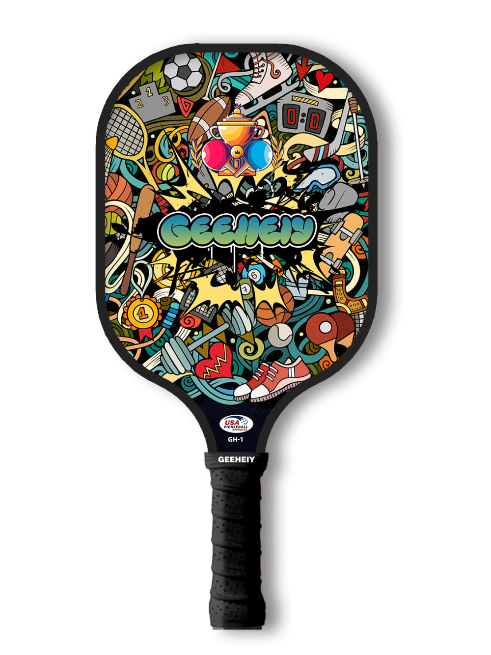
35 Responses to Option D
Options D, A and B are really cool pickleball paddles with the fantastic graphic designs on them
I love how fun and colorful D is.
I like d because its very busy and the design is exactly what im looking for.
I like the brighter, more colorful designs much better
Option D is the ONLY paddle I would get. It's really cool and modern, and it hides the logo a bit, because it's so loud and busy. Option C, A, B, and I would not. Because the name of the company doesn't make sense, I will assume it's Chinese, since of a lot of their products have names that don't make sense or sound American to THEM. I am trying to move away from companies that exploit their workers, so I couldn't buy them.
If I were to choose a pickleball paddle I think my preference would be option D because of it's overall design and how chaotic the image is.
I thought D and C were unique and interesting with D standing out the most by far. A is pretty good but more generic and B and E are boring
I love the size of the pickle ball and the material used to make the pickle ball, most importantly the drawing on the this pickle ball makes it look more aesthetic than the other available options.
Based on my mood of the day, I like the more colorful pattern of "D". Then followed up from "A", "B", "C" and "E" down the line. Option "E" is kind of plain.
I prefer D and C because they are the most colorful.
i think the flashier the better
I really like how noisy and fun the design of option D is. This was my top choice by far. Options E and C I felt were pretty boring. Neither of these designs evoked any real positive emotions for me. Both options B and A I felt were pretty cool designs. I felt that the color contrast in option B was more striking, so I chose option B second and option A third.
I think D has a very intricate and unique design- I like it the most.
This is my choice order based on color and design, but I like the design and colors of D, best
I think the pickleball paddle is a place where it'd be fun to have a loud design and show some personality. First of all, I like the graffiti design, but. I feel that I ordered the options in terms of boldness of design.
I like the graffiti style artwork on this paddle, it is very colorful and pops.
Honestly the first option is amazing, the other ones are all last choices because they are basic but the first one I would honestly buy.
I enjoy the graphics on Option D much more than the others. I like the hexagons on Option E and wish that the whole surface had that pattern. I don't like Options A and B, because of the color choices and they don't compare well with D.
I really enjoy the bright colors and cute graphics on this paddle. I didnt really care for the others they kinda plain and boring next to the brightness of the other paddle
I thought d had the most fun and unique design so I put that first. A had a pretty fun design as well. B looked really cool, and kind of a cartoony way. C and e weren’t bad, but definitely not as good as the previous options.
Option D is probably the only one I would actually buy in a store and I do like it quite a bit! It's got a fun, unique design which I would like showing off. The next tier is C & E. I like the simpler design and like C slightly better because of the colors. A & B are in the bottom tier and I don't like them because the logo text is very visible and I'm not familiar with the brand, so I'd rather have a plain design than an advertisement.
I made my choices based on which options I felt were inviting and made me feel that I wanted to pick up the paddle or learn more about the paddle and what it would be used for.
The ones that I picked look more authentic and cute for what it is. I went from wow to more simplistic simple.
I like some of the designs but the others are either plain or have too much design on them
I like the colors in the first one the best. They are all pretty colorful and eye catching,but the ones I ranked the top are my personal favorites for that reason.
those were the paddles that i thought had the best designs ranked from worst to best
I personally think the overall design of the whole thing is cool and very attractive and I think the one I picked is the best because it’s more colorful and unique
The colorfulness of Option D is very attractive. It would catch my attention quickly and it has a quirky and cute design. The others are less attractive.
Well one of the most important thing I observed about this brand GEEHEIY is the color sense and the quality of graphics design.
They all look good but the way I ranked them is the one that looks the most interesting to me
Rated by the graphics that I like the best to the least
I like the way they look and I don't care for the darker ones I like one with a lot of color with them plus the one I picked first has lots of my favorite color in it and I really like that
I don't really like big logos on my sports equipment but I think the logo on D blends in pretty well and I like that design the best.
I generally like a simple design but the visual I picked for #1 was outstanding, I think it was the variety of colors present. The rest were in subsequent order of designs I found least intrusive.
I am currently looking at five different product picture and trying to decide which one would be the best fit for me, After careful consideration, I have ranked them in order of preference. My top choice is option D, as it seems to be the most suitable and has a lot to offer in terms of features. Following that is option A, which is still a good choice, but not quite as appealing as option D. Finally , I would rank options E,B and C in that order. Overall , I am confident that I can make a well- informer decision based on my preferences and need.
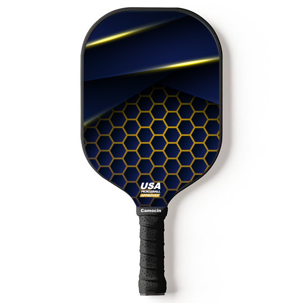
93 Responses to Option E
I have always loved single colored bats more than the multicolored ones and so have rated all the above 5 options as per the same criteria from the best to the least liked. Option E is the nicest one of the above 5 categories due to its almost one color design.
I most prefer the option E paddle product design because I like the geometric shapes and blue color design the most. I chose option C, D and A second, third and fourth because I like the green geometric shape design more than the colorful patterns design more than the blue and yellow paddle color design. I chose option B last because I do not like the black and yellow color design shown here as much.
I like that E is a black based design and has only a complementary color. It is more my style.
Normally I'm trying to pick something kinda low key, which is why E and C, but D is a really nice design that I think I could roll with. Honestly though, whatever they look like, I won't see them when we're playing, so it better feel good in my hand
These choices were purely from my own personal taste. I like things that are subtle and 'cool techy' looking more than the overly bright and colorful paddles. They are all good patterns for different people.
E. I like this one the best, the text on these don't really work for meC. not too much text looks okay tooB. the graphics are nice on this oneA. cool design if not the text would have been top choice probablyD. um, just way too busy!
i love pickleball, but truthfully only E is one i'd get, the rest of these are kind of childish in design and with the large logo font
E is a sophisticated design. B is an exciting design. C has good colors. A is o.k. and D is too distracting.
I prefer this option. I like that it fades into two designs with the honeycomb creating depth. The depth perception is what made this my first pick.
I thought E was the best by far and I did not like the others as much. I don't like how the brand is displayed on all the others and how they don't look normal. So to me E is definitely the best.
I really like the design and color scheme of option E. I think the colors match my style well and would make me more likely to win
The only one I like is E. The others are too busy and loud for me
no wording...then colors and less wording and last one is "to busy" looking to me
I think that the words are distracting. The clean look of option E looks the most sporty.
I like the plain in option E the best but some of the logo ones are cool.
Option E is the best option because it has the most clean and quiet design. When I purchase this product, I do not want a loud design on the paddle. The other options have too much colors going on.
I prefer simple design, so E and C were my favorite options here. Option D is my least favorite, it has too much going on and is too visually busy for my taste.
I prefer Option E because of the dark colors but primarily because it doesn't have the company name all over it like all of the other options. I wouldn't want to advertise for a brand.
The paddles with the least amount of lettering were most attractive. Then they were ranked by how unique the color scheme looked.
I like E the most because for me, it's the most aesthetically pleasing. It doesn't have the company name on it but looks really cool and I can see myself buying this paddle. For B, I really like the lightning on it as well as how the company name is right in the middle of it. Both of them go together well and it makes the paddle look really cool. It was my second choice, but easily could have been my first. Option C could have also been my first choice as well; I like the old school colors and it reminds me of the movie Tron or an old school video game. I also like how the company name is vertical and not horizontal like all the other ones. For option A, I am not a big fan of the comic book style colors back there. I think it just makes it look old and faded and I am not a big fan of that at all. It also just looks like a weird abstract painting more than what belongs on a paddle so I don't like it at all. For option D, I just think there's too much going on. There's a lot of things it wants to fit in to this one design and the text of it reminds me of a hooligan printing graffiti on it. I am not a fan of that and it just doesn't look great. Plus the colors are way off from what the other designs shown here.
I don't like the large logos. E is simple yet an interesting design. C is cool colors and D is a fun graffiti look. A & B both have the large logos, so I picked A over B because of the colors.
I'd prefer a simple graphic design with muted colors; having the name plastered on the front is not a good look to me.
I have to go with E because it's a cleaner design.
I picked E because of the Clean 3D look. After that I liked the dark blue and yellow look. B and C were close but the lightning won out a little. D is a little too cluttered and messy for my taste.
I like choice E because it looks the most official
I like the more muted design of E and think the darker colors and honeycomb design look nice.
I like the more subtle designs like Choices E and C, and I don't love Choices B or A, but they are much better than the wacky design of Choice D
I went with the cleanest choices first (E/C), the rest are way too must for me and I ranked them based on appearance.
I prefer a simpler design like option E or even C. The rest are too busy and overloaded with graphics.
My choices are ranked from best to least based off the design, as I prefer simple and modern designs over loud and extravagant designs.
I like option E because it is the most simple and least distracting design.
The first one appears to be the most "professional" looking, which is a look I prefer.
I like the more simple and non-cluttered designs.
I chose E as my top choice as I like the color scheme and design for this paddle, the blue and yellow/gold colors look good together. I chose C as my second choice as I like the green against the black in this design, it almost looks like glow in the dark. I chose B third and A fourth as these designs aren't as appealing to me and have the large logo across them. I chose D last as this design has too much going on in it.
I like to choose not complicated design because when it's complicated, that makes your eyes tired
For me, with a pickleball paddle, the simpler the better. Don't put a lot of flashy colors or words on it. My selections reflect my preference for a simple, non-colorful paddle.
I like the cleaner, less busy options the best.
I like the more plain designs compared to the ones that are overly busy.
I chose E because it looks like a dart flight and pretty cool. I chose C next because the brand name does not get in the way like the next two options. A and B are pretty much the same for me, but I like the colors of A more. D is atrocious; its design is too busy.
I'm not a fan of easily seeing words on a paddle
E is the only one that doesn't have too much stuff going on. The others are way too distracting and too many colors going on.
I prefer the darker designs
I really like e. E stands out to me as a space themed paddle. Not too messy but not too clear looking either.
I chose E and C first as the logos for the company were more muted on these and had good designs. I placed the rest in the order D A B in order of which has the least instrusive logo placement to the most.
I like the subtle, more subdued design used in Option E the most. I'm also not sure what the "GEEHEIY" means in the other designs.
Option E is my first choice because it looks the most streamlined and professional. Option C is my next choice because of the cool black and green colors, although it looks less professional. Option D is too distracting of a design when playing. Option B shows the brand name too distinctly. If I am playing pickleball, I want to have a more professional looking racket. Option A also shows the brand name too distinctly and in a less appealing color.
I would be most likely to purchase option E because I think that it has the coolest and most interesting paddle design/pattern out of the five options above. Options E, B, and maybe C are the only ones I would even really consider purchasing. I think that the patterns on options A and D are too bold and cluttered for my tastes.
Option E was my choice because it didn't seem like it was too cluttered on the paddle. I thought the design was very simple, but also stuck out.
E was my favorite because the brand name wasn't the main focus point.
I found the choice of colors to be more elegant in Option E and C. I like the beehive pattern (hexagons) in E and C. Option B comes close as colors.
I liked the simple patterns better. Designs 4 and 5 seemed too busy.
Option E is clear and not too fancy. I like that the color pallet is simple and dos not distract
I much prefer the sleek black look of my top choice. I think the geometric pattern and swipes of color look really sharp and add an edginess to the paddle that is really attractive. I think my #2 choice has similar qualities but isn't quite as sleek looking. I think the name brands busy ones are much less interesting and don't provide the same sleek resonance of the top two, especially my first choice. They are forgettable.
I like the dark theme with a lot of black and gold accents. The honeycomb pattern is simple but pleasant to look at without making the whole design busy or garish.
I prefer the simplicity of the pattern in E because it is less distracting than the other options
E looks the most sleek and modern. A is okay, but I don't like the prominent writing. B is middle of the road, kind of plain. The design is C is too abstract and not appealing and D is far to busy of a design.
My first choice is option E. It is a sleek and classy design. I really like it! My next choice would be Option B. It has good contrast making the design appealing without it being too busy. Option C would be my next choice. The design isn't my favorite, but I do like the contrast between the green and the black a lot. Option A is my next choice. It's a little too busy for my taste, but I do find the color choices appealing. Option D is my least favorite. It is too busy and looks too juvenile for my taste.
Option E presents itself as a serious player piece of equipment. Option D is a fun/colorful item for casual play. Option C is a generic/plain/futuristic design. Options A+B are trying too hard to be edgy in both graphics and lettering.
E is low key attractive and functions as it shouldC adds a little flash but not too loudA has a wild design but the colors mute a littleB it too flashy and loudD is just a mess
For pickelball I prefer a more subtle paddle so that it doesnt distract.
I liked E and C it was the most plain design, not distracting
I generally like basic designs that are not flashy so I ranked in order of this.
Option E would definitely be my choice because of how simple and professional the design looks. I prefer a more basic design with sports equipment like this, so something like Option D comes off as too busy and not something I would ever choose myself. Options C and B are also decent in my opinion and would be respectable consolation prizes.
I prefer a clean look that isn't "busy"
E has the simplest design and would be the easiest to use.
I picked choice E as my first choice, because it doesn't have a logo on it and I like the color scheme of it. I picked choice C as my second choice only because I like the black and green colors together, I think it looks really nice. I am not really a fan of the looks of the other paddles though.
Option E and C are definitely my first 2 choices because of the minimalistic design. Options A and D are definitely my last 2 choices because the designs look messy and there are too many colors in the paddle (unless you are trying to confuse your opponent). Option B is my middle choice because it is a good combination of both minimalistic and stylish.
I think the busy patterns are distracting. I like the monotone type minimalist designs. E is cool with racket half on the bottom.
I picked the paddles with the best graphics on it. While I liked all the designs on the paddles, I ranked them as fair as possible.
I like option E the best because it looks less cluttered and more like a professional piece of sporting equipment. I picked option C second because you can see the logo still and it's a bit off centered, but doesn't look very cluttered with too many graphics and lettering. Option B and Option A are pretty interchangeable, I do not like the design because it way "too busy" and would not buy this product. Option D is the absolute worst. It looks like someone graffitied the racket. Maybe that is the point, but I wouldn't even take that as a free item. The design is borderline silly.
I liked the simplicity and colors of the E paddle the most and then option C caught my eye with the bright green color. Option D I thought was interesting looking but a bit on the busy side. Options B and A I just didn't care for in general.
The plain design with the stripes is the best in my opinion but I don’t like over the top things. The lightning on option B I would also buy. Option D has way too much going on. It has a soccer ball on it which doesn’t make sense!
It nice and amazing and the one you have for the
Option E is my favorite. Very sleek and cool design. Options B and A are the worst - the brand name is too big and obnoxious.
The overall color combination. The pattern on the paddle. For the ones at the end, they are too much animation on them.
I like a more simple design
I really prefer the paddle without any lettering on it by far - plus it's the cleanest look. Some of the other paddles are just far too busy.
I choose E because it was blue and very simple to and it's also eye catching
Options E and C are pretty minimalist and have cool designs. If I had to go with something less minimalist, I would pick Option D, as it's the most creative. Options A and B are pretty ugly, so they are last.
i have arranged them from the most pretty and simple one
The all look amazing but my first choice looks better
Just going for simple not flashy Something plain not with a confusing pattern
I think subtle geometric shapes look really cool on a paddle. I like a paddle that is cool, a little edgy but not too busy and loud. My options reflect that in the rankings.
I like the colors of my first choice and feel like the design and colors flow well. I like how the second choice paddle pops and has a lot of color, it drew my eyes to it quickly.
I prefer a more simple design-the more clean and classic the better
I prefer the simpler patterns and solid colors.
I like the simpler designs and less drastic colors
Not a fan of the "anime" styling that D has, so it goes last. A and B are fairly close but I prefer the simpler design on A. C is quite good and I like the neon green color scheme, but E takes a long lead as it doesn't have a giant brand name on it.
I like E way more. The design isn't super in your face and looks good. I also like that the branding isn't large.
My first choice is because the batton looks cool and less flashy. Second is also cool and vintage. Third option is because green is my favorite color and I also love the design. Fourth is because of the design, its too catch for me, moreover, I'm not a fan of yellow. Finaly, the fifth choice is because of the design and also the color
I prefer something plain. The other paddles are too busy for me.
I prefer the darker the better. I do not like flashy things.
I like the simpler design of E. The D design seems much to busy, but it would be easiest to identify as you own if with a bunch of paddles
Explore who answered your poll
Analyze your results with demographic reports.

