Poll results
Save to favorites
Add this poll to your saved list for easy reference.
If you are a pickleball fan, which pickleball paddles would you choose?
Option B won this Ranked poll with a final tally of 52 votes after 5 rounds of votes counting.
In a Ranked poll, respondents rank every option in order of preference. For example, when you test 6 options, each respondent orders their choices from first to sixth place.
PickFu requires a majority to win a Ranked poll. A majority winner differs from a plurality winner. A majority winner earns over 50% of the votes, whereas a plurality winner earns the most votes, regardless of winning percentage.
If an option does not earn a majority of votes, PickFu eliminates the option with the lowest number of votes. The votes from the eliminated option are reassigned based on each respondent’s next choice. This process continues in rounds until a majority winner emerges.
Scores reflect the percentage of total votes an option receives during the vote counting and indicate the relative preference of the respondents. If there is no majority winner, look to the scores to see how the options fared relative to one another.
| Option | Round 1 | Round 2 | Round 3 | Round 4 | Round 5 |
|---|---|---|---|---|---|
| B | 23% 23 votes | 25% 25 votes +2 | 32% 32 votes +7 | 37% 37 votes +5 | 52% 52 votes +15 |
| C | 20% 20 votes | 23% 23 votes +3 | 28% 28 votes +5 | 36% 36 votes +8 | 48% 48 votes +12 |
| D | 16% 16 votes | 20% 20 votes +4 | 23% 23 votes +3 | 27% 27 votes +4 | Eliminated 27 votes reassigned |
| E | 17% 17 votes | 17% 17 votes | 17% 17 votes | Eliminated 17 votes reassigned | |
| A | 14% 14 votes | 15% 15 votes +1 | Eliminated 15 votes reassigned | ||
| F | 10% 10 votes | Eliminated 10 votes reassigned |
Age range
Gender identity
Online shopping marketplaces
Options
Recently purchased categories
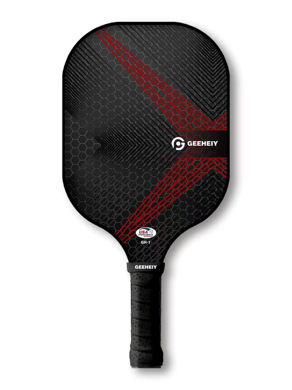
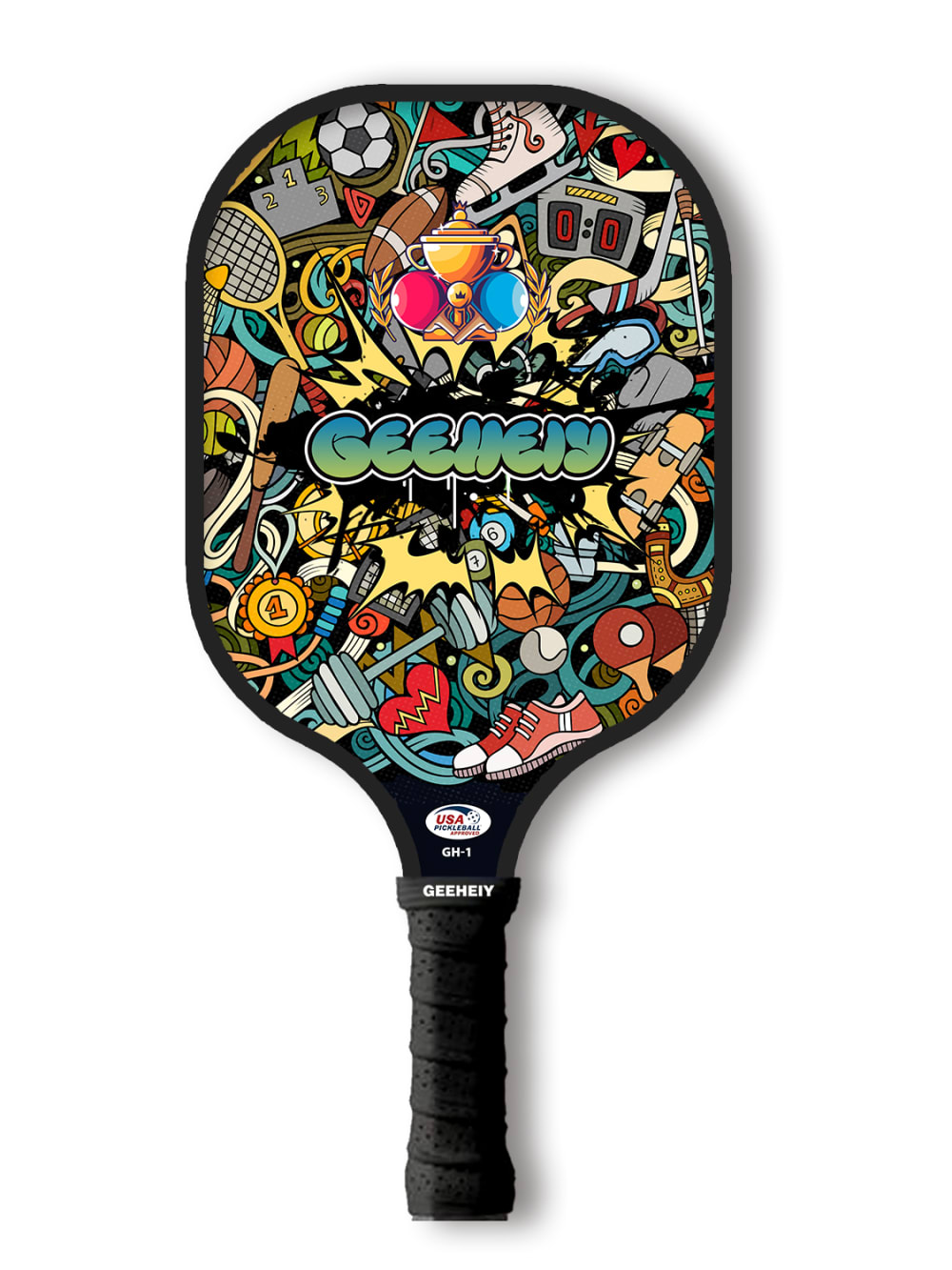
14 Responses to Option A
I prefer A and B as the design/color are more sparse and complementary.
I would choose option A as I like the plain black paddle, it looks smooth and professional. I do not like the graphics on other paddles. Option E was my last choice as it looks like graffiti.
I like the dark colors and dark red of A, but C is pretty slick. B and D also have the simple dark theme. F is dark but the green is a little annoying. E is too cluttered.
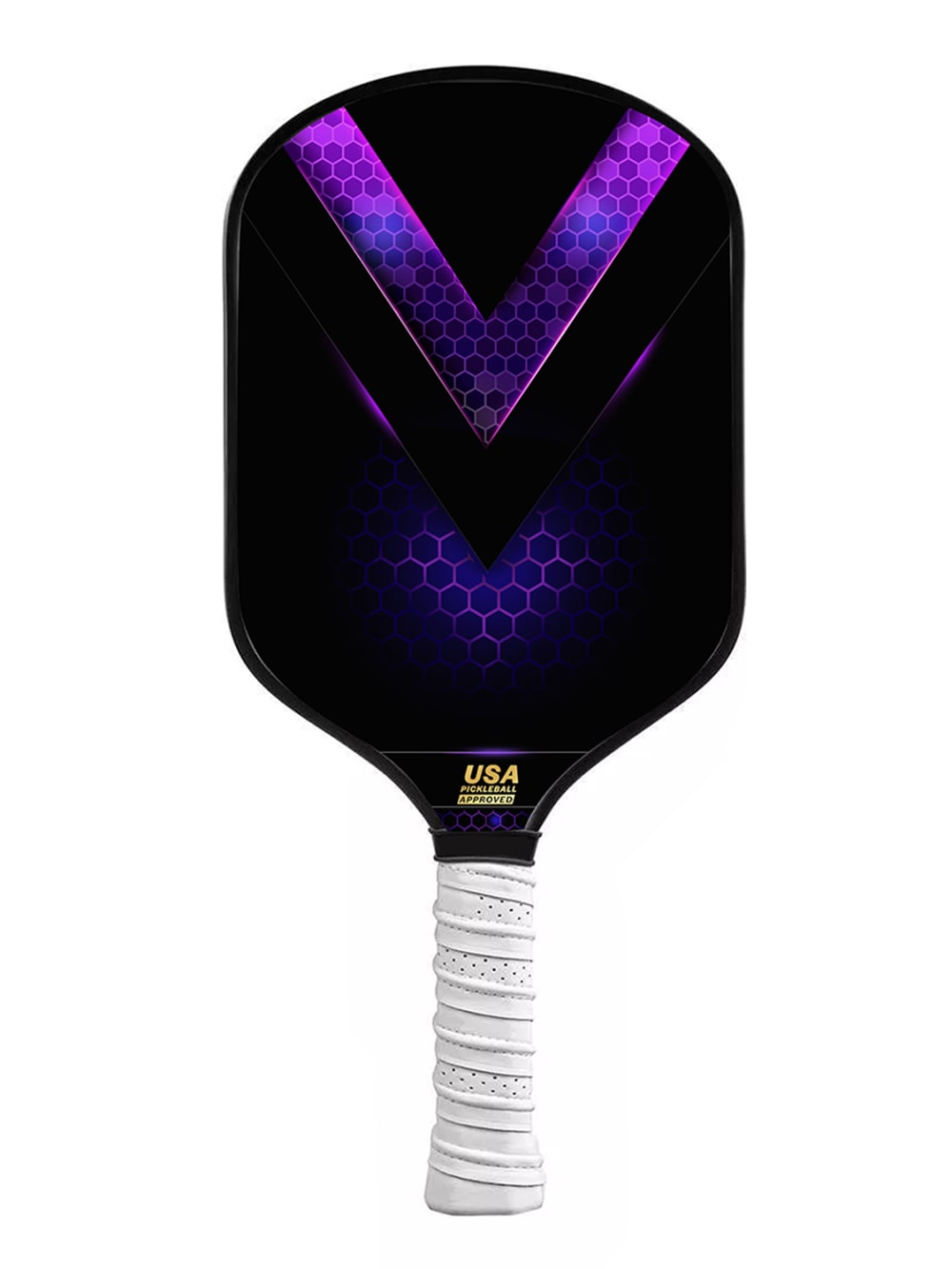
I find the "V" patterns to be the most aesthetically pleasing.
I like them not to have too much decorations and color. A little bit is ok but not to go crazy with patterns and colors. Too distracting
Option A. I play pickleball regularly and I like my paddle to be understated with muted colors. I think that this makes the paddle more classy and refined.
I prefer the ones that look professional, not the ones that look to busy.
I like more simplistic and darker designs so I chose options A and B as my top two. Option E is a bit too visually busy for my taste so I put it at the bottom.
I started with the colors I liked with the least amount of noise on the paddle. I would start to get distracted by all the imagery and not focus on the game.
I like the ones with the black background. They have a better look in my opinion and seem much cleaner. They'd be more fun to play using.
I like understated. Let my game do the talking. I ranked from quietist to loudest
I prefer a paddle that matches my age and has good performance
i prefer simple designs over things that are very colorful or cluttered.
The #1 choice is an easy one for me. Definitely the red and black minimalistic paddle. I am a big fan of minimalistic designs, and any red flares in the design is a huge plus. I would definitely use the paddle in choice A. Choices B, D, and C are also beautiful, however, does not beat the red and black design. Option F and E are poor options for me. There's just too much going on in there.
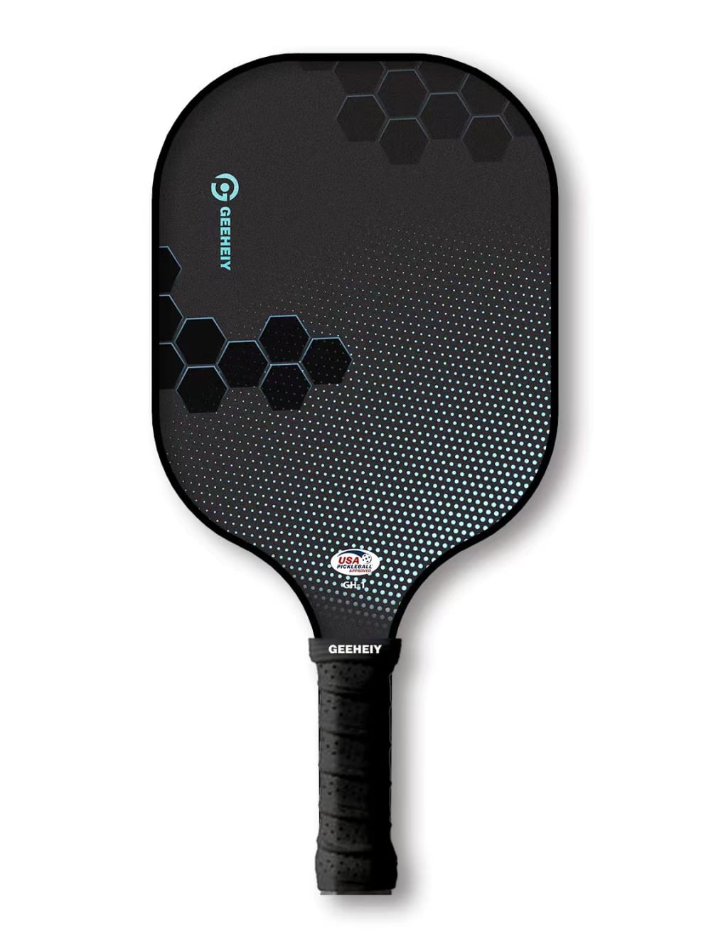
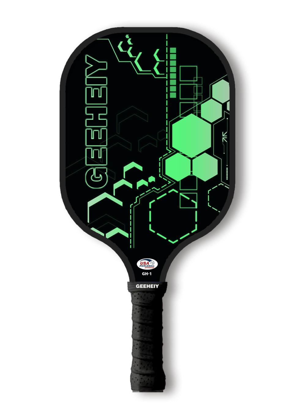
23 Responses to Option B
I most prefer the option B paddle product design because I like the hexagonal shapes and lighting shown here the most. I chose options A and D second and third because I like the red and black color patterns more than the golden hexagonal shape designs. I chose options C and F fourth and fifth because I like the fearful looking purple on black shapes more than the strange light green geometric shape patterns. I chose option E last because I do not like the complexity and colors used on this paddle as much.
I like the simple green look of the paddle. I think simple is better.
The dark color for B makes the paddle look more aesthetically beautiful and appealing compared to the other options. Simple color but classy most so the fact that it is dark color all over the product.
I like the simplicity of this one. I like that it is mostly black. I like the circle design on it. I usually don’t like too much color in this type of item
I would choose option B as a pickleball design because of the understated design. I would not want a design that is too loud and I do not want to distract other players with the design of my paddle. I also like the black and grey design, it is aesthetically pleasing. The other options have too much going on.
I like the darker options, especially B, which would go with most home decor and game rooms.
I'd prefer paddles with a solid color background. I don't really like extravagant or bold patterns on my equipment.
I chose option B as my first choice because the design is simple and not too shiny, Same method of selection is applied for all the other options and placed them in queue from the most preferred to the least.
I really love the black paddles, specifically Choices B and A. Choice D is my next favorite, and Choice F and C are roughly equal. I would not buy Choice E.
I chose option B. I love the colors used for this paddle as well as the design. I could imagine using this paddle.
I like the simple colors and patterns.
I like the simplicity of B. The minimal design on A & D. The green of F and the black handle of E. I do not like the white handle on C.
I prefer a more plain and simple design such as options B and A. They look solid while not being overly flashy.
I like the darker colors, they just seem more aggressive. Option E was a wild card for me, I don't know how I feel about all the colors on the paddle, but I can see it really growing on me if I were to own it and play with it on a regular basis. Option D was also a little out there because it looks like it has a huge ridge running through it, but again, that might grow on me as well.
The plainer the better, the ones that are very colorful and full of designs look like they are for beginners. Also I do not like a white grip, gets dirty too easy
Option B is simple and does not impact my outfit when using it. I like the dark paddle and it would blend in well
I liked B, it was the most plain design
B/C/D I ranked first because I like the clean look and ranked them in order of how I liked the colors. A is the worst color of those 4 so it's 4th. The last two, I really like them as well, I just think I'd prefer a cleaner, less-busy pickleball paddle.
I prefer subtle clothing and accessories. I went in order of what was most basic and my last two choices seemed too loud for my personality.
The less flashy and simpler designs are less disctrating and would be more willing to use.
I prefer a more simple and less busy design
I picked choice B for my first choice, closely followed by choices F & A. I like choice B the most because the brand logo is small and the slight blue accents on the black paddle look really nice and clean. I picked choice F because I like the color scheme, but I don't like the logo in such big letters. I picked choice A as my 3rd favorite because I like the colors but not really the design on the paddle.
I like the sci-fi computer looking ones. The cartoon one the least.More subtlety is better than intricate and fill distracting color.
20 Responses to Option C
Definitely Option C for the colors, and the shape design on Option F. Thank you!
I love the color scheme of Option C. Option F is high tech looking and I like that as well. The others are somewhat bland and unoriginal compared to these two.
C is the best looking paddle in this bunch by far. Sick design with those colors!
option e is far too busy for my taste. i liek the deep color and design of choice c. it has a bold and strong presence.
There are two main reasons for my ranking. The first is that purple is my favorite color. Added with that is that I like a clean look on things, even t-shirts. The main reason for E being last is that it is too busy. Plus, the worry that the graphics could peel or chip plays into my decision. The rest of the choices were based on the clean look of the paddle.
I really like the design in C and D with the V shape. I think the colors in C and D stand out the most. F and A are nice designs but not as flashy. I think B is the least interesting design and E is just too buy with too much pattern.
I have ranked them according to the preference of mine over the color, design and textures of the design which is graphical design.
I love C. The purple on the black background is gorgeous and the purple would look great in motion. The white handle really makes it stand out.
I like the paddles with the more simple pattern.
I like the bold colors and prominent V design in C. D is also good it just doesn't stand out as much as C. The colors in A don't stand out as much as the first two. B is pretty plain but an overall decent look. F has a distracting and strange pattern and E is too busy of a design.
I would be most likely to purchase option C because I think that it has the most premium and visually appealing pickleball paddle design/pattern out of the six options above. It almost feels alive and has a three dimensional feel to it. Almost like you can look not just at it, but INTO it. I also really like option D. Options A and B are okay. I don't really like the shade of green on option F and I think that option E is way too busy/cluttered.
C has a nice design I can see. D is ok but I like purple more than orange F is neon but understaded B is too plain A is too dark and E too bright.
F is too busy that's why it's last. I like the colors and simple design of C A and D. They look streamline and would match other gear well.
Patterns that are too bright and busy make my head hurt.
I like the paddles that don't have big logos.
I like option C the most because of the dash of color and its not too distracting.
The purple coloring of C really contrasts nicely with the black coloring of the paddle and looks great.
I love the sleek, black and symmetrical looking rackets. I think the black simplicity is desirable for a number of reasons. It's a compelling statement and keeps the racquet appeal simple. I think the busier racquet faces are distracting and don't really have a need since it's something that you are swinging around versus displaying. I have an affinity for the geometric patterns since it's a racquet sport that relies on angles for successful play as well.
Options C and D color scheme is the most unique and cool looking. If I’m trying to distract my opponent then option E is perfect it’s colorful and all over the place but it’s not my style. The purple and black are very unique together
The first one is really pretty and I love the colors they have it makes it look even more pretty
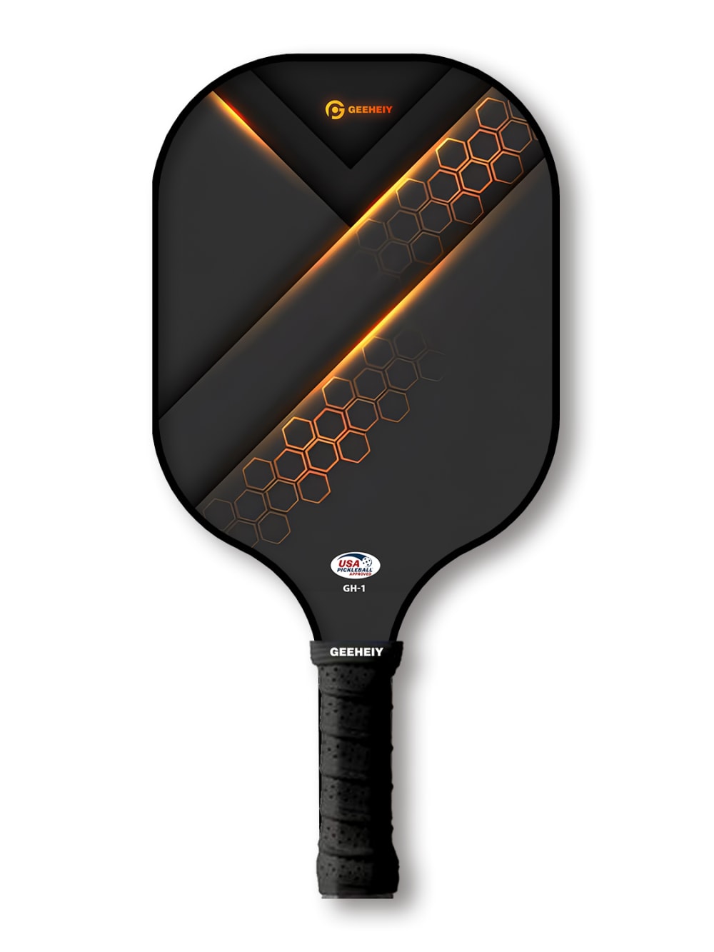
16 Responses to Option D
The color scheme of C is extremly ugly. E looks too chaotic. I like the 3D effect of D a lot and the design and the color looks energetic and exciting. F and B lacks this 3D effect and A looks too plain in my opinion
more solid color patterns are better as they look sleeker
I prefer the more simple designs because they aren't as distracting when I'm playing.
I prefer option D because I think it has an attractive design and color scheme. The product fits my personal style well and I can easily imagine using it
manly colors that are plain is my first options to a more colorful female decor paddle I selected last
My first choice would be Option D. I like the clean design that has a bit of a futuristic feel. The contratst between the black and orange and the way it's layed out on the paddle looks really cool. I would choose option C next for similar reasons as Option D. However, I like it slighly less than I like Option D. Option A is my third choice because it's my third favorite design. I like the red and black, but it lacks the bold contrast of te first two designs. Option B is my fourth choice. It is definitely an intersesting designs and I like the blue, but it's not all that exciting. It's just a bit plain for my taste. Option F is my fifth chioice. I do not find this design appealing. However, I do like the contrast of green and black. Option E is my final design. This would be my last choice because it looks very juvenile to me.
the gold and black design looks solid
D, A, and B all look very cool and modern.
I prefer this option. I like the golden color contrast on the black. I like how the graphics make it easy to determine the center of the racket.
The metallic color on the paddle is what got me interested in this paddle. The shiny look of the paddle caught my attention and led me to believe that this particular paddle would be the most admored one out of all the choices.
I prefer option D because it has a unique and appealing design.
I prefer more sleek/simplistic designs for my pickleball rackets
I ranked according to which I saw had the most attractive design and style
all the cool subtle ones are super slick and nice, the larger graphics and fonts are childish i don’t like
I like plainer paddles so I thought D C B and A were all the best because they weren't flashy but they were still really cool looking. I didn't like F and E
Option D - very high-tech and cool design. Option E was my least favorite. Too extreme and too busy of a design.
17 Responses to Option E
i like the paddle design in option E because it has an artsy and colorful look
I would choose to buy option E because of its elaborate design scheme
I really like the artwork on E, it really stands out, I like how minimalist B is, and the color on F pops!
E is just so fun. I think I'd get a lot of compliments and people wanting to take a closer look to see the details.
Option E is the most stylish by far and looks amazing. Option C has a nice color pattern to it but it's just not as nice as Option E. Option F has a smooth green color pattern to it but it's a little washed out looking. Option B is very plain but the design is still appealing. Option D doesn't look all that great overall and Option B is just way too plain and has no kind of appealing look to it.
E had by far the most unique design, so it was my favorite. I like the futuristic look of options b,d and f. A and c we’re by far the most plane options in my opinion.
I absolutely love the design on e and think it would be really cool to have and look at.
I like choice E because its bright and different.
I love E because it's bright and colorful and I love the design. I also love C and d, love the design and colors of those too.
This is my choice order based on color and design but E, is by far my favorite
I ranked them by which ones stood out to me the most and were the most interesting. E really stood out among the rest.
"E" is my first because the graphics are fun. Second choice "B" was chosen because of the simplicity of the design. Options "C", "D" and "A" are about equal. The order is by my preferred colors. Finally, "F" is just not too exciting for myself.
I think E is the most unique and interesting.
My favorite is option E and I remember it from another survey I did. I think C, B, D, and A are all in the next tier. I like their minimalistic designs, but like the purple and orange accents better than the other ones. F is my least favorite. I'm not a big fan of the design and I think the text takes away from the overall design as well.
those were the designs of the rackets that i liked the most, i ranked them from what i liked to the best to the worst
I made my choices based on which options were flashy and would allow me to show off my style and flair to others. I felt that I wanted to be very interested in the game and colorful choices with designs and different colors make me feel more excited and wanting to play the game.
these looked the most official - fire. something that I would rock.
10 Responses to Option F
I like the contrast of the like green and black. It also isn’t too busy like option e.
I like the design and green and black color scheme. I find it interesting.
I like option F the best, because it has a bright, fun design. It looks good and has positive energy. I like the color on option C, but not as much as F. Option D is ok, but it doesn't have much energy. Options B and A are very dull. Option E is way too loud.
I like the look of the bright green.
F is my favorite, E i don't like at all, the others are ok
I chose F because I like the color scheme and the design of the paddle the best.
Each of these are unique and fun. I like option F a lot. Great color pattern. Nice scheme overall. Think that works well for the overall look in green. Option D is nice as well and a fun honeycomb design. I like option C too in purple. Options A, B, and E are not as appealing to me but they are good still. Option E feels very busy.
I think the green looks the nicest and I Think E has way too much going on
I think option F is the most interesting and I love the colors which makes me the most likely to buy
I think they all look pretty good, but the more subtle colors will pop more in the water for sure.
Explore who answered your poll
Analyze your results with demographic reports.

