Poll results
Save to favorites
Add this poll to your saved list for easy reference.
If you If you were looking to buy pickleball paddles, which pickleball paddles would you choose?
Option D won this Ranked poll with a final tally of 77 votes after 4 rounds of votes counting.
In a Ranked poll, respondents rank every option in order of preference. For example, when you test 6 options, each respondent orders their choices from first to sixth place.
PickFu requires a majority to win a Ranked poll. A majority winner differs from a plurality winner. A majority winner earns over 50% of the votes, whereas a plurality winner earns the most votes, regardless of winning percentage.
If an option does not earn a majority of votes, PickFu eliminates the option with the lowest number of votes. The votes from the eliminated option are reassigned based on each respondent’s next choice. This process continues in rounds until a majority winner emerges.
Scores reflect the percentage of total votes an option receives during the vote counting and indicate the relative preference of the respondents. If there is no majority winner, look to the scores to see how the options fared relative to one another.
| Option | Round 1 | Round 2 | Round 3 | Round 4 |
|---|---|---|---|---|
| D | 32.45% 49 votes | 39.74% 60 votes +11 | 41.72% 63 votes +3 | 50.99% 77 votes +14 |
| B | 30.46% 46 votes | 30.46% 46 votes | 33.11% 50 votes +4 | 49.01% 74 votes +24 |
| C | 17.88% 27 votes | 19.87% 30 votes +3 | 25.17% 38 votes +8 | Eliminated 38 votes reassigned |
| A | 9.93% 15 votes | 9.93% 15 votes | Eliminated 15 votes reassigned | |
| E | 9.27% 14 votes | Eliminated 14 votes reassigned |
Age range
Favorite sports
Gender identity
Online shopping marketplaces
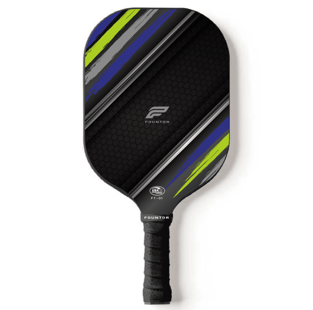
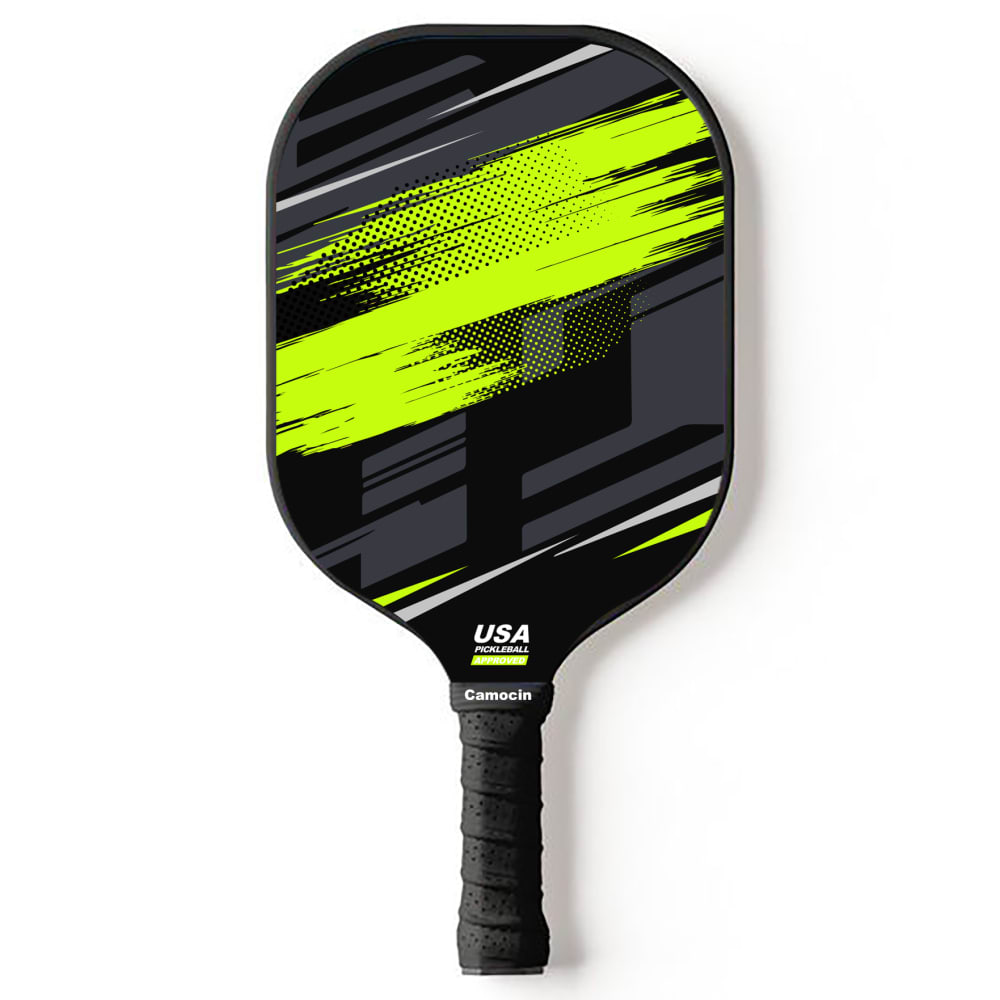
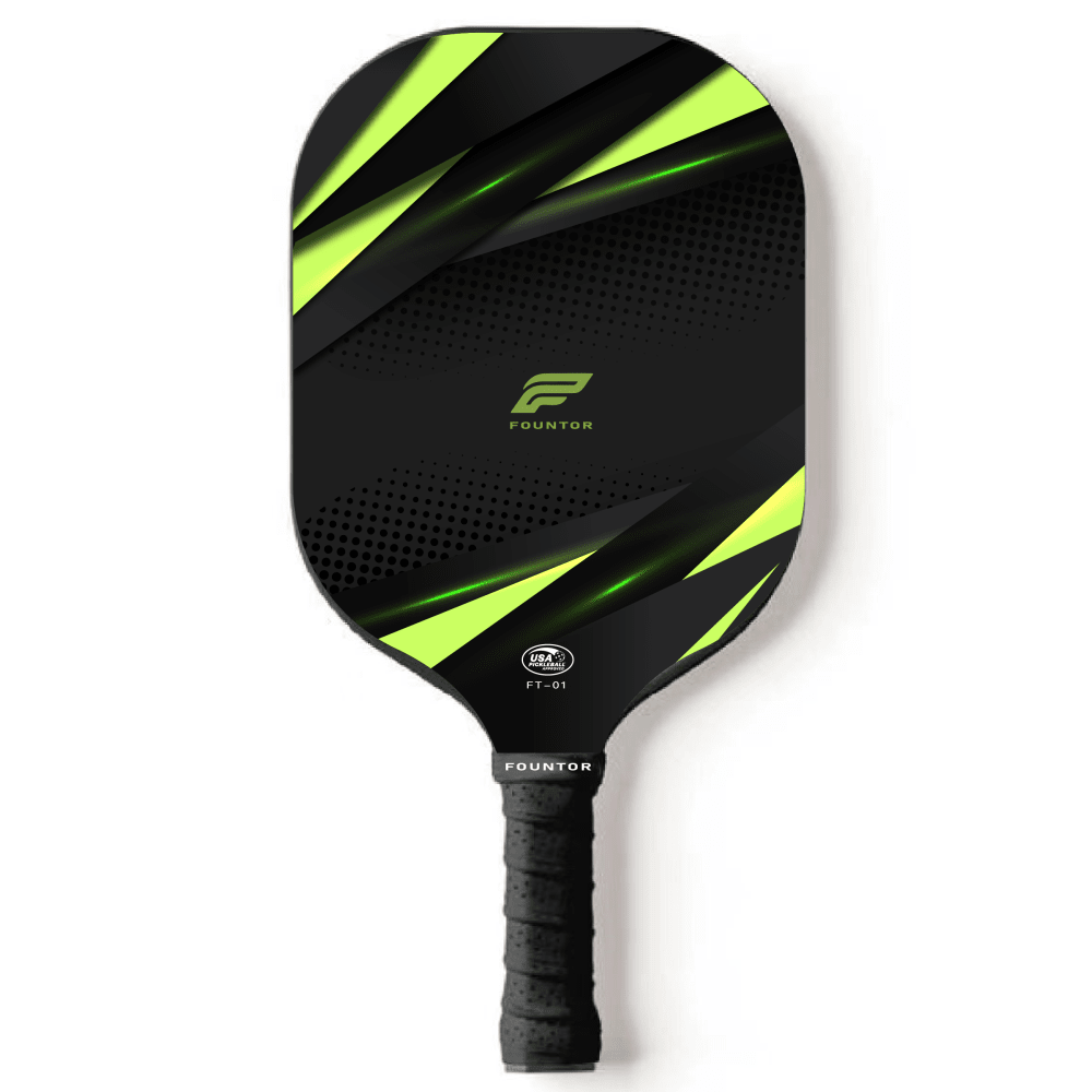
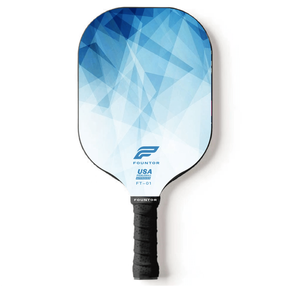
Options
Recently purchased categories
15 Responses to Option A
I would choose option a because I really enjoy the color scheme and design.
I like the mostly black designs, and I want to get something not too flashy and distracting
I prefer option A because the pattern is orderly yet still visually appealing
I prefer this option. I based my selection completely on color design and picked the one I liked the most.
I would choose option A because it has the most simple design. I do not want to distract my opponent with my paddle during gameplay.
A little bit scattered around, but A is definitely the cleanest-looking visually. I also really like D/C. B/E I'd probably pass on, especially knowing that ADC exist.
I don't really want or need anything flashy that could be distracting while I'm playing, that's why I prefer A
I like the darker colors best. i think they stand out more
I like fun colors but prefer a more simple design
I like that option A would go well with many things and option D is also uplifting. These are all quality.
i pick according to the ones i like most as my first chose and the rest folllowed. Its how i made mt decision
I like the black options best and A is the most attractive to me
I like the heavier green color scheme, followed by the diagonal stripes, picks 4 + 5 are to 90's and geometric of a look for me
I much prefer the more simple designs. This is why I chose A as my number one. E was too busy of a design so I ranked it last. I much preferred the dark colors as well.
I think the blue black and yellow combo looks the best
46 Responses to Option B
A and C are slightly too boring for my taste. B and E looks the most energetic but I prefer the color scheme of B, which looks more natural. The color of D is a bit too light for me.
I like the neon green and yellow retro designs the best
B. really like the neon designC. also niceA. I don't like quite as much but has an interesting flare to itE. it's only okD. least favorite, not bad, just too plain looking, like clipart look to it for the design or simple template filter
If going in this direction, might as well go all the way. I like B because the green really pops and makes a statement.
Option A the blue, green, and gray/silver don't really blend well together. I love b and d. B feels like lighting and give the impression it moves fast. Option D the colors blend really well and give a futuristic type vibe. C is okay and just give a camo type vibe. Not my type. Option e has way too much going and is way to busy.
i simply like the design
colors and design look I like best to least due to flow of colors spread out on the paddle
I would choose B because the green on black looks energetic, and the design conveys aggression and speed. C and A are similar/ E and D look calmer and less cool.
If I were looking for a pickleball paddle K would likely choose option B because of its color palette
Options B and A are my favorite. They look like they have a 'smear' on it, which makes me think the person hit it so hard it smeared the paint. A small thing really but the design put these two far above the rest. C, E and D look good, but are pretty basic and generic.
The contrast of neon green and yellow on my top paddle choice is appealing to me
I prefer the ones that don't look too busy and are minimalist.
Option B. If I am playing Pickleball, I want a racket that is readily visible and I can see how the ball will interact with my paddle.
Option B looks like it would be lightweight, I like the color scheme, and might throw off the attention of my competition. Option A has another good color scheme that looks lightweight. Option C is mostly black, but the bright green is an attention grabber. Option D might be a little distracting to my opponent and I somewhat like the color scheme. Option E is just too busy and the company name is too large for my liking.
I ranked them as per my own stylistic tastes.
I like theses colors and patterns better and think it would be easier to play like this as well.
I'm really loving B, I think that burst of bright color would look amazing in motion
I like option B the best, because it is fun and vibrant. It has a lot of positive energy. Option C is decent too, but not quite as fun as option B. Options E and D are ok, but not great looking. Option A is drab and dull.
I like the neon yellow and black color combinations, so I picked options B and C first and second respectively. I really liked the design for option B, so it was my overall first choice. I did not care for the color combination of option A, so I ranked it last. Option E was an attractive choice for me too. I liked the bold design and color scheme, but I did not like the prominence of the brand name. I would have preferred this design if the brand logo was similar to that of the other designs. I liked the colors of option D, but didn't really care for the design.
I like the color and pattern on option B the best.
I feel like the green and black stick out and are more eye-catching. I liked the color scheme
I chose based off colors that i liked. B has cool colors and i also like the design the best out of the options.
I like all of these but I think option B is the best because the image looks like it would look the best during movement and I love the colors
I prefer the green design and color more than the rest of the rest and I prefer it to bright colors and after that i will prefer the blackish type
This is my choice order based on color and design and B, is my # 1 pick
I prefer the most amount of bright color.
I chose the one I did because the design isn't too dark or too light so it won't distract from my ability to see the ball. This should come in handy since I am colorblind.
I like any with the green. It reminds me of tennis which is a lot of fun.
I honestly chose my answers by the look of the product. Since that's all the pictures have to offer
B- design and color scheme angular C- design and color scheme A- design and color scheme D- not great design and color scheme E- worst design and color scheme
I will choose the pickleball paddles in option b because it's design look great and the color is cool
I like choice B first because it has the USA logo on there and looks more official
I love dark colors especially with a splash of bright color which this paddle fits my style perfectly..
I generally favor green on black color schemes. Option B looks the most visually interesting. Option D is just too bright and plain. I'm not a fan of the symmetry of option A. C and E are ok as well.
I like all these designs. I put option B as best because I like the smear of yellow in the center. Option C and A are similar but C was a little more abstract which I like more. I like the darker paddles over the white ones which is why D and E were last. Option D has a cool design but too much white.
I like the black ones better because they will show dirt less. I like the mix of black and yellow. The blue ones are just eh - do not like the colors. And E just has a weird pattern I think is ugly.
I love the contrast of the neon yellow against pure black in options B and C. B is my first choice because the design really appeals to me and I like how the colors blend and the grey & bits of white are incorporated into it. I chose Option D as my second choice because that specific blue is one of my favorite colors and I really like geometric designs. I placed this one between the two top neon/black options because, despite how significantly different it is from them, depending on my environment and/or mood, I could see myself preferring that one, even over B (something less bold). I found Option E least appealing because the transitions in the colors/design are hard lined (as opposed to soft/blended) and including various different shapes close together, as well as writing, is just too much, I think.
Went by the style and colors that suited me
I value the designs and the durability of the paddles to my specs
I like the simple, sexy yet bright and sharp look of the neon green and black one.
They look like the same design but lighter colored paddles make it harder for your opponent to track where you are hitting.
I like the options that are a little more plain and less showy.
Green colors stand out way more then blue does. I like a flashy paddle.
I love the color scheme of the first 3 options, the last 2 just seemed a little too basic for my tastes.
Option B has the right amount of color.
Green and black has been my jam since the Matrix came out a billion years ago. I like the one with the green more prominent the most.
27 Responses to Option C
I like the color scheme and design of my top choice. I find it appealing.
I think most of the black and yellow designs are really cool, but I also have a soft spot for the white and blue in Choice D. The only one I wouldn't buy would be Choice E since I don't know the brand and don't like the style
Love the designs for the paddles here. I like the green and the sharp lines for option C. This is fantastic and modern. I'd use that first. I think option A is not bad too. Love the blue and green. Good design there as well. Option B is nice too and love how much neon green there is. Options D and E are not bad in blue and white.
I chose C, I think the lime green color is very cool and eye catching and I like how the center doesnt have a pattern on it so the ball wont wear it down
I like patterns with clear lines and look clean. Don't need a lot of crazy colors and patterns
Darker colors I think look nicer and C is the least loud and distracting of the designs so I like it most.
I definitely prefer the dark with the neon green types and I'd choose any of the top three that I picked here. My overall top choice has a more subtle but edgier vibe with the minimal green slashes across the face of the paddle with implies a sharpness to the look. The 2nd and 3rd choices are close but are either a little more muted (#3) or a little over the top, less focused (#2) versus my top choice.
I like option C with the clear dark center and the angular green on the top and bottom. It somehow makes it clear where the ball should go. Option D just looks cool--almost a polygonal sky look. A again I like the dark center. B looks like a smeared version of C. E looks more like an elementary notebook design.
D i didnt like and i think its because of the color. A is ok but a bit boring compared to the rest. C and B really stood out to me and the designs are sharp and bold. E is decent but didnt stand out as much as the first two
I prefer the colors in options C, A and B. I like the simpler designs of choice C and A, but C stood out more and caught my eye first. E and D are okay, but don't look as high quality. They are pretty basic.
I prefer more black and more orderly designs.
I like the green and black color combination. I do not like the blue and white options. They would get dirty fast and the black would not.
I prefer ones with a more plain and subdued design
I like a plainer, less abstract design. I'd rather not have it distract from my playing style.
C is not too flashy and distracting, good basic paddleA is about the same but adds another colorB is getting loud and distractingDC or ok but lean female in color and I am a dude
I like the design and color scheme of Option C most. Option A is good too. The others are just boring and unoriginal to me.
I prefer the simpler styles without text. I would likely go for option C or D. They look high quality to me.
I prefer option C because I like the bright yellow accent colors on the black paddle I think this makes the paddle stand out more. Option B is a close second for the same reason. Options D and E are my least favorite because I don't care for all the white space on the paddle, I feel the white would show dirt easier than the black paddles.
I prefer mostly black paddle since it's easier to see the ball. C has most area of solid black, and the green stripes are cool, best. then A, the stripes are darker and not interfering. then B, the green in the middle is a little too much for me, but it's better than the rest. E is better than D, D is over all too light in color and the pattern is too busy.
I like C's color and design as well as B. They are both great designs and stand out looking pretty cool. A gives a little yellow with a darker color and blue and looks good. D I like the light blue and E is ok
"C" was my first choice because I prefer black over most other colors. This one is a simpler design as well. "D" was second because I simply found it visually appealing. "A" was next. Again due to the black background and simple design. "B" beat out "E" because of the black versus blue. Otherwise, those are a toss-up in preference.
I really based my decisions based on color scheme of the paddle itself. All the paddles look very similar and appear to function in a similar manner, so I based my choice mostly on color with a secondary emphasis on the placement of the logo. I picked C as my first choice because I like the black and yellow color scheme. It almost has a bee like design with the color. I also like the logo being placed in the center. I picked option A second because it has multiple colors. I like the multiple color scheme that is divided by the black center. Option D was a close 3rd for it's color scheme. I put option E 4th because I am not a fan of the color scheme or design. You could almost trade it with option five B for the same reason in my opinion.
I rank them ljke that because of their quality, design and colour
I decided based off simplicity and boldness. When the design is too busy I am uninterested
I like the cleaner, less busy designs
They are ranked in order of personal preference.
I think that the black with neon looks really crisp. The lines are sharp and it just reminds me of things that are fast. Also, I would imagine that the black would hide scuff marks really well, making it look new for longer. I though the blue paddles were not aggressive enough, the hue of blue that was chosen was not dark enough. However, the blue might pair well with a similar outfit.
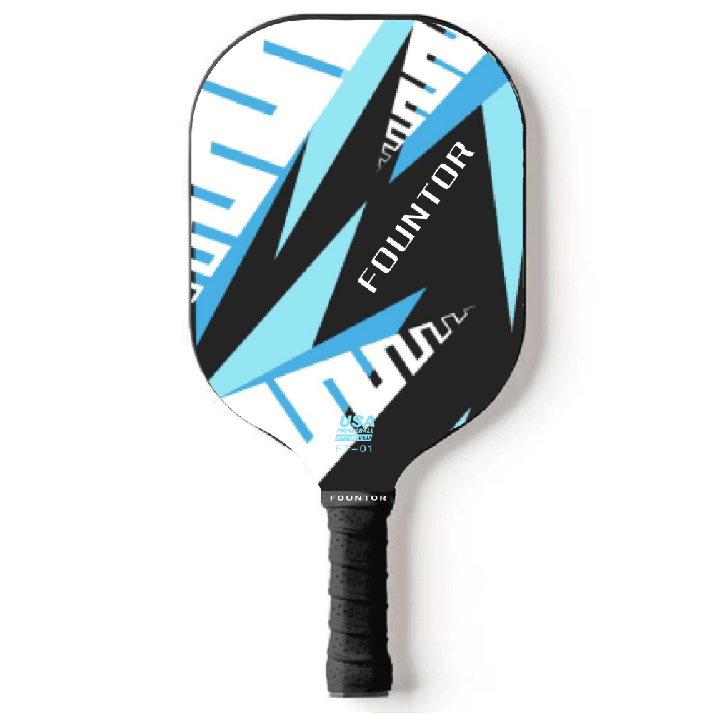
49 Responses to Option D
i would choose the paddles in option D because they look fun and colorful to me
I prefer the option D paddle product design because I like the sky blue geometric patterns shown here the most. I chose options B, C and A second, third and fourth because I like the light green color swatch design more than the smaller triangular design more than the blue and green color stripe design. I chose option E last because I do not really like the large brand name shown here nor the style of these blue triangles of different shades.
I prefer the softer colors on D.
D is definitely my favorite. I love the color scheme. Light blue is my favorite color. I like the design and how it fades into white. It sort of looks like shattering ice
I really like how light this option is and that it would go with a lot of different outfits which matters to me. I do not like how dark all of the other options are and I think the green makes it look like a child’s toy
i love tbd blue color way and gradient these are all cool though
I would vote for option D as I like the lighter color and like the name on the paddle is located. Option E is my second choice as I like the lighter color, but do t like where the name is located as much. I don’t like the other options the darker colors as much.
D has better design and color compared to the other options.
I really like that blue tone. Havent seen somethin like that.
I like the blue and white colors the best. It looks the coolest to me and the most fun. Stands out the most.
I love the color schemes in Options D and E the most, particularly because of the way they incorporate various shades of blue.
I chose option D. I like the mix of the blues and white as the paddle looks great.
I like D because it looks more professional. I would not buy any of these as I prefer a better paddle like a Selkirk
I would be most likely to purchase option D because I think that it has by far the most interesting and visually appealing pickleball paddle design out of the five options above.
Option D is a nice color and does not look too busy. Some of the graphics overlap with each other too much and distracts from the racket.
I love D and E. I love the designs ANd the color on these. Not a fan of green and I love the blues on the other ones. love the graphic look of D.
Option D stands out with the perfect amount of blue color. Option E is just as nice as Option D but I just liked D a little bit more. Option C is somewhat plain but the colors look good on the pattern. Option A is plain but I don't like the colors on the pattern. Option B looks a mess with the colors just going every which way .
I like the light blue shade in options D and E a lot. The black and green in the other options don't appeal to me and look a bit juvenile.
I prefer option D becayse it is the most light and fun design.
This is a tough one because all of the options look really good with the design. I like the way Option D looks for my first choice because it gives me a "ice in my veins" vibe. Option C and A are also good looking with the green flares in the design.Option E looks way too cheap for my liking.
those were the designs of the paddles that i liked from best to worst
Pattern was most important, followed secondly by colors. Patterns with sharp triangles looked childish and were ranked lower.
i wouldn't want for my board to have crazy colors on it. i think option d has a great design and lovely colors.
I have ranked all the above 5 options primarily as per the color combinations used, and out of which I liked option D product the most as I love light blue colored playing bats the most, next preferred is option A.
I like the more subtle colors and patterns.
I prefer a lighter color on the pickleball paddle ... which is I I made my first and second choice. After that, the bright yellow color is nice. I don't like the dark paddles at all.
I like the blues in D & E better than the greens. I ranked B, C & A based on what I thought was the coolest design.
I made my choices this way based on which design and style I felt fit the overall feel I wanted from playing pickleball. I felt that something light color with a fun design was the most exciting and made me want to learn more and play the game.
Either D or E because I like the blue better than the green options.
D is the brightest color. A, B, C will show dirt less. E is ugly.
I like the blue of D and that the design covers the whole paddle. B is a close second, the green and placement of the color would pop and look like moving fast
I like the color and design of D the most by far.
I think it look the coolest and I love the colors. I chose the last one as my least favorite because it looks ugly and boring.
I actually ranked this based on the design first and looking at them the first in the ranking looks very much innovative.
The diamond pattern caught my eye first. I like the geometric shapes and the colors remind me of gems and diamonds. C-B all have the same color scheme and overall the same design pattern. I thought E was the weakest because the pattern was so busy.
The design on 1 is really cool. I prefer the colors in 2 and 3 which also have neat designs. 4 is a little boring for me and not a fan of the busyness of 5
I like the color scheme and pattern on D. For the others, I don't really like the fluorescent yellow, and I don't like E because the logo is huge.
I like option D the most because I like the geometric graphic look of the design, and love the blue color. I also really like C and A because they're mostly black with a little bit of color, which looks nice. I chose E second to last because I the design is a little too busy for me and the pattern looks too random, and I put B last because I don't really love the neon green color.
I like the blue color scheme of the first 2 paddles that I chose.
D has a cool and unique pattern that reminds me of air.
D reminded me of a sheet of ice which to me seems cool to hit a pickle ball. I like E due to the blue accents. I choose C over B due to the smudged look of B. A seemed too plain.
D has good colors. A has a pleasing design. E has good colors although a little busy. C has an ok design but the green is a bit jarring. B makes me dizzy.
I like the blue/white faded design most because it isn't to out there. It's a nice blend of colors.
I chose D as my top choice as I like the design and colors used on this paddle as it has multiple shades of blue on it. I chose C second as I like how the middle of the paddle is black but it is outlined by the yellow design, it looks sharp. I chose A third as this one is similar to C but I do not like the multiple colors as much as the yellow. I chose E fourth as this design is unique but probably not one I would typically go for. I chose B last as I don't like the design and the color combination used.
If I had to pick one of these paddles, it would most likely just be Option D as blue is my favorite color and if I were a pickleball player, that is the only paddle I could realistically see myself using.
D has the nicest design while the others look like designs that you would find on a shirt or something similar.
D has a nice color scheme that is calming and doesn't advertise itself too much. I would definitely go with that one.
Options B and E were too distracting.
The blue patterns are very nice and relaxing so I really like the vibe of those. The other colors are great, but the blue really pops.
14 Responses to Option E
Definitely Option E, love that design and colors used! Thank you.
I really like the light blue, its one of my favorite colors and i think makes the product look great.
I preferred a simple blue design over the green
I liked E and D the best, A was okay too. I just think the blueish color is the best so I liked those better than B and C
Options E, C, D are my favorite option because it has the great color combinations and design
I love the color blue and think it looks sharper on the paddles. E is looks better than D because D looks a bit like a dart flight. I chose B third because it brings me back to thoughts of an 80s Trapper Keeper from my childhood. C is an okay design and A is last because the design is plain and boring.
I thought the design in E was most appealing followed by D, A, B and then C.
Blue is my favorite color. That’s why the ones with a good amount of blue were my first 2 choices. A was the most plain in my opinion even though it had a small amount of blue. B and C were not as plain as A but they didn’t contain blue.
I like choice E because it has the most interesting design and incorporates my favorite color.
The lighter blues really pop, while the green and black has a more childish playfulness that makes it seem to be more of a toy.
I thought option E was the most fun to look at. Option C and A might be the most helpful with shot placement. Option D felt too vague to me. Option B looked too much like a Monster energy drink can.
I prefer options E and D as they are both lighter colors and look more interesting to me. I really like the blues in both of those options so they are my favorite options out of these 5 options.
I like the color combination best, it's the most desireable looking.
I chose these options based on which would stand out the most. I think E and D are similar and would stand out versus many other peoples equipment. C and A felt pretty generic to me so I placed those last.
Explore who answered your poll
Analyze your results with demographic reports.

