Poll results
Save to favorites
Add this poll to your saved list for easy reference.
If you were shopping on Amazon, which product would you rather buy?
Option G won this Ranked poll with a final tally of 26 votes after 6 rounds of votes counting.
In a Ranked poll, respondents rank every option in order of preference. For example, when you test 6 options, each respondent orders their choices from first to sixth place.
PickFu requires a majority to win a Ranked poll. A majority winner differs from a plurality winner. A majority winner earns over 50% of the votes, whereas a plurality winner earns the most votes, regardless of winning percentage.
If an option does not earn a majority of votes, PickFu eliminates the option with the lowest number of votes. The votes from the eliminated option are reassigned based on each respondent’s next choice. This process continues in rounds until a majority winner emerges.
Scores reflect the percentage of total votes an option receives during the vote counting and indicate the relative preference of the respondents. If there is no majority winner, look to the scores to see how the options fared relative to one another.
| Option | Round 1 | Round 2 | Round 3 | Round 4 | Round 5 | Round 6 |
|---|---|---|---|---|---|---|
| G | 26% 13 votes | 26% 13 votes | 26% 13 votes | 30% 15 votes +2 | 40% 20 votes +5 | 52% 26 votes +6 |
| C | 18% 9 votes | 18% 9 votes | 22% 11 votes +2 | 24% 12 votes +1 | 34% 17 votes +5 | 48% 24 votes +7 |
| F | 24% 12 votes | 24% 12 votes | 24% 12 votes | 24% 12 votes | 26% 13 votes +1 | Eliminated 13 votes reassigned |
| B | 14% 7 votes | 16% 8 votes +1 | 16% 8 votes | 22% 11 votes +3 | Eliminated 11 votes reassigned | |
| A | 10% 5 votes | 10% 5 votes | 12% 6 votes +1 | Eliminated 6 votes reassigned | ||
| H | 6% 3 votes | 6% 3 votes | Eliminated 3 votes reassigned | |||
| D | 2% 1 votes | Eliminated 1 vote reassigned | ||||
| E |
5 Responses to Option A
I ranked them by which one I liked the most. I like A and D over all the other options and don't like tight shirts.
I like how A and E blend in and aren’t overly flashy. F had too much going on for me personally.
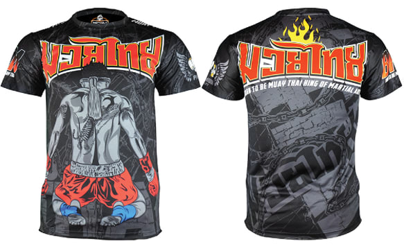
I went with Option A because where I live a person needs be careful in what they wear. It is a very dangerous neighborhood with a quite a few boxing clubs and martial arts dojos. That said I will get specific. Option A is humble. Options G and H are shiny but they are alright, could walk anywhere just be respectful. The capital letters starting the words on B (M, T and K) at their bottoms begin to look a bit "scripty". D, C, E and F have script, it will be called out by some gang that feels it's look was ripped off. I love D, C, E and F but I would not buy them, at least not to wear here. Hope that helps.
Option A' is my preference because the artwork is well-designed and the colors are appealing. I will consider buying it because I think it is the best among all.
I ranked the shirts based on the ones that had the most interesting designs and which shirts reminded me the most of the Muay Thai boxing matches I attended while in Thailand.
7 Responses to Option B
I prefer the minimalist approach like my top pick, I don't like too much artwork.
I prefer a more classic looking shirt. Not sure I would buy any of these
I'm a minimalist type of guy, so a simple Muay Thai King on the tee-shirt would work for me!
I liked B because it seemed sporty but also classy with strong colors. I thought G was okay too due to the athletic looking color scheme. I thought the rest looked too gaudy for my tastes.
The more simple the design I feel the better it is. I do not really like shirts that has too much going on.
I love the simplicity of this design as it looks very sharp.
I chose this order based off of how graphic each shirt was. For instance I chose B first because it was very simple and not a lot going on. I chose F because it is very busy. There is just so much going on in the shirt and that is not for me. Of all the shirts I really only liked B. So the rest I ranked according to how I just described.
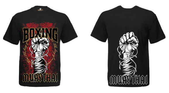
9 Responses to Option C
the fist visual is both not too overwhelming with imagery but also nice looking and communicates my passion.
The colors stand out a lot more which is far better than just a plain white, black t-shirt. It's more vibrant and appealing with the colors
I made my choices based on which options were more low key, or did not just have a huge design that covered the whole shirt. I felt that the shirts that looks more relax would go with anything.
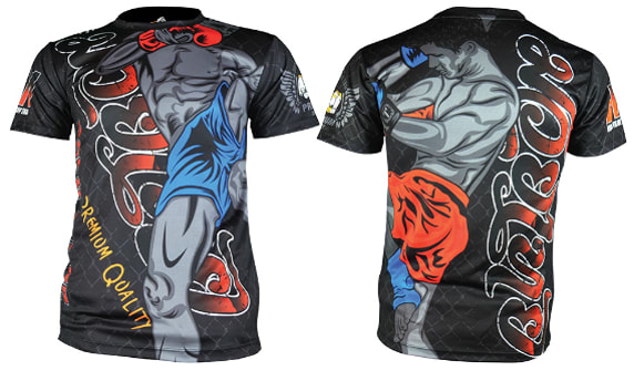
C is a strong statement for a boxer, with the fist in the air and the red stand out on the black background nicely. The back should be different, perhaps the option A backside?F is also a good option. Might be a bit cartoonish considering it is boxing merch, but definitely eye-catching.D is good, but the back side is a bit repetitive. Perhaps a different design on that side.E has a good design on the front, though the logo is on both sides and looks better on the backside.A is tasteful and has the gold-on-black thing going for it. Looks great for a dedicated fan of the boxer.
I choose C, Because I like the design and style of the product which is more attractive and I like the color.
Option C because the image on the shirt wasnt overwhelming the entire product
The graphic design of the gloves that is shown for C seems like the best sort of fighting shirt for the look of C here.
C looks the best to me. This has a nice intense style, but also looks well made and professional.
I'm hesitant to buy anything with graphic covering the entire shirt, so H, F, and E wouldn't be considered for that reason. They're too loud for me. Out of the rest of them, I like C and A best, by far. Both of them are interesting, designed well, and look like they might be band shirts at a glance - I could see myself wearing either of those. I like the first graphic best. G isn't my style, but it's a decent design. B is a bit boring, but functional, and I'd be hesitant to get D because it would feature two giant men in little shorts in close quarters on my chest.
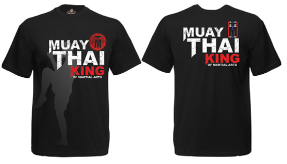
1 Responses to Option D
Think they all look great. Not even into this at all but they are very well done, makes me want to get one.
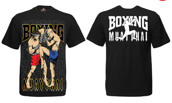
12 Responses to Option F
I think F has the coolest and clearest himage of the fighters of the choices,
I'd probably buy these in terms of the designs and aesthetics
F because I'm a big fan of UFC and anime and I feel like F does the best job at intersecting my interests. It's better than the plain designs.
Regarding my first choice, I made it because the colors stand out for me the most
I just ranked them in order of personal preference so I had F and E first as I liked those full body designs on it.
Some fun designs here for the muay thai t-shirts. I like option F as a colorful and fun choice. Best of the group I feel. I like option H as well because that has a lot of style to it. Option E is cool with the color and the fighter there. Great look for option G in the yellow. Think those would be the best but all styles are pretty cool.
I like the multi color designs (well most of them at least) better than I do the majority-dark color theme designs. The extra colors add a nice "wow" feeling to the design.
I think f has the best design overall and something that id really like to wear.
The brighter ones are better. My number one is much more colorful and the artiwkr on them is awesome. The yellow one is nice also. I'm really first 3 the most. I like the black backgrounds in all of them.
I like option F the best because I love the artwork and the graphic design of the letters. Overall the shirt is vibrant and eye catching on both sides!
All the shirts look good. The ones that I prefer have an over the top style that works well with martial arts. The more colorful and outragious the shirt, the more I liked it.
Personally, I like these options quite a lot within everything and I think they are quite attractive
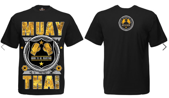
13 Responses to Option G
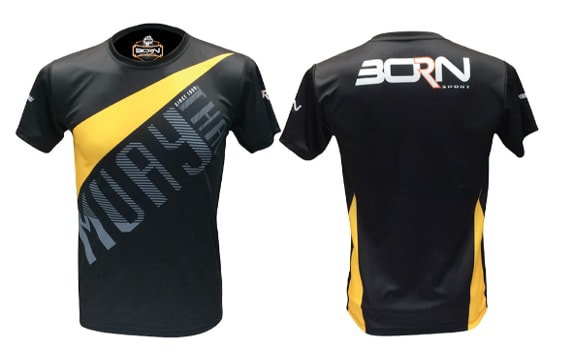
C, H, E, and F are really gaudy and I find them kind of ugly. I prefer simpler designs such as the design in G
I would choose option G because of the gold accent and black color that looks minimalist.
I like all of these but option G caught my attention the fastest and is a shirt I would most likely wear which makes me more likely to buy
Most of these shirts are way too aggressive for me. I don't think I'd wear many of them. My top 2 choices are the only ones that would interest me to be honest.
I like g the best. Not over the top but clean and professional looking.
i do not like bright colors and excessive graphics so I ranked them in the order from least color to most
Because I personally prefer more basic shirts with less going on or less cartoony stuff on them. Which is why I rated G the highest.
I prefer option G because it is very visually appealing but also has a somewhat professional look.
This just comes down to personal preference. I don't like shirts that are too flashy, and I don't like ones that proclaim me to be a "king." The more in your face these types of shirts are, the more likely you are to get into a street fight.
a more intriguing nad interesting design here
A, D, H, C, and E are all guady and obnoxious. I would never wear any of them. G is the most nuanced. F and B are equal to each other; they are obnoxious but less so than other otpions
I don't like my shirts to be too flashy, so simple and to the point are what I like, I don't like to be noticed by my apparel.
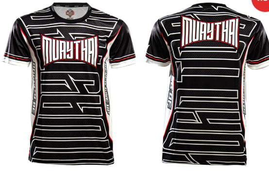
I am not a fan of very graphic tees and I'm not a Muay Thai fan so my rankings reflect that. I ranged Option G first because it is a sleek shirt. It reminds me of biking or other athletic shirts and I could wear it casually. I didn't like any of the other shirts as much, but Option H and Option B were also limited in their graphics. Option H is more graphic heavy than some others, but it feels like a striped shirt. Options A and D were options I would have liked when I was younger, but feel like too much now. C, E, and F were all progressively worse in terms of too much graphics going on in the shirt.
3 Responses to Option H
I would personally have no interest in any of these shirts. Option H is the most visually neutral. Options A and G are the next most neutral. The rest are too loud and attention getting rather than attractive.
I picked in order of the shirts that appealed the most to least to me. This honestly wasn't that hard to begin with.
The more complex designs featuring bright colors and intricate patterns attract my attention more easily. I am fond of interesting elements and strong messages on display for these appealing product offerings. The shirts are highly desirable.
Explore who answered your poll
Analyze your results with demographic reports.
Demographics
Sorry, AI highlights are currently only available for polls created after February 28th.
We're working hard to bring AI to more polls, please check back soon.

