Poll results
Save to favorites
Add this poll to your saved list for easy reference.
If you where shopping on Amazon, which Notebook would you buy and why?
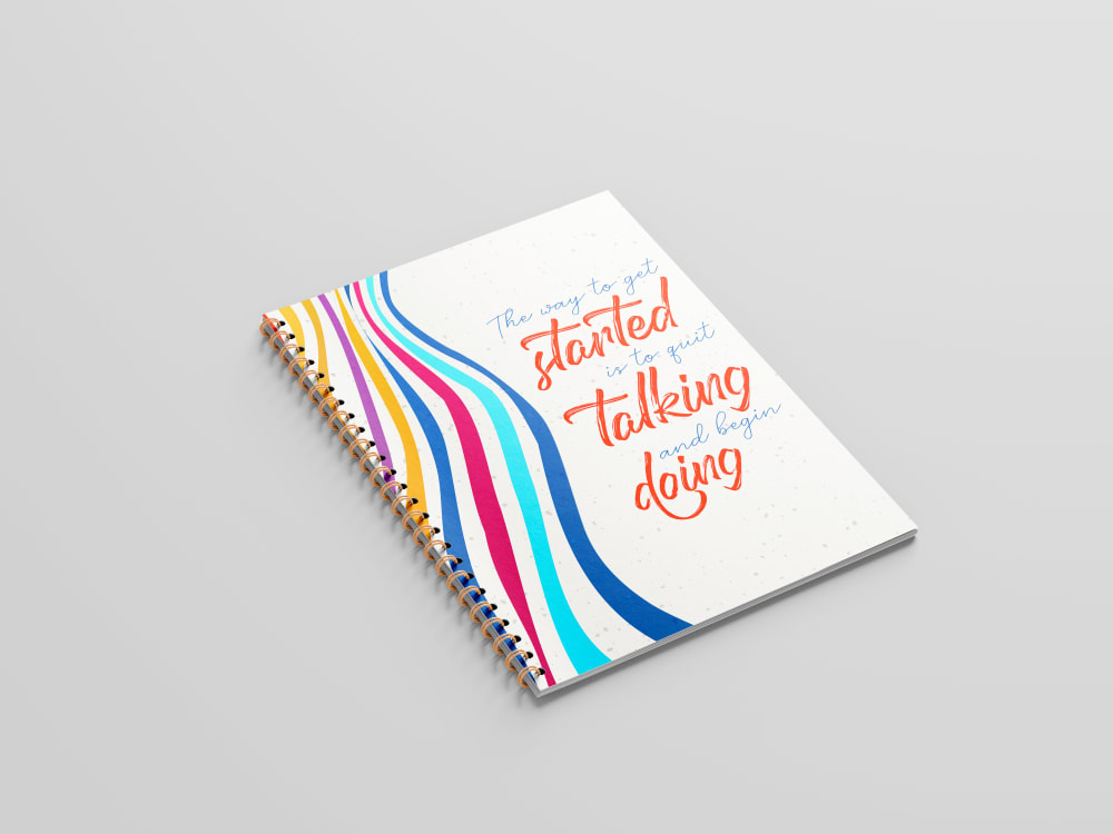

Option A won this Ranked poll with a final tally of 30 votes after 2 rounds of votes counting.
In a Ranked poll, respondents rank every option in order of preference. For example, when you test 6 options, each respondent orders their choices from first to sixth place.
PickFu requires a majority to win a Ranked poll. A majority winner differs from a plurality winner. A majority winner earns over 50% of the votes, whereas a plurality winner earns the most votes, regardless of winning percentage.
If an option does not earn a majority of votes, PickFu eliminates the option with the lowest number of votes. The votes from the eliminated option are reassigned based on each respondent’s next choice. This process continues in rounds until a majority winner emerges.
Scores reflect the percentage of total votes an option receives during the vote counting and indicate the relative preference of the respondents. If there is no majority winner, look to the scores to see how the options fared relative to one another.
| Option | Round 1 | Round 2 |
|---|---|---|
| A | 44% 22 votes | 60% 30 votes +8 |
| C | 32% 16 votes | 40% 20 votes +4 |
| B | 24% 12 votes | Eliminated 12 votes reassigned |
22 Responses to Option A
I like the vibrantly colored rsinbow like ribbons on the cover.
I really love A, the message is great and the color scheme is nice. I don't really like the colors on C so wouldn't buy it and I don't agree with B's message on life's purpose. I think A speaks truth and would buy.
I prefer the sayings on the covers of option A and B the best.
I like option A the best because the message on the cover is very inspiring and motivational.
A has a cleaner look to it that I find more pleasant and enjoyable
I find A to be the most intriguing of the bunch, it has the most interesting colors. C and B are both much lower on my ranking than A, but I do think C looks a bit better than B
Between the three different options, I first decided that I would definitely purchase option a first and this was because I really enjoyed the light coloring on the book. The lines off to the left were not overbearing and they did not take up a lot of space either and I really enjoyed the orange text as well and I thought that it stood out. My next choice was option c and I really liked this one because I liked the picture of the flower that I saw in the bottom right corner. I thought that the text was really good as well but I did not like the focus of it in the center of the book. Third and finally, I decided to go with option b as my final choice as well as my least favorite. This one was my least favorite because I thought that the text should be different colors other than just a simple blue. I also thought that the color of the book in the background was just very plain looking and while I did see that the colors kind of merged from one to another, this was just not enough creativity in my opinion.
I like the colorful wavey design in choice A. A close second was choice C. I think both are visually appealing and look fun!
The first two focused on getting things done. That is why I would purchase a notebook like this. I like A's bright colors and saying a bit better than C.
I would go with choice A because the motivational writing on the cover is one that already resonates with me so I feel like it would be a constant reminder every time I looked at the notebook.
I liked the options with brighter and more engaging colors.
A is my first choice. I like the quote and the graphics. B and C are close, I'm not a fan of either of them personally. C was last because the cover art is loud and disjointed, imo.
Option A is preferred. The saying on the cover says it all - i.e. quit talking and start doing. Like I've always said to my children, it's not what you think, it's what you do that matters.
I rated the notebooks in order of preference. I really like the look and design of A.
Options B and C contain somewhat trite, woo-y sayings. I'd prefer DOING.
I like the use of color in these notebook covers and the ones that are my favorite have bold and bright colors that look fun to use
I like the motivational message on Option A's notebook the best as it encourages me to start doing and stop talking. I want to just open the notebook and start writing down plans. The other two options I find to be much less inspiring.
Option A is the one I'd be most apt to purchase given the cover design. I like the color palette as well as the design.
I liked the wording and the decoration on the cover
note-taking, journaling or other writing, drawing, or scrapbooking.
A - this had a nice interesting pattern. C - i liked the colors, B - the colors were a bit faded
I like this option most because I feel it is super motivational and a good reminder.
12 Responses to Option B
I chose B because I like both the overall design and and colors and the saying on the cover.
I picked option B because I Like how the cover mentions a purpose and happiness.
This one stood out to me. Do not like the fonts and cursive of the other ones.
Option "B": I found the cover sentiment more relatable with this design and message compared to the others shown; I liked the muted cover colors as well.
I like the message of being happy the best. Then I like the believing in yourself. Which leaves A for third.
I believe each of these options are a bit too live-laugh-love for me, but I like the design and message of Option B the most. Option A is a bit more nondescript. Option C is a bit too feminine for me.
The purpose of our lives is to be happy. That's a great sentiment, perfect for a small notebook like this.
I chose option B. I like the light colors and the fact that they compliment the cover instead of overpowering it.
I like the simplicity of this book. To me that is what I want when it comes to an item like this.
I like what this notebook says, even if I don't believe it due to the fact that I serve and tend more to others than taking care of myself.
like B best, clean and easy to read. then A, clear. C is too feminine.
I prefer a nondescript and simple design for my notebooks and option B met this criteria the best. I ranked the remaining options according to this criteria as well.
16 Responses to Option C
Choices C and A are more visually pleasing to me and the cover color is more attractive as compared to choice B.
The design and art of the cover on book C is the most attention grabbing and nice looking to me.
I like option C because the cover is the most colorful and has the most visually pleasing design.
C I like the saying, the colors and the flower. A I like the saying. B I like the colors.
I like the design of C so that is the one I would buy
I like C the best because I like the design of it and the saying on it the best out of the three.
option c front page is colorful and water painting looks so pretty so its my first choice. option a cover page looks neat and font is pretty so its second choice
I like the saying on the outside and I like the calm soothing colors that were used.
I like the pattern and color of this one. It is more interesting.
I choose C because the graphic design of C is very creative and visually appealing, compared to other options
i really like the color tones and artwork in choice c, but choice b is nice as well.
I the affirmation of Option C best. It conveys confidence in self and is the one I would want people to see me carrying around if I'm seen with it. The other two are a bit preachy and over-assuming.
I chose C first - I love the artwork and the quote goes well with it. It would give me a lot to think about each time I looked at it (both in the words and the images). Then A - it has a slightly retro look in the image, but it also feels like it's cheer-leading and being an advocate to inspire me. And that works with the quote. Option B - the quote and artwork are in complete harmony. It's more a matter of opinion on this one. And it doesn't inspire me as much as the other to. It's more sedate.
I prefer option C. I this positive message. I would be good to see it everyday.
Option C, I thought the design looked the nicest and the most eye-catching. Option B, I liked the quote a bit more than option A. Option A, just looked okay. Not my top choice is all.
1st one is generally the most colorful the 2nd 1 is nice but it's got a lot of white space and I'm not a huge fan of it the 3rd 1 is little bit naked looking
Explore who answered your poll
Analyze your results with demographic reports.

