Poll results
Save to favorites
Add this poll to your saved list for easy reference.
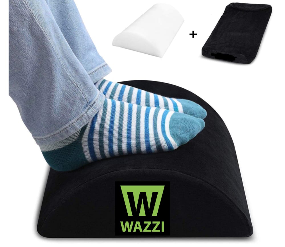
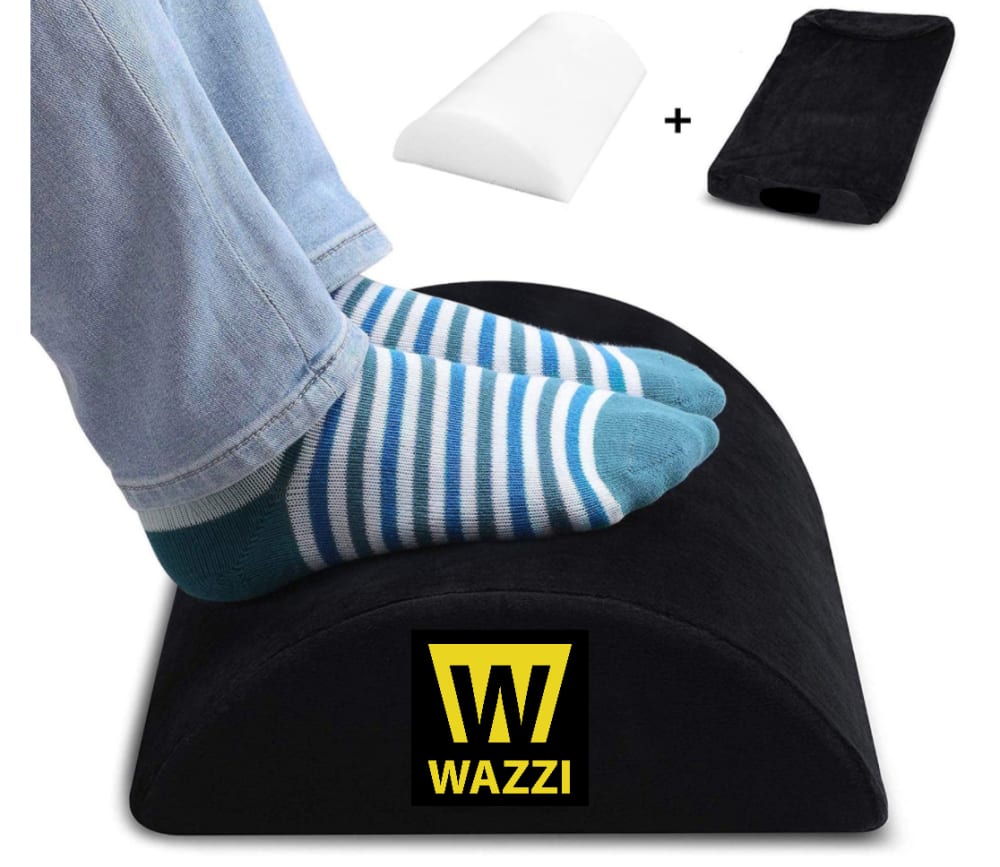
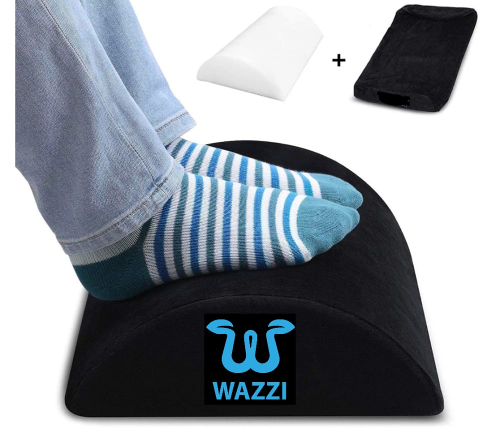
Not taking the socks into consideration, which logo design/color do you prefer for this footrest?

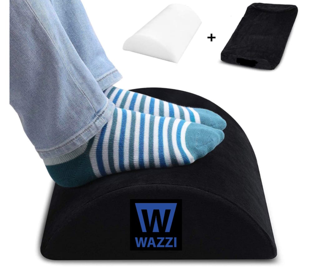


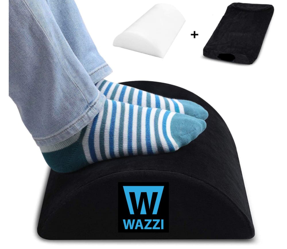
Option G won this Ranked poll with a final tally of 28 votes after 7 rounds of votes counting.
In a Ranked poll, respondents rank every option in order of preference. For example, when you test 6 options, each respondent orders their choices from first to sixth place.
PickFu requires a majority to win a Ranked poll. A majority winner differs from a plurality winner. A majority winner earns over 50% of the votes, whereas a plurality winner earns the most votes, regardless of winning percentage.
If an option does not earn a majority of votes, PickFu eliminates the option with the lowest number of votes. The votes from the eliminated option are reassigned based on each respondent’s next choice. This process continues in rounds until a majority winner emerges.
Scores reflect the percentage of total votes an option receives during the vote counting and indicate the relative preference of the respondents. If there is no majority winner, look to the scores to see how the options fared relative to one another.
| Option | Round 1 | Round 2 | Round 3 | Round 4 | Round 5 | Round 6 | Round 7 |
|---|---|---|---|---|---|---|---|
| G | 22% 11 votes | 24% 12 votes +1 | 26% 13 votes +1 | 26% 13 votes | 36% 18 votes +5 | 40% 20 votes +2 | 56% 28 votes +8 |
| H | 18% 9 votes | 20% 10 votes +1 | 20% 10 votes | 24% 12 votes +2 | 24% 12 votes | 38% 19 votes +7 | 44% 22 votes +3 |
| C | 10% 5 votes | 10% 5 votes | 16% 8 votes +3 | 20% 10 votes +2 | 22% 11 votes +1 | 22% 11 votes | Eliminated 11 votes reassigned |
| B | 16% 8 votes | 16% 8 votes | 16% 8 votes | 18% 9 votes +1 | 18% 9 votes | Eliminated 9 votes reassigned | |
| A | 12% 6 votes | 12% 6 votes | 12% 6 votes | 12% 6 votes | Eliminated 6 votes reassigned | ||
| D | 8% 4 votes | 10% 5 votes +1 | 10% 5 votes | Eliminated 5 votes reassigned | |||
| E | 8% 4 votes | 8% 4 votes | Eliminated 4 votes reassigned | ||||
| F | 6% 3 votes | Eliminated 3 votes reassigned |
6 Responses to Option A
The cursive font for the wordmark is definitely better.
I like the logo in A, G, C, and E more than the other. I ranked those four the highest and then in the color order I prefer. I think the blues are the best and the darker blue the better of the two. Then green is better than the yellow.
I like A the best because I think the curve of the W and the shade of blue is the most attractive. I like G almost as much for the same reason I just like the blue of A a little bit more. I like E and C also because they have the unique W for the logo. The rest are okay but the W on the rest of these doesn't look as unique or get my attention as much so I ranked them lower.
I ranked A and G on top because I think blue works best against the black background and keeps the design from becoming garish. I think the curvy logo of A and G are a higher effort logo than the logo shape of H and B, which is just a trapezoid. H and B are next because they are still blue, which works best with the black. I ranked C and D fifth and sixth because the green is more muted than the yellow logos of E and F. I don't think the lime green works as well as the blue, but it's not over the top. Again, the curvy logo of C looks like it had more effort put into it. I ranked E and F last because the yellow is a very harsh yellow and it makes the overall product less attractive because of that.
I chose option A because I like the blue with the stylized W the best. I don't like the block lettered W logos. They're too basic.
I like all of the curly "W" logos better than their solid block counterparts. While the solid block might appear "stronger", is also appears rigid and less comfortable. The curly "W"s seems softer, and comfortably silly. It fits the idea of providing reliefs to one's feet better than the solid logo.
8 Responses to Option B
I chose Choice B for #1 because the logo is crisp. It is seen without overshadowing the product.I chose Choice F for #2 because the color does stand out if the manufacturer wants it to be seen.Choices D and H are just picked in color preference.Choice E for #5 because the logo does not reference anything towards the footrest. If it is supposed to be feet, it does not look like it.Choices G, C, and A are for color preference only.
I like the darker blue, "block" design first so tried to prioritize those choices. Just looks better and matches the blockiness of the product.
I mostly like the blocky looking W for Wazzi, as it looks more official and professional. It looks trustworthy and sturdy. It makes sense with the product. I also like the darker blue and lighter green as they are the most eye-catching to me and have a good look with the foot rest.
The solid block font for the logo is better. I feel that fits better with the company and is easier to understand. I like it simple like that. The best color seems to be the dark blue. It's perfect for this. I like the green and the light blue as well. The yellow is decent. But I feel that's a personal choice and those are my favorite colors there. Great looking footrest and good place to put the brand name.
I like the blockier shape better which is why I chose B and H first but I like blue over the other colors. Green is much more appealing than yellow which is why D and C are ahead of F and E.
What this choice boils down to is two different logo designs and 4 different colors of each. I'll start with the logo design I prefer. Options B, H, D, and F all have a simple, almost blocked in looking logo that I quite like. Options A, G, C, and E all have a much fancier W but it looks a little too busy. The design of B, H, D, and F looks firm and stable, which are qualities I would want in a food rest. The design of the logo in Options A, G, C, and E looks pointy and uncomfortable in contrast. As far as color choice goes, I like the dark blue the best as it feels the calming. The lighter blue is a second because it's also a cool and calming color. The green is not as cool a color as blue, obviously, but it's still towards that quality. The yellow logo just stands out too much for me. Yellow isn't the color I associate with comfort and relaxation. So for this reason my favorite overall is Option B as it contains the logo I like in in the color I like best.
I prefer the darker blues the most, I like my logos to be inconspicuous.
Prefer the snakeless purple and black color scheme the most. The least the logo stands out, the better. You want the item to look good next to your decor, not to stand out with a bright logo on it. Um, also, snakes are aggressive.
5 Responses to Option C
I liked the swirled design and the color better than the block, and then it just came down to what colors i liked best.
I like choice C footrest design is visually appealing and the color is eye-catching. Choice G the color design is distracting. Choice A the design looks unpleasant. Choice E it is confusing. Choice H the color does not stand out. Choice F the color looks boring. Choice D the design is unfavorable. Choice B it is annoying.
I chose option C first because I like that the W look life it has leaves coming off of it and that it is green. It gives me the sense of nature and relaxation. I didn't like this logo with the other colors, only the green. The other colors don't convey the same sense of natural product that the green color does. My next choice was B. I like the dark blue color of the logo the most of this logo design, then the light blue color, the green and then gold. I selected F last of that particular logo design because the gold color is very bright against the back and a little distracting. I prefer the W in the solid trapezoid logo over the colored W that are shaped into leaves (except the green) that is why I ranked them in the last choices.
I LIKE THE COLOR AND LOGO OF THE FIRST 2 THE BEST
I like a lighter colored logo. The green also stands out and contrasts pretty well with the black. I also prefer the serpent like logo of choice C. Plus, the green is a good match for the serpent like design.
4 Responses to Option D
I like the green or blue color with D/B/F logo
i chose option D because logo at the bottom is bold enough when compared to others. Since it has bold and light green color filled in the logo W which is very attractive. Remaining choice has different kind of letter for W but this is not fit for the logo.
I really like the W is stylized in a blocky way over the flowy design, it just looks better to me. The blue looks better with the colors of the sock, over the orange W's.
I prefer the simple and less flashy design so that is why I ranked those four in the top four. After considering that, I preferred the green color the most, but the light blue was a close second as well. Choice B and F had good designs , but I preferred the green and light blue the most.
4 Responses to Option E
Given that the resting pad is black, the brighter the better for the logo. As for the logo design, the open-ended logo is unique. The two tips at the end of the 'W' is very stylish and appealing. The other logo looks plain and not creative.
The Option E is my prefered log. The color was really my biggest impression. It was light and reminded my of my Bombas socks. The more blocky logos seem more like something you'd buy from Carhart (like good work boot socks). Whereas the more sleek curvy design seems more like a regular sock company that is not made for steel-toed boots. So Option E is what I would wear on a rainy day in the house. Other colors for the wavy design follow, and then my choices end with the rest of the blocky designs.
Have to go with E ad F 1 2. O mean maize and blue made a sorry school and state like Michigan popular, it's gotta be good. E over F since it's not just an upside down U of M logo. C and D next, I'm not a huge fan of the green but H G A and B are horrific, blue can't go on blue, what's the point?
Option E is brighter than all other footrest.and the logo design was perfect for this color.
3 Responses to Option F
The ones with the rhombus are FAR better. The ones with the squiggly lines at the top are just too odd looking. I really like the yellow rhombus because it stands out.
All design are good. But F is the good design and color. The design and color of the F is unique than others. It is a good one. Nice color and design.
I voted for Option F as my first choice because I prefer the "W" in the logo with that font. The yellow looks good against the black footrest and is aesthetically pleasing in my opinion. I selected option H as #2 again because I like the font and that color of blue looks very good, also. I picked Option D 3rd because the green is okay and it is easy to read on the black footrest. Option B was my 4th choice because it is not as bright as the first three choices, but I still prefer that font and logo design. Option E was my 5th choice because although I don't like the "W" font as much as the first 4 choices, it does stand out and looks modern in the yellow color. Option G was my 6th choice because the brighter blue looks good and is easy to read. Option C was my 7th choice because that particular color of green doesn't stand out like the blue or yellow. Option A was my last choice because it is the dullest.
11 Responses to Option G
To me I like the green and yellow colors equally which is why I flipped the order of green and yellow for C and E and F and D. To me those are interchangeable. I dislike the purple color in B and A since that color doesn't contrast well with black. I like blue best since that's my favorite color so I ranked G and H first among their respective categories. I like how fun the font logo is in G, C, E, and A. The block font on the other logo is too serious.
The highly stylized "W" in the logo is preferable to the more generic "W" so I chose those first, and the colors I found most aesthetically pleasing. After that I chose the non stylized "W" logos in a similar order, although not exactly the same, as the different logo lends itself slightly differently to different colors.
I like the logo that has the flared out W in the design. It strikes me as being different and stands out more to me than the block letter W does. I also like the light blue color of the logo the best as it makes for a nice contrast.
I liked Option G the best. I think the light shade of blue really stands out and highlights the logo and the curvy "W" in the design catches your attention too. It almost looks like two snakes. I like Option C for similar reasons as the green stands out with the black. I would prefer just a tad a lighter green. Option H and D I ranked 3rd and 4th as they are the same colors as the first two options I ranked, just with the different design. The design is good, but it doesn't catch your attention as much as the curvy design. I ranked the yellow designs of E and F as my 5th and 6th options. These are still good options and I could see people preferring this colors, it give off a yellow jacket vibe. I ranked options A and B last as the blue was a little too dark to really appreciate the design of the logo.
above all, i think the curvy W logo is the most cushy and comfy looking. The other rectangular logo doesn't give me "soft" feelings. It looks industrial. Next, in terms of colors, I like the soft blue the most, it is the color of sky, which I associate with comfy clouds. Then I like the green and yellow tied for next because it is readable and bright. The dark blue is harder to see so I like it least.
The color combo with the design logo which is different but still looks good is the best option I think. Easy to read but also not bland either which is important in my choice
I really like the color and design of logo G. It looks good with the black color of the footrest. I like the design of C, A and E. The light green color on option D is really pretty and contrasts well with the black
I really like the light blue, it's one of my favorite colors and I think it looks really good against the black. The logo design is kind of cool looking and I think it looks best in blue too. Since I like the light blue color I chose light blue again for my second choice, that logo is good because it blends well with the black. Next I chose the darker blue because I think that blue and black always look good together. The logo on option A looks good against the black and the one on option B looks a little small but it still looks nice. For option E, I think that the yellow is very bright but it's also very noticeable and it stands out. It reminds me of bumblebee colors though. The logo on option E really stands out too but on option F it reminds me of a yellow cab sign. I don't like the green on option C and D, it is really a bright neon, it does stand out though. Out of option C and D I think that the logo looks best on C for that color.
option "g" has an excellent design ..then comes yellow design then comes option "e" ...then comes b with blue color then comes wide range of green then i like the least of not vibrant blue of"h" and "a'
I primarily prefer the curly W logo than the solid W logo. For some reason, it gives me the impression that it is more thought out and that it's very unique. I do want a bit of a unique flair for clothing icons because it impresses me when a clothing line is unique, innovative, and ahead of the game. The solid W icon (for example, on D, F, B), seems too basic, quick, and simple. For colors, the light blue is a good contrast for the icon it is on. The Dark blue is way too dark for the item. The green color is pleasant as well, but the light blue color seems to match the socks in the picture well. The yellow is incredibly bright, but at least that color does contrast well with the black cloth.
For me, I really like the W that looks like a snake more than the W that is in a box shape because the snake like one has a better design that captures my eyes right away. As for the colors. I prefered the lighter teal blue the most because for the socks, a brighter color is better. However, the yellow was too bright for me which is why I chose teal. Additionally, the teal is a unique color which helps it stand out more.
9 Responses to Option H
I like the more blocky logo design. It has a cleaner line and easier to notice and makes it stand out. I like the contrast of the lighter blue or the yellow the best in regards to color.
Half look like snakes...bad!
I don't like the ones with the script looking letters. It looks like someones behind or other body part. I like the plain looking letters. Other than that, I can't say that any color is better than another.
I really liked the W in the box logo much better than the “squiggly” W. I also liked that light blue color the best, which is why I chose option H. Lime green and then the darker blues were my other two favorite colors, in the order. Overall, I voted F and E last because I really did not like the yellow. The yellow was off-putting to me and not pleasant to look at.
The combination of blue and black is by far the most attractive in my opinion. The green is a distant second and the yellow doesn't look right at all. I like the blockier W logo more.
The light blue text definitely popped the most. I liked the text with bolded background as well.
I prefer the simple nature and colors that are used for this text option. I like the light blue and these H and F B D look the best for a pillow product
I like the logo that is more structured and the color is bright but not too bright. I don't care for the logo that is less structured - it reminds me of a snake. The darker blue (options A & B) don't seem to have enough contrast.
I ranked the choices based off of the colors that I felt compliment the logo well and would grab my attention if I were to purchase the product.
Explore who answered your poll
Analyze your results with demographic reports.
Demographics
Sorry, AI highlights are currently only available for polls created after February 28th.
We're working hard to bring AI to more polls, please check back soon.

