Poll results
Save to favorites
Add this poll to your saved list for easy reference.
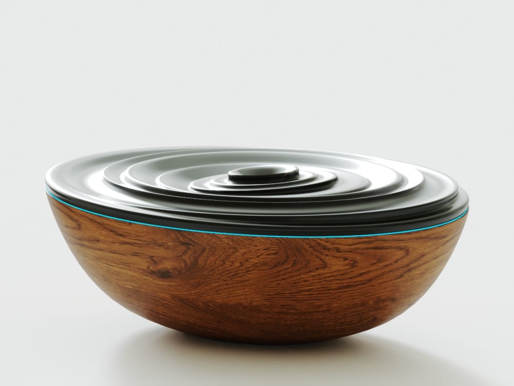
Rank Which Essential Oil Diffuser design would catch your eye, make you want to buy it and why?

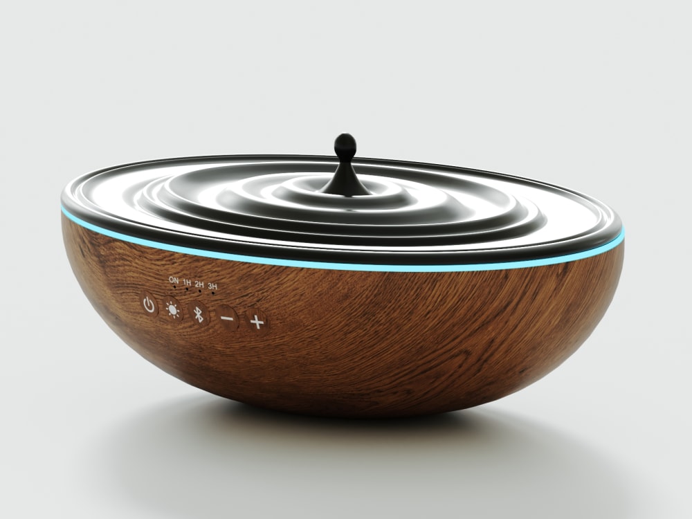
Option B won this Ranked poll with a final tally of 123 votes after 4 rounds of votes counting.
In a Ranked poll, respondents rank every option in order of preference. For example, when you test 6 options, each respondent orders their choices from first to sixth place.
PickFu requires a majority to win a Ranked poll. A majority winner differs from a plurality winner. A majority winner earns over 50% of the votes, whereas a plurality winner earns the most votes, regardless of winning percentage.
If an option does not earn a majority of votes, PickFu eliminates the option with the lowest number of votes. The votes from the eliminated option are reassigned based on each respondent’s next choice. This process continues in rounds until a majority winner emerges.
Scores reflect the percentage of total votes an option receives during the vote counting and indicate the relative preference of the respondents. If there is no majority winner, look to the scores to see how the options fared relative to one another.
| Option | Round 1 | Round 2 | Round 3 | Round 4 |
|---|---|---|---|---|
| B | 22% 44 votes | 25% 50 votes +6 | 39% 78 votes +28 | 61.5% 123 votes +45 |
| C | 27% 54 votes | 29.5% 59 votes +5 | 33.5% 67 votes +8 | 38.5% 77 votes +10 |
| E | 23% 46 votes | 27% 54 votes +8 | 27.5% 55 votes +1 | Eliminated 55 votes reassigned |
| A | 17% 34 votes | 18.5% 37 votes +3 | Eliminated 37 votes reassigned | |
| D | 11% 22 votes | Eliminated 22 votes reassigned |
Age range
Education level
Gender identity
Online shopping marketplaces
Options
Personal income range
Racial or ethnic identity
34 Responses to Option A
I prefer the simpler look of options A and B.
I like option A because it looks like vibrations in water. I liked that B was wavy but regular. I liked that D was wavy, but it was irregular. Option E was ugly to me because of how high it goes off the top. I didn't like Option C because of the small, breakable protrusion.
I prefer the flush streamlined design because it does not stick up as high. I don't want a pointy diffuser.
I prefer the design of A. I like how it is more flat and doesn't have the height that some of the other options have. I think it's more sleek.
I think that the options A, B, and E are the most soothing to my eye and fit with the idea of the oil diffuser.
I like the flater top of this machine. I think that it is less busy and would just be crazy looking in the decor.
I find A quite mesmerizing. It looks pretty. E is my least favorite as I think it is too high.
I like the slight change in height with A then B. C is nice too, but D and E have too much height.
I love the tapering circles of choice A. They are attractive and yet have some symmetry.
i really like the swirl look in options A B and C. i feel like it looks like a puddle that had a drip in it and i like it a lot. i feel like it is simple yet pretty at the same time.
Option A is my first option because it is the first that caught my eye and the design itself is calming in its circular pattern. Option B is my second choice because I like the gently wavy pattern at the top of the diffuser. Option C is my third choice because I like the symmetry of the circles. Option E is my fourth choice because I like the waves of it and find it eye-catching, just not as eye-catching as some of the others. Option D is my fifth choice as I am not really drawn to the asymmetry of it.
Although I generally prefer oblong to round in such items, I went with the to parts and how I liked them, as they really stick out. I prefer the flatter, rounder lids over the high, odd shaped ones.
I liked A and B the best because the bowl looks very rounded and almost like flower petals. I'm not sure, but I really like things that look more natural and close to nature.
A looks symmetrical and uniform
I prefer the look of the diffusers that almost look like moving water, very interesting to look at.
I really love Option A, it is intriguing, visually eye-catching, and it reminds me of skipping stones.
I would not buy any of these because I just don't like the design at all but if I had to pick one I would pick the most level one or the one that made it look least likely to spill oil out.
I prefer the simpler design on the top rather than the way the ones that stand up taller.
I prefer A as the top is lower and less noticeable. Then the others in order as I like them and for the same reasons. All very unique designs I must say.
I don't like the black and brown color combination, especially since the brown part seems to be imitation wood and not real. Honestly the designs are cool looking, but the colors are really a sore sight. For the shapes, minimal curvature is better, even though the more intense curves look cool. Smaller is easier for storage and moving around, also less waste hopefully.
I like the symmetry of this choice best and the wave effect of my second choice. I find both of these calming which is the desired effect I want from essential oils anyway.
I picked the ones that I felt looked most compact and would take up the least amount of space on a shelf.
I like A the best because the design reminds me of the rings when something is dropped in a puddle. It looks minimalist and soothing. I think the ridges in B are quite eye catching. I don't like the raised middle portion of C. I like E the least because the design looks too modern/bold.
I like the ones that look like ripples more than the ones that look like waves
These actually all look really interesting and unique, I'm pretty hard to impress but I like them all. I chose A as my first pick, because it reminds me of a stack of balanced stones, very meditative and serene. C was a close second because I like the rippling water look, my biggest concern would be is it sturdy? Is that water drop going to break off? B was third, I really like this. D and E were last, aesthetically, they're not my favorites. I feel like they draw too much attention to themselves when I'd rather have it be in the background. But I do like the designs, just not for me.
I like option A the most because it reminds me of water or rocks and I find it to be very calming. I like option B the second most for a similar reason, but it reminds me of less calm water than option A. I like option C the third most because it reminds me of a droplet falling into water, but I'm not sure how well the "drop" would hold up. It seems like it would break off easily. I like option E the fourth most because it is visually interesting, but I don't like it as much as option A, B, or C. I do not like option D because I don't understand what it is supposed to look like. I find the design of option D to be strange.
prefer a simple, minimalistic design.
The simple designs look more like something you would see in a spa. Simple and elegant.
I like all of the options, but I picked A as my first choice because I liked how the swirling circular motions looked perfect. I picked B as my second choice because I liked that one just as much as option A. I picked E as my third choice because I liked how that one had circular motions, but in a different direction. I picked C as my fourth choice because I like the drip effect just as much A, B, and E. Lastly, I picked D as my fifth choice because I did not like that one as much as the other options.
I prefer the swirled ones.
Option A reminds me of the ripples in a water when you skip stones, and E looks like waves, both of which I like in the design.
Option a is a sleek design that looks good
My choices were based on the oil diffuser I liked best and would choose to select if comparing between these product images. My top choice is Option A. I like the contemporary / modern design of this essential oil diffuser.
I think the Essential Oil Diffuser in Option A catches my eye more because I find this design to be the most attractive of all the options. I think most of the options look pretty odd looking, but this one looks the least weird when it comes to its design.
44 Responses to Option B
Oh wow! Fun choices make it hard to pick. I love B because of its contemporary vibe and modern design.
I like that it’s such a sleek and unique design. It’s modern and classy which I prefer.
B is the most creative A is very unique, I like the raised design on E, D reminds me of the ocean and C reminds me of a children's top
They are all very unique in design but option B is the most attractive to me. I like the style of this one
Option B and A is something that looks discrete and pleasant. Some of the options look really weird and I would not want sitting in my house.
I love the shape. IT reminds me of a ripple. It is simple but it stands out. I can put it in any room and it will fit in really well. I love that the design is not too over the top.
option B oil diffuser would catch my eye because it has calming effect on eyes and mind and makes me want to buy this product.
I really like B or A. I like that it looks like water, or waves on top. It would help give the calm feeling that I would use the diffuser for.
The unusual shapes and assymetrical designs are far more interesting than the concentric rings that look more like a lamp. I am allergic to scents, however, and essential oils cause me severe physical harm
I prefer option B. I like the design on it and the type of movement it looks like.
I like Option B, it reminds me of a seashell swirl design. Very symmetrical and calming. Option C reminds me of a spinning toy top. I'm afraid it will tip over, any second. Option E, is ok. It reminds me of waves on the ocean, but it is really TOO tall and I'm afraid it would stick out like a sore thumb and not blend with my home decor. Option A looks like a tupperware bowl and lid and Option D looks like a child's portable potty. And I had to do a double take when I first looked at it, because that is what I thought it was. My granddaughter has one and believe me, it's a similar shape. Not a very pleasant thought for an oil diffuser.
I prefer option B because this diffuser looks a bit bette than rest of the options provided, however, they are all weird looking and I would never purchase any of these.
I like this design the most because It looks calming and has a nice unique design.
The design is visually stunning and intriguing. The product look is aesthetically pleasing and likeable.
I love the wave appearance of B and E. C looks very very strange to me.
These are all strange designs and I'm not sure what I am looking at, but the one with the swirls looks the nicest to me
The goal of these is usually to bring transqulity, and B and D seem to ahve the "calmest" designs, so they were placed first. A is calm but it looks off balance so I put it in the middle. C and E have the most "action", but C has an interesting design so I placed it before E
Essential diffuser really caught my eye because of its unique shape and design. I love the contrast between the dark walnut wood in the black.
i liked the look of b. i thought the pattern was cool without bekng overwhelming
Option B has the most visually appealing design for me. There's a natural symmetry that's both attention-grabbing and intriguing for me.
I ranked in the order that I like the height of the wave or water design.
Option B looks like a pretty ocean wave. It’s interesting, but not super unbalanced.
B and E had the most interesting shapes. They reminded me of waves frozen in motion. Very soothing and cool to look at. A and C were nice patterns but reminded me too much of those toy tops you used to play with as kids. D was just a little too out there for me.
B has stood out to me the most, because it is aesthetically appealing, to me. B and C were a bit of a toss-up. D and E are too tall. A is my least favorite because it looks lopsided.
B and E have an interesting shape. D is odd but at least a bit different. A and C are just too boring.
The design is very unique and looks very nice
I selected the oil diffusers that I found to be the most visually appealing.
I like B because it is the most understated. D and E are too garish.
I love the unusual design of B, it is very different. I love E as well, but don't like that it is so much higher profile than B.
I really like option B, it’s very fancy looking and looks smooth, the others are fine, they’re all unique and things I’ve never seen, offering different designs wouldn’t be a bad idea as everyone as different tastes, however B is my favorite.
I give a slight nod to B over C. While I like the water drop design of C, I prefer B's chocolate pudding appearance.
I liked the cute design of B best. I really did not like the sloppy looking design of D at all.
I like the off center ripple designs better. The drip look I fee has been overdone and it just doesn't look all that interesting to me anymore.
I chose option B because I liked the design of the diffuser better than the other options.
The swirling pattern of B is very attractive and mesmerizing, I could enter a zen state by simply watching it.
I like how it is smooth and looks like waves in an ocean. I than i like the circles in symmetrical looking pattern. C is like a spin top and is smoothing. E and D are very unattractive and no interest in looking or buying them.
I think the swirls are so cool looking and mesmerizing
I like the design of option B, it looks a little like swirling water. Option C is nice too, it looks like a drops of water and some ripples. Option D is unique looking. I think that option A is a little flat and option E is a little too tall.
My choice would be diffuser that is option B. I like the way the inner middle part mimics a wave of a flickering candle. I think these designs are really creative and very different from what I've ever seen. Wow looking at it closer I really like the swirl inthe center.
The most interesting design on top of bowl
don't like it too high in the middle, so I like B the most, it's unique but still low profile, best. then C, the center looks nicer than A. after A it's D, better than E, E is too high I'm afraid it'll spill
I love options B and D - I would buy them right now, C is okay, I don't really like the droplet. Option E is too tall, but maybe it looks more interesting from another perspective. I flatly do not like A, I think it's dumb looking, lol
I wouldn't buy any of these. I really don't like the abstract looking top to them.
Oh I really like the look of Option B, it's perfect, and unique in it's own way! Thank you!
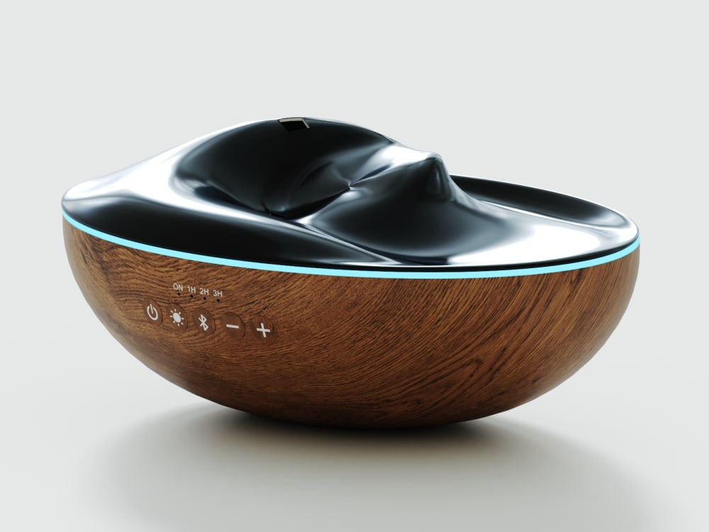
54 Responses to Option C
Some of the others look more like certain human body parts.
I picked option C because I like the tip in the center of the product that could be gripped to take off the lid.
I like Option C. The drip is so engaging. I feel as though I am seeing water movement.
C is more neutral and would go with more decors
I would prefer C the most. I really enjoy the waterdrop effect as I think it makes the overall product more Zen and peaceful in a way that users can resonate with. I also think the design makes the product appear to be more lively yet soothing at the same time thus making it more compelling.
I chose C first because the design is unique and innovative. It is different from basic diffusers.
I like this design it reminds me of a drop of water and is relaxing
I like the circular designs. Some of the other designs look too much like vaginas.
I like the more simple and understated designs. I like how my first choice looks like water rippling from a drop of water.
My design choices will always gravitate towards understated minimalism. C & A are most aligned with that aesthetic
Honestly they all look a little off-kilter and I don't think I'd buy any of them. Picking between these, though, D and E would really bother me. C was okay but the stick-up part is a little creepy, I liked C and A a lot better
I chose the designs that were most appealing.
C and A are the only life that make sense to me visually.
I like the waterdrop shape of C because it's so lovely. That's the first one to catch my eye. I like the concentric circles of B and the " wave" shape of A. These mimic the shape and movement of water really well. I like the wood grain finish.
The more even ones would catch my eye more - this is a product about calmness, and relaxation, and I think the more even, symmetrical ones would catch my eye more for a product like this.
I absolutely love that this one looks like a water droplet hitting the water. It gives me a sense of peace, serenity, and a bit of surrealism.
I prefer Option C as my first choice. It almost looks like a piece of sculpture and has a lovely "boho" feel to it. Option A is also quite nice and has a simplicity that's pleasing. Option B seems different and has a sleek, modern look that's appealing. The remaining options are perfectly fine but are not as eye catching .
The water "drop" design would be amazing against a wall at a distance.
I feel like the less ridges and grooves it has in the design, it's more appealing to the eyes.
Option C looks like the best among this options. It has a theme of some dropping water into a bowl of water forming waves that look very relaxing. The drop looks very good.
i prefer a centered easy to comprehend symmetrical image as my brain enjoys those more
I prefer choice C because the design is more aligned.
The diffuser in option C catches me eye and makes me want to buy it because it is round and symmetrical and pleasing to look at. I like the diffuser in Option B second best because I like the swirled look in it. My third choice would be option E because the raised center is decorative in any room. I do not like Options D and A because the are odd shaped and Option A looks uneven, so is not attractive to me.
1st-C: it's a water drop, really nice and creative2nd-E: it's beautiful, like a shell but more graceful3rd-B: it's simple but cute, very pretty for ladies4th-D: it's impressed and got my attention first, but it brings a male vibe, like the ocean (big and strong)5th-A: it's nice but not impressed like the others.
The concentric circles in the top of the diffuser are attractive. They indicate that the oil will dispense evenly.
I like the flatter design rather than the big mountains on it because it allows for a more elegant and sleek look rather than a statue taking up more space than needed
They all look great, my favorite is C, love the drop and the complete design
I like choice C because it looks like a drop of water and is relaxing to me.
I would pick option C because I like the design it looks like a drop of water hitting still water and that's something that I haven't seen before.
I like this option the best because it is simple, yet elegant.
i have never seen a design like option C, it is unique and out of place
I choose "C" because I like the little thingy sticking up in the middle. It makes it more eye catching for me.
I like the more stable look of C. The others seem to have motion when I glance at them because of their swirls.
C first choice for the uniform concentric circles and the tiny bud in the middle. B for the symmetrical swirls that look like pudding. D for the intricate shapes that make a wavelike effect. E for the large fin shapes. A was last pick because it didn't appear symmetrical in shape.
the first one with the simple water drop design is my fac
Option C caught my eye first. I love how it looks like a drop of water is hitting a puddle in perfect geometric form. Option B was next because I like how it is in a curled up shape. Option E reminds me of a seashell which is cool. Option D is kind of weird shaped but seemed a better choice than A which seems like a dud.
I like the shape that looks like a water droplets
Like most of these designs except D. I think it would look nicer white instead of black though.
Option C looks like a droplet falling and causing ripples and is very cool looking while feeling more balanced in its design.
I really liked the design of this diffuser. It looks like a drop of water hitting a tranquil bowl of water. It’s relaxing just to look at.
C looks so awesome. Honestly I like all of these. They're very unique and interesting looking. D also looks like it would be fun to look at. Overall I chose based on how much they called to me in the moment,
I liked the one that looked kinda fun.
i really like chocie c. i think it has almost an alternate gravity feel to it. it can be, but its not. its cool.
I like the symmetry in option C, option b is unique and different, option e and a are okay option d is my least favorite from the angle of the image
I picked C (and to a lesser extent A) because if that's the lid on top, the design on both of these would make it easiest to lift. E is interesting as well, but D and B look like they'd be difficult to use.
I chose C because of the gravity defying like droplet in the middle. I ranked the rest based on how zen I felt the pattern was. Basically, looking for uniformity.
The reason why I choose option C is because I like how they made this essential oil diffuser to look very unique and different from the rest of them. The reason why I choose option D is because I like how they made this essential oil diffuser to look very nice. The reason why I choose option E is because I like how they made the essential oil diffuser to look very inspiring. The reason why I choose option A is because I like how they made this essential oil diffuser to look like a spinning top. The reason why I choose option B is because I like how they made this essential oil diffuser to look very different from the rest of them.
this one looks really natural and like actual water which I think is a cool vibe, and it seems easy to clean
I prefer the lower profile swirly designs. I feel like they would look really cool when turned on.
I really like the drop of water look. Also the more even the more visually pleasing in my opinion.
They are all pretty cool! It was a tough choice. I think I like them only slightly different because they are all very interesting. I definitely like the drip in C, though.
I really like all of these oil diffusers. These are very creative. If I had to pick, it would be C hey, I am when I first looked at the photos I really like this one because it looks like a single drop of water being dropped on impact into the bowl so it's really cool and I like it
I like C because of the stylish, classic look, E for the unique look, B just look more appealing to me than A and D.
Option C reminds me of a photograph I've seen of a water droplet falling onto water. It is beautiful and clearly inspired by nature.
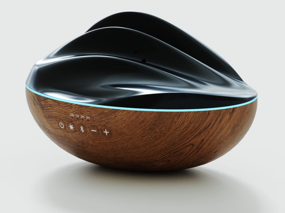
22 Responses to Option D
D is cool to look at and I imagine the scent following the path of the design into the air like a labyrinth which is a calming structure.
I really like the asymmetrical look of D and E and B. A is kind of different and C is a bit predictable.
I would go with option D. I think that the design looks like ocean waves and is very appealing, would give context to users who use essential oils for calming and relaxation.
I do not like the sharper edges/lines in E. I liked D because it felt soft, calm, like a soft river rock to look at. Aesthetically pleasing. C is nice as well, because it looks to me like the effect that happens when a drop of water falls into a large pool of water.A reminds me of the effect when throwing a coin into a wishing well and I love that too. D, C and A are my favorites. B is cool because it looks like a wave but do not like as much as D, C and A
I like the ones with the wave patterns over the circular ones.
I prefer Option D because it looks like a mid-century modern ash tray and I collect those because I love the style.
I think my first choice has the most interesting look to it. This would be the one that I would want.
I liked the options that had more dramatic ripples and waves since these stood out to me more than the options with more subtle appearances.
I chose D I like the design of the lid.
D and E are the two two choices as they are the most visually appealing and are reminiscent of sculptures which has an added decor bonus.
The asymmetrical waves of D are very cool looking. I also think it would be the easiest to keep clean. E is similar to D, but might be harder to keep clean. A would not be TOO hard to clean. B & C would be very hard to keep clean (diffusers get dirty!).
I prefer this one, it just looks more visually appealing to me and it looks whimsical.
I would want it as simple as possible, I would pick option D as the best choice.
I like the one I ranked 1, D, because it looks more rustic and unkempt with the shape of the top being different sizes.
D looks like the easiest one to clean and so I like it the best. A looks crooked.
I like a subtle but flowing shape.
I really like Options D, B, and E. Just from a side view they look calming. The top strongly suggests peaceful, slow movement, as if I was watching the ocean. I would be happy with either of the three. Against them, Options A, and C aren't as attractive to me.
I think my top three ranked options are the most intriguing and eye-catching for me. They make me most curious, so I would click on them first.
The essential diffuser that would catch my eye and make me definitely want to buy the product would be option D. The design and aesthetic appeal of this diffuser definitely draws me in as a consumer and I would be very likely to add to my cart immediately and make the purchase.
I like when it looks unique, more like waves, but still has balanced form.
The first 3 of my choices give me a peaceful serene vibe. I can imagine the oil scents coming out with nice music playing via the device. The other 2 look like a contraption and a bit odd shaped. It doesn't make me want to purchase because the design is so complicated.
These are all really interesting looking. They remind me of the movie Arrival for some reason. Anyways, I like option D best because it's the most interesting to me. I guess it's the most dynamic and almost feels alien and strange - interesting. Then comes option A which feels very calming and zen-like. The same goes for option C, although this one is a bit more dynamic than option A. Then there's option E, which isn't bad by any means, but I just found the others more appealing. This one reminds me of the ocean. Finally there's option B which again isn't bad, but I find the least interesting out of this group.
46 Responses to Option E
based on which is most relaxing and asethically pleasing
These are really lovely, I'd definitely like E the most initially because it's so stunning. I think C is really awesome looking also, followed by A. They're really unique designs and I feel like they'd be an interesting piece just to have around. Options B and D felt the most boring and so they're last but they're also really handsome.
I think E has a very elegant design and I like the way it looks B and D are okay but they don't really wow me the same way. C and A are a bit bland and generic. They just don't really appeal to me.
I like the high waves on this one the best. It's really unique and cool looking.
This shape stands out with the taller design looks more like a diffuser and less like a bowl
design is cooler
I really love the designs of both E and B, so they are actually tied for first place! All of these diffusers are interesting and beautiful, though.
The design on the choice E is very bold and beautiful. It looks. like layers of water waves. It is a fun piece to look at. It is a great piece. The choice C is also a mimic of a droplet. It has a very fun take to it. The choice A is very similar to C and they give off the same calm ripple effect. The are good to look at. The choice B is looking very unique and modern. It looks like a fun cool take on the choice A. The choice D is a fun abstract piece. I love that this piece can stand alone as a solo piece. It is a good artistic display.
Uqune design and will be able to go with any decor. Like the natural looking wood.
E and D give me the feeling that it would look cool with the smoke of the oils and difuser coming out. The others look cool too and I imagine they would be cool as well, but something about E and D seem more dramatic.
OPTION E D AND B ARE SO UNIQUE AND DIFFERENT. I WOULD LOVE TO PURCHASE ON OF THESE OPTIONS
First option is E for the Essential Oil Diffuser design that catches the eye for purchase because it is original and because it stands tall it demands attentionSecond is option C because of the little point at the top draws the attention of the eyesThird is option A because of the swirl circled look is interestingFourth is option B because it has an interesting twistFifth is option D because it looks like puddingAll options are interesting but I prefer option E most
I thought option E looked the most interesting and unique. Option D, looked very dynamic shape wise like option E. Option B and C looked okay. Option A looked a little boring when compared to the other options.
choice e is very unique and fun looking. it like the design and creativity
I love option E it speaks to me the most because of the waves. D and B are also really nice. I think with option A I would always be thinking that there was something wrong with it and it may be because of the picture that it looks like it's off balance. I really can't move beyond the fact that the top looks like a stack of plates that are off balance. I just don't like option C. I feel like with that someone is gonna try and pick it up by that center piece and it's gonna break or fall or just make a huge mess.
The larger options, e and d, would catch my eye first because of the size. Options A and c have basically no height when compared to the other options therefore, they do not stand out as well as the others.
I chose E because I like that this design has volume.
I ranked these in the order of the design I liked the most and feel like it is the best
I like the 3D effect of the product.
I think E stands out more because of ho the top os it is raised up. It gives it some depth and makes it more attractive.
This one looks like icing on a cupcake and that is appealing to me.
Option E I love how it looks on top I love that design it's very creative
I like how E is swirled up and really catches your eye. I also like the swirl design of B
I like the ones that look most like moving water, option B looks very off and i would not purchase that one at all
My choice is option E as rank 1 because of the product pattern of the upper part is very very unique from others so i choose this as my choice
I personally really love E, B and D because I love seeing the design and the oil diffuser come up with everything. It looks so elegant and professional to me and it grabs my eye right away. From there, I chose C over A because C catches my eye with the spot whereas with A, it just looks a bit plain to me.
E would be my first choice because it looks more like a diffuser.
D is an eye sore. E is innovative and futuristic. B, C and A are all pretty and eye catching.
The crest of e looks like a wave — it’s both beautiful and calming. The others looks best if they’re flat and rounded.
E is beautiful, the height draws my attention to it.C is unique, but looks like it could break easily. Otherwise it would be my favorite.B is also very nice.D and A do not grab my attention
E and B look more pleasing to me. The wave shapes are organic, relaxing. They catch my eye. A and C are interesting with the play on a drop radiating, but I don't know if it would be as pleasing over time.
The raised design is appealing to the eye and pretty.
I ranked in order of what was most interesting and aesthetically pleasing, and what would provoke me to look into it more to potentially purchase based on the designs
The design of E is super eye-catching and unique, and reminds me of the ocean. I also like C for its cool "frozen in time water droplet" effect. It's very calming. B is too much like cupcake frosting and A is boring
I made my choice based on the uniqueness of the design. I feel I would enjoy having something so distinct.
Option e has an interesting shape. It reminds me of the sydney opera house
I like how organic E and D look. I also like A but it does look like a speaker so I don’t know how I feel about it. The last two (b and c) don’t seem to match the design of the bottom of the diffuser.
I really don't like option C. If it didn't have the little thing in the center. I would like it more. I enjoy the swirl designs the most.
I chose E as my first choice because I like the unique look and the way the center looks in coming out of bottom. I chose A as my second choice because I like the way the layers go in circle and go small to large. I chose B as my third choice because I like the way it is shaped and looks like it goes up and down. I chose C as my fourth choice because I like the unique center piece. I chose D as my fifth choice because I like the shape and how it looks sort of like a shell.
I am an artist, I like abstract figures and objects that insist you give your attention to. E commands that I look at it, study it and be inspired by it. I cannot immediately determine what it is, but I know I want it. B reminds of cakes so it is my second choice. The swirl reminds me of my childhood, when every Sunday, my mother baked a chocolate cake. C calms me, it looks like a drop of water falling into a pond. I can almost hear the sound of water. D and A are interesting as well, but did not spark nostalgia.
I really like option E and for that matter D because it reminds me of ocean waves.
I chose in order of the way each stand out
I don't like option D because the shape of it looks like someone crushed it or smashed it. I think it looks weird. I like Option E because it has a unique design and looks like an interesting architecture design. I think option B is okay but it looks more like food. I am indifferent about the rest.
I ranked them based on their appearance and how they would look when in use.
My #1 choice reminded me of a seashell. They all look nice, though.
The design E is like a mountain range and has a smooth and shinning finish and looks very attractive and gives a luxury looks than all the other designs and so I prefer E than others.
Explore who answered your poll
Analyze your results with demographic reports.
Demographics
Sorry, AI highlights are currently only available for polls created after February 28th.
We're working hard to bring AI to more polls, please check back soon.

