Poll results
Save to favorites
Add this poll to your saved list for easy reference.
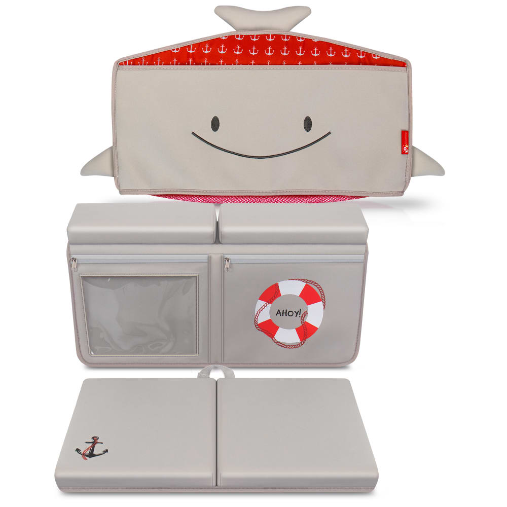
This product is a baby bath set, which includes a Bath Toy Organizer & Bath Kneeler & Elbow Rest pad, designed to keep your knees and elbows comfortable during bath time. Which design would you rather buy for your Bathtub?
Option A won this Ranked poll with a final tally of 28 votes after 2 rounds of votes counting.
In a Ranked poll, respondents rank every option in order of preference. For example, when you test 6 options, each respondent orders their choices from first to sixth place.
PickFu requires a majority to win a Ranked poll. A majority winner differs from a plurality winner. A majority winner earns over 50% of the votes, whereas a plurality winner earns the most votes, regardless of winning percentage.
If an option does not earn a majority of votes, PickFu eliminates the option with the lowest number of votes. The votes from the eliminated option are reassigned based on each respondent’s next choice. This process continues in rounds until a majority winner emerges.
Scores reflect the percentage of total votes an option receives during the vote counting and indicate the relative preference of the respondents. If there is no majority winner, look to the scores to see how the options fared relative to one another.
| Option | Round 1 | Round 2 |
|---|---|---|
| A | 50% 25 votes | 56% 28 votes +3 |
| C | 20% 10 votes | 28% 14 votes +4 |
| D | 16% 8 votes | 16% 8 votes |
| B | 14% 7 votes | Eliminated 7 votes reassigned |
25 Responses to Option A
I prefer Option A because having the red color on the top match the red color on the life preserver design is a nice touch.
I prefer the red options.
Option a with its red check accent and red and white life preserver is the cutest
The ahoy adds to the design enough but keeps it subtle. The red livings it up a bit. A was my top because it had both
A is the most attractive to me as a consumer.
A is my first choice because I like the red and white anchor design added to the pad and the red life saver on the toy organizer. This adds a nice touch of color to bright up the drab gray color. B is my second choice because, although not as colorful as A, it still adds some relief from the all over gray color. D is my next choice, again for the addition of a bit of color and C I would not buy at all because it is drab and unappealing with it's all gray color.
I chose by sets that look the most interesting and lively.
I ranked the designs of the bath toy organizers that I liked the most. I found the design of the lifesavers on option A and option D to be the most appealing. I then liked the red color of option B more than the more grey color of option C.
I like option A with the red the most. Nice look. I like to see the "Ahoy!" with the life saver there as that is fun. Think that design looks best of these. All very close and very good.
It’s very grey, so pops of color work well here. I like C because it include the most red
I like the life saver being added to the knee pad. I picked A first because the extra red added makes it seem more playful and the kids like colors. I have D second because I like the life preserver better than just having more red
I chose option A because it has a more colorful design and is more interesting to look at.
The more color the better. I'd go with more than just the basic red, but what is shown I prefer Option A.
I liked the nautical anchor on A and D but appreciated the brightness, boldness and confidence of A and B more since they featured a cheery red color
I like that it has more color to it in option A and B. I like the design as well. I think A stands out the most.
I really like the pop of red on the hat and the red of the life buoy in option A
All the four images are very cute for baby product. Some of the image gives a color combination of it.
Utility wise they are all the same, so I would choose the ones with more colors first to amuse the baby.
The design at bottom is cute and stands out
Option A, the design is cuter with the color red, would definitely but as it makes bath time easier and more comfortable for parents
i like option A the best. i think it is very cute and would look very good in the nursery.
I voted based on how appealing the images were to me compared to the others and which ones I would click on in the real world.
The design aspect of Option A is my favorite. I know my kids would love this item. It is an impressive overall look and context.
The anchor and life preserver really make the organizer stand out. I like the red trimming over the grey, so put Option A in first place.
A has good contrast colors and attractive
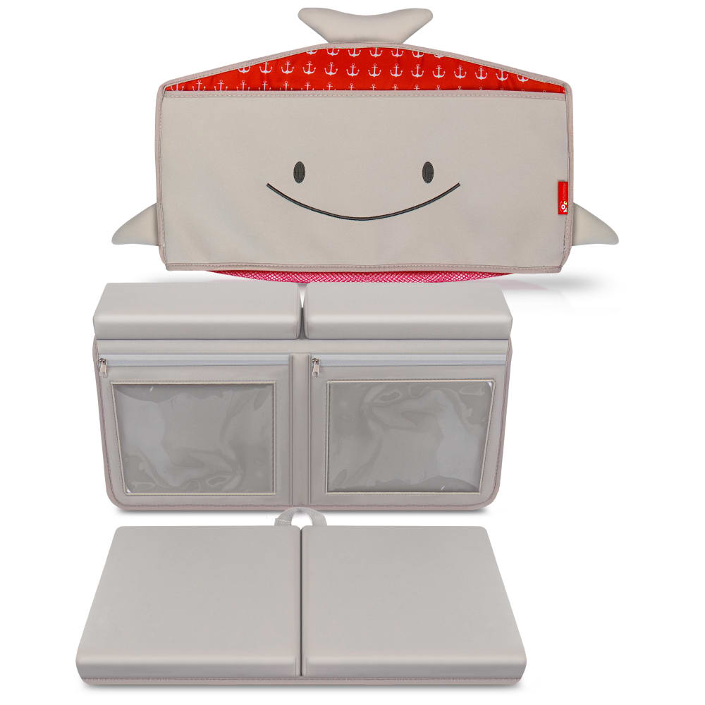
7 Responses to Option B
B and A stand out to me the most
One of the hardest things to do with my grandson and this would be the best thing ever to keep him comfortable and get him to take his bath,
Honestly, I don't like the smiley face on any of them and I don't like the nautical theme, but I chose the more colorful one of each style as my favorites.
I like the red look which will add a pop of color and be super comfortable. I"m not as big of a fan of the ring but i like the color the best.
They are all really cute and I wish they had something like this when my kids were little
I like the red in the design. Also like to clear front doors. You can see what's in it. Overall the best one
I love the red accent, I could not however rank A as 1st or 2nd because that front pocket looks like it could trap water/mold
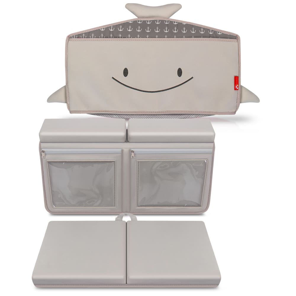
10 Responses to Option C
C has a robust and highly functional layout.
I love the smiley face features on the first few as well as the product layout better. Looks more desirable.
I wouldn't need all the details on it - just something simple.
For B and A I do not care for the red accent color in the product at all. I much prefer the grey. I also prefer the extra clear compartment on the grey in C to the ahoy logo in D. The ahoy logo does go well with the red accent color in A if you must have the red accent color.
I prefer the non nautical theme ones. The red would be worrying incase of an accident.
I chose C because I like how it has two clear pockets. The colors are easy on the eyes, it's something people see everyday. I chose B for similar reasons; the pockets are clear. This prevents mildew and lost items. I chose D next because the nautical theme is fun and the colors are muted. I chose A last because I would get tired of seeing the bright colors and not having both pockets clear and easy to clean.
I Love choice C because it's grey, I don't really like the red. Choice D has the ahoy label on it, which is cute, like a sailor. Choice B has the red cap, which I don't really like, but it's not too much red. Choice A has the red cap and the red ahoy, it just looks like too much red
Option c would be my pick because I don’t like the red color.
The design is fun and likeable. The product look is creative.
i like the grey one best without all the extra colors
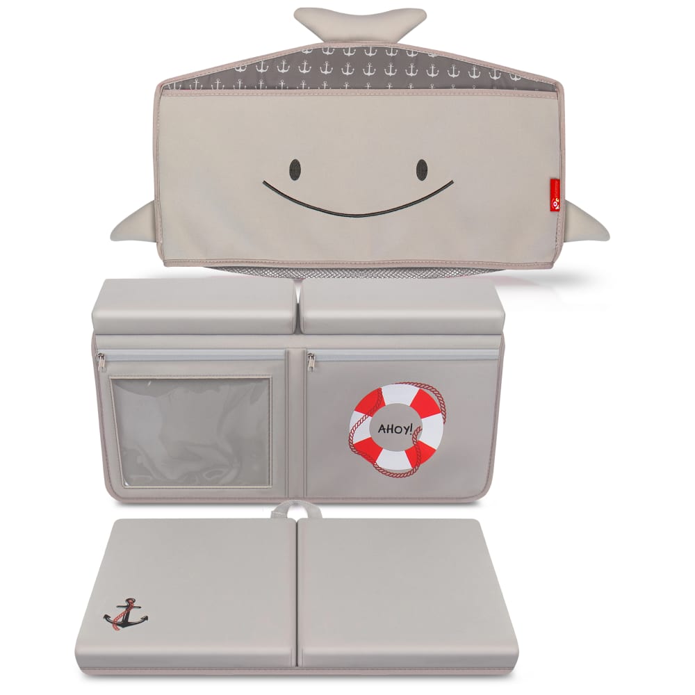
8 Responses to Option D
I like the colors and the details in Option D most.
I think the life preserver is adorable and would suit any gender
Options D & A are my favorite. I like the added features on the design - the lifeguard float and the anchor. I actually like the look of Option D better than Option A slightly because I like the gray top better than than the red polka dots.
The varies pockets on it would offer a more waterproof option for one. And easy visibility on the other. Plus it has a better matching color theme.
I like the nautical theme of option D and A but I prefer the color in option D
I think the anchors add something to it. I am just not sure from the photos how this works. I think that would be more helpful.
The float ring is a cute addition
Option D looks appealing and has a name on it, option A is also eye catching with a label, option B same colors but no label or logo, option C same colors as well but no label or logo.ch
Explore who answered your poll
Analyze your results with demographic reports.
Demographics
Sorry, AI highlights are currently only available for polls created after February 28th.
We're working hard to bring AI to more polls, please check back soon.

